Here i will add a update to whats happening at the games i develop. The older stuff i will move away to the "old Blog" section.
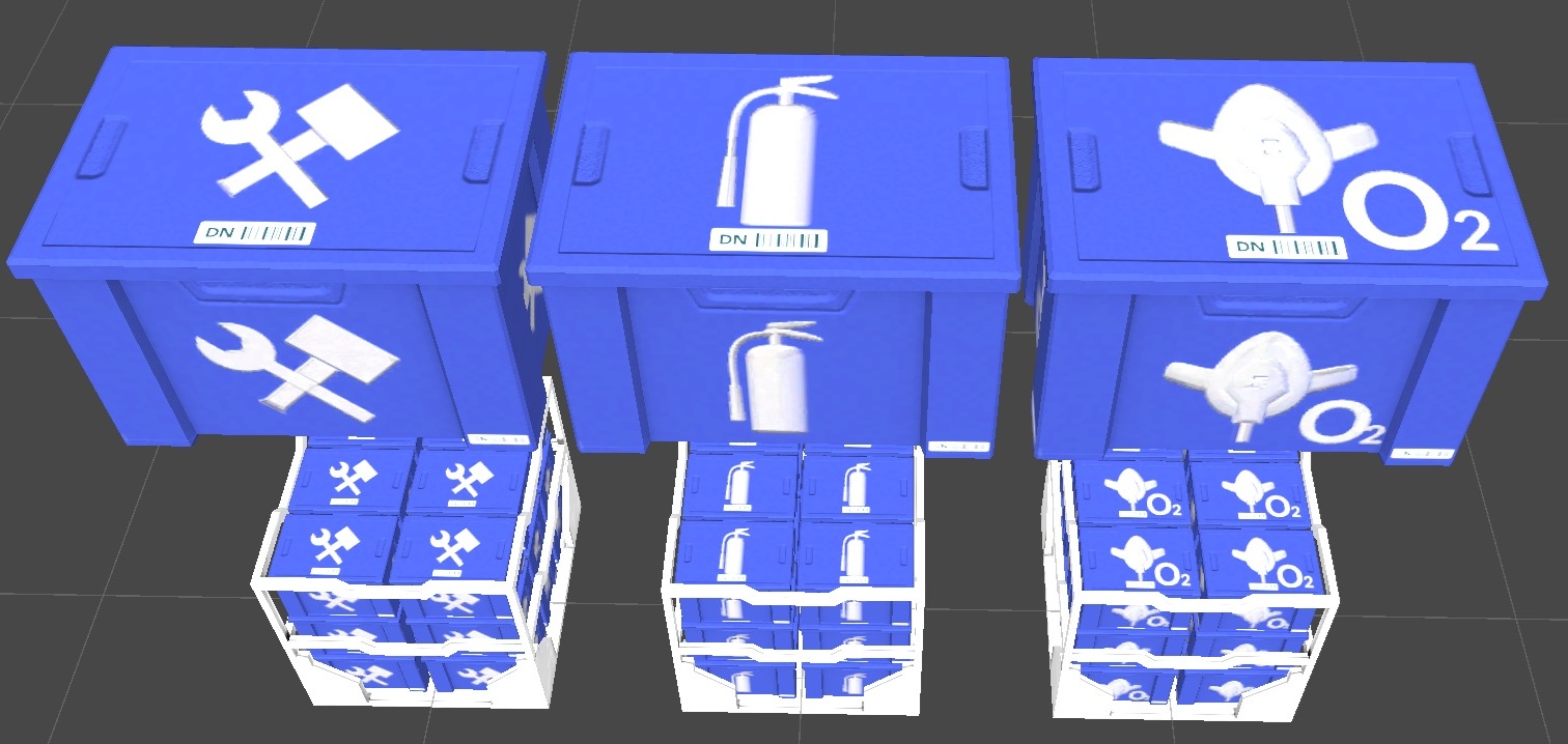
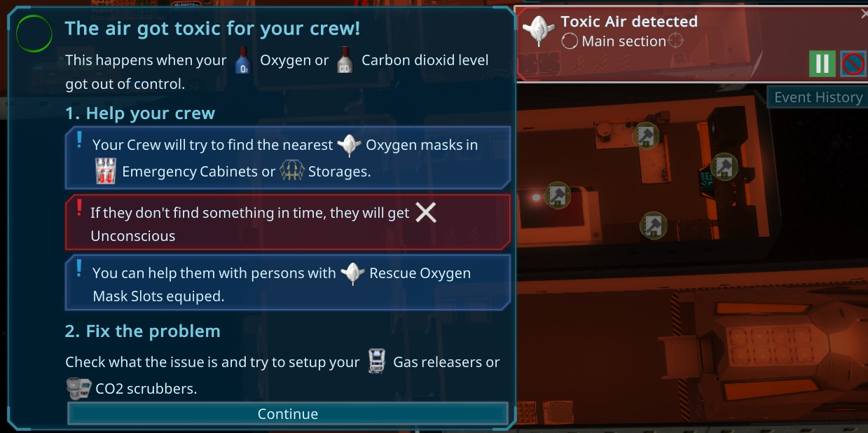
As planned i started with the O2 Mask as a temporary item. Its created when the air gets bad and persons try to fill them like before. Before, all persons instant fait when that level was reached, so i added also a random timer to that. If they don't wear a O2 mask in that time, they fait like before. It was very easy to do with the systems i already build.
Today i just fixed some smaller bugs and prepared my todo list for the next iteration. The topic will be "Emergencies"
After getting very good feedback and ideas to make the emergencies better, i want to directly do that, so the main thing will be temporary person slots, using the O2 mask. It will be later also used for more garbage creation, maybe for cleaning the floor with water and instant converting it to brownwater while cleaning.
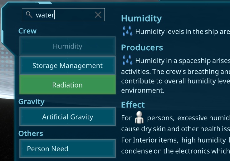
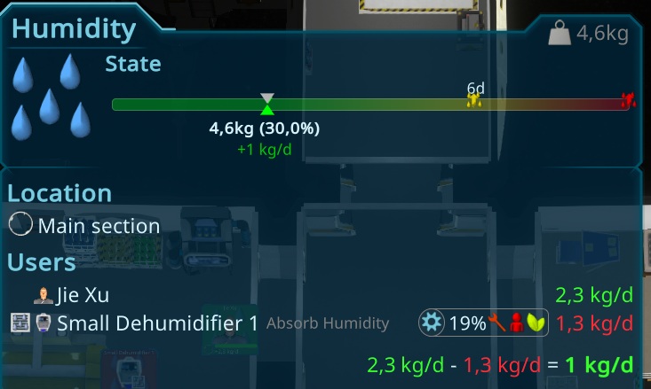
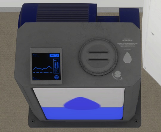
Also the effect of the humidity problem will be lowered with the following idea. When the humidity reach 100%, the water will condense in the rooms. When a person cleaning the room, this water will be removed to its slots.
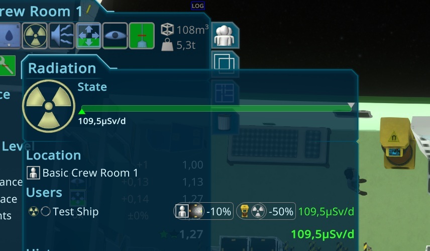
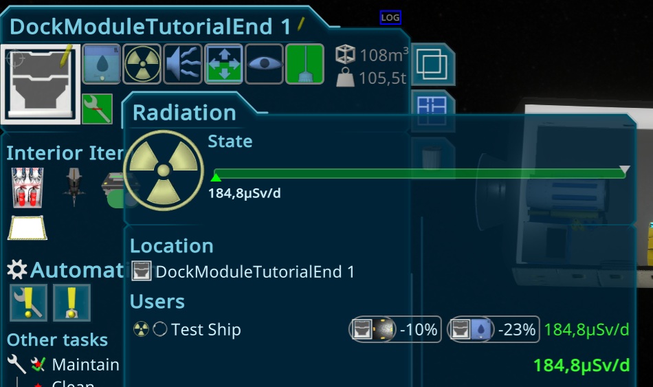
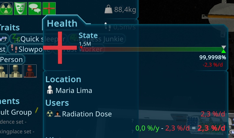
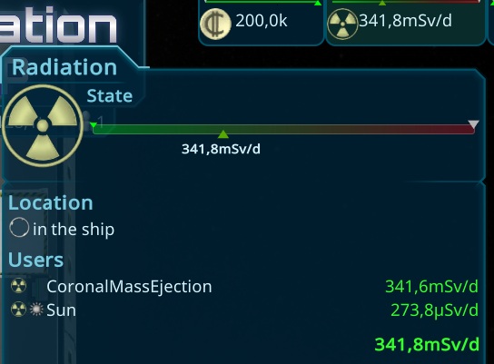
It also allows to help persons putting O2 masks on in emergencies and heal them when they are dying, so medics gets more important. To continue with the main progress of the game i will continue adding radiation, so the persons might health is affected more. The plan here is to add an interior item, that allowes the player to pump water into the walls of a room to shield it from radiation. The game should be prepared for that feature, so i hope its not that much effort.
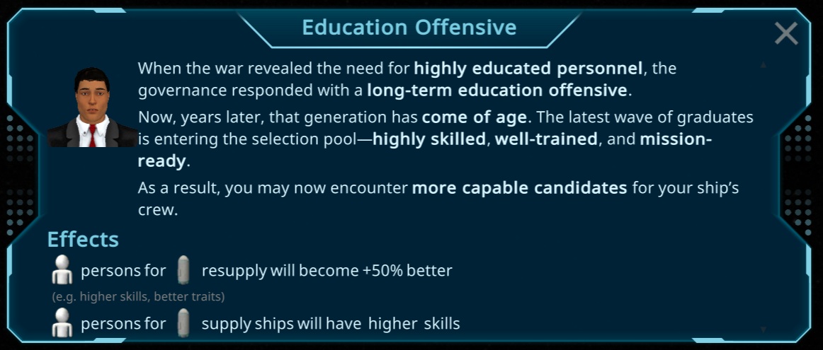
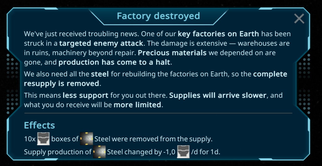
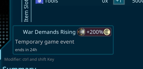
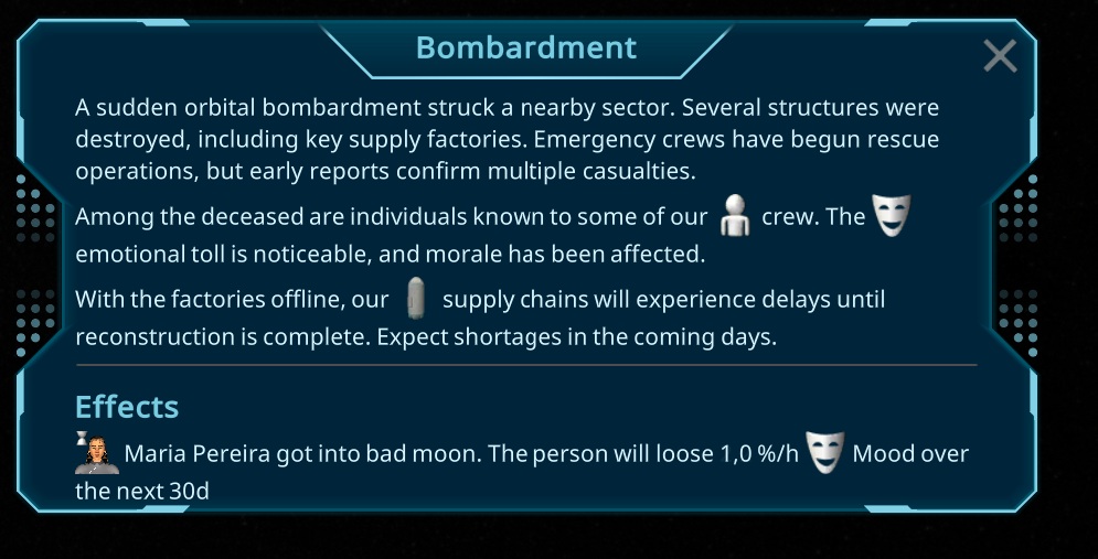
To make this good usable, i plan to add the event system in this iteration too, so there can be "sun flare" events, where the persons have to go into a good shielded room. Not quite sure how i will do that, but maybe similar as the new Bad Air alert, where persons will grab o2 masks by themself. Also other events, affecting the person moods i plan to add, to create a good event system, like the war on earth is going bad, so less resources can be used.
Last but not least a bigger list of smaller improvements are planned. All in all its a tough plan, but i hope i can finish it in the next month. I'm not sure if i can hold that timeplan, due to its pretty unclear how much i will find time to work on the game, due to our appartment movement.
I added another common problem as a thought in tha game. Sometimes the persons working on something are very slow, due to e.g. the mood of the person. To visualize that for the player, i created another thought for tasks, showing low mood or low skill impacts with the new thought bubbles. I hope this will now hint the players enough to that problem.
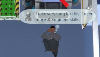
I also improved the bubbles, by keeping them at least some seconds alive. This was needed, due to at a timewarp, the max 20s gametime are over very fast or might be skipped, before the bubble was shown. So at a timewarp, the player did not see those.
Than i started with the last planned part of this iteration. I want to have a better person overlay, showing where he live and works. First i added Residence and Worker Icons above the things the player set up.
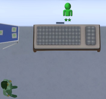
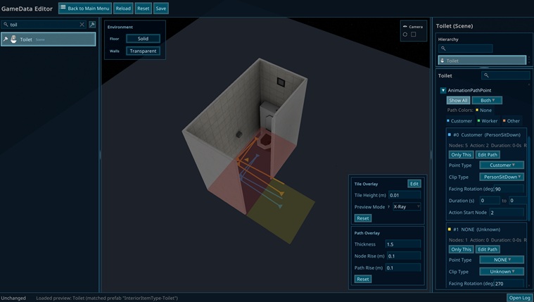
The next thing was to add routs to the places, so its easier to find. I also worked more on the paths, to visualize them better.
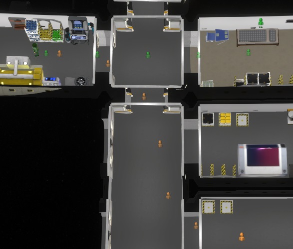
Yesterday, i got a big report with several of new Ideas and improvements. Most of it belongs to emergencies and how to handle them. Due to this will be a big update again, i will first do a major release before i work on them.
The last days i was very busy with preparing for the appartment movement, but i finalized the Thought bubble, making it look nicer and fixed some last special cases.
Today more fixes and improvements, like setting the room level with a basic value of 1 star, to make it easier for uneducated persons to find a room. Additional i setup the room requirement up to 5, so its more spreaded between the persons.
I also did some changes to the priority, to prevent extreme priorities and fixed some small performance issues.
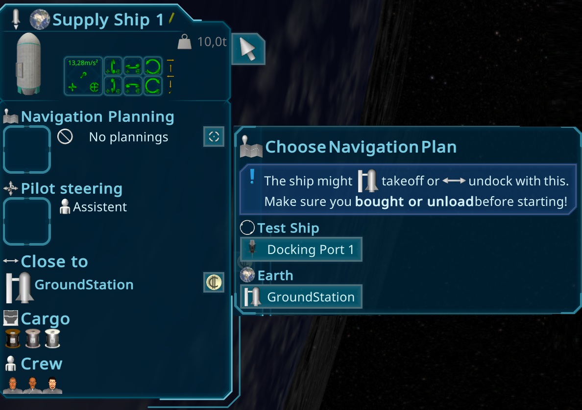
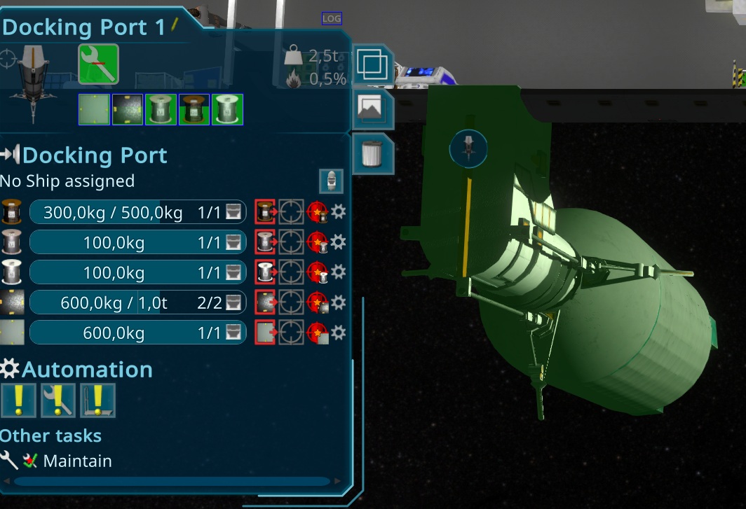
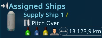
There is now also the possibility to setup the supplyship when its not ready yet, so it can be preconfigured when its undocked from the ship.
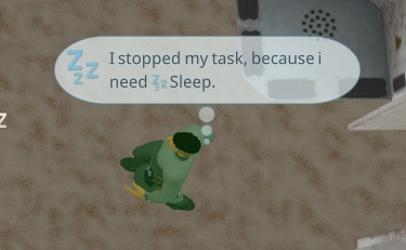
Afterwards i prepared the visual thought bubbles. The idea is to hint the player to the feelings of the person, due to i saw many players that didn't know why the persons don't work. I'm not yet sure when i will show them. In the evening i was able to create the logic for it. First i added another short thought, when a task has been stopped, to do fulfill basic needs. Than i implemented the system, showing or hiding the thought bubble i implemented in the afternoon.
Our appartment movement has been started, so i'm very limited in working on the game for the next months. I will try to do my best to keep the improvements, at least working on the bugs and reports for the next time 🙂
I also found an easy workaround for the looping ui error when using window mode. To prevent endless changing, i just ignore the size change when its getting less than 2px smaller, so the cols will might stay 2 px to large.
I also worked on some overlay and pathfinding things. Its now showing the concrete activity type for the person path overlay and fixed some warnings and special cases.
Today more improvements on the pathfinding. While profiling i found, that the adding to the cache takes a lot of time, compared to the calculation. Also the cache hits are not much faster than the new pathfinding itself, so i decided to remove that part for now.
After the change of yesterday, the baking time got realy high (for development). I found that the main bottleneck is the icon creation. I can use multiple images to create the icon, but for the fast path rendering, i just use one texture. This baking took a long time, so i moved it to the runtime and its done just when it was needed. This caused now a big lag when using it the first time (around 1.5s), so i converted that logic to a bursted job what uses all CPUs and takes now with burst just 100ms.
I will redo now the Thanks to the commits i stopped a while ago. To make this as easy as possible i created a tooling today. I can now commit with an @Name in the headline, and the name will be replaced by a superscript number, like ². Below there will be added a Thanks section where the community member is mentioned. I also updated the Server, Steam News generator and ingame elements to adapt to that.
The rest of the day, we prepared for our movement to Beijing.
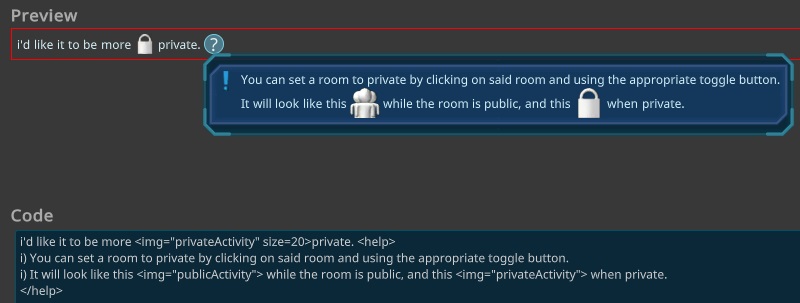
Today even more fixes from the last days playtests. One of the things was a new I18n Feature. Its how possible to use multiline <help> tags, result in a Questionmark with a Tooltip with the given content.
Besides that more than 10 other issues and reports i worked on.
Yesterday was a streamer online playing the game. I wantched a longer time and found several things that should be improved. So today i worked my big list i created there. Most of them were just smaller improvements and some minor fixes. In total i fixed around 20 small things and one larger simulation bug, related to the energy.
The last days an old fiend visited us, so i didn't had much time. In the meantime, a new tester brought a lot of improvement ideas and things that need to be more clear. Today i worked on many different parts on the ui. The other tester reported no errors on the new performance update, so i did also a release for that, looks like it worth the 2 days spend on it.
Today i worked on the tests and fixed 2 bigger simulation issues. I also analysed another game that was very slow. The reason is a bit complicated and is related to the event system for the resources. It seems some events fire too often, like energy update. I tried different approaches, ending up in a small change, that helped very good! While working with the big savegame i also found, that some easy container updates took ages, even with the new extreme fast pathfinding, they took 300ms (without burst). The reason seems to be that i update the persons when i found a possible task and than the person is doing something else instead.
While doing so i also found the bug, that the persons don't talk to each other and fixed it.
I also found that my sorting method for the Container users was too slow, it took around half of the time of the simulation on larger ships. So i optimized by precalculating the improtant values. With my new approach, i could make it 66% faster.
Today i finished the performance updates and did some smaller improvements and fixes from my list.
Then i read the news that the new Unity i use get to the LTS version, so i updated it. It got a major Entities package update, causing a lot of changes in my code.
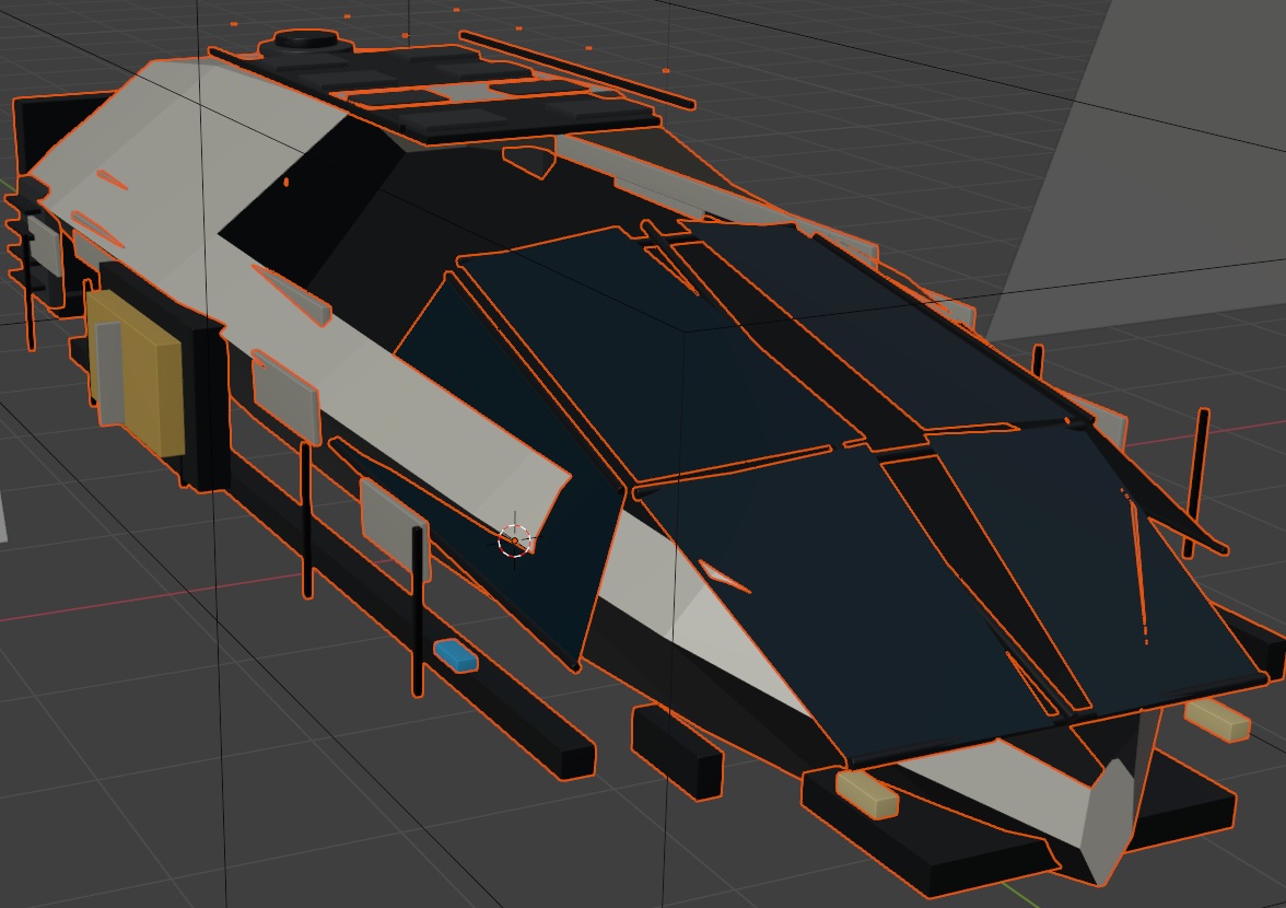
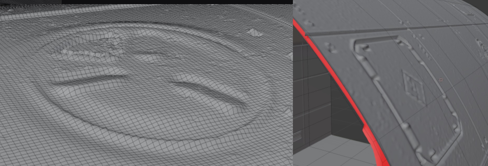
I had a talk yesterday with an old friend, loving to 3D print things. He want to print out a Generation Ship. To start i tried to create a high res model to be able to print. Due to i paint the details in substance painter it was a bit tricky to get that painted normal map back to blender, but in the end it looks pretty easy
I finished the big change what i started yesterday. The new approach seems a lot faster than the old one. In the editor, a path calculation goes down from 1-2ms to below 0.1ms. On the huge ship from a player it was even more extrem, there it get down from 47ms also to 0.15ms! So i think i am on the right way to solve that performance issue!
In the end the game got a huge boost from today. It started with 9seconds of simulation and end up in 200ms. The preparation with the bursted job is done in 22ms on that huge ship, what is really amazing. That will be triggered, when something has been changed, like a new room or you add an interior item.
Today i started to analyse another error, reported in a savegame with a huge ship. In the editor it was pretty slow, so i decided to do some performance updates first. I found something related to the newer bar change and was able to reduce that from 50ms to 0.03ms per frame. I also found, that the consistency check causing some dirty calls to the checked entities, causing the ui to update, without any need. The gaugepanels now also behave better and just update when its needed. Than i found several jobs without burst and updated them too. Also other smaller things i was able to improve, so it looks now better.
The next thing i found were huge lags on the big ship. A single update of a person cost several seconds, due to some special situations the optimizations could not be done. This is a huge problem for larger ships. To solve this i first improved the pathfindings internal algorithm what had not much effect. In the evening i had an idea to precalculate the door to door connections, so its fast to check for interiorItem connections in the simulation. The precalculate is running asyncron on other threads, can run in paralell and can be done between two frames, next to other graphic things, to have less impact as possible. I used my A* algorithm and adapted it for that, without a stop. Than i just visit all nodes and add their paths. I also reduced the memory usage of the new and the old algorithm. Tomorrow i plan to implement the new fast way to reuse these door to door precalculations and hopefully to boost the simulation with that.
After a longer travel, i fixed the rest of the tests that were failing, due to the bigger change to the new non-interioritem mode. I also worked all the reports from the last week like fixing some rare simulation loop cases.
The sad news is, that i will not have a good working environment the next months, so the development will slow down. The reason for this is, that we are moving from Shenzhen to Beijing and than to Xiamen and than back to Germany in the next months. While traveling, i just have my laptop to work on, so i expect a big slow down of the development in that time.
Due to we go to another short vaccation tomorrow, i just fixed the last issues i found in the playtest yesterday and run the tests and fixed there more things related to them.
After i fixed all the things from the last playtest, i did another one, this time around 2h. The major gameplay went pretty smooth and i like the new way without crafting the interior items more and more, so i switched all game modes to the new non interior system. I found again a big list of 25 todos for myself that i will work till tomorrow, before going to another short vaccation trip.
After another small vaccation trip, i fixed today the rest of the bugs i found in the last playtests and did another one. I must say, it looks better than before, but i still found many things i had to fix.
In the morning i did a small playtest to see the results of the new gameplay idea without interior item boxes. I actualy like the new gameplay, it feels easier to manage, you don't have to craft too many different things and don't need to check so much about the crafting queue.
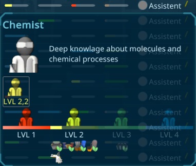
After the playtest i had again a bigger list of things to do, but all very small or graphical things. For example improving the view for the Skills in the supplypopup tooltips.
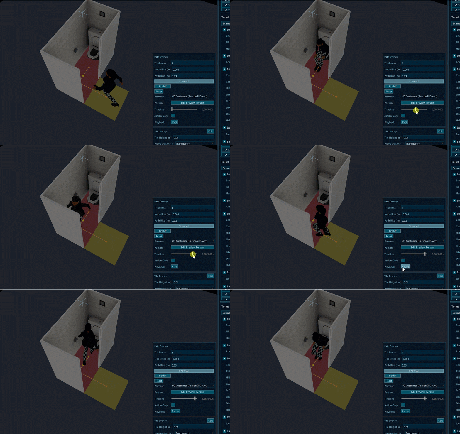
Also many other things like showing an overlay when hover over a persons activity or the queue behind. It now also shows the path to the item, this can make it more clear what item is ment, without selecting it.
I improved the Feedback screen. Than i started with a tryout i wanted to do a longer time. The idea is to remove the interior item boxes again, so the interior items directly need the resources. I struggled with it, due to its not realy logical to do everything there. But on the other hand, it also has no logic to fit a complete shuttlebay in one box
The main difficulty is now to separate the different levels of construction. One way would be to add a research feature, but that would be a bit much for now. The other way was to add more ResourceTypes to craft, so there is still crafting, but the items can be reused for different items. It also makes the storages easier to manage and i can also add a panalty for unmounting items by creating e.g. 10% garbage.
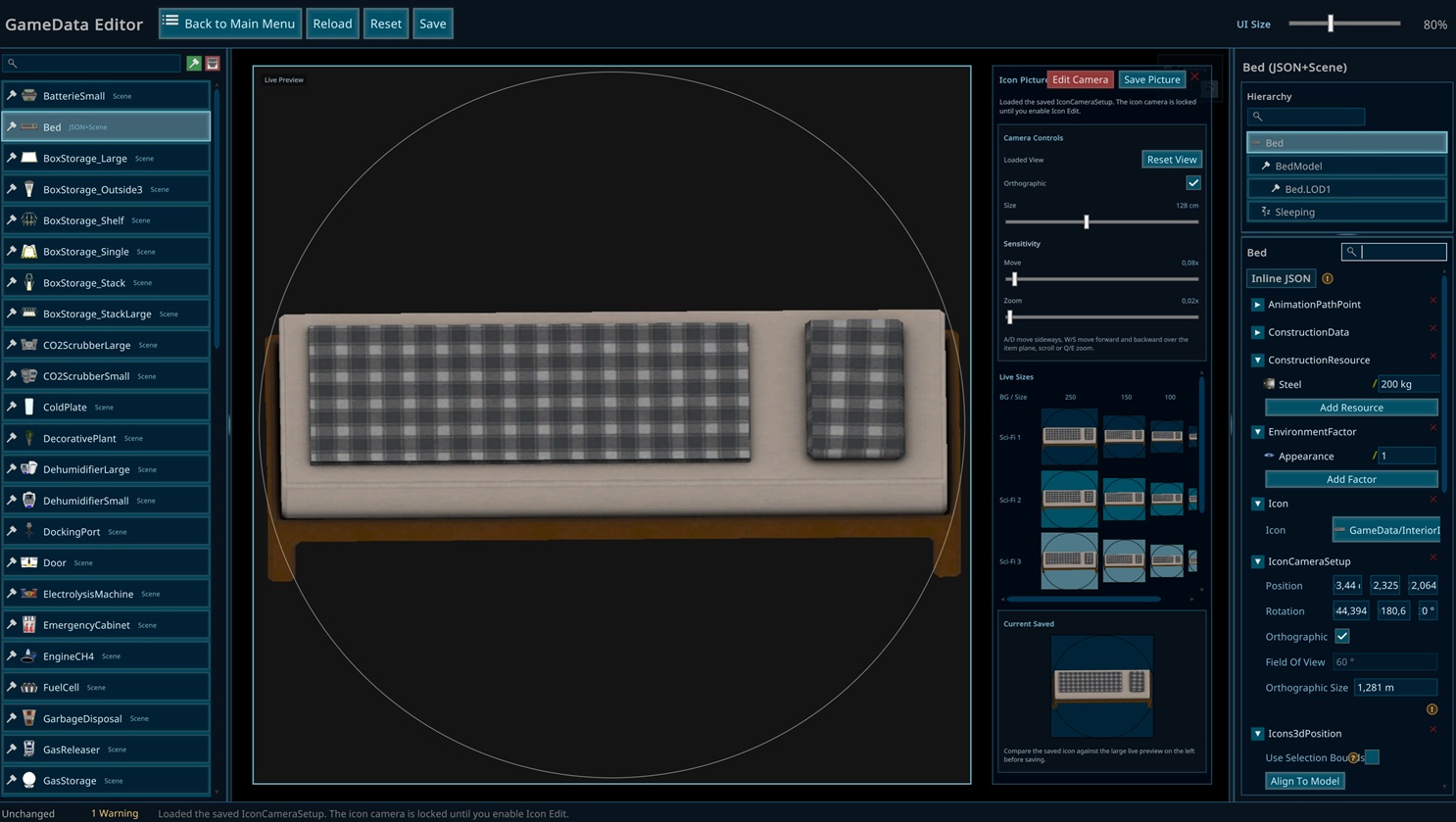
To make that easier managable, i created an editor window, that can directly show and change the construction resources. I worked the whole day to try to get useful values there, also to use the relevant things. Not sure if its good like it is now, but i will do a playtest tomorrow and check it out.
I also added another way to create Prepared Earth. Till now, you have to have an purification plant to recycle the garbage water. To make the start with food easier, i created a new recipe for the chemistry table filter garbage water to water and directly prepared earth. I hope this can improve the speed there.
Today just small improvements to the Thoughts and some planning how i want to restructure them. Since the time i implemented the mood and thoughts there came a lot of new things in. Now this part is a bit crowded and not good understandable. My idea is to merge some of the things toghether into thoughts. For example when all basic needs are fulfilled, they get a positive thought, leading to the positive impact on the mood. This will merge already several of them to one new one.
I decided to make this simple and just add a nice text to the thoughts, without using the real thought system for now. It will react on the different parts of the calculation. I hope this will makes it easy for new players to understand the problems, and also no need to check the Calculation Tooltip.
I analysed a bit the performance and found an issue with the ResourceOverview. I could push it down from 6ms to 1.2ms, including some other optimizing helping in other parts of the UI. I also found an performance issue with one of my loggings, causing realy bad simulation speeds.
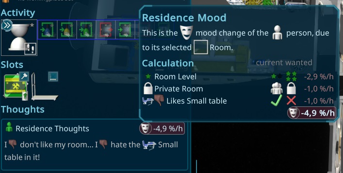
Than i worked more on the Residence Impact. Another influence on the Persons Mood, that should relate to the selected residence and its Room Level.
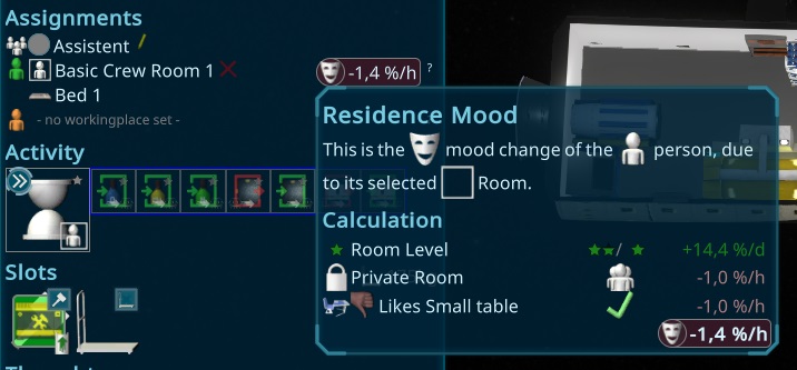
After having a break yesterday, i did some bugfixes from the tester and finished a new design for the person selection panel. After adding all the new features, it get pretty fast crowded, so i decided to move the skill and traits together and also the assignments. The assignments now get back to a line-layout to easy add the mood delta (i want to do tomorrow) to it.
All in all it looks running pretty well except some rare crashes of unities core, what unity don't tell me the problem. I hope they fix this soon...
In the morning i added the plants. Yesterday i prepared already that i can switch multiple meshes of the items, that i use now for the plants. You can change the pot and the plant separate from each other. There are 5 pots and 5 plants, so 25 variations. I designed them as plastic plants, so no need to use water or oxygen production. Maybe in the future i will add bigger ones to do so.
I decided to stay with that new content for this iteration. I still have some others i might add in another iteration: SoundBox, Piano, ArmChair or Sofa,... But for now the content should be already good to test the behaviors.
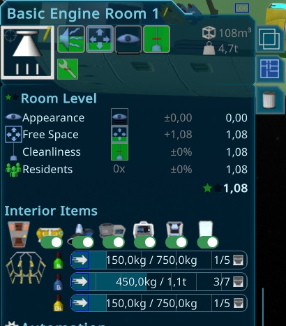
The next step was to calculate a RoomLevel, related to the new Values i added recently.
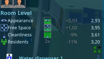
I also reworked the interior items of the room overview, to make it more useful.
Today i worked on the next Appearance Item: A scultpure. With that i created a new feature, that makes it possible to change the sculpture like the texture for the picture frame. In general it was very similar than the texture changing. For Texture i could just use the color texture of the texture, but for the mesh, i had to create a picture for all of them. I added it to my image generator, using the current item setup, so its easy to do for further additions.
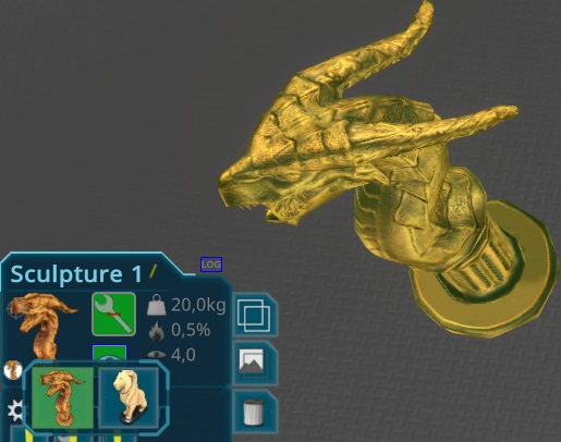
The Lion i used as it was from a bought asset. The Lion i painted by myself and optimised the mesh. For the rest i used a preset as a basic idea and created my own one and painted it.
Today i started the new Appearance Environment items. First thing was a picture frame.
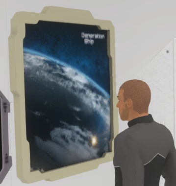
The challange there was to add a changable material, so the player can choose between different pictures. This system will also work for other items in the future, where i can switch complete materials to make completely different looks possible.
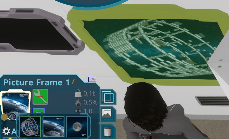
For the start i created 3 pictures out of the Games Logo.
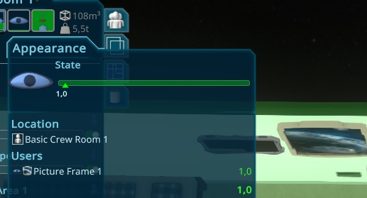
Than i added the logic for the Appearance. Due to it was the same as the noise, it just worked without more setup.
I added the selected material to the Blueprint system and randomize it for each drop of a new Item. On Clone it will always drop the current one.
Today i worked on the graphicy for the new Cleanliness environment value. I decided to make it more simple and just have one cleanliness value at room level, but the interior items are adapting to that. It was pertty easy and quick, and the result is way nicer than i expected for the short amount of developing time.
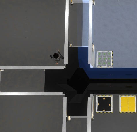
I also used the same logic for the interior items. Just needed to make sure the dirt is just inside of the ship rendered.
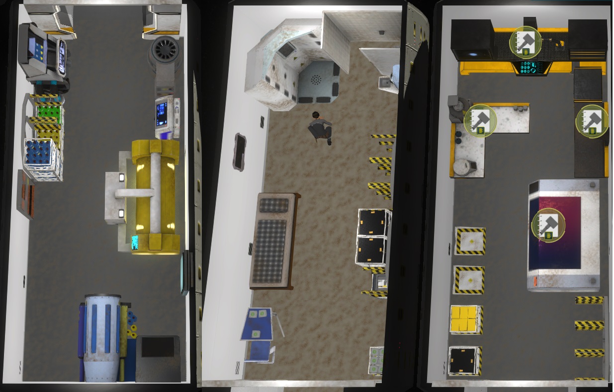
I also created a cleaning animation for the new Activity. It was a bit tricky, due to i updated to blender 4.3 and the export wasn't working anymore, but in the end it worked.
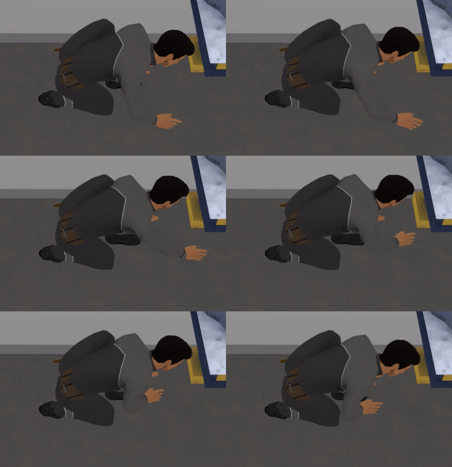
After that i added another source for dirt in the room. Some interior items got now to a source of dirt when active.
The rest of the day i spend brainstorming about new interior items, tht will improve the new Appearance level of a room. I searched through the asset store to find some nice ideas and assets. I know i will have to repaint them or adapting most of them to the style of the game, but it might save lot of work anyway.
Today i finished the last parts of the release to continue with the next bigger step. The next topic is also close related to the persons: the environment. Besides that its planned to improve the thoughts and show more obvious the mood problems. But first i start to finish with the smaller issues i noted the last days.
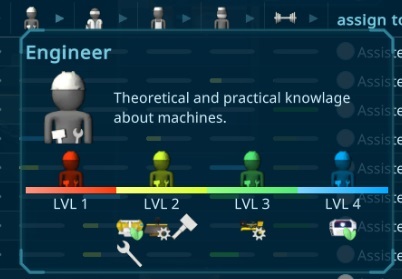
I started with the Free Space Value. Its calculated when something is added or removed from the room. All in all it was very easy and fast to implement.
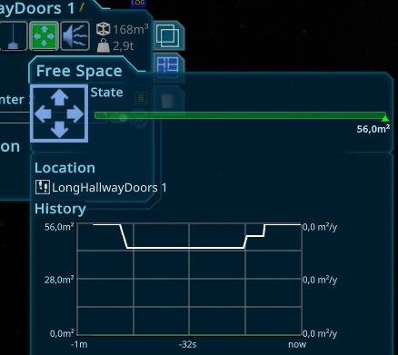
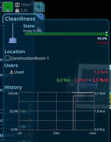
The second thing i created is the Cleanliness Environment variable. The idea is, that that value is increasing when persons are in the room or special machines are activated, that could make the room dirty. As an Icon i created a simple broom icon.
Today another big bugfix day. There were still special cases in the automatic rotating algorithms. Also some endless simulation loops due to the talkto feature i fixed. I also adjusted the new Efficiency values for all interior items to give it to the testing stage.
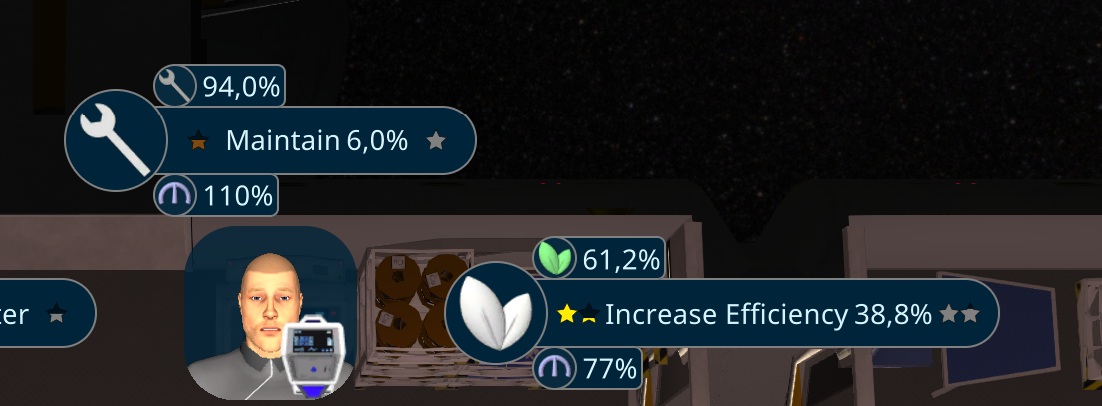
Today i implemented a new work type for the persons. There is now an efficiency value for several interior items, effecting the productivity of the items.
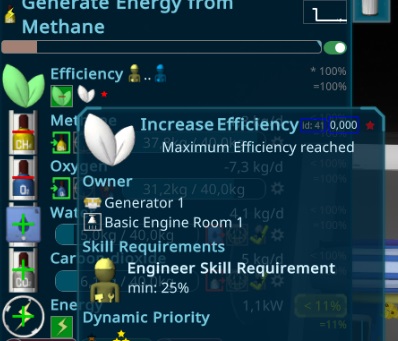
While doing that i improved also several other things starting from adding the speed calculation to the Activity tooltip, up to moving the SkillRequirement for Construction and Maintenance to the Task to align it with the rest of the ui.
I also updated all the Interior Items, that don't need direct working and added the efficiency indluding the animations for them.
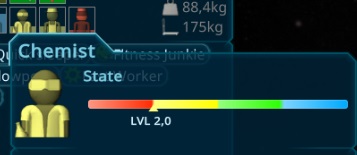
To make the skills more clear i added a better visualisation for the value. It now shows from level numbers from 1..4 to make that easier to use.
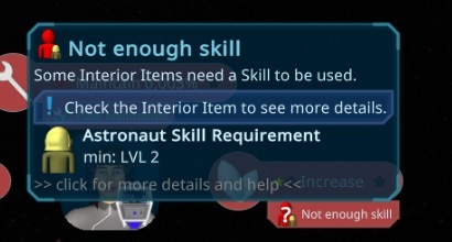
I also polished the Not enough Skill Problem, so its easier to see what is missing.
Today not that much time, so i moved the new Feature to tomorrow. After discussing a bit with the community, i updated the Fitness devices. They now have always a basic priority of 1. To make them use them, i also added a fitness schedule item. Its like the education or sleep, so all work items are restricted, regular items auf -50% priority and the fitness items gain +100% priority. They also do the fitness when having nothing else to do, so i think thats fine so far.
Instead of doing what planned a report from a good tester arrived. There was the missing stackoverflow exception i searched for a long time, so i had to deal with that first. It took a long time, due to unity did not handle that well and didn't tell me where it is. So it took a lot of logging and unity restarts till i figured out the reason for it.
Afterwards i worked on the performance. He reported, that the fps drop down a lot on fast timewarps, so i tried to profile more and analyse problems and bottle necks.
After that parts were done, i started with next big gameplay change of this iteration will be the usage of skills. They should have a more obvious influence on the work, what i prepared last week the logic and ui for it. Adding it was much faster than expected, the
After a longer family weekend, i found several things in the logs with deleted entities, where i had no chanche to identify what this could be. To fix that i created a system to store the old names and try to show them in the logs. I also send it with the report to find the issues next time.
I profiled a bit the game and found several smaller things to improve the performance.
Besides that i fixed the last issues from reports and my findings, to start tomorrow with a new improvement.
Next i tried to fix the issues with the consistency check. It was very slow in the editor so i debugged a bit and found a perforamnce improvement for the persons. While doing that i reimplemented an old idea to completely do the consistency check for ALL entities but iterative, so they will just take around 10ms per frame to reduce the impact of the gameplay. This also means, the autocorrection will work without pressing F5 when its enabled.
I also worked on the tutorial for next tuesdays weekly testing and added a repeat part for the connect interior items, due to i saw still problems in that part.
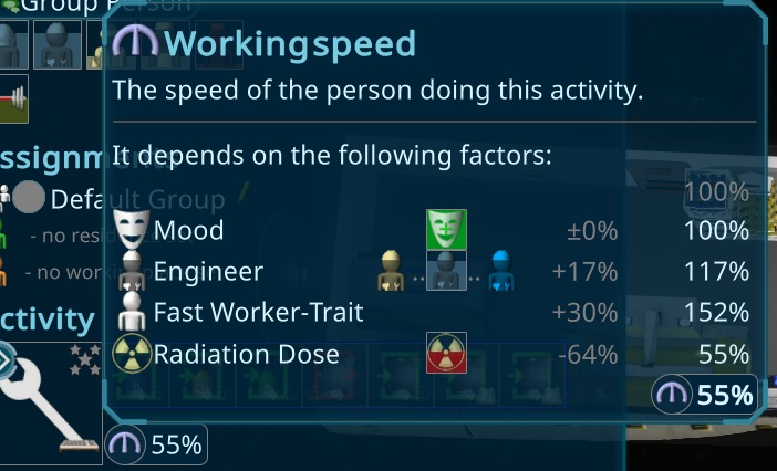
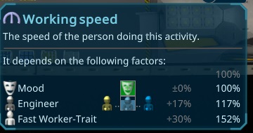
To make the worker speed and the reasons for it better visible for the player, i added tooltips and a bunch of the value-elements i added on wednesday.
The calculation tooltip will be extended later including also the required and current skills and its working speed effect.
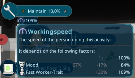
I added it also to the task itself and in its tooltip, so its now everywhere easy visible.
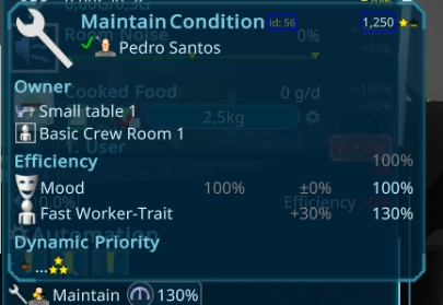
The last place was the worker slot. Its now just added like everywhere else.
The other speed impacts like Skills i will do in another iteration, and focus on polish this part first. Another thing i added is the increase of fitness while transporting things inside of the ship. This is a prototype example for increasing other things like skills later on.
The rest of the day i spend analysing some reports and try to make the consistency update faster and the game more stable.
Today i added the traits to the randomizer for the persons. They now all have the new traits when choosing them. The starting person will always have the same setting like before, to have a good start. The traits are now also added to the supply popup and to make them better readable, i created an automatic created icon, depending on their effects.
The special persons now have a very good rating, so they will spawn always with good values. Later i will change the target rating also for the others, when i add the event system, so at start there will be medium ones, and later the good persons are needed for the war on earth, so there will be not so good ones anymore and the player have to train them by itself.
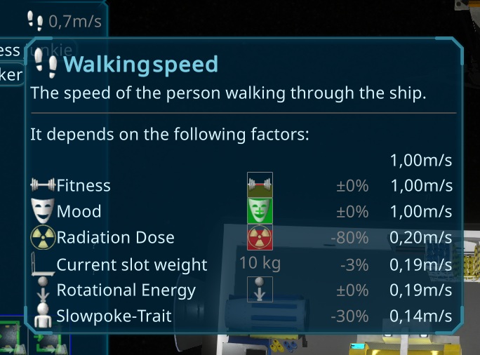
Than i worked on the working speed traits. First i refactored a bit, so all parts of the working including transport, crafting, maintain, construction and so on are using an speed calculation now for modify the speed. The activities respect now also that speed for the workers. To make this visible, i added it to several places of the ui. It started with the PiMenu, so to check the possible speed, the player can just rightclick on the target with the person to see that.
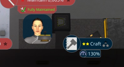
Today i added the Traits to like or hate something. It can be an interior item or an activity. As a first start, it will incrase the fun, while doing something with it. This can be using it or just constructing, maintaining or extinguish a fire on it. I also created an Like/Dislike icon using the persons of the game for the model.
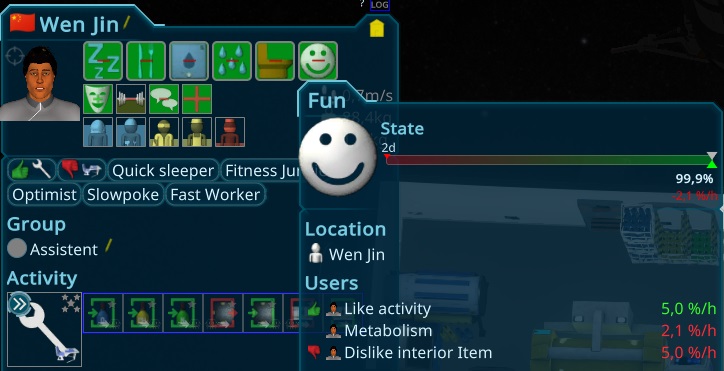
After the UI like/Dislike part including their Tooltips are were finished, i started with the person randomizer. Thats a bit tricky to not get too overpowered or underpowered persons.
Today i worked more on the fixes. There were still some annoying rounding issues in deeper simulation logic i had to fight with. After all known bugs were fixed again, i continued with the Trait system.
I was able to finished the walking speed trait, so there is now a "Fast Walker" and a "Slowpoke" Trait!
A good tester got back from summer break and found several smaller and larger issues i worked on today.
Yesterday evening i made a first list of traits i want to do and planned the architecture around it. Today i started to implement it. All in all its going on faster than i expected. After the model and setup was done, i did the activity effects, so here you can see that the person increased the sleep need way higher. It can be a fixed value or a dynamic percentage of the resourceType.
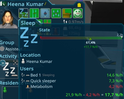
Afterwards i worked on the UI to make them visible and inspectable by the player.
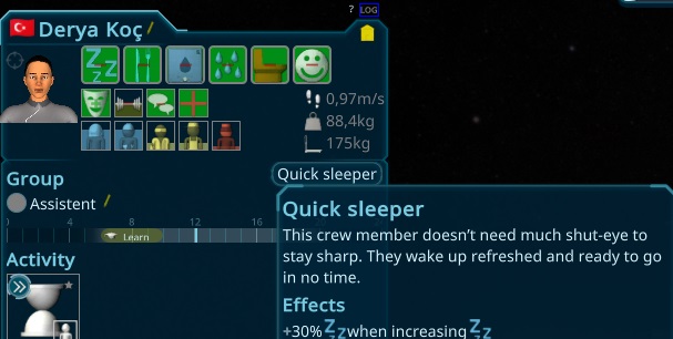
In the end of the day i added also optimist, pessimist and with it the feature for permanent change of needs.
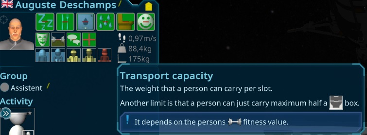
In the morning i added the ui for the new transport capacity, depending on the fitness value i implemented yesterday.
I also implemented the simulation logic for the increasing social value for persons when they do something together. Afterwards i worked on the last weekly tester result by enhancing some tutorials. Than i released the new version to focus on the next bigger feature to make it more important to choose the right persons.
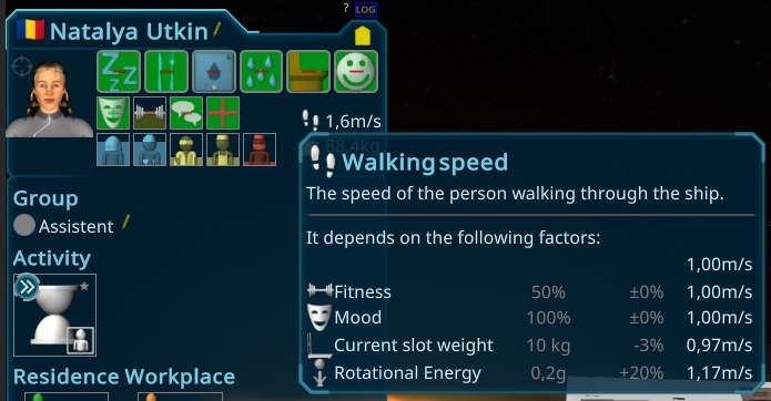
Today i worked on the second impact of the fitness. The person can carry more things when being fit, so it will have a much higher impact on them. To make that work better, i changed the logic of the transport again, so now they can carry around 200kg per slot or half a box maximum. It will be depending on the fitness level, going from 50kg (weak) up to 300kg (max fitness). The values are quite high for now, maybe i will reduce that in further releases.
Afterwards i created a simple new interior item: A starmap screen, that can be placed on a wall, without using too much space. It will slowly increase the fun. The main purpose is for the starting ship or later in private quarters. When i add the Environment, they will also make the room nicer.
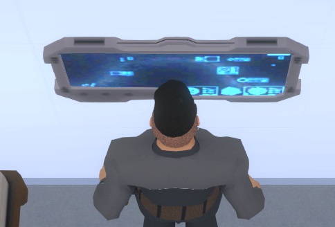
After yestdays burocracy to apply for new visas and I started to work on the impact of the fitness value. To make that visible for the player, i added it to the person selection panel.
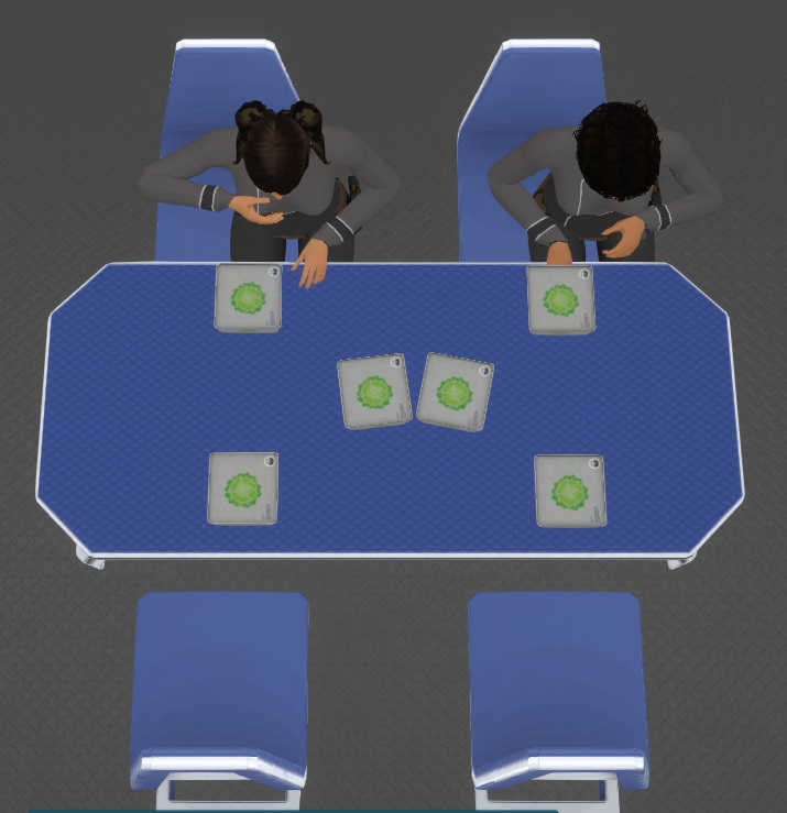
The next thing for the socializing is to have activities, that can be done together. For that i started to improve the small table. I split up the chair from the table to reuse it and created a large version of the table. I found, that its not very nice that the person need to stand next to the chair to use it, so i had to change that animation, including the small table. Due to i want also more things doing while sitting, i also thought to split up the sit down/stand up animation from the other animation, so i can reuse it easy e.g. for meetings or controlling items.
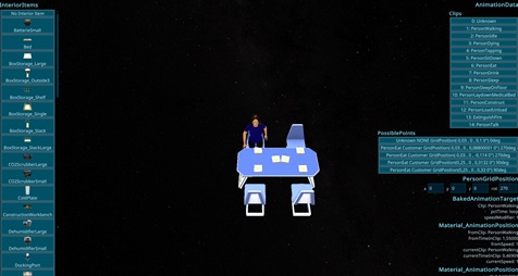
After a whole day to try a different approach for rigging the persons, i worked on an animation testing scene to be faster in development. After having the basic setup i fixed an annoying bug in the animation framework, not ending an animation correct in some special cases.
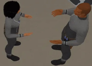
Today i couldn't work so much, but i was able to finish the talk to each other simulation and animation part. Its not perfect, but for the first try i will leave it for now.
The social need goes down very slow, so 100% in a complete month. In a normal game, this will not happen so fast, so even at the start of the game, i might add a trait that the first person don't need so much social and it takes even longer to reduce it to zero for him. Next will be a bigger table, where the persons can talk to each other while having food. This will also make the schedule more useful, due to all persons will eat at the same time.
Today i finished another new item increasing the Fun need. Its a home computer i prepared several months ago.
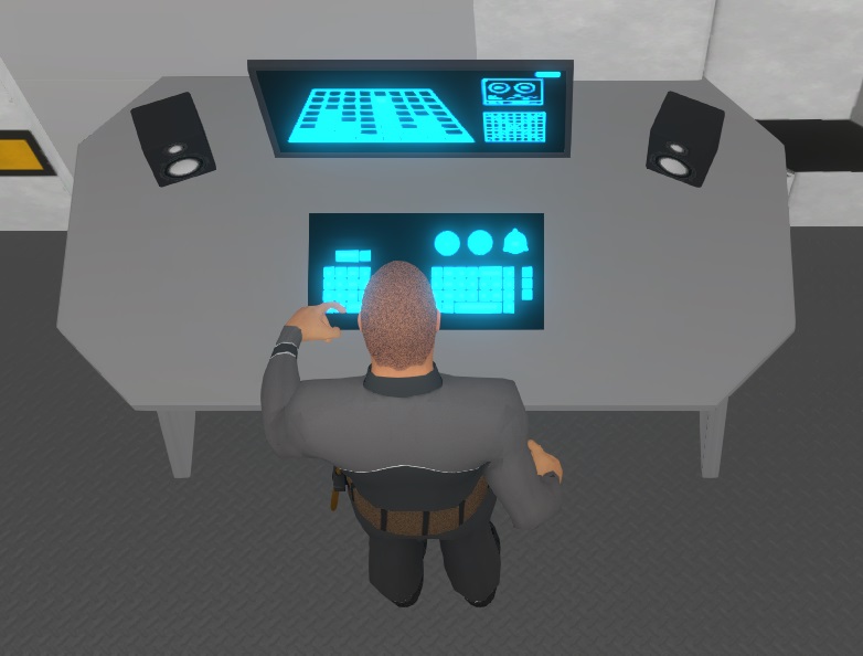
I also planned the rest of this iteration. I want to finish the social and fitness needs. For social it means i want to create another easy interior to increase the social need. It will be a earthphone to call the relatives on earth. Another bigger feature will be talking to other crew members. I plan also to create a larger eating table for multiple persons. When they use the same item it will be similar than talking to each other and increasing the social. In a later stage, so not in this iteration) i will add friend levels when talking to each other, so they can get friends as a preparation for the family and children feature in the next level of the development.
The next thing i want to do in this iteration will be the fitness impact i created yesterday. I plan to do two things with it, one will be the speed of the person and the other will be adapting the carry capacity of the persons, so stronger persons can carry maybe 1-2 boxes at once, weaker ones just 0.5-1 box per slot.
Depending on how long i take for the things before, i will also create traits in this iteration, with several impacts on the persons, so it gets more relevant what crew members you recrute. The generation of the persons will also be enhanced in that step.
I started with the most complicated one, the talk to other persons. As expected it was not that easy and needed a lot of things to do. After the easy part creating a new TaskType, there was the pathfinding, that was optimized to find paths to interiors, not person to person. Than both persons need to stop the task, when one stops it. Also they need to stop in front of the other person and need to turn towards them.
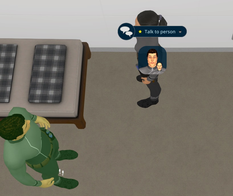
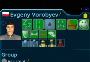
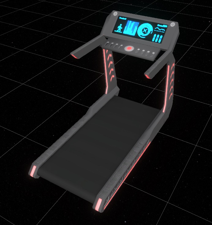
For the new Treadmil i created the needed fun icon. Due to i already work on it, i also added a fitness value, that should influence the speed and carry capacity of the persons. Also a social icon was created for the next step i plan to add for them. Due to so many new needs, i had to split them up in the UI, to make it more clear to work with. I decided to do the "Fast changing" ones in the first row and the slower improvements in the second. So Mood, Health, Fitness and Social will be in the second line. The skills move to the third line and maybe later somewhere below.
For the animation i plan to refactor my animation system, to save graphic memory and be able to add more animations without much overhead. Till i have that, i just use the walking animation. After trying it out i found it very complicated and not very handy to implement the new way, so i skip that for now and might do that another time. The advantage might be anyway not that much.
Today started to work on the persons. The plan is to let the persons have more things to do in the ship, to get a nicer gameplay. One new need will be fun. I start with a treadmill, where persons can do some exercise. I could finish the model, painting and basic setup for it in around 4h.
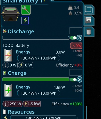
I tested more on the batteries and its still not working well... Its realy a hell to make that work well. There are so many sideeffects and algorithms involved and due to unity its horrible slow to debug... In the end i revert the split to two activities and solved it another way. The old architecture was actualy a good plan, but i needed to handle the change from consumer to producer in my algorithms correct. With the new way, i'm pretty sure it's that this problem will not appear anymore.
Today i checked the logs from the last 2 week players and found several things to fix before i start with the next topic. Besides some smaller loggings and ui bugs, there was a big endless loop issue with the batteries i started to debug. After getting deep into the game logic, i had an idea to solve it. I used a script to change the recipe of the battery from charge to discharge, causing the main issue at the battery. Due to the single recipes worked correct, also stopping themselves, i came to the idea to just add two activities so both recipes work the same time. It was still tricky to find the problem, but in the end i found it at wrong priorities, so all batteries have to be lower priority than the other items.
The only thing is now to change the ui to show the user both recipes, but that was an easier task. It was a lot of work, so i move the rest of the polishing to tomorrow, here the current state.
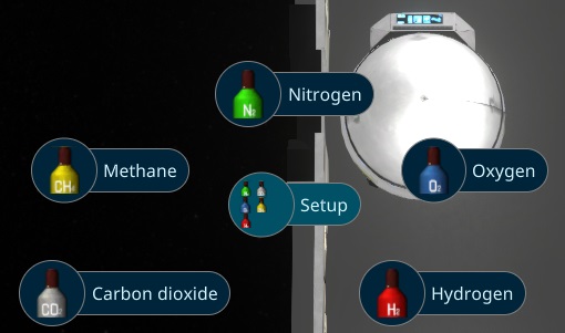
I fixed more special cases for the new single storages and started with the dynamic material, so the object can represent the selected ResourceType by changing the textures.
For the polishing, i added also a pi menu item to setup the resource type for that kind of storages.
In the afternoon i started with another single storage for liquids, so for now Water and garbage water. It's similar than the Mass Balancer, but act like a normal storage.
After a very long break i was finaly able to get back to work. I started with some modeling tasks, due to thats what i plan to focus on more. First thing was a gas storage, that the player can switch the types. Tomorrow i plan to do also a liquid storage switchable between Garbage Water and Water. It went pretty good, for the whole model with neutrals and ch4 design i took just 3h. I still need to take care about my kid, so i can just work a bit over the day.
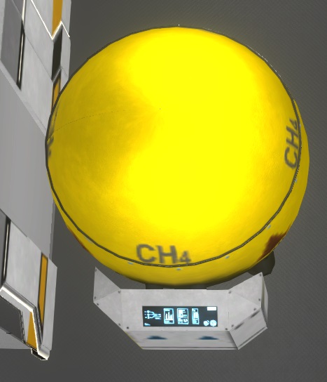
In the evening i started with the logic so the player can switch it. This part was not that easy, due to there are a lot of special cases to handle.
Today i worked on some open errors and reports to get a clean state when i'm back from the business trip. At some points i struggled again with unity endless loops in the ui rendering engine, that cost a lot of time.. I found a workaround, but there is still some fishy rendering errors in that special case. I hope its not crashing the ui again and wait for newer untiy updates.
After a longer weekend i started the working day handling a special error in discord, when the player blocked the discord bot or prevent letting him send him messages. I handle the situation on the server and show a nice message with solutions to the player if that happens.
In my own playtests, the savegame crash bug happens now also after playtesting it a longer time. I did many debuggings with log files, to get closer to the error and finaly i found it. In some situations, there are destroyed entities, that still exists to cleanup e.g. memory. Passing them to the copy world of unity causing asserts in the editor, exceptions in the game and crashes, when burst is enabled.
I have to go for a business trip starting from wednesday, so i just clean up the rest of the things, checking some reports. I also prepared a bigger release and prepared the news for it, what i plan to do tomorrow.
In the morning i worked again on the new crash report. It looks like its crashing in the clone method of unity. I added more debugging to it, to see what entity is effected. It cost a lot of performance, but due to the complete game crash, i have no other choise till i figure out unities problem.
Than i worked on the next feature related to the work schedule. In space there is usualy a setup for the light, to indicate if its day or night to adapt to the regular day-night cycle on earth, what the human body is used to. I prepared this already a longer time ago and make it now configurable for the player.
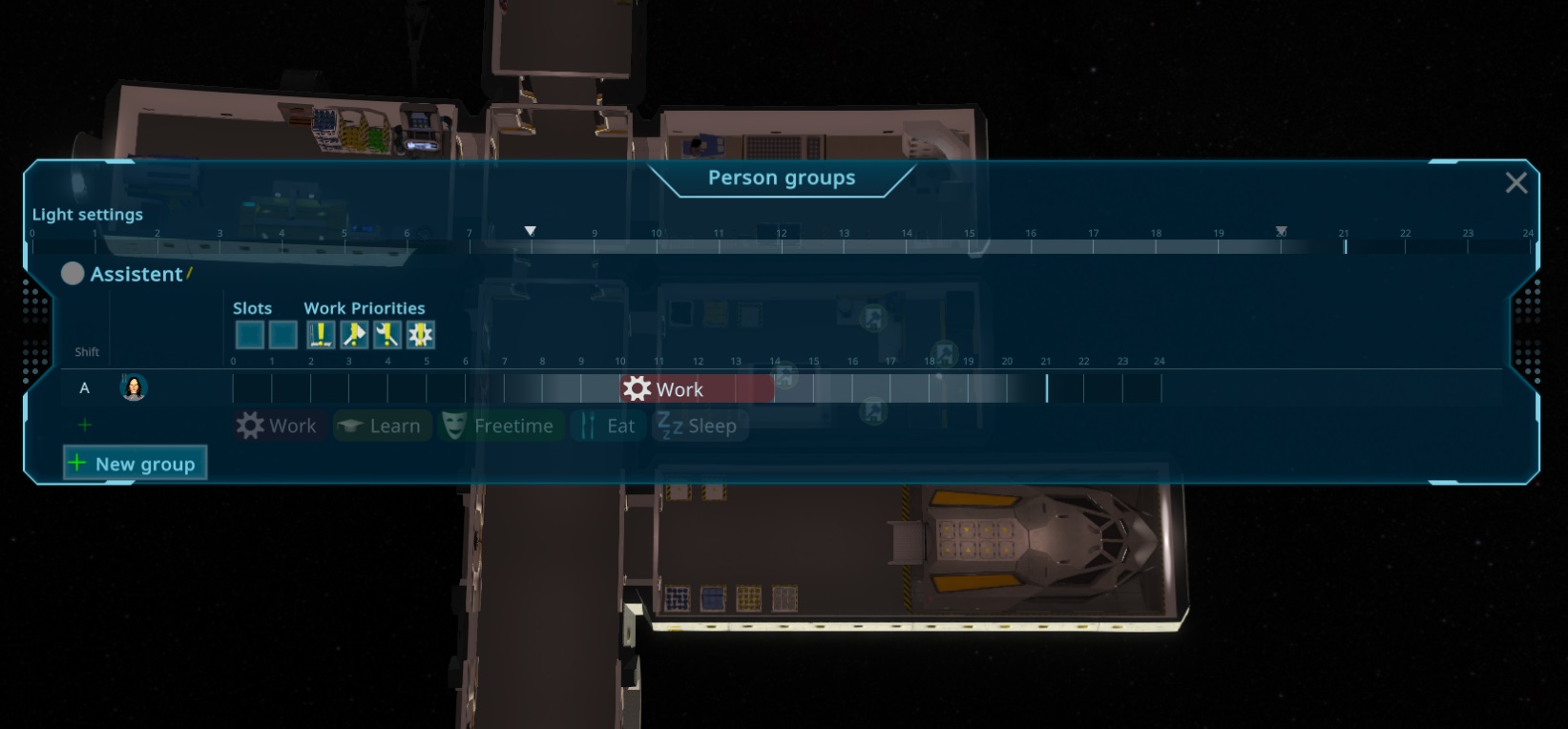
I think i'm close to the next release, the Person Groups looks already a big gameplay changer.
I checked the loading and savegame again this morning and it looks now fine. None of the problems i had yesterday raised up again, so i decided to do a release after some smaller ui fixes due to the person group changes. The Work priorities and schedule are still not functionable, but i still do a patch release to fix the savegame issues now. I also improved the text for the migration part when loading a game, to let the player know whats happening there.
Than i started with the working priorities. It's implemented as a general multiplyer to the metric, so normal will not change it and e.g. very high doubles the metric value. It need to be balanced a bit when trying these things out, but as a first try it should be fine. Also Pause is working as a "Don't do it", not sure if players understand this, or i have to add a special case for that. Its due to i reuse the TaskPriority enums for that, to make it everywhere look the same. All in all it was very very fast to add this feature.
Afterwards i implemented the day schedule. It was also easier than expected, so in total i spend only around one day to do all the group logic! I think i will disable the subGroups for now, due to there is no real usecase for now. I guess it will become more useful later when the ship sections gets more useful.
This morning i worked more on the reports. Yesterdays downgrade try and the not responding unity team leave me no choise than trying to implement my own copy method to workaround the bug in unity. I started with a first try and hope its already fine enough now, but can be that i need to replace more unity core systems there.
Afterwards i tired to implement a fallback for the unity exception to get rid of it, but everything failed. In the end i implemented a custom Instanciate Method for the entities, to work around the annoying unity behavior...
I came to another bug in the loading mechanism and spend the half night debugging. It just appears in the compiled version what was very strange and time consuming... In the end it looks like it was the async loading mechanism, that caused problems randomly by removing my childs again. Seems in Unity 6 they changed the mechanism how to update the child components and these systems updating while rendering a frame while loading...
I checked some reports from players, but they look all very strange, that it could just be bugs of the new unity. Due to there was no help in the forum at all for any of the problems i reported the last 2 months, i tried to downgrade unity back to the latest stable version, but there the other bug what many other games had still appears. I couldn't compile due to the compiler can't find a resource created by the compile process. This bug is already over 1 year reported with hundrets of forum entries, but still noone of unity cares... So back to the newst version.
I also had trouble with the internet here in china, my server wasn't reachable the whole day, so i was very limited in what i could do...
Today i did the functionality of the Slots and Uniform setup. It was pretty easy and seems working fine. The Slots now have a changable value, so the player can't change a slot defined by the person setup. I'm not sure what i should do when i change back to "none", for now, i will keep the old setup, but make it changable.
I started to make the Persons group directly editable in the person selection panel. To make it simpler for new players, i hide the schedule when there is no item added yet. The Groups now also just shown the Shift and Group, if they have some, so its just shown when the player is so far in the game, that he use it.
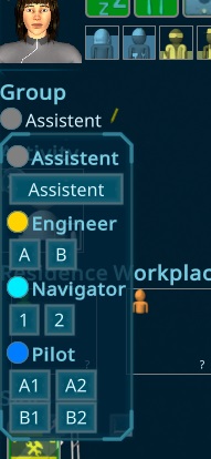
Than i added it also to the Supply Popup, so you can directly setup the person before he arrived. I plan also to give him full forced slots, so in case of emergencies, you can send some with already applied oxygen masks and tools to repair things in the ship.
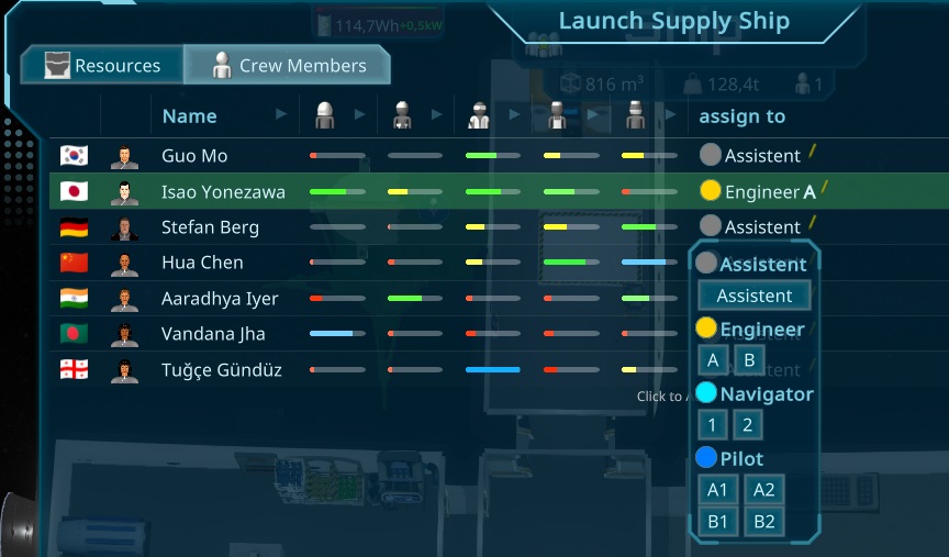
After that i started with the last big ui change related to the new groups. The Person Overview Area has been structured with the new groups. Before it was not good usable when having a larger amount of persons. Now they are structured in the Groups, and you can see what the persons are doing in what shift.
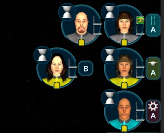
In the end of the day, i Polished more the ui and added the groups also to the Person Popups.
Today more work on the Person Group Ui, i improved the hover/drag effects of the persons, showing the Area Names in the drop targets, improved the removal of the items and polished the add and remove buttons. The Popup is now also fully translatable and have names and descriptions for the work priorities.
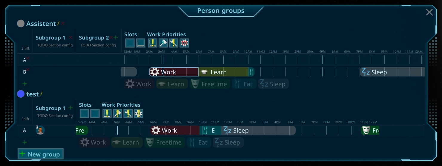
Afterwards i concentrated on the other ui elements, first for the one in the person selection panel. I refactored the schedule element to make it usable also as a smaller not editable version. It was a bit tricky due to i implemented it as a fixed width at the first implementation. Than i also added a "Current" marker to the schedule and highlight the current item (related to the gametime).
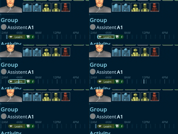
In the morning i polished finalized the polish of the new Schedule planner. It get into detail, so when 2 schedules are together, there is a "Drag Both" option where you can move the slider back and forth. Also some last ui errors i found were fixed like wrong aligned hour bars. There is also now a separate layout for small items, where the type icon shrinks to the wanted size. Also i prevent overlapping when dragging them, so they will not shoot over instead stay at a minimum/maximum size. At last, there is now also the possibility to keep ctrl pressed to copy a complete one, e.g. when moving something to other shifts it keeps the duration. All in all, many small things, but ending up in a nice usability.
After that i started with the last element of the new UI. The assigned persons with the change feature per dragDrop. Today i just did the basic functionality, tomorrow i plan to polish that with more hover effects and other smaller fixes. Than i will start with other UI parts. One would be grouping the PersonOverview by the assignments, or adding that workschedule to the person selection element and details popup. I hope that i can also start with the easy functionality tomorrow and doing the advanced functionality the day after.
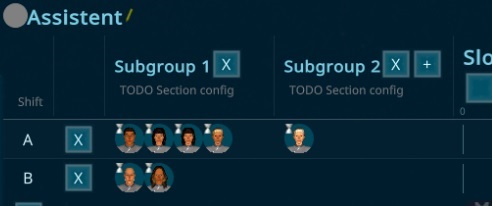
After the weekend i worked on the new Person Groups. The model was done fast, and the basics of the UI doing also a good progress. Now i'm at the schedule creation. I'm not so used to do this drag drop things yet, so this take a bit more time. Also there are many special cases i have to deal with when creating it, to make the user experience good, like cutting the other items when something is overlapping, splitting it if dropped in the middle or merging two following ones.
Afterwards i had do teal with many Unity bugs, starting from crashes all the time without any visible reason followed by wrong render positions of the dragged elements and much more. All looked like a big mess, even the debugging tools from unity showed the element at a different location, than the renderengine rendered it, up to not rendering the rest of the ui while dragging... Very stressful, so it looks like its not allowed to do anything with the dragged item, or unity completely gets into chaos...
Today i planned the next big feature: Person Groups. The idea is to make the handling of many persons easier and allow also the better usage of the ship sections. It's also a preparation for more social things, so the persons will have more free time and time to eat together.
So there will be many aspects to implement. First there is the Groups like Engineer or Assistent. There you can define a Slot setup, to e.g. enforce all persons having a Toolbelt, e.g. for engineers. Than you can define additional priority modifieres for the different activity types like construction, maintenance or working on special machines. Each group can have multiple Subgroups and Shifts you will be able to create.
A Subgroup can be used for different sections in the ship. So e.g. you can assign group1 to only work in one area of the ship, near their residence.
A Shift will have a daily schedule, where you can define strict plans for working, freetime, eating or sleeping.
So a person is always defined as part of a Group with Subgroup and Shift, Engineer-A1 for a Group Engineer with shift A in Subgroup 1.
I already have a plan for the implementation, the most effort will be the UI but the balancing of the tasks will be also a challange.
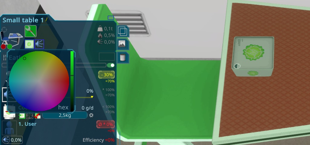
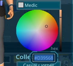
In the morning i played more with the custom colors and implemented another approach, that makes it easier and nicer to colorize things. Now its up to 3 colors (and i can push it easy to 4) that can be customized and way more details can be added. The blending has also been improved and is now more flexible.
Than i implemented the way to let the player change the colors. I decided to make it easy and just adding some color pickers to the selectin panel.
I fixed other bugs i found for at special situations of the new features i added recently and fixed them. The interior placement also tries out more rotations now for some other special cases.
Another special case was when a person got unconcious or going to emergency sleep in a room, that is dismantled. There was a logic, that they try to leave those rooms, but if they can't, they stay there while the dismantle is finishing and end up in space. To fix that, i added another step to the Construction Process, waiting for them. It's a separate System, counting the persons in a room, that might be used again when i add "lights sensors" for the night.
After that i started with my basic improvements of the persons. First i worked on smaller things like the timewarp panels of the current activity and the problem overlay was not centered when the person e.g. slept. The next bigger thing was to make interior items have changable colors like the rooms. The first usage would be setting the bed-color to the uniform color of the assigned residence.
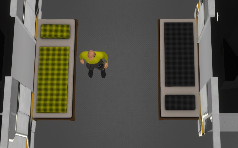
I also added a Worker and Customer icon to the Activity Overlay, to make it easier to see if its used.
Than i worked a bit on some I18N and Icon things for the recipes, but skipped that for now, due to low priority and a bit complicated to find a good solution. I also worked on a problem in the late game, when players have created a cycle of rooms, it was not possible to dismantle them, due to all have still neighbors. For that i had to implement a new algorithm to figure out to check if all rooms are still connected after the dismantle.
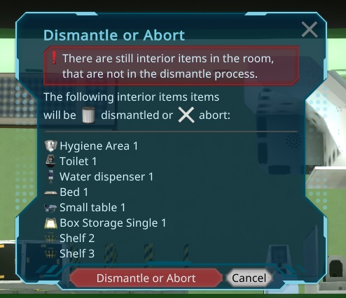
Another feature i found very useful was commented by some playtesters. When want to move a whole room, it takes too long to dismantle all the interior items inside of the room. To make this easier, the dismantle button now shows a popup to do it for you. It also works if a single room is selected and pressing the delete button.
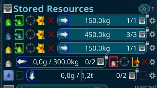
In the morning i worked on the last reports and logs of the current Reports, improving the logging. Everything were just minor things happening that are already autocorrected by the system well, so they were not recognisable during the game. Afterwards i had an idea to use the opacity, to indicate what state the crafting is in. I hope this prevents further missunderstandings.
Today i just created one new feature. The Items with a wall are now automaticaly rotate towards the nearest wall. They also snap towards the wall. I can setup the distance, what is set to 1 tile now otherwise it might look too sticky. The main reason was that close to all new players first try to set the panel box outside the ship. Another reason is, that its now easier to drop them! Tomorrow i will adapt the tutorials to it and do another patch release.
In the morning i was able to finish all bugs and todos i created in my last playtest, e.g. not shown problem icons in constructions, wrong path overlays for under construction items, not shown paths for construction storages.
I also get through my todo list and identified the next tasks for the next days. Besides some smaller improvements, i plan to do a better interior planning, e.g. items rotating automaticaly to the walls. I also should rethink the ui overlays vs the problem overlays and other overlays for construction, maybe i find a good way to align them all to use ui overlays too. It's a bigger list of around 80 items, but most are very small ones i think. In that time i will create a more detailed game design for the person improvement. You are all welcome to give ideas
The next bigger topic i plan to do are the Person Improvements. There i want to create a game design while doing these small things. You are all welcome to throw ideas for that to me, maybe we plan a community brainstorming event or so the next days. Here a short summary what shoud be achieved:
The player has a lot to do when increasing the population the first time to the 5 persons. Crafting Life support items and prepare crew quarters. Than there is a lack of things to do in the game, till starting to build up bigger production and doing moon missions and preparing for the launch. This is the time where i planned for the player to increase the persons quality of life and make them happy, adding social things, more thoughts, adding environmental things like plants or paintings, have the empty room space have an effect, adding specific hobbies, traits, working schedules, shifts and more. Than the production part continues with maybe 10-20 crew members. I also plan a day/night schedule (visual part is already done) to make the days more visual.
At the end of the day, i worked on something i saw in other games. Its about placing the interior items, it always felt a bit wrong, due to i just used the cursor to find the tile and than just dropping the items 0/0 position to that tile. For larger items it was not positioned well, due to you place it between 2 tiles, so its jumping back and forth. The new implementation respects the size of the item now and calculate where the player realy wanted to place it.
At my last playtest i found it a bit annoying how many clicks were needed to setup the storages, so i tried out a new way. The idea is to move the configuration part to the ui itself. So at storages, there are buttons to create the automatic tasks if it hasn't one already. Than i moved the automatic task to the fill line like in the other interior items. This also brings consistency. The downside of that is that it looks very unstructured. To fix that, i added a orderby automatic type, so it looks more sorted, even if its changing the position when changing the setup, but the better layout makes it worth it.
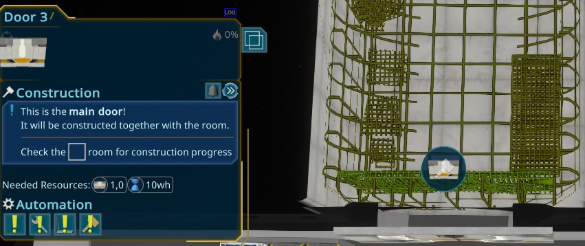
Another confusing thing in many playtests was that the player selected the door of an unfinished room and wondered about the status. To explain that, i replaced the "Wait for room finish" status to a hint text.
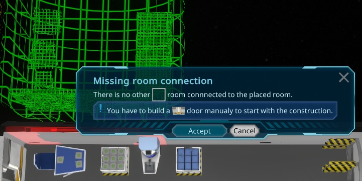
I also saw new players placing the new rooms in the wrong direction, due to the auto-rotate just worked for doors. Now i added also the rotation towards rooms as second priority. It also shows now the new Doors or Door positions and shows a warning, when the player want to create a new room without any connection to prevent that in the future. Instead of asking to add the doors, the doors will directly created. Due to they are anyway shown in the preview, its perfect fitting in the new workflow.
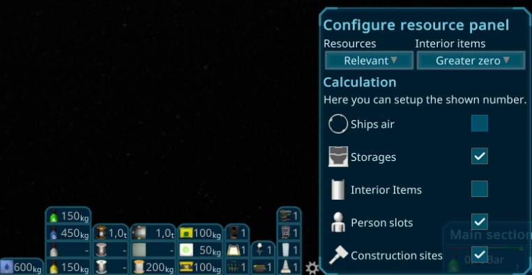
I added an configure button for the Resource Panel. With that its now possible to customize what is shown there. It was a bit confusing what was shown, depending on the situation, it's different what you need to see, so now its customizable. Its also stored in the savegame.
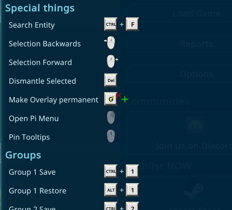
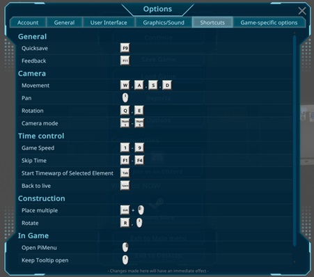
Besides that i added the KeyBindings to the Options. For now, they are all fixed so its more like an overview, due to the compley and not good customizable unity system i plan to build somewhen my own one, there were no requests or complains about the key bindings yet, so it looks fine so far.
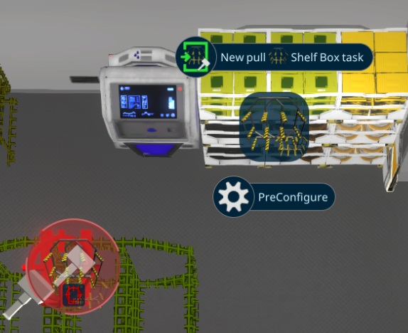
Another problem of some players were, that they added connections by accident of not finished storages. They wanted to just configure the construction storage, but created the preconfigure task instead. Even if there is a small "construction" icon to indicate, its not clear enough. So i added a subgroup to make this more clear.
I also polished the timewarp for the construction. It's now estimating the resource arrival better, so also partial arrivals are nice visible and not suddenly stopping when its full. It also didn't stop now when the resources are loaded and continues the timewarp till the item is fully finished. When noone can work there, there is also a maximum speed set to not overshoot, when e.g. none of the crew can construct it or is busy.
To have a better changelog, to be also more reliable and faster, i added also an offline support for the changelogs. For each version a resource file has been created and will be automaticaly in the build pipeline. This will be used by a new UI Element showing the data. The one in the Starting Scene has been improved, so its now showing always the full changes instead of just the version numbers. It was a bit tricky to make this performant, due to the hundrets of versions already out there, but it worked in the end. I also updated the style adding tags and a date to it. Due to a nice script and my server that was already used to store the changelogs, i created all the historic old changelogs from the start of the development.
After that i added the "Whats new" Popup when the game is started with a different version, showing all the changes (using the same elements).
I worked more on the smaller issues i found like closing popups with rightclick too, or that the construction sites had no icons in the tasks. I also added some Loading tips like in most of the games. Even if the game starts very fast, in late game the loading can take several seconds, so it might be useful for some players.
The last days i didn't had much time to do much, but there was a good playtest with the new Tutorial. It looks it helped understanding more things and prepare more for the game. As usual i found many things to update, what i start to do today, like separating better the item boxes from the items by adding a "Box" text behind and some other things.
After fixing and releasing a new version i found that some generated audio files sounds different than before. It seems google updated its text to speech to a higher quality, so i needed to find a solution for that. The rest of the day i spend checking the reports from the last weeks were i was away and fixed several smaller issues.
Today i finished everything of the new tutorial and did a small release. I worked on the new Steam Login Button today. The reason for this was a streamer trying to play the game, but struggling with the username. The new system now can check for the username for a given steam id. After that functionality, it was easy to just adding a "Login with Steam" button, that checks the database for the steamid and set the username. If it didn't exist, it will register the user automatically using the steam name of the player.
I also worked on the Steam Demo and prepared the depos, images and build setup.
In my vaccation the last days i didn't do much, but i was able to do a new Tutorial. Its structured different than the old one. This makes it possible, that the player can missconfigure stuff as much as he wants, without implications on the further game. Its also easier to setup specific ships for the different tutorials, to explain it easier. One example of that the workbench had to be placed in the crew room, to show the transport features.
Instead of being inside of a regular game, there is now a tutorial menu where different tutorial scenes can be loaded.
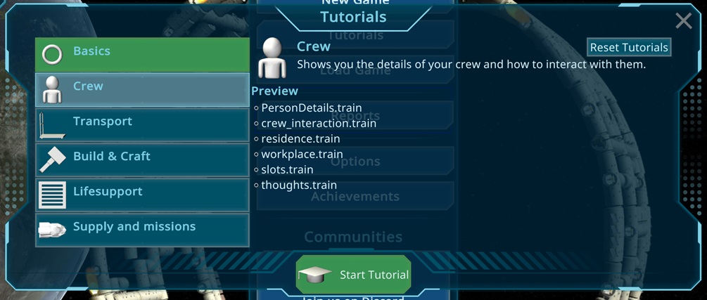
Inside it looks pretty similar than the old tutorial. The Tutorial window has been enhanced, so you can see the other tutorials too, so its easier to see the progress.
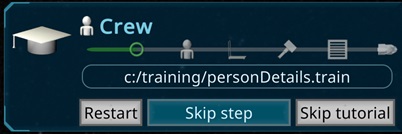
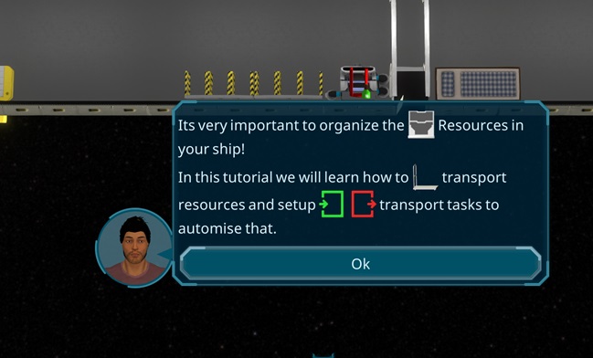
I added another place for the tooltips, sticking on the bottom center of the screen, so they not block the player. The main usage of them will be the new TryOut steps i added to several places. The player can experiment himself if he wants with the shown things to learn and remember things better.
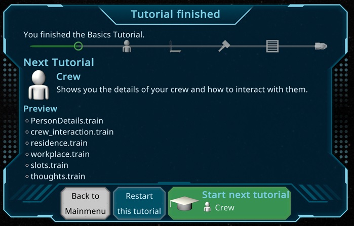
When finished a tutorial, it shows a new tutorial finished window, where the player can choose between do it again. When finishing the basic tutorials, there is also a "Start game" button for players who like to tryout things by themself.
I didn't finish all tutorials i wanted to do, the more advanced ones are not done yet, but i will give it a shot now to try it out now.
Today i finished the big update of the new container user algorithms. It took some time to fix the last issues, tests and adding a migration to the old savegames. Especialy with some special cases with the greenhouses got me a bit in trouble.
The next 2 weeks i will be in vaccation. I will just have my laptop so everything will be slowly. I plan to do the new tutorial and maybe some 3d models.
Today i worked on the update of the container users. A container user is e.g. the generator for the ship energy. There is a complex algorithm updating them when something happens, e.g. when a new consumer is added. Now there is a problem updating the producers when they change the priority, its not reflecting instant. To make this possible, i had to completely refactor the logic behind, starting with the items setting their real maximum, so the algorithm can use that to turn the right ones directly on.
After that was done, the more complicated algorithm part started. In the end of a long day, it looks working, but i have to check tomorrow and doing all the tests, its such a big change, i expect several issues to solve and doing the migration tomorrow. In general i think it will improve the performance of another big simulation performance issue i found last month in the playtests.
Yesterday the first streamer tried out the game. Big thanks to Szenario for that chanche .
Similar than the other testers it was a slow start to learn the mechanics, so i decided to do a new tutorial approach with separated scenes, just for the tutorials instead over the next weeks.
Besides that, a lot of things me and Silver could discover and i improved several UI things and worked on the log files to find and fix more problems like another special pathfinding and the priority filling up the slots were some bigger things, but he was able to find solutions for that.
To make it more obvious what the persons are doing after the current task, i now added the next tasks to the current Tasks in the Person panel. I had the basic already a longer time but after the big refactorings the last days, now it seems stable enough. It was a bit tricky to deal with several special cases i have added to improve the performance, but i think it will work now.
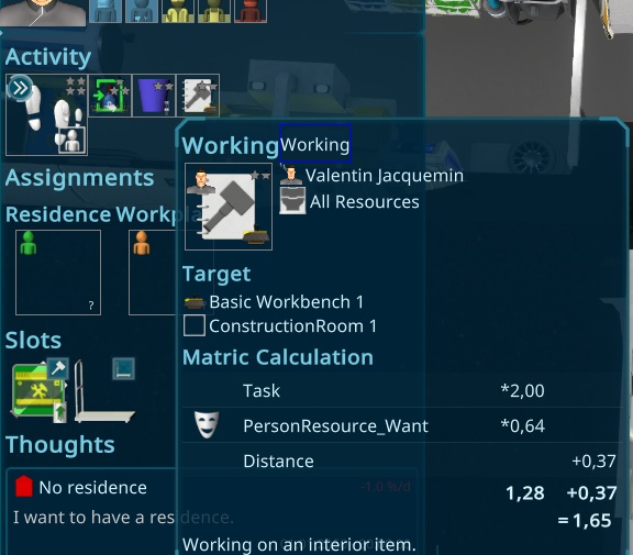
Besides that, i also added the new Metric Calculation to the UI. Each calculation part consist of 2 values: A multiplyer and an additional value, added after all the multiplyers. Its now also possible to see why the person don't wan't to go to work, but i have to add a "Player task queue" to make this more obvious. Then i can show also these rejected tasks, like wanted to shower but cound't find one.
Today just watched another playtest and smaller fixes of some special cases of the pathfinding. I also finished the german translation, due to soon a german streamer want to try out and stream the game
After the Pathfinding improvement there were big lags in the game, due to tons of new Path calculations. It just happened the first time after loading, when the caches get filled up the first time. To fix that i did several improvements. First of all, it detects connected storages and precalculate them. This improves it, due to it always runs with burst (not like the simulation) and can be done in paralell on all available CPU cores. In addition to that, i found that not needed paths were calculated for fill and empty dummy tasks, that are not realy used. The last improvement was for the metric calculations, there its now doing the distance calculation only when the task fulfills all other requirements. Doing this it improved the first calculation dramaticaly in my editor.
I also did a small playtest and found just small things to improve now, its getting good and feels better and better.
I'm a bit sick today, so just slow progress these days. I'm working slowly on the new metric calculation and have now also the more complicated things migrated. I start to have both calculations in paralell, to check that both return the same value to slowly migrate that important part of the game.
I migrated more and more and tried to align the code of the different Activities. All in all a lot of work and big changes, the automated tests helped a lot again. Without them i would have no chanche to do that!
While refactoring, i found another bottleneck in the code. To calculate the best metric it crawled the task list very often. I could reduce that alot and it looks like it boosted the performance 50% or more up! So on the big ship without burst it was around 3h/s in the editor.
Today i worked on the issues found on yesterday evenings playtest. Most of them small improvements, nothing but, but in total over 13 things to make the game more accessable for new players.
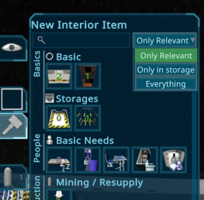
Another hint from the testers are usualy, that its too much items for the new players, so i added another filter option for the interior item build menu. Its now by default at "only relevant", that will show only craftable, orderable or things in boxes, to reduce that amount. it can still be switched to everything to get an overview.
After 2 days vaccation, i fixed some bugs with the new pathfinding, related to several small things, like reusing the same cache for the way back, or finding a way to the door in the next room. I also continued refactoring the simulation part, to improve the task metrics next, what are responsible what tasks the persons are picking. There is a performance bottleneck i hope i can improve a lot with the new architecture there.
I finalised the new Pathfinding, so the path between the rooms is now also nicer, took a longer time to refactor and analyse many things due to the new special cases.
The pathfinding has been completely restructured. Now we have more caches for the different things, and the algorithm not relates to rooms anymore. Its precalculating now the interior fields for all items and calculates the distances from all interior items to doors and between the doors when changing something. The Path algorithm than uses that to find the best route, so the issue with long hallways and strange path findings should be fixed. I was also able to simplify the code by replacing the old cache with a new version of it.
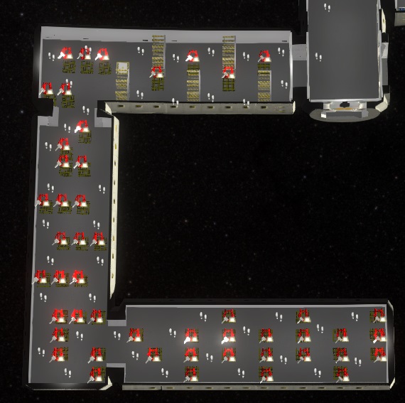
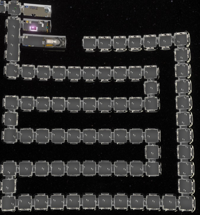
The algorithm i created just used a fixed maximum of rooms in a path. To make this more flexible for huge shups, i changed it a gain to a more dynamic approach, keeping all functionality. It might be also even faster now, due to the path data has less data included and the path is just calculated when its needed.
This morning i fixed the last things for the new Transport Mechanics, and also improved the Problems. They are now more clear and aligned between the tasks of both storages.
Afterwards i worked more on the memory leak. In the tests there is still a lot of garbage, killing the editor.
There were still trouble in finding out why a crafting was not started when the containers are close to be full. After some tryouts, the final solution now to just show 1t instead of 1t/1t if its the same text. If the unit is different, it will add a percentage value, like "1t (99.99%)" to indicate, that its close to be full.
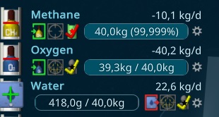
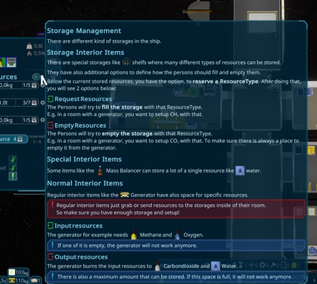
Than i got to another problem with the storages. The new restrictions make some kind of connections impossible, so i thought a longer time about a better solution and started to implement it.
Over the Weekend many testers played the game, so i was busy checking the reprots and fixing issues they reproted. A lot of things have been improved and i also did a playtest, finding more things to do, but they get smaller and not so noticable for he normal players.
I started with a dragDrop support and implemented a basic drag dorp functionality. It was easier than i thought, even multiline seems working fine so far.
It took a bit time to make it smooth and support other features like having a garbage container to drop it, or to change the current recipe when drop it there. Also some special cases like when the queue changed while dragging needed some adjustments.
The Clone feature cloned already several things from the original one. To make it more obvious what is done and having the option to just copy a type of an interior item, i added a small panel on the top, showing the settings.
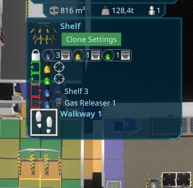
In the morning i finally found a solution for the too high tooltips. The idea is now to let it be width or height as the screen and calculate an offset to the position value. I also adapted the automatic detection, so its putting big tooltips to the left side, to prevent streatching them.
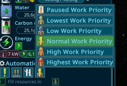
After that i started the next bigger topic, that is already open for a longer time. Its about the Task Priorities were not easy to understand. To fix that, i split them up to the different priorities to make it also better controllable. In the old verison, there were just 2 priorities, one for the construction and one for the rest. Now the rest is split up in Transport, Maintenance, Item and Work. Item is a new one, mentioning the priority in electric control (but also works for e.g. co2). Work is also a new one, that should also fix the problem of some players forcing the persons to work in some bad mood scenarios.
Players still have trouble to setup the toolbelt slot on the start of the game. Also experienced players forget this, so i added a small notice to the player when he didn't do that after 1h of gametime.
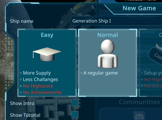
I found that too many players fail very often at the start. To make the start smoother, i added an "Easy" Mode to the game scene. It should help new players discover the mechanics easier. Besides the regular setups i already have implemented like more money, less cost, more supply from earth, i also added the possibility to change the fire chance, metabolism and ships heatup value. I also used very low values for that in the sandbox mode.
#
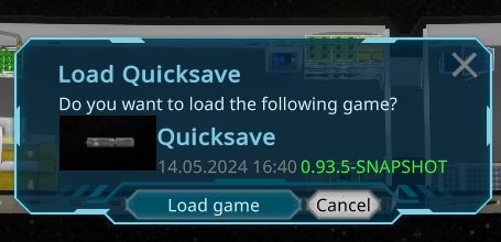
To make the testing faster, i decided to finish the implementation of the Quicksave. Its a separate system next to the autosave, showing the save progress same as the autosave. With F9 you can create a save, that will be shown in the regular saves. With F10 it will show a confirm popup (with enter as shortcut for confirm) to load it again.
The last bigger task for today was to add a check to the tasks, so cycles in the setup will not so easy to create for the player. It impacts the automatic tasks, with corelated storage connections. Otherwise they will e.g. push resources out to the other storage, find there something to import it again.
In the morning i had the situation with the memory leak occuring without a unity crash. I used this rare chanche to check the problem and found several savegame and gradient pictures in the memory. I cleaned this up, hope it helps against the crashes.
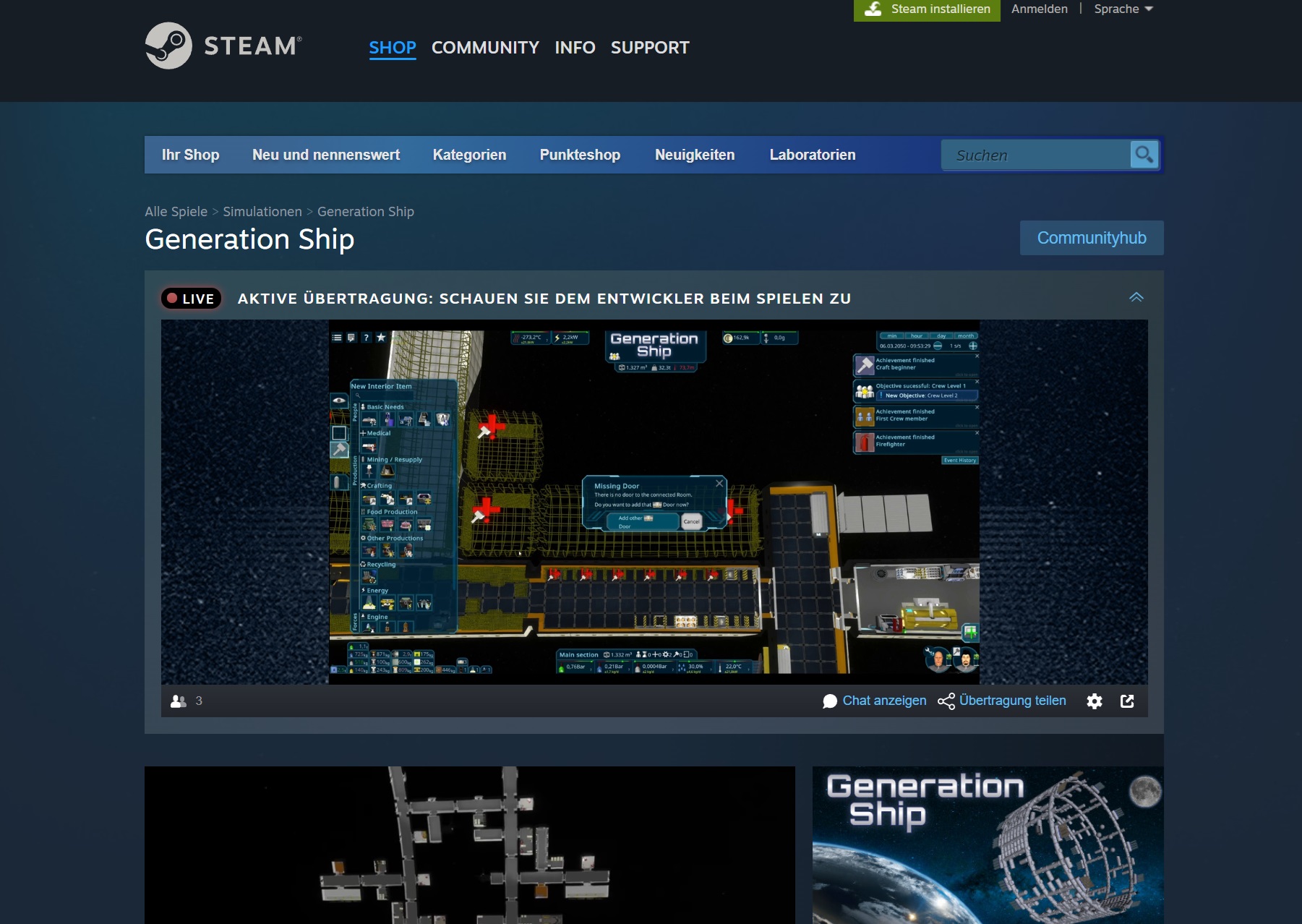
I also played a bit with the Steam Broadcast feature and was able to set everything up.
Than i finalized the First part of the ResourceOverview Popup. I decided to do the more complicated parts later, i think its already very useful as it is now.
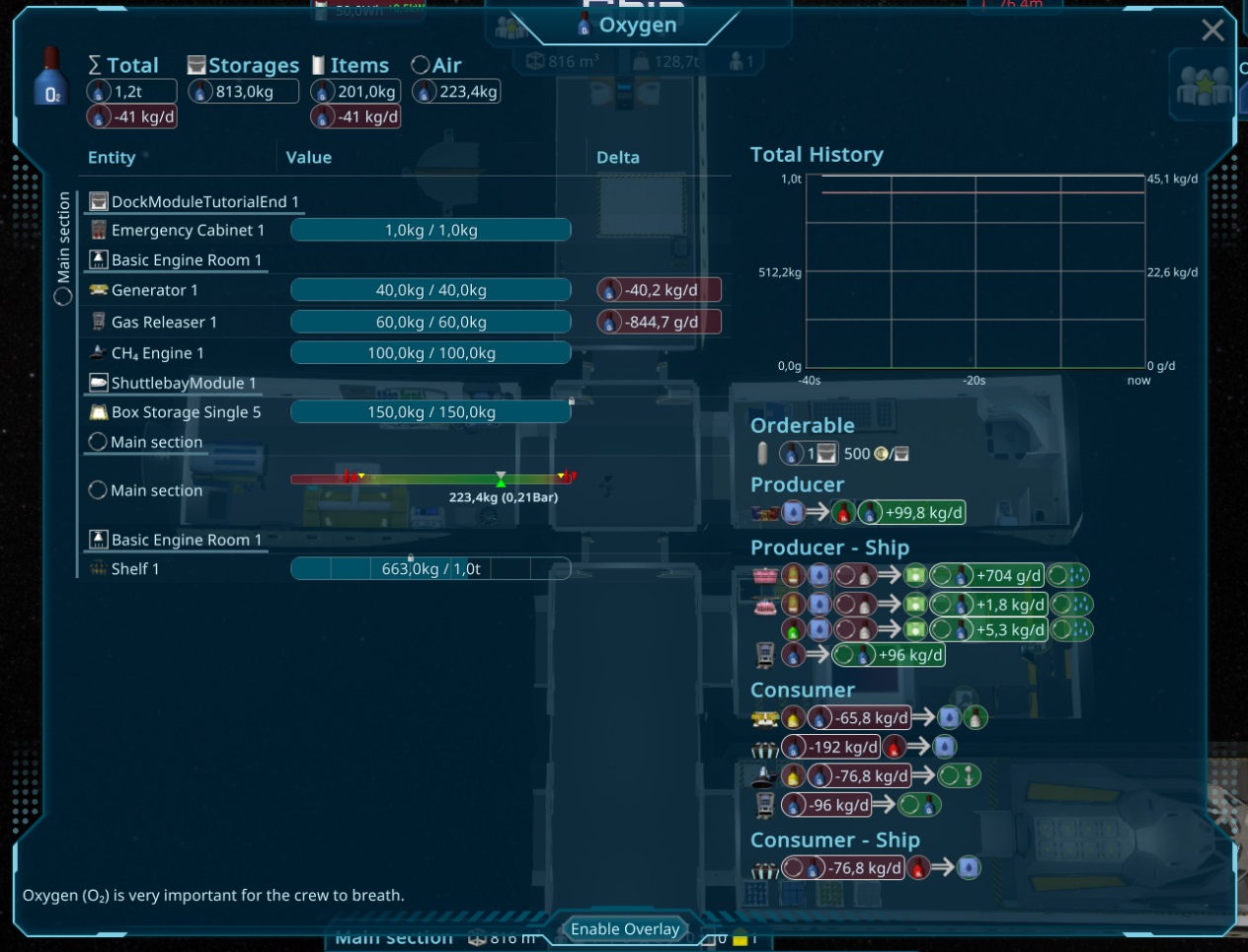
I also reduced the complexity of the ResourceType tooltip, due to these infos are now in
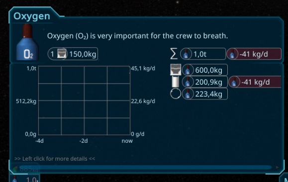
The issue with tinting the screen in red or green is also solved. The problem was the curved ship and the distance calculation to the camera. If the element is close to orthogonal to the camera, the distance to the camera is so small, that the element was scaled enormous big, so the camera saw just maybe 1px of the original picture scaled to the complete screen. I added a minimum distance to prevent that.
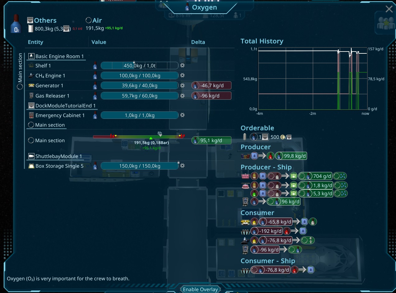
Today i fixed several things i found from yesterdays new weekly tester. Slightly improved the tutorial and some ui issues. Than i started a bigger topic, a new ResourceType Overview Popup. Its an advanced tooltip and should also contain all elements, that are involved with that resourceType. The Target is to show craftings, Supply from earth, Persons and shipsections all in one view. It should give a complete overview about the resoruce. Here a first view of the work in progress
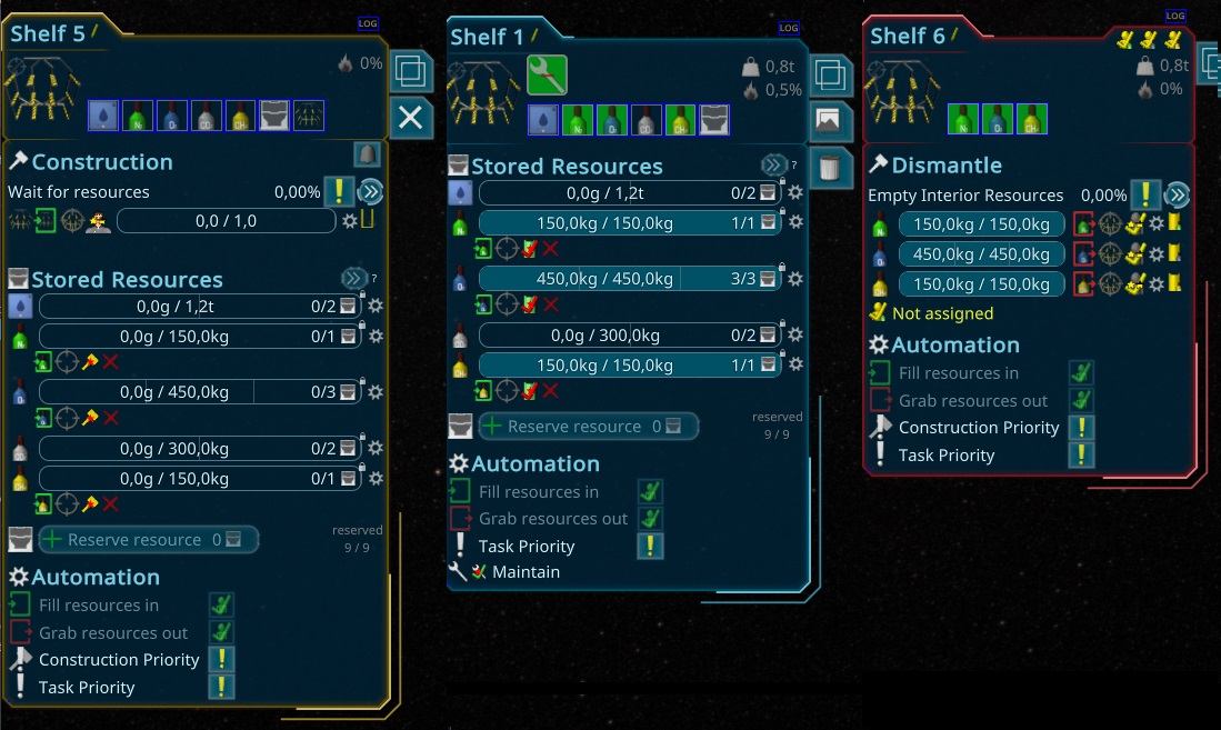
Due to there is now a lot to configure in the not finished items, i make it more clear by changing the border color due to its construction state.
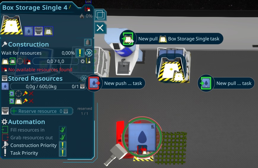
While working on the bigger bug related to the connections of the clone rooms, i came to the conclusion, that there are now too many specialcases for the construction resources. They are stored also in the interiorItem, what makes it difficult to presetup things, like what is needed for the blueprints. All had to be done in special setting data, that are applied when the item finished construction. At the clone, it can still be the case, that the target is not finished, so everything is a big mess. To make it easier, i decided to extract the construction storage to a separate child of the interioritem. It will take some time to refactor everything related to it.
So on the screenshot you can see, that now storage and preconfigure is available via the pi menu. the stored Resources part below is just accessable when both items are finished.
In the morning i worked on the playtest report i created from yesterday, creating tickets from it and fixing already most of them. Besides one problem with some missing update, everything way minor priority, so i think its on a good way to go. While trying to write the next release notes, i found that the changelog list is too long. Also i want to do better minor releases including notes in steam. To do so, i created a small tool, to create me that in different formats. The infos are all comming from the git messages and tags. A bit sad, that steam did not support automated patch notes.
I also did a code coverage run after over a year now. Result is, that the code got around 20% more lines, grown now to 160.000 LOC.
Besides that i fixed around 20 tickets today, and prepared for a bigger release tomorrow.
Today my main task was to do a camera update since a very long time. I got some feedback, that it's missing a "pan with mouse" feature. It was a bit tricky, but it worked in the end, so now with keeping the middle mouse button pressed, you can pan the camera.
After adapting the other usecases of the middle mouse button like rotating items or keeping tooltips open, it feels very nice to me and i'm very happy about that feedback!
The other time i spend watching a playtest. The new tutorial was close to be as i expected, just need to readd the drop of the dockingport and it should be fine. Can't wait for another tester to see if it was the result of the tutorial or just luck.
Again i'm on the tutorial, can't count how often i changed that now... This time the focus is more clear on the crafting. This is used than to show the different transport mechanisms to fill these up. Ill show 3 different ways to do so, to get the player some possibilities and teach him the pi menu interactions that way. It's also focusing more on the important parts and removed some details, the user can figure out by itself and via the ingame help.
Besides that i have done 10 other smaller improvements from the last weeks playtesting.
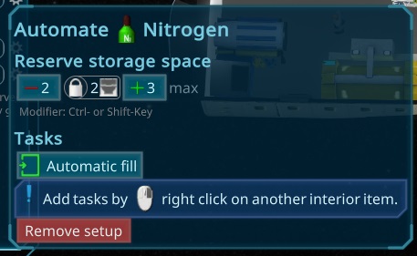
I completely refactored the customer and worker slots in the morning, similar as the mission slots yesterday. Than i worked on more ui to improve the setup of the storages. there are now bigger buttons and a hint to the modifier keys. Also a max button behind it, due to this is the common usecase to use one storage for one resource type. I also added the lock icon there, to make it more obvious, that this is the value that is shown in the graph.
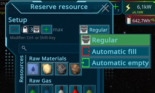
To make configuration faster, i also changed the Add buttons popup. It has now also a reserved amount and directly the option to enable the fill or empty task.
Today some smaller bugfixes and improved the backend for showing shorter reports on discord. The reports changed a lot since i developed this part, so now all parts are up to date and its easier to filter them to be ready for a bigger playerbase.
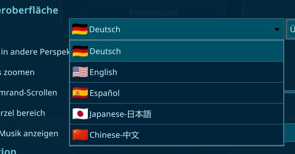
While adding icons the the different types, i had the idea also to reuse the flags of the nationalities of the persons for the language chooser and added that quickly.
Besides that just some improvements of my editor, to work easier and some thoughts about a change of the tutorial, to make the start easier for new players.
In the evening i worked on a ui bug with the mission crew. The code for assigning the persons was very old, so i bring that to a new level using the new abilities of my task system. It took a bit time to catch everything there, but now they support everything what the tasks are doing and prevent bugs. One could be setting up Work Requirements for different slots, so it might be useful to have a pilot with a need of astronaut skills later.
Today i worked on the connection feature inside of blueprints. After creating some tests, i decided to refactor the api for it, to have an aligned transport api mechanism. It grown a lot due to different usecases that have to be alligned, to make it more reliable and easier to use.
With the tests if found also some bugs, related to the latest changes i fixed and created more automated tests.
After trying to solve a huge memory leak in unity i downgraded again to the older version. Than I could finished the mass calculations. The simulation take around 150ms in editor on the huge ship, the parallel burst job take 0.1ms in the editor, than using all your cpu cores in parallel another 0.2ms, so in theory it can run now every frame. I will also add the dirty mechanism, so its just updating whats needed to save more time. The old way took around
Today i worked the morning on validating the Dynamic created rooms, due to i found some issues. Now they just update if they need to. It has not much effect on the normal player, but its good when validating the game state in the editor, also for huge ships. It also checkes in the consistency check part for missing updates.
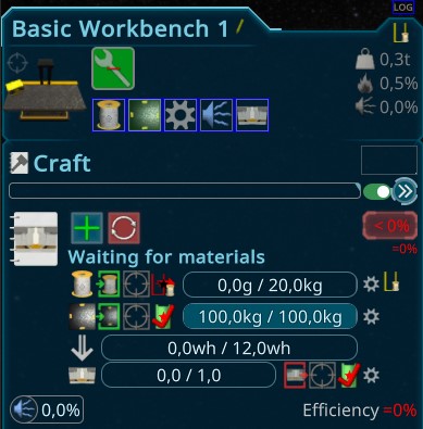
Than i worked on some reports, one said it was not clear what resource is missing. I fixed the bug and enhanced also the ui: The state got now more space than the other production line parts and there is a problem icon, when its not full, to indicate a problem. I think it looks also nicer than before.
In the evening i worked on the mass of the ship. i saw several wrong mass calculations and stript some down to the metabolism of the persons. Some small adjustments were already fine. The mass calculation is one of of the big simulation performance killers, taking several milliseconds. So i think its a good time to extract that from the system. I plan to do this async every few frames and on request by the simulation. The Overlays will also use it to simulate the changes and optimal values. It will take a bit time, but i think it worth it.
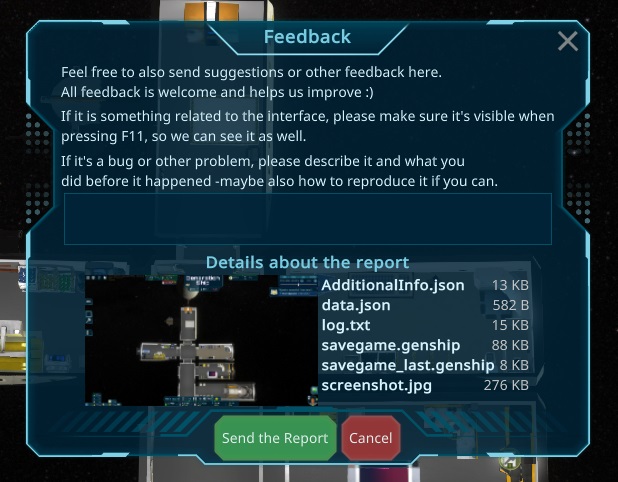
In the morning i worked on the Report screens. They are now aligned and using my new Rerport Api to generate it. There is now also a common component showing the data what is send, and everything is in nicer popups. The original reason to work on it was the crash reports. Recently i found where unity stores them and now also creating reports when detecting them.
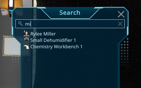
Afterwards i go back to the ticket list. It was a bit annoying to search in a loaded savegame for the entities mentioned by errors or the player, so i created an easy Ctrl+F window searching by the names. Its also available for you!
I also did some smaller things like painting the cursor position on the reports screenshot or improving the edit icon of the cursor. In total one big thing and 10 small tickets, progressing but still a lot to go.
Today i finished the tests with the new processing mechanic with automated tests for it. I also created a cancel popup when garbage is produced, so the player know what he is doing.
Today i started with the big change of the Production, to add the garbage. First i created some basic tests, to make sure my initial refactoring worked. It took a bit time to create a nice reusable setup for further tests in the future. I also updated all the old Tests related to production.
Yesterday i worked a lot on the recipes, and i completely lost the overview while changing things back and forth. To prevent this in the future, i spend now a longer time to update the Unity Editor for the Recipes. Instead of 2 pages of the classical unity look its now everything in one table and updating correct when changing the values. The calculations to check if it makes sense from a gameplay perspective. It took a bit time, due to i had to convert many other components to the new Ui Elements. With further changes in the future, its ready to be put to the game itself and not restricted to unity anymore.
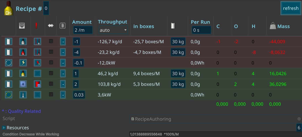
Than i started improving it to support the new mechanism i want to implement. Turns out with the new Editor its way more obvious where the problem is. After thinking a longer time for solutions, the only good and not so complicated option is a new garbage resource, that can just be thrown away. Later i will change that, so its more recyclable, but for now the only thing what you can do with it is to throw it away. It should just happen when canceling specific things by the player, like in smelting or hydroponics, that should not be the case so often.
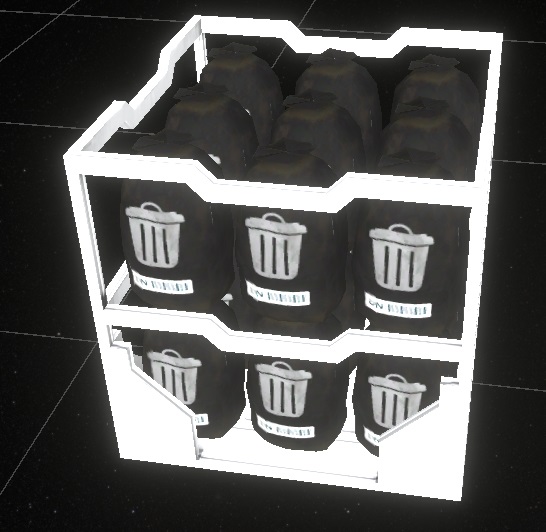
Today i worked on another issue the play tester found with balancing. There is missing N2 and CO2 in the ship. I researched a bit, and it seems not a good way to get n2 from the moon. From other atmospheres of other bodies it might be easier later. So i created 3 kind of ores: Sand, Copper ore and Iron ore. For that i decided to create a separate model to separate it more from the others to show, that they are raw materials that need to be converted firstly. I refactored the creation part, so there is now a prefab for each of the kinds to make further updates and fixes easier.
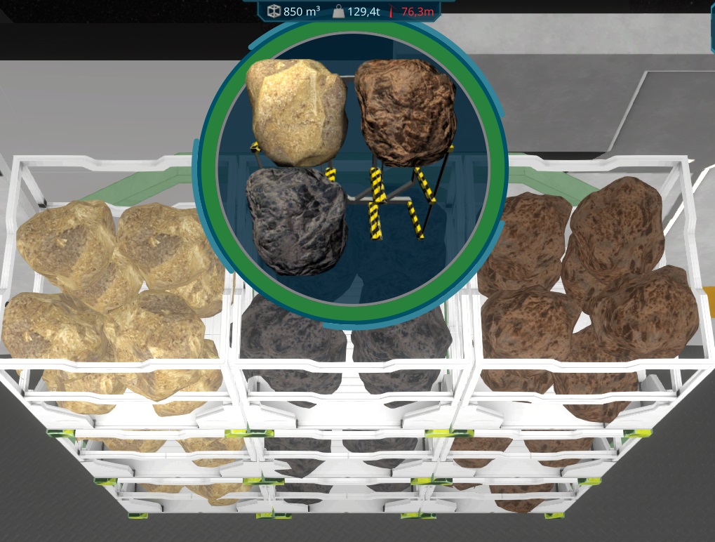
I added them to the Smelting and Chemistry table, so they can both now convert the items. The problem was, that they create humidity and co2 to the air. When canceling the model, the resources had to go back, but the h2 should be partialy in the conversion, so i have to find a solution for that tomorrow.
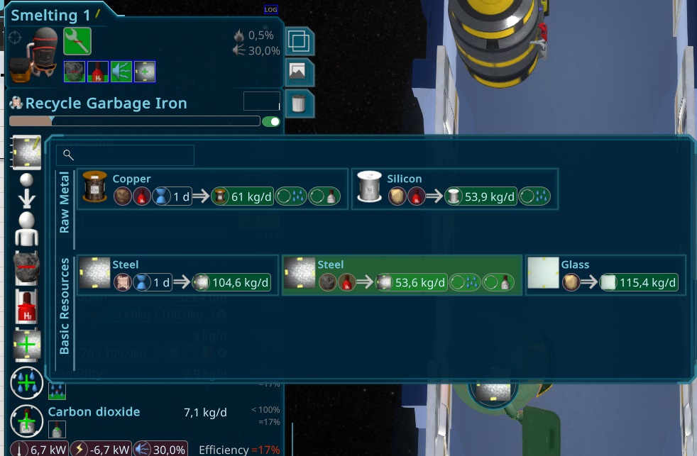
While adding the new Resources, i found, that my Screenshot tool didn't support the resourceBoxes. Due to the latest change this iteration with the single resource items on the table, i was now able to automate that creation for the resources too. I also used the work on it to improve the lighting and defined special camera angles for each of them.
In the end of the day i came again to the broken meshes when setting the random offset of the stones too high. The shader just hides the pixels out of the area till now, but i had another idea that solves it. I now move the verticies in the vertex shader further away from the box, so i can hide the pixels far away from it instead. This brings now nicer resource box randomizations
This morning i realised, that the reports sometimes missing the savegame files, so i rechecked it and improved the logic there. It took too long time but now it looks much better, including a progress bar and faster response times.
Than i worked more on the reports from the tester and fixed several things like the that the persons filled things in random storages. The new logic have 2 different things. First the person priotize the target better, and if a task is stopped, they will first try to put the resources back in the source storage where they picked it from. I created some automated tests for that now.
There was also a bug where the connection priorities were wrong, due to at clone an interior item creates the task in the storage, not in the item. Also an automated test now.
My plan is to do more and more with the automated testing again, after a longer break. With the new Hot reload plugin for unity i can work with it way better than before. The latest performance improvements also helped with that.
Today more bugfixes, the weekly tester is still active and find realy a lot of smaller and bigger issues. Big thanks for that, it realy helps to push the game forward!
There were some problems with the transporting mechanism, where i created several automated tests now, to make sure these things keep working.
The last days i updated the complete simulation to the new entity approach, preparing to split up the logic in seperate Jobs. It was a big refactoring day, to bring everything to the next level.
Today was a bad day. I could reproduce an issue with the persons grabbing things to their slot, without any reason. It just happened in burst mode of the simulation. After debugging a while the logs didn't make sense and nothing seems reasonable. Something realy realy bad goes on there. The simulation is grown over ten thousands of lines of code, and i have the feeling, that i reached the maximum of the burst compiler, that he got troubles with addresses or something.
Due to the latest created big ships got troubles with the simulation, it's maybe time to do an other approach that is able to parallise more. The code has been structured so far, so maybe there is a chanche for that. So i worked the rest of the day in preparing the simulation for it.
Today i worked on all the reports of the last days, analysing problems and started with graphic and smaller other bugfixes.
While working on a performance problem, i realized, that the resource holders were much more expensive than needed, due to the ui is anyway not good visible when being further away. So i designed new holders and had also an idea to improve the storage view with the same approach.
I also make the Marker using an icon instead just the triangle, so now i added a reserved icon for it, to make it more clear what it is. The interaction of it is now also easier, on the upper part of the bar a single click is now enough to show it. Also the duplicated tooltip is fixed now.
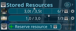
While trying to analyse the problems of the tester, i needed to improve the performance for my editor. One thing was to do the JsonObject creation more async. The main Mechanism was already added to the Library, but it was not good to use, so i had to refactor the whole library to fulfill my needs.
I did a lot of optimizations today, so i can run the big ship from the tester now with 20fps in the editor. It should also boost up the compiled version!
I fixed serveral issues the last days. While debugging another endless simulation loop, i created 2 more debugging features to step better through the tasks and have a separate editor window with the resource container details with exact values.
Today more bugfixes, first the camera bug had some low level bugs in calculating the ship bounds. I created a new algorithm for that to prevent that.
Also the crafting part got several bugfixes and a better internal state handling.
Besides that i improved the UI when using batteries. It's now showing a more detailed state e.g. when batteries are full or partialy charging or being used.
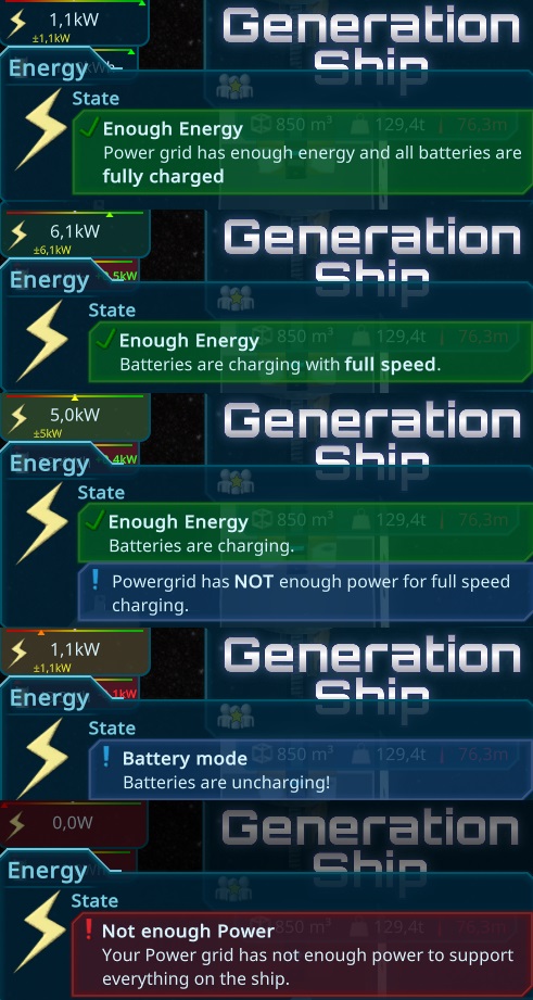
After fixing more bugs and get through log files, i worked on the main task for today. The tester realised, that there is no way to create food, expect from garbage water. Thats a problem due to that is also needed for plastic. I studied a bit and it came to hydroponic cultures. With that its possible to create food without the recycled garbage water. Usualy there is also a need for more resources to the nutrition water like Kalium or small parts of iron and copper, but to make it simple i just added nitrogen to the cycle for now.
Above you can see the old one using prepared earth and below is the new hydroponic approach. It creates more humidity and needs more co2 from the air than the other one.
I also worked a longer time again on another Unity bug that was found by the tester. The Listviews not selecting the element correct, after rightclicking into it, they work as expected... It took a longer time and i give up finding the reason but adding a workaround for it, till Unity fixed it...
At the end of the day i improved the reporting again. The last playtester played several hours, creating a huge log file. To improve that i also send the last lines and prioritize the file uploads better.
After a week of holidays and birthdays, i come back working on the reports of the weekly tester. He played a very long time and build huge ships, producing a lot of log files, bug reports and improvements for me to work on.
Today i was able to fix some major bugs and did another release. The rest of the issues will take some days, its a lot of things to do!
I worked on some time measurements to have a better tracking for the simulation tasks, that took too long. It was a bit difficult to get around the unity restrictions, that inside of a burst job, there is no way to get the realtime from unity itself and other c# ways seemed all blocked by the restrictions, but in the end i found a way that its compiling with burst but still when called normal or in the editor its measure the time.
Than i continued with the log files, and was a bit lost how to track the errors down. Due to in burst are many things restricted, the log is not so useful. I also played again around with the tostring method. It looks like there is no way in burst to log the entities right, but i extended the support for other entities instead. I created now 3 burstable ToString methods with the EntityManager, own lookups and simulation code for the different usecases. But they still didn't work with burst. In the final testing i found a case where its working and was able to adapt the code so its now fully burst ready! I hope it helps to debug further bugs faster.
Thanks to the current weekly tester i got several things to fix, he played a long time so far so there are a lot of log message i have to check and lot of smaller and larger bugs to fix. All in all it looked pretty stable, no crashes, good performance, even on the larger ship in the later stage. So today and the next days are bugfixing days, before i got some days to vaccation, where i can't do so much.
In the weekend i just did some performance optimizations, related to some jobs. More expensive things are now just done, when the entities have been changed.
In the last playtest were an annoying bug, where the taskmanager got crazy and executed too many tasks causing the game to hang. I couldn't reproduce that if this is happening, please report.
After i tried to analyse the display bug from yesterday and reporting a file, i came to the idea just to switch to another font, till its solved.
I wanted to do some german translations for the weekly-tester (due do i have to do it anyway) and found several issues with the Translator Element in the Game that i fixed and possible improvements that i implemented, to work faster and give you all better tooling for translating the game!
It's a lot to translate, but with the tooling i created it went actually very fast so far and i'm close to done. The weekly tester discovered some bugs i will priotize tomorrow first.
I fixed a strange exception in the new button logic. It seems to be a bug in the unitys ui toolkit, happening when removing the element in a special timing. I also worked long in the night to fix the last known bugs to make a release with the new tutorial.
Today i didn't had so much time and the limited time today i spend in debugging a crashing bug, when exiting the game. It seems something in unity again. The analysing is still very annoying, due to the random appearing unity bug, that breaks the builds...
Due to i struggled a lot with that unity bug, i tried to update to Unity 2023, due to the bug is not in the known issues list. The first compiles were sucessful, looks like this annoying bug is not happening there anymore!!!
BUT i found a strange bug, that "fa" and "fs" in a text causes unity to overwrite 10cm to the left side, so its overwriting something the other text... no idea but i asked the unity developers for it. As a workaround, i will add spaces in between ^^. Its not fixing it for the editor or text areas, but at least for the visible text...
I worked the whole morning on the new tutorial. A mixture between improving the code for writing tutorials and creating the new ones.
In the middle i started the task to improve the crafting ui. The old one used my table, that has somehow a performance problem when used inside of a scroll panel, but i couldn't detect why unity starts a huge restyling calculation.. So the new Design is more box-like and includes only the more important info directly. The amounts can be viewed easy with a tooltip. It also highlights the current and queued items very obvious.
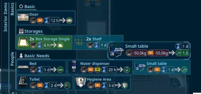
It get on my nerves, that i had to copy paste things over and over again, like "Left click to select". So i improved the Tutorial system. Instead of a automatic generated text-id it can also get now a overwritten id.
I also fixed another issue with the help system. If the UI Element to highlight was inside of a scroll panel, it was a bit confusing. now its highlighting to the scroll button instead.
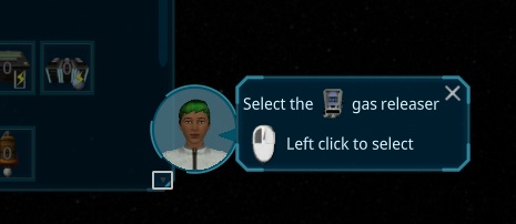
I had the idea to change the starting ship again, by not having too many interior items at front, so the player has more freedom to start and can learn the mechanics easier.
Due to the CO2 and Temperature are not getting a problem in the first month, this is now the first crafting interior items for the player.
While doing that i figured out that the humidity increased too much, debugging that i found, that the shown ship volume is double the real one.
I also found some smaller issues on several places that i fixed in the morning.
Than i continued creating the ship and adapting the tutorials and the first primary objective. Needed to improve the ui for it, to have a nicer view.
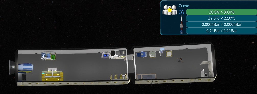
I worked on the Resource Overview Layout panel, trying to structurize this more, to get more overview into it and make it more handy. Due to there are now more resources added in the last iteration, this seems needed to be done now.
First i categoriesed it, so same categories are above each other. I added also the labels, but it turns out, that it took too much space, and the grouping seems already fine enough. I tried 2 different layouts, one like the old one and one with just small icon and text. It looks the 2. one is way smaller, so i go for this one for now.
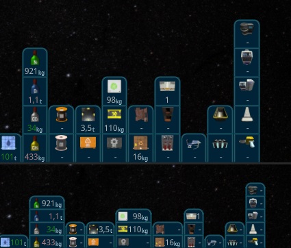
I also fixed another issue with the Battery calculations. It was very tricky, but i analysed a longer time and think i found a solution. With that i will release another minor version, to prepare for tomorrows weekly tester event.
Afterwards i tried to get more detailed statistic about the resources, to add that also to the tooltip.
I also released the game and fixed some automated tests that were failing, finding and fixing some issues with them too.
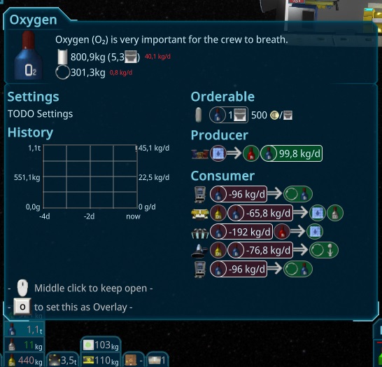
In the morning i worked on visualizing the state for the crafting items. I decided to change the color when some resources are missing. I hope this indicates easier that something is missing at the crafting and give a better feedback to the player. It had some special cases but in the end i think its a good result.
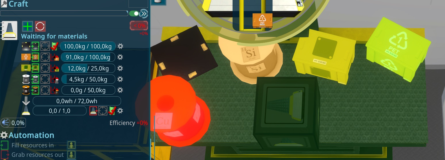
Than i also added the setup for the other Workbenches
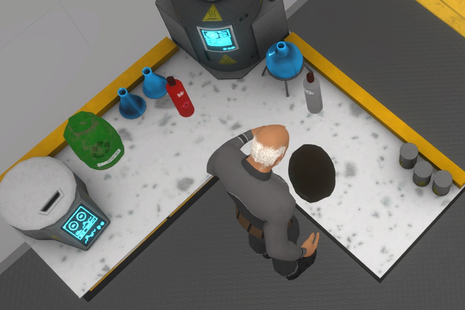
While my playtests i found it not clear enough what the crafters are doing, so i decided to add a small box on the table, to be visible whats crafted.
To make this work i added for each resourceType a small version. Multiple systems are involved to detect the resourceType showing, switching it and replacing the resource model.
After that basic work was done, i added the main feature on top of it and added the resources to the workbench.
Today i worked on the things i found in the playtest yesterday. There is still the problem with the High humidity, so i improved the help for it, to hint more to the way to solve it and hint in the tutorial, not to order the second person already. I also balanced the Dehumidifier, so it can deal now with 2.9 persons. So even with 2 persons, it can reduce a significant amount of humidity from the air. Besides that it can hold now more water, to be filled later. Additionaly i added a multiplyer for the humidity effect, so e.g. the Eating Table gets as much damage as more electronic devices like machines. I hope all of this solve the issue with the high humidity for new players.
I also worked on a bug that get on my nerves already a longer time. In some animations the persons were stucking in the ground. The problem seems something on the import config of unity. After redoing that it worked fine. Still no idea what is the broken thing about it, but its working now.
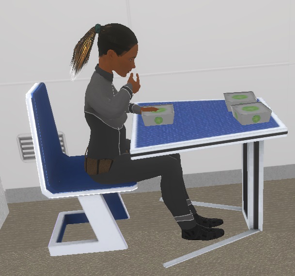
I worked also on the original bug that goes even more on my nerves. The selection of the Persons in the bed are not working well. The reason for this is, that its always used a fixed selection box, that is not updated in the animation. To do this, there were several approaches, now while baking the animation, i also bake the bounding boxes of the person to a separate component and update the fixed one.
I did the same thing for the Photovoltaic Panels and the Ship Radiators, so they are not selected from space when not unfolded.
I fixed some bugs related to dead persons and did some other debugging improvements this morning.
I started the new iteration with a new feature to automate the batteries. They now switch between charge and uncharge automatically depending on the ships energy. To have a more usefull ui, i changed the ship overview panel for energy, to support the batteries.
While doing this i also updated the Energy overview, to show the battery state instead of the not useful ship energy value.
I spend the morning to try to speed up the compiling in unity, but failed due to too many dependencies, it would take too long time. I found some interesting tools to debug the compiling time, but i cound't find much..
In the evening i tried another hot reload plugin for unity. It works way better than the other one i had. Supporting way more special things i used from c#, still some edge cases i have, but in general it looks very good and will speed up development.
I finalized the new Workbenches and 3d printer and did a small playtest, to check the basic setup. After that i fixed some small things i found and did a release. I decided to do a major release, due to its already a longer time ago and its a complete new gameplay.
Today i created the chemistry workbench. I used the original workbench as a start and make a corner table. I added a smelting device with a design of a kitchen cooker and a simple centrifuge. With this its possible to create steel, plastic and filter garbage water. Including the setup in the game, modeling and painting it took around 4h.
The first sketch of the model
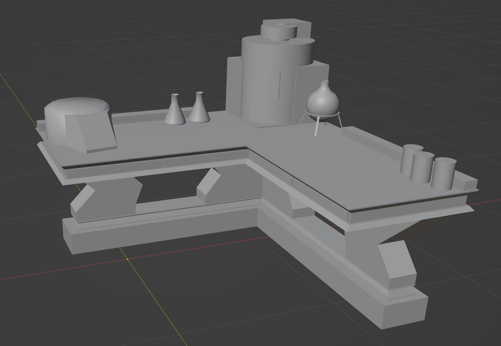
The painting with substance painter
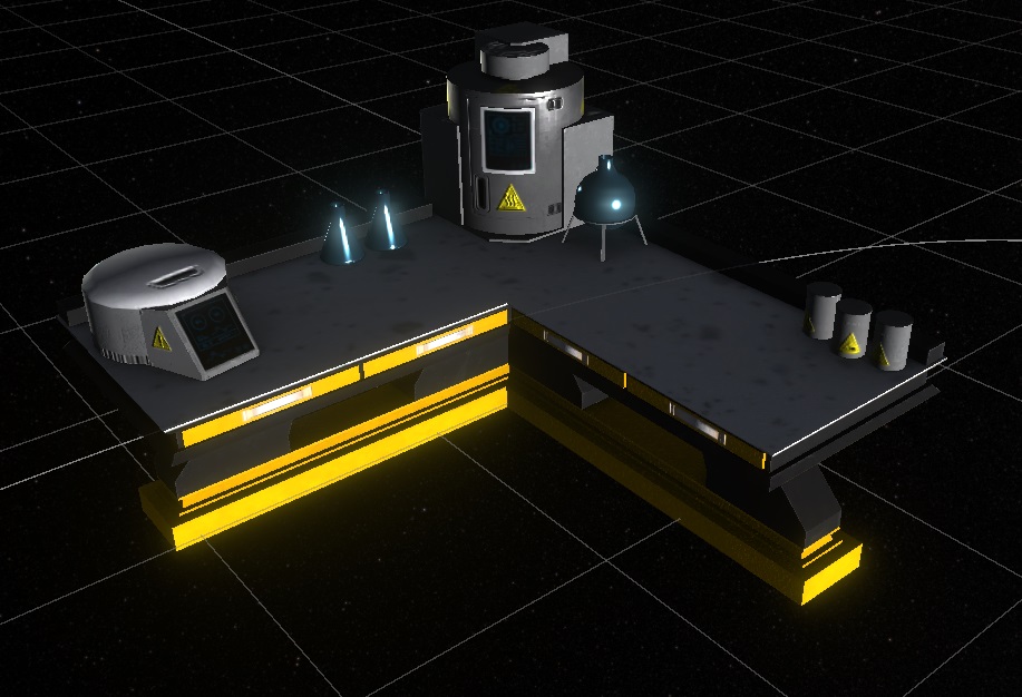
How it looks now in the game engine
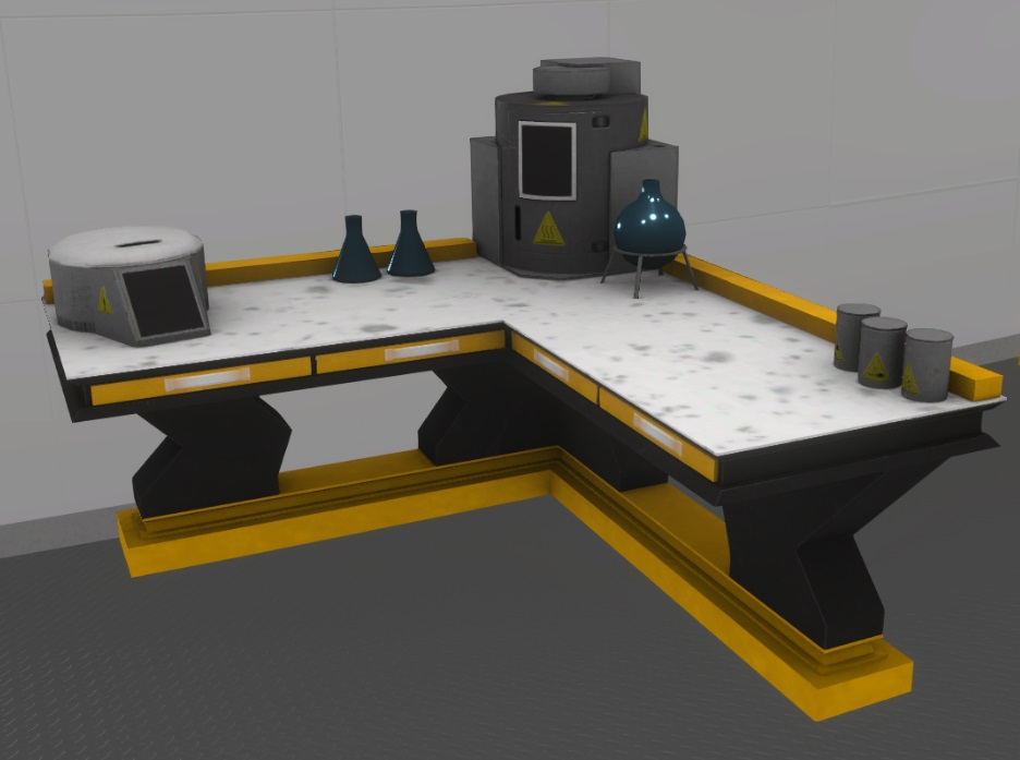
And here the current setup what i start with:
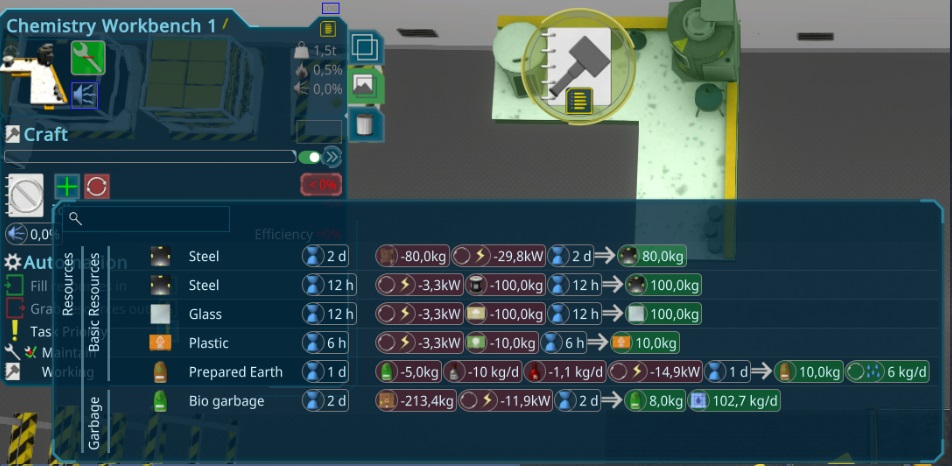
Today i worked on the models and painting of the new Resource types. I choose the box i already had for the plastic and sand. Due to these are small peaces, its the best way to store them in a spaceship. For the other raw materials i needed something else, i decided for a coil where copper and iron are rolled onto.
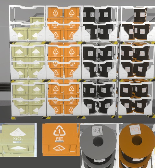
I also did the rest of the new Materials, all in a simple box or reusing the coil model.
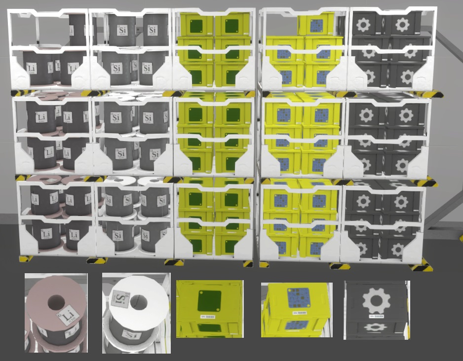
I improved also the box icon turning it more and did all the other icons for the new ResourceTypes.
In the evening, i tried to make it even more clear how to get a resource, i added also orderable (by supplyship) and harvestable (by missions) to the ui.
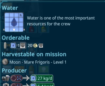
I started the day with bugfixes and analysing some errors raised in the last players log and given feedback. Than i setup all interior items to use the new resources and setup the rest of the game. Can't wait to try it out to see the effect.
To get a better overview about the usages, i improved the resource type popup. It took a bit time to show the best data in a good form, hope its clear enough now.
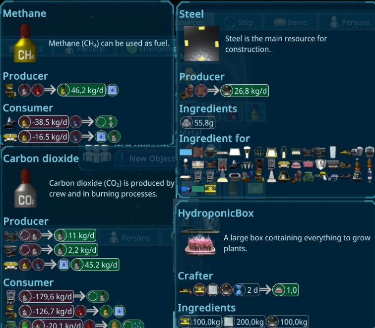
Afterwards i worked on the new Productions. To have a faster start i created the first sketch of a new basic workbench. The plan is to build basic things there, its just a working plate with some tools on it, so everything takes longer to construct with that and not everything is possible.
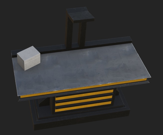
I started the day with working through the things i saw in the playtest and player feedback yesterday. Some smaller fixes with the overlays and one savegame that was very far i found that the shuttles were not removed correctly. All in all only minor things left, so i think the game gets to a solid state again.
Also i saw people ordering too early too many crew members and getting in the humidity loop very fast. To prevent that i calculated the possible capacity and show a warning if the player adds too many persons.
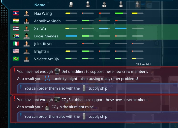
Also other smaller but important things i added like the escape key now also removes the permanent overlay, or showing the problems of the interior items in the special event helps.
After another week suffering with another infection, i start to get better again. I started slowly with working on the new Resource Types and their crafting recipes, to have kind of a in game order. I worked on the editor and generators, so its easy to create new ones for experimenting with it. The plan for the next days are also set.
The new plan is now to add around 7 new Resources, related to crafting interior items. There will be some basic resources like copper or iron that can be harvested on the moon and electronic parts with 3 levels, needed for many interior items. Also more crafting tables and smaller versions for production machineries are planned, so its easier to start up in the game and have more progression. I hope to finish it in the next 2 weeks to bring out another major release after that long time sickness the last months...
After fixing some strange Bugs in my admin web ui, i refactored the crafting mechanism with a new CraftableAt, so its directly configured at the interior item or resourceType where and how long it takes to craft it. Everything is now prepared for the new resource types and i started to sketched some parts i want to add.
I worked on the concept to add more progression to the game. There are many ways to add this like research or story/progress based unlocking. These two i didn't choose for now, due to it seems not realistic to me for the basic things we need for a space station. The other way i explored a bit is like factorio and good company are doing it. Beside research, they limit the things to build also via resource types, so you need special resource types to build others. As an example, i will add kind of simple circuts and advanced circuts. The small dehumidifier could use the simple, the big one the advanced circuts.
The interaction of the workbench can be used also for the 3d printer and other new factory interior items to craft them. I don't plan to add the hundrets of resourceTypes of Good company, but i like the concept and will use it only for basic progression.
As a start of this concept, i will change the interior items to be made out of other resources. Till now it just creates recipes for the workbench. I implemented the basics and changed the Tools 3D printer and all interior item boxes to that new method.
In the new version there are some audios missing. After checking that i found that its related to a bug in unity, that they fixed for the new not released version.
While analysing a ui performance bug i found, that it just happens on scroll inside of unities scroll element, so i tlooks i optimized as much as i can without building my own scrollview.
The rest i worked on the findings to the playtest and needed to go to the hospital. Still many in my family sick, hope everyone recover fast to get back to the original working speed.
The main part today was to improve the capability to debug log messages. Unitys entity system logs just ids of them, causing a not readable log file. I found a way to get most of them now named properly, so its easier to track down the problems.
Beside that, i fixed some problems with the history system graphs and made another playtest, just found smaller improvements this time.
I finished the ui for my game sessions analytics and worked on a bug, that just appeared in the compiled version. That was very annoying again, due to unities compile bug is still not fixed (over a year now...). So it took several hours to analyse that, ending up in its a bug in unities UI Toolkit, what i can't fix for now.
I checked the logs of some reports and found some errors i can't debug very well, due to its logged inside of burst, where i hvae no stacktrace. I worked a bit on the Task executions, so its more dynamic changing the performance and also be able to turn burst off as much as possible for debugging.
While doing that i found a missplaced annotation, causing the burst mode was never on in the last releases. So the new change did not impact the performance, even increasing it in the regular mode. When its needed it will turn on burst mode. Due to that was a long time ago, it had dozens of small things, that were not supported with burst and each time i need to run the compiler for around 2 minutes... Takes time...
After it was finished, it worked pretty well, now its just using the burst if needed. Burst is exactly 10x faster than the non burst version and and can execute around 250-500 tasks per frame (10ms time)
The big traveling through china with my family is now over and the game development can continue. But directly at the first workingday, i got sick again, so i will start slowly. I just worked on some statistic stuff today, to analyse the games better.
I worked again on the new Transport mechanism. Seems there are situations i forgot to handle well. Also i want to add another feature, what makes it better handlable. Currently the connections are just one sided, so you can't see item->storage connections at the storage itself.
One sad news: In the next 2 weeks i will have no time to develop bigger things.
After finishing the last polishings, i experimented with another kind of overlay. The SelectedOverlay for Persons should show possible targets. It also shows problems of the interior items.
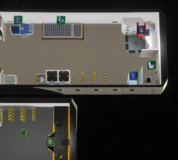
Today i created the new Overlay element as i planned yesterday. It's an add button and when an overlay is set, its showing the current one instead with a remove button.
The GaugeElements for the Ship and ShipSection got a click handler, so they toggle now the shown overlay to be also visible without the large tooltip shown there. While doing that, i refactored the GaugeElements to the new USS way of styling.
Than i worked on the Add Overlay popup and created several categories and search field, to find the needed overlay faster.
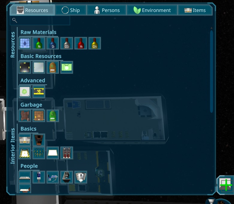
There is now also a Overlay for all Ship Section based things like air value and temperature, showing the users of all shipsections at once, coloring the ship section.
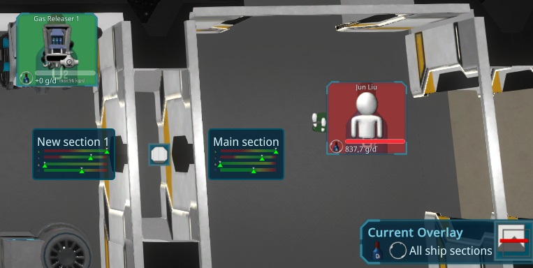
Than i also added the highlight to the ship section overlay, so its highlighting the rooms of each section with the corresponding color.
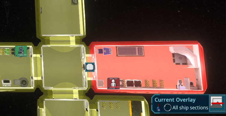
I also did some last polishings for most of the overlays, like adding a highlight for fire overlay or specific colors for the air values. Also you can press "O" to make a temporary overlay permanent, so its also possible for special task overlays to keep it.
I was able to fix the too early darkness achievement and some bugs in the overlay, due to the many changes the last time.
I also improved the overlay for the Container Users. Thats e.g. to see where the power is used.
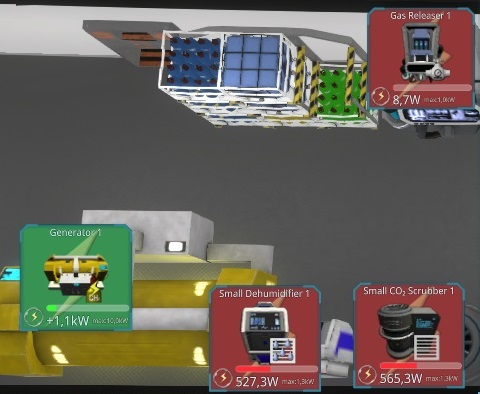
Still something to do to improve the overlays, to make them better usable, but this i will do tomorrow.
Than we got the first weekly-testers. Like usual i found several things to improve while watching and fixed already some blocking bugs.
In the evening i also worked more on the overlays. First i added a path for the persons, showing now e.g. where the maintain person is moving to the item. Not sure if its that useful, but its working fine now. After that i tried to structure the current useful overlays and create a concept for a new UI i want to create tomorrow. Maybe it's a better way to visualize it. It might also include some kind of Legend for them if needed.
After fixing some last things with the transports, i improved the overlay for the Resource Holders, so items or persons that uses the selected resourcetype. It shows storages in yellow, producers in green and consumers in red. Its also adapted to the new storage concept, so it shows above the space including free space and how many are reserved. For Producers and consumers it also shows it above in the box-layout, so its more clear how much is located in the items itself. To show also the possible capacity, it shows a bar related to the maximum production or consumption of the activity.
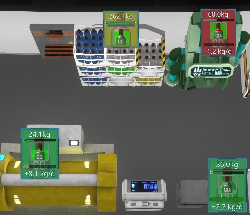
Today i added the new Tutorial for the Storage management. It shows how to use reservation, interior item connections and automatic connections.
The rest of the day i spend time for refactoring. This time i removed the old roomtype completely from everywhere.
Today a final refactoring about the Priorities. The code got way nicer to read and it looks now more error resistent.
I thought about the latest changes and found another thing that might be good. The normal interior items can now stop the automatic tasks, so the players tasks can be the only possible ones, to prevent moving resources to the wrong locations. To make it more clear where the item search for targets, i added a room icon to the pick icon.
Another bigger problem was to make it into the blueprints and to the clone feature. Related to that, it's also removed when the container is removed, so e.g. at the crafting, it got very annoying, due to the setup is lost after each craft.
The mapping of the blueprint names is a bit tricky, so i decided to just remove the not added references.
Today i finished the last part of the new Transport. It's now possible to setup the storages while constructing them.
Today i dealed with the last special cases of the new Transport Mechanism, like removing the connections to other entities, when the container has been removed. Its now also working for Under Construction Items and Rooms (similar as interior items, it has to be setup at the construction site). Also to move resources from one construction side to another is now possible.
I had a nice idea to make it more clear adding the automatic tasks, there is now a "automate" button behind the storage items, showing many options. I also moved the reserved amount to that automate menu and added a marker to the bar instead. Its also changable via dragdrop that marker now.
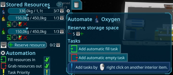
I also dealed with more special cases due to the change, so its possible to keep a container with max 0 units, when there are still connections.
I worked more on the player Transport connections and its way more complicated than i thought. One bigger thing was to improve the UI for the Storages. Its now showing the added tasks below the Resources. Also showing the Automatic tasks, to make it more clear whats happening. They will have a pick icon, to indicate that.
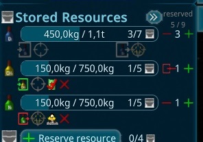
In the morning i started improving the Create Transport Task popup. Adding the From and To entity and showing some details to it.
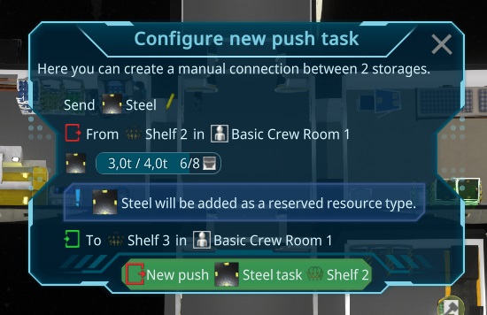
Than i added support for the other interior items. Due to the task have to know the state of the interior item container its restricted to add FROM the interior item to the storage. Otherwise the person will do it for each gramm produced e.g. in the generator and walking all the time.
I started to check for bugs from older versions. One main Painpoint in many playtests were the private rooms. Till now the rooms get automaticaly private if a resident is assigned to it. This also blocks non residents from using e.g. the eating table in the room, letting them die. The players didn't get that concept, so i decided to change it, so the player have to set a room separate as a private room. Till now there is no need for it, maybe later persons require their "own" private room.
I also finished the news article about the last update:
https://store.steampowered.com/news/app/1638030/view/3993070504830812676
After that i start thinking about the transport mechanism. It would be very useful to setup hard connections between storages, besides the auto configuration. As an UI, i will use the PiMenu. So rightclick on a target while having a storage selected will show create connection items there. I started to do that today, but i guess i also need the day tomorrow for the fine tuning. I could finish the basic part where the person is doing the created task. Here the UI for it.
After a longer weekend due to a family incedent, i started to fix the tests. There were some small but hard to debug bugs i fixed. Than i thought about solutions for the gamedesign problems, like storage connections and private rooms.
I tried an release but got several release specific errors, that took a longer time to fix..
I could finish the release, its available on the latest stage branch for now. The next days i will promote it to the default branch.
I also finalized the article for the 2023 summary.
https://store.steampowered.com/news/app/1638030/view/3993070504830800555
I worked more on the Achievements today. Adding more Rules like checking the Ship data or restrict by GameTime. I also make the Primary Objectives to Achievements, also causing some special UI handling. I also added other polishings like a progress bar for the total achievements reached and a hint why they are not counting (e.g. due to cheats are enabled, or started a sandbox game). I could finish the first bunch of achievements with the logic behind. Its now 18 Achievements.
First of all, sry for the long queitness, but we got another decease. But happy to year!
After that long pause, i refactored the Rules system, so its easier to extend and more performant for many rules. Its now completely jobified and runs in paralell to the rest of the game. Due to there will be many achievements, this should be valuable.
There is now also a "Close To" feature for the Achievements, so they will show their PlayerTask when they are close to be finished. The main usage for now is for the starting Crafting task, to lead the player to do that. To make this work, i created a global statistic system to keep track of that data inside of a game.
I also added the Achievement Popup to the Mainmenu, and storing the state in the config. Somewhen i plan to add it to the server, so its updating each login and can't be changed so easy.
I also added categories and colored them. The background is now always at the achievement, so its easier visible, that the achievement is meant everywhere in the ui. The generator is also adapted and shows e.g. this.
I started to make storages configurable when they are not finished. The weekend i go to somewhere, so i will not have so much time again. Hope i find after that finaly some time to work more.
I also worked more on the new achievement system. The old one used gameobjects and was done in a very early stage of development. I improved my coding skills in the last years and used entities now. It reuses most of the things of the PrimaryObjectives and just have some specials. It went pretty fast that way. I created UI, Tasks and all basics for it.
I found the new Craft Element so nice and useful, that i decided to make it more generic to be used for the other interior items also. To make it easier to use, i will make it toggleable for the other interior items, so you can decide, what you want to see. I also added problems and the productivity to it and improved the icon that is shown.
I also added a basic storage overlay, showing the resources and the bar around shows the filling state.
It can be enabled via the PiMenu or in the selection Panel. It also reflects the error/warning state now, to make more clear when there is a problem.
Beside adding the door state i use also the main changing need of a service interior item for the progress circle.
In the end of the day i also added the state of supplyship and dockingport to the progress bar.
I worked on the logic for the energency cabinet. It was a bit tricky, due to it should just be availabel to the slots, but in the end i found a good solution for it.
In the morning i created the Model and UI effects for the Emergency Cabinet i started some time ago. It contains O2 and CO2 for the O2Mask and FireExtinguishers. It just needs one wall area, so it can be added to all rooms without big space usage.
Today i continued working on the Battery Logic. Its in a state where it works so far, but the player has to change between charge and uncharge mode. I plan to add somehow an auto switching mode, but i will first keep this for the player. Maybe i do some automation options later, e.g. with special interior items like "server" where this could be setup.
To make the development faster, i also added easier cheats. Till now i used always the mousewheel for changing the resources, now its working also with the mousebuttons. With left mouse its set to max, right to min and middle to the target.
I also worked more on the simulation, to prevent too many useless warnings due to some rounding errors and restructured the user updates for that.
Than i created the Model and painting for the new battery.
In the afternoon i added the fill state to the model and also added some leds that are on when the battery is used.
Still not recovered well, so i just added the environmental factors and effects also to the preview for interior items.
I played again around with batteries as a new feature and tried out some ideas, but all not working well so far.
After another week of another disease, i started to fix some bugs with the history. This time i created some tests for it and hope to catch more problems with that part. It took a longer time to finish this as expected, but now it looks working very well.
Than i worked on the test idea i had. I have now a folder with savegames, that are just loaded to make sure the special situations are tested that happened there, without much effort to reproduce in a special test. It also tests the migration paths
After some smaller fixes i wanted to move the tutorial avatar element more closer to the element, to hint it more clear. This took a bit of effort in reconstructing the Tooltip calculations, so i can reuse it easier.
I also created some basic Help text for Storage Management and Residents. I realy like the images inside of the text, it brings way nicer understanding of the content. I also added more Images like for the SlotItems and Keys.
To make the Private Room Concept more clear, i also added a tooltip to the Add Residence and removed the old method to assign them.
After all of that i found more bugs in the simulation, seems a never ending story. This time due to the update in the last iteration, 2 power producers updating each other back and forth, keeping in a close to endless loop.
Yesterday there was an incedent with a cristmastree killing the power in our serverroom. It's fixed now so the servers are back online.
There is a feature where players can change the text. Till now i just send the whole data, what makes it hard for me to update, so from the next version, its just ending a dif to the versions original text, so only the changed text is send. I created a small patch tool, to see and update fast the wanted changes.
I also tried to make the thermal system easier to understand. As a start i wanted to add images to the Help text. To make this easy work i finally added support for images in the I18n text. To make it more clear, i split the HeatEnergy into Temperature (in shipsection) and Cooling Pipe (in ship),
I also worked on a very annoying bug where in a special case the person will not fill a construction site, instead grab and put the resourcebox back to the shelf.
Afterwards i improved the ui for the calculation of interior items. Its now way better visible where problems are. I hope new players focus on the important parts now.
I also readded the recipes for the Interior Item Popop, so its clear what the items will do. For a special case, the crafting interior items got a separate rendering, to make it easier to see what they can craft.
At another playtest i finally found the reason of the broken customer. It was related to the updates of the energy when the energy depleted. That update was not passed to the interior item so it turned directly off when it should start. When i already worked on that part, i thought about implementing a new energy system. All in all it all looks very complicated. So instead of that i changed the simulation, so the new task priority of the interior item is now one point to decide what is turned on or off first.
Besides many small bugfixes and improvements i added a switch recipe to the pi menu.
Another feature i added is a repeat feature for the crafting queue. In the playtest i found that would be useful to prevent adding lots of photovoltaic panels to craft, instead can now just add 1 and press the repeat button.
Than i started to work on the bigger issues, like boxes were not updated in the first frame, or the global history seems not correct.
Today i made another playtest and found just smaller things again. The bigger bug with activities i was able to debug a bit, but still not clear what happens there. I fixed several
In the morning i created a Crafting Icon showing up above the interior items that craft something. I created a custom element to show the state in a circle.
Than i worked on the licenses. The first thing was to improve the license view to make it easier to understand the license models. Its showing now the current and the possible others including the features.
I created more Restriction Labels and added make the interior items restrictions to the license, to prepare for the public beta.
I also worked on the special event problems and added more details to the HighHumidity Event.
I worked on the sideMenu and hide it in special cases to make it less annoying. I also worked on some Overlays and readded the "show connections on selection" feature.
Today i started with some smaller fixes i found. I improved the help system for the fire, so its easier to understand for new players.
Than i worked on the PrimaryObjectives. They are now shown as PlayerTasks at the side and can be removed if not wanted by the player.
Than i did all the pi menu updates like the for changing the door state, opening supply popups or changing the uniform of persons.
After a longer sickness im slowly starting up the development again. After the main fixes i finaly did an release with the new gameplay. Hope you enjoy it.
https://store.steampowered.com/news/app/1638030/view/3869216984206186661
Today i did another longer playtest and it feels way better than before. I run out of money very early, so that i will quick balance this bit better. Besides that 2 bigger bugs i have to fix before the release, but the rest looked pretty good so far. Also the new Tranporting mechanism starts too early, so persons are very busy moving just several gramms out of an interior item, when there is nothing else to do. For that i have also find a solution, it impacts the overall performance. But in general with a crew of 15 persons it still had good fps and run with 2h/s.
Today i also started to get sick, so propably less updates over the next days... I did an release for the test release to the test branches, so feel free to try it out
Today i started with the configuration of the supply data beside some bugfixes. So now there can be for each difficulty different supply values. The major part will be restricting higher level resource types to buy from earth. Also to create less items so the crafting is getting more important than before. Some interior items can't be bought at all, so from earth there will be just the basic things. I did a starting setup, need to see how it plays with it. I guess this has to be iterated several times, maybe i made this customizable, so you can also play with it around and suggest good setups.
I also tried to update the tutorial. I think the old tutorial took too long, explaining things, that should not be needed at the start. So the new idea is to have a minimum tutorial, showing only the basics and do the rest with kind of an interactive help system. Something like if the O2 goes down too much, it shows a quick tutorial for that purpose.
I started with some improvements of the PiMenu and the Recipe choosing. Its now showing also the current one in the numbers and supports rightclick where its unqueue the item. The room menu item was outdated, so i improved it. It now directly start placing a room and includes filters for the blueprints, with a quickfilter for the choosen icon.
After polishing that part, i also added the total amount in the ship for the interior items to the menu, so its easier to see.
The planned change took way longer than i expected, but i think it improved the gampelay a lot. I did another playtest and it looks way nicer to play now. As after every playtest, i found several things i want to improve, but its going to the right direction.
I traced a very annoying bug. It looks just in the compiled game, the tool belt was not shown. In the editor everything worked perfect. First i thought its something with the hashes, but it turned out, it was some caching problem in the race data.
I fixed some issues with the latest changes and added the game won feature to the new Primary objectives. After that i created some new Icons for the objectives, and for the Credits.
Than i added the current values to the UI, so its always visible.
I want to work now more with the Credits i have added 3 years ago. The idea was to try it out over time and find a good cost balance, but this failed, due to it was no need to work with it. Now i setup the cost as a difficulty parameter and add rewards for the tasks for it. So fulfilling them will increase the credits you will have with the governance on earth. I added it to a first class citicen to the UI at the top. As usual, the known features like history and so on are working.
I started with the sucessful objective popup. To not interupt the player, i added a PlayerTask (upper right corner) for that.
When clicking on that, it shows up the new overview and a text for it.
To add the feature, that the more advanced tasks can be added when lower task levels are done, i also added a special support for level 0 tasks and updated the ui for it.
While trying to add the I18n for the new values, i found some problems with the Translator and in general the plugin system using without having a playing game in the editor. This took very long till i figured out how to use ecs in the editor.
In the morning i started to create the new Game Setup mechanism for the different game modes that are comming along with the story. I got very early feedback, that it has to have a sandbox mode, so this was necessary for it. I created a ui for it with a new button type and adapted the game start to a more generic mechanism where it is possible to setup intro, tutorial and more details if needed.
Afterwards i started implementing the rules for the objectives. So e.g. that it calculates the amount of persons in the ship and change the state and fire events when its done.
In this iteration, i just want to do the basics for it and start in the next one with the other content, events and achievements. So i was also able to add some rewards today. Here an example:
Tomorrow i will polish all of that, e.g. creating an icon for the Credits, maybe showing it in the ui and so on. Also i will prevent showing too many things at start, so there will be rewards like "new ResourceType".
Today i started fixing several small things and also added an easy way to update my I18n values very fast. I also found another popup with Resources in the new Storage Panel, where resources can be reserved and updated that also to the new Design. It also shows now the already managed items, to not confuse the player too much.
I also added the Slots to the Person Overview, so it's directly visible, who is carry what.
In the end of the day i worked on some game design ideas to the new Story part. The result is now that will completely remake the old achievement part, what was kind of the storyline. I will implement a rules system with ECS this time.
I give all Interior Item activities now a specific noise and some a effect on their productivity. Than i also show the noise in the activity overview, so its more obvious whats happening. It might sounds strange, but i added just now a neutral color to the value labels. I also had an idea for a nicer layout of these panels and implemented it.
To create faster the blueprints i need, i added a cheat for destroy an interior item (ctrl plus buttonclick). I also had an idea to improve the interaction speed, by adding kind of a contextmenu to the items. Due to i have already the pimenu, i will use the piMenu for that.
While doing so, i also added the double confirm feature for it, and restructured the code for the pimenu, so its easier to use.
In the end i thought it could look nice when i add the design from the morning also to the pimenu items, to increase the buttons. Here the result:
After fixing some smaller issues in the morning, i also changed the transport amount. Persons can now carry up to half a box, doesn't matter how heavy it is. It way very annoying otherwise when unloading e.g. a lot of steel from the dock.
Than i concentrated on the Game speed. Some time ago i set the use of the 1-9 keys to the speed settings and found some not so convenient behavior i fixed now and also in special situations, the timewarp wasnt stop when pressing space.
Than i refactored a bit to prepare for the new shuttle system. While doing so, i added the current setup to the panel, so its easy to see when there is already a setup.
While improving other things i found, i thought it would be nice, if the interior item hitns are also scaling depending on the camera distance, so i adapted that also. Its now a simple generic method, so i can add this to all world elements where its needed without much effort.
Next i found that just clicking on the resource line in the supplyship should also increase it, so the buttons are optional. With rightclick it will reduce the amount. In the end of the day i added the delta feature to the earth supply, so its now increasing over time. Next step tomorrow will be makeing this more configurable and thinking how to change that also over time with some events.
I found the search bar too plain and added a regular styling to it, so players will recognise it now. It also has a clear function when a text is added.
Than i wanted to improve the Recipe Choosing for the Workbench. I thought to add a table there similar as in the Supply popup from yesterday, but i wanted the side categories like at the Interior View. I moved that logic out and enhanced it and improved the table again, to support categories in an easy way now.
Than i updated the panel, that i originaly wanted to improve. Here the new Recipe Choosing. With that features it was than easy to add also the duration and the recipe details to the table, so its now fast visible what will be crafted.
I added also a bit more interaction to them, so its showing how many of each thing is queued and selecting the current recipe.
Today i worked the whole day on the new Supply Popup. Got many troubles with the tables but in the end everything works as expected.
After fixing some smaller issues i improved the tooltip design. It can now have a separated Headline, similar to the Selection Panels.
While thinking how to update the resupply popup i found a multi column list view from unity, what is actualy a tableview, what i searched a longer time. First it looked pretty fine and working, but when trying some details i figured out that its completely not working as i need it to. The sorting of the headers is nice, but i was not able to turn it off, the sizes of the cells are not automaticaly sized well, and in general, nothing what i realy need worked well... The api is also hard to use, so i decided to build my own one... Took a bit time, but in the end i'm pretty happy with the result. I already migrated my old editor tables and tomorrow i will add it to the game ui.
Today i started improving the interior item activities to support multiple recipes also for non crafting interior items. The plan is to have just a "gas releaser" what the player can switch the recipes. Later i will use this also for other interior items like smelting can process garbage iron or iron ore.
While working and testing the Recipies i found it a bit strange, that a cancel not changing it directly to the next state. I changed the state machine there, what had lots of other implications i had to update.
After everything was working as i want, i had another idea to improve the ui. The old status will me merged with the recipe feature. You see already the final pictures above.
Today i want to visualize the Noise. First i have to make sure its easy calculatable where the noise come frome, so i added also a noise container to the interior items. As visual, i just added it at the side. I'm not sure what to use as a unit, due to db is a non linear scale. I played a bit around and i will use internal μPa for the calculations and show dB to the user. After it worked, it looked very annoying, as expected the logarithm scale is not easy to visualize and understand. E.g. an item with 50dB and an item with 60dB result in 62.4dB. This is physicaly correct, but i think not a good gameplay. So i switched back to percent.
Than i worked on the edit room overlay. It should make very clear to the user what are the implications of the drop. First i need to show the current room environment panel. It shows all environments, that shows all related environmental changes. It just shows the possible values before and after. The green marker is just the basic value of the interior items without active activities. I think its pretty self explaining, but need to wait for player feedback for it.
Than i readded the worldElements of the interiors. They should show the activity impacts. E.g. adding an interior item that makes noise next to a bed should show that the bed will not work as good as before. It took a bit longer than expected, but i could add also the UI for the changes of the interior item panels. It's also showing the stats for the new Dropped Iterior Item at the top, where i maybe add more details or hints later.
After fixing last issues with the new Interaction System from yesterday, i started with the new Environment Effects. I use ResourceContainers for them, so it also all their features like a history. The basic implementation was pretty easy and its now added as a part of the room. Interior items can effect them when they are finished, e.g. for Appearance Environment value (what i will add later) or when they are active. E.g. the Small table will add a small noise to the room when someone is eating. This also makes it better to have more private residencies, with less people in.
Afterwards i added the UI for the Processing. It should make it clear why the efficiency goes down, or the item can't operate. Hope with that UI its clear enough.
In the end of the day i added the thoughts when stopping a task with a customer. In this sample, he is annoyed by get woken up from loud noise.
To work on the new Gameplay, i first improved the Interior Items Menu. Due to it will be used with all items now, it has to get a search bar and nicer category structure. To make it even easier to find things, i added main categories around the categories and structured them better. They also have now a fix priority, showing in a better order.
Than i start updating the interior dropping. The 2. step when creating a room is removed and replaced with a general interior dropping in all rooms. If placing it in a non finished room, it removes the "construction view" and show like it is finished as before in the 2. step, to make it easier to place it there.
I polished this feature make the rotation nicer, so the position stays over different rooms. In the end of the day i started to work on a small but useful feature what could be very annoying, specialy for new players. When adding a new room but the original one didn't had a door, it was a bit annoying to place that by hand. I added a popup to ask to automaticaly add that missing door.
Next iteration is the plan to add a storyline and improve the gameplay with the new mechanics. After playing a bit, i found the starting ship limits the start possibilities a lot. I decided to srink the crew room, even when the shower will not fit yet. This should just go on the persons mood and the player will build a proper crew room soon. Due to many players left the game after the timewarp, i think to explain that transporting is too early. So the new one base satelite will be more "friendly" and instead adding some interactive helps when this happens in the game.
After playing more around with it, i had some trouble what to do next. So i structured the current and planned things in a big matrix and found, that i already have a lot of items in the game, even for the basic needs. I plan to structure everything in different levels, to get kind of a development tree.
Another issue i found was, that it is too difficult to fast construct things. Everything need differnt rooms and it took long and its a bit difficult to get to a nice state. Maybe ill remove the room types completely and add the planned environmental factors instead. The question is, what is the need for different rooms. Its privacy for persons, i added with the residence. Than we have noise, smell, Aestetics and cleanliness. To make sure the pause room is separated, only noice is realy needed. As panalties, i can think of two ways. One would be negative thoughts, the other will be efficiency. Maybe i add both, due to both is not that hard in the current code to implement. Smell is in general nice to force the separation of sections later and aestatics i guess is most for the crew rooms or when adding a general new person need. Cleanliness can be nice to add when the infamery gets more use, adding disieses, other health problems, pandemics and so on. So i will start with noise only.
So instead of doing a linear storyline i want to give more freedom to the player. I try to not restrict something story based, just give with some events and a bit storyline, changing the resupply or other factors. The main "Story" will be more the big task "colonizing another planet" i broke down to subtasks the player has to fulfill. Each of them will get different levels with different targets to fulfill. They will be Crew (amount and people related things on the ship), Autonomy (create enough resources by yourself), Colony Preparation (DNA databases, Cryo capsules and so on) and Flight preparations to the next planet (containing enough engines, shields and fuel). If all of them are fulfilled, the player can start the ship. What he is doing first depends on the player. Maybe i'll add some rewards for the levels, like a 2. supplyship or more resources, due to you provee, that it can be a success.
The playtest was fun, but it was still needed to add priorities. To make it easy, i added it to the Interior item itself, adjusting all the needed tasks. The old behavior is now at normal priority. At normal, they will start at around 60% to fill, empty or maintain. At low this goes down to around 40% and the lowest its at 10% Increasing it to very high will trigger the fill behavior for each percent.
I also added a simple behavior for the garbage disposal, without an animation. It's anyway just for solving special cases. Now i think all interior items are converted to the new storage logic.
Than i did a release, and found a bug in my server i wanted to fix. But the CI wasn't working anymore, so i needed also to fix Jenkins.
https://store.steampowered.com/news/app/1638030/view/3799410012383068805
The Pi Menu was not ideal anymore. Especialy for the large storage in next to the Dock. I decided to do the planned grouping feature now to fix that. It was faster than expected and works very well already.
I adapted the filter logic and a lot of filter logic could be removed. I should have added that grouping feature earlier.
I also found that game looks way nicer if played with a constant speed instead of just timewarping from one event to another, like i was used to do it. Especialy if more persons moving around. To make this better usable, i used now the 1-9 buttons to setup directly to the different speeds. I like the 3 where it goes to 1h/s, especialy when multiple persons moving around and doing things.
I found it a bit annoying, that on smaller scale the construciton bars are hiding. I did this due to they were overlapping. To fix this i had another idea to just scale them. Its now way nicer and is visible from close to far away distances.
In the end of the day i fixed some bugs and polished the last parts of this iteration.!
After enhancing the unity editor a bit with easier changable resource amounts, i added more convenient fuctions like a timewarp for the Storages. It timewarps to the end of the transport tasks, what was a very annoying part in my playtest.
I also added an overlay for the Task itself, so its not so confusing when in and outs are used at the same time.
The Mass Balancer has also been updated to the new Systems and working now with the same feature set.
I fixed the missions and updated the problem icon more smart, so it turns to a warning, when there is not assigned working tasks, and shows no probems, when a person is already delivering the needed resource. It shows now also all problems of the construction, so if two resources are missing, it shows both.
I also updated the construction Storate UI, so its now a similar style than the normal storage, showing all the features there including tasks assignment and problems.
I readded the Construction Priority feature for the Transport Tasks its now also using the Construction Priority including pause mode. So it respects your priority wish.
Than i updated the DockingPort UI. To make it look nicer on many resources, i added support for singleLine for the elements. They all share now the same element what worked pretty well so far.
Here an example for the shuttlebays unloading procedure.
Due to i have already aligned most of the ResourceContainer usages, i also updated the ones inside an Processing. They now show the same line as the others. To make it easier to see what is in and out, i improved the storage ui again, so input is always at the left side, output at the right
To still gain more details and infos if needed, i added an task tooltip for the new and the old elements.
I did a small playtest in the morning to check how the game plays now. For my feeling its way easier to use the storages, besides a few features are i have to add, like force empty or create manual transport tasks. Besides that no big crashes, most of it smaller problems. It feels the big update is finishing soon.
In the end of the day, i added also a force empty button to the non managed resources. In my playtest i had a lot of times the problem that some resources just added to the storages, so i had to empty them first. Now this can be done without managing the reosurce first.
To make the start easier and update the tutorial, i added a waterbox to the engine room. The accessible tutorial has been replaced by a new tutorial, showing how to setup an input storage.
I did a small playtest in the weekend fixing some bugs and found, that the simulation speed is much better than before! It was also too easy, due to its directly moving water directly now from the dehumidifier to the drinking water. So i thought to set interior items to default only in room and maybe fix that in later iterations. This should also prevent by default, that persons moving through the whole ship to fill interior items. Storages will stay with the "from everywhere" setup.
The main Part of the huge change is done, so today i focused on updating the rest of the game like blueprints, help system and the tutorials. Also a lot of other polishing had to be done.
After doing some planned polishings, i found a strange behavior of the Transport. If i enable the wanted input of 2 storages, the person moves resources back and forth all the time. I thought about it and came to a solution, where its best to setup a "storage to storage" option, so each storage can be setup with "Wants fill" "default" or "wants empty", to prevent this behavior, what is a similar behavior than the in/out storage before, just on resource level.
Besides that i did several polishings, migrations, tests and fixes for the new logic. Took time till it is smooth again...
After rethinking the entire resource srinking, i came to the conclusion, that the old boxes looked way nicer, so i will keep them and find other ways later to visualize them at the persons. Maybe i just srink the boxes like in the other games.
So i want to keep the following resource storages now:
A 1x1 storage, with just 1 box (as before)
The new Shelf but with 3x3 boxes. I finished the painting and its using now 1x2 blocked and 1x2 walking tiles.
And a large stacked storage with lot of space just put everything on the ground. It needs 2x3 tiles and will stack 2 high. It needs walking space on both sides to reach everything.
After i finished the visuals i started with another feature of the new storages. To achieve a similar mechanis than before, i will show for managed resources the input and output tasks, so the persons will try to fill or empty the container with resources from somewhere else. I found a nice place for it below the stored resources and implemented it. I was supprised that i could reuse an already added feature and could implement this in notime.
To make the storages look more clean, i implemented also a grouping algorithm. So the storages define storage groups to the slots. This means, they try to stack similar boxes and use free space for different resourceTypes first. So if the 3x3 storage is filled with 3 resource types reserving 3 kind of resources, they never overlap and its always good visible whats in the storage.
The implementation worked, but was a bit expensive, so i just optimized several things, now it's doing the calculation heavy things only when its realy needed, so most of the time it's just checking for changes in the visuals.
In the morning i made the rest of the tests green. After that long time working now on deep simulation stuff i decided to make a day break from it by doing the new visuals for that systems. As explained a few days ago, the resourceboxes will srink, so they and the resource storages get a new design.
The Box size is now half of the original one, so it contains just 1/8 of the resources than before. The boxes are now small enough to carry it at once, so i will change the transport amount of the person to exactly 1 box maximum instead of weight based, to make it also easier to understand.
I thought long what storage kinds i should add and than just started with a shelf. I craeted the model (without painting yet) and played a bit around with it.
I'm still not happy with it, due to it looks wrong. I checked a bit other games and found that they change the size depending in what storage they are. I played them long and didn't realize. Maybe i adapt that idea.
I started to create a Test System to have fast and easy automated tests for the new container logic. It can run some tests on the simulation only, without any visuals or game initialisation. I hope to faster develop the new logic with it and find most of the bugs with it.
The rest of the day i worked on the tests to make them work with the new system and fixing bugs i found with them. With the tests on the new system i fond also very rare issues of the old systems. All in all very useful and i have the feeling it gets to a good state soon.
I worked a lot on the algorithm to update the targets of the resource containers. Its was improtant to find a performant way, due to i think its the most used algorithm on high simulation speeds and could cause performance problems if it's not done fast enough.
While working on it i wanted to add easy tests, what makes the current systems a bit difficult. To improve that i refactored now the task and resource container system to support easy sync usage. Before that wasn't possible due to the dynamic added resourceboxes inside the simulation. After this specialcase is removed now, it was possible.
After fixing some bugs, i found that its time to make the pathchecks being extremely easy and fast. To do so, i added a Section Connection Detection System, that can precalculate if 2 items are connected.
While testing i found that it would be nice to have also the input controlled, so i readded that feature also with the new logic. I guess i should hide i it for some cases where it not makes sense later.
I also added a highlight to the current connection, so its more obvious what connection is choosen. It was useful for debugging, but i think also for the players this brings more overview.
I started to improve the Task findings, so now its possible to see more next tasks of the person.
Also the overlay part has been migrated, showing now the first good target options for a task. I will add a highlight for the used one later too.
Than i continued with the storage settings and make them working in the blueprints. I also added a migration for the old blueprints, so they will still work similar as before.
The next topic was to make the container tasks more flexible. So now i have automatic balance tasks, that switch their type if needed. This is used for most of the resource containers in the interior items, that are used for the interior items. Now its possible to attach multiple, so the storage get an empty and a fill one at the same time. This makes it possible, that players can define a priority for them too to make them filled by persons like the other interior item ones.
The change that the containers now have multiple tasks caused some troubles and i refactored the transport mechanism again. The code get easier and easier every time i work on it.
To make the progress and debugging faster, i started in the morning with the new visualisation. Before all resource containers were simulation entities, now they are just for visualization and created and destroyed on demand. This makes it way easier to deal with them in a separate high performance system.
Instead of the filtering, it will be a reserved amount of the a resourcetype the player can add. Its showing the current fill state including the boxes and maximum boxes.
After that i created the ui for the new storage element. It's completely different and way simpler now. If there is space for generic Boxes, the last row is also added, where you can add reserved units like steel in the screenshot. In addition to that, you can setup the reserved boxes for each resource type, so its easy to use one storage in a very complex room now. Please ignore the Resourcecontainers on the top i will remove them when i finished. The Automatic tasks, are also merged here if possible to the upper layout, so its directly visible.
Than i worked on more findings i had while testing with the new systems and maybe found the problem of a very annoying rounding issue in the simulation. It was a lot and i hope to got all places now and didn't add more bugs related to that.
While working on the bugfixes i realized, that i'm throwing a lot of logic away and rethought if its realy the best aproach, when i anyway redo so much stuff.
So the new Idea is to completely remove the resource Boxes from the simulation. They will be replace by half the size visual only boxes. That will make it possible for me to improve the simulation even more and also make storages much easier. The storages than just get resource containers as the other items, just get a special "All Resources" or filtered one instead of a fix one. The boxes than shown stacked on the ground or in a shelf and also as a backpack when carried by persons, to visualize that also easier. Later i might add autonomic robots that can transport the things like before.
I don't know the final size of the boxes yet, now the box is a 80cm cube, maybe 50cm can be nice, to be stacked 4x2 to one tile on the floor, similar as now the cooked food box. This also makes it easier to just "stack" the resources for construction sites and make it easy to visualize them. Maybe show also with construction resources the needed amount, so its pretty obvious on the first view how much is missing.
This makes it also possible to add completely new kind of storages, like easy shelfs that are not taking much space up to just throw things on the floor shelfs, where it takes longer to grab them, or automated storage machines, storing a lot of things and be very fast placing and grabbing them.
To fix some logical issues, to have 1 small shuttlebay box, i will improve this part by using component-boxes like for the rooms. So there will be a 2. level of resource types for example like "Liquid Tubes" "Pump" and "Steel-Parts" that are needed to e.g. build a Toilet. So its not longer needed to construct separate item boxes and carry small parts of it arround. The persons will than grab 1 box instead of just 20kg of it, what also makes things easier.
In total this is a huge change again, what i wanted to avoid to keep the timeline, but i think its worth it to get the transporting system smooth powerful and better visualized. I guess i will take 1-2 weeks for all of that.
I started to work on the transport tasks again. It's getting easier and easier each time i work on it. I could turn the logic of the balance tasks around, so its now changing the task type, to directly say what needs to be done.
Than i started with a huge task for today, changing the construction logic to use containers instead of storages, so persons have to move the resources by themselfs. This makes it now more difficult to build far away rooms and makes it more necessary to optimize the routings for that. It took the whole day to migrate to that new concept but it looks working fine now.
Today i still worked on the migration to use tasks where ever it makes sense. It took a bit time to cover all edge cases, hope i got all of them now. The 2 expensive checkFor methods are now finaly removed, this should speed up the simulation speed for larger ships a lot. More and more special cases are removed and the code get much cleaner. I could finish the basic migrations like for working, services and missions and will start tomorrow with the larger migrations like for the transporting system.
Today i started with bigger refactorings related to workers and customer (service like toilet). Its now all task based and should increase the performance in ships with many persons. Its one of the most complex parts of the game, so it took some time to get it work with the new system.
I added a debugging panel for the Tasks of the persons. Maybe i will publish it after some polishing, so players can see the next tasks of the person.
In the end of the day i struggled a bit with the struct only approach i need in jobs but fund an elegant way to surround this problem. All in all it took way longer than expected, but still good progress today.
While fixing some bugs in the morning i came to some thoughts to refactor the game logic related to the storages.
One major problem i saw in the last playtests was that it was not easy for the players to figure out why an interior item can't be filled. Currently its done depending on the other storages and their settings. Another problem i faced in my playtest was, that the storages got irrelevant for me and i just had 2 big storages with tons of things in. I played close to the end and just used 1 or to storage connections.
So in general i thought to demote the storages, to get a better and easier understandable gameplay. The idea is now to focus more on the Tasks and show them directly to the player, so he can understand whats up. So all resource movements will be now done by persons. The moving resource boxes will be outdated, due to it makes it too easy in big ships to do balancing, and also makes the setup very complicated. Maybe i will add autonomic robots later, that doing this again.
To keep the emergency storage feature, i will add some "Resource Usable Settings", defining what the resources inside of this storage can be used for. This can be 2 things. First are balance tasks, so e.g. the O2 Releaser needs to be filled. The setting is now only for the output, so it can restrict the usage for others. The second usage will be for person slot filling, so e.g. to use for the Tool belt. By default it will be setup for "Everywhere" and "Allowed for Slots".
To promote the tasks i will add them to any selection Panel like you see in the sketchup below. I plan to add a priority, so they can be changed that e.g. the O2 releasers get priority when a person wants to empty their slot. As before it will first search in the current room, than in the section and if nothing found, than in the whole ship.
To make these things possible, i have to adjust several things in the game, what i have started today.
In the morning i worked on the server. After the release yesterday i figured out, that the unregister button for the newsletter on the webpage is not working. Turns out another annoying spring behavior, not telling me, that the things what i did are not persisted in the database... But it was just this single item.
Cleaning everything up a bit and fixing small isuses.
After that i did a playtest by myself, and no bigger issues preventing to continue, but a lot of small ones i have to fix. I played close to 2h and besides that the story part is the next topic i didn't find big problems. In the end i expanded too fast and got trouble maintaining everything good enough, due to the humidity raised too much and than circling between the problems. In total around 40 new things on my task list, sucessful test 🙂
I got a bit unmotivated to just do the help system over so many days now, so i added another topic in the middle. I want to collect more feedback and added some questions when a game is stopped. Its also replacing the other Feedback screen, when alt+F4 from the Game itself.
I also updated the steam page, by adding translations for other languages. I read somewhere that it helps the visibility, so i added german, japanese, spanish, chinese, france, russian and corean. I still need someone that can check the france, russian and korean language, so if you are a native speaker of that, it would be cool to get your feedback!
Than i improved the special Event panels and added the related problem Elements there too, so its easy accessable.
I also released a new Version today, so tomorrow i hope to start with more beta tests.
https://store.steampowered.com/news/app/1638030/view/5321624234775905339
Today i started with the main reason for that big problem help topic. Showing the player how to deal with fire and help him to prevent that in the future.
I also migrated several other Problems to the new System with some basic helps. Hope its helping new players what to do if they can't figure it out.
Today i worked more on the implementation of the new Help system, making it easier to use to add a lot of them very fast in the future. It was a short working day, so not so much done today.
To make the errors easy available everywhere, i added them to all selectable items to the upper right of the selection panel and moved the other things down.
I worked on the next Help for the Empty container and found out, that its way more complex than i expected, but i think it's necessary for new players to have this kind of help.
The vacation got canceled, so i had some time to work on the new Interactive Help. After thinking a longer time for a good procedure, i added it to the Problems. Till now, there was just a big text with solutions at the problems. Clicking on a problem now opens a big popup with more details, including some interactive helps.
I might also show these mitigations at other positions, but first i will refactor the old problems to them. The mitigation help should directly show the player a situation based help where to click it, to solve the problem.
The rest of the day i spend with annoying bugfixes in Unity, the ui just disappeared without any obvious reasons... Still not fixed it looks like a unity bug again...
Tomorrow i will have three days off, so i will not start a bigger topic today. I just started with the Fire extinguisher holder model. Due to many games end with problems with fire and no CO2 is available, i will add a special interior, what can be build at the walls of rooms. There CO2 will be filled and it can be used by the persons with an fire extinguisher.
After i added it, i thought it might be also useful to add the Oxygen masks, due to its highly recommanded to wear them to prevent unconciousness of all crew members. So i also added them to the model.
I finalized the models of the new Slot-Visuals (just rough painted yet)
Than i focused on the code, due to the persons will not carry e.g. oxygen mask all the time, i want to prevent the rendering of the models all the time. To make this possible, i created a system, that checks if it should wear it and if its changing the person model instead.
After that i finished the Painting of the Slot Models for males.
Than all of them needed to be done again for the Female version. It was way faster than expected, due to i was able to reuse the paintings and just adjust the models a bit to the female one. Not even a new rig was needed.
I released a new version hand had again troubles with the new unity version. I improved the build system again to get it more stable.
After analysing some playtests that didn't rate so well, it looks like they had all problems with fire. I guess it's not clear why the fire break out and how to solve that. I have to add a proper help for it and improve that part. But today i focused on more on the Person Visuals, and created a basic Oxygen Mask, Fire extinguisher and a Tool belt.
To make the new Uniform usable, i added some prepared roles assigning some basic colors. But its also possible to switch it to casual or a uniform with a custom color if the player wants. Its available at a new edit button in the person selection. By default its setup to assistent.
The rest of the day i spend analysing the reports from the last week and do things i saw on the last playtests. Many small things, but all have to be done.
I also analysed a very annoying crash, happening at the first time, for many players. It looked like its just when an exception was thrown before, but i couldn't reproduce it a longer time now. But now i found it, the crash at new game happens, when the player pressed the mainmenu button of the exception popup before.
Today i finished the Male Uniform. It was a bit tricky to find a new out how to get a nice looking and need several tries to get an acceptable result. The Color can be adjusted, so it can adjust to a crew class, to make it easier for the player to detect the different responsibilities.
The female version was than streight forward and took not so much time.
After a longer vaccation i restarted checking the reports from some players and fixed some bugs. Due to most of them were related to already fixed ones, i decided to release a new version. I still plan to add more features before a bigger release, so its just a patch version for now.
I planned a bit this iteration, so the plan for this iteration will be improving the persons in several things. I started with the uniforms and tried to figure out how to create custom cloths for the persons by myself. I finally want to have a nice uniform for them and i will also add kind of roles for them, that you can assign that get a different clothing and colors, maybe also batches for the skill levels. Than i might also have the chanche to add tools belt, the oxygen mask and visually
I worked on the first really planned ticket of this iteration. The Persons should get more attention and should be easier to manage. To do so, i added big person icons in the lower right of the screen. Its showing the current Activity and problems of the person and you can select the person there directly.
It will also adjust the size, so on huge ships with a lot of persons, it will decrease them.
After that i worked on a feature, that was requested a longer time ago: Edge scrolling, so when the player moves the mouse to the edge of the game window it should start scrolling. I implemented also as further you come to the edge, as faster the scroll is and its configurable in the options. Its not doing anything over the menu, to prevent its happening when the user don't want, and has a small delay, so it just starts when the curser is not moved some milliseconds, to prevent scrolling when moving the mouse to a ui element in the edge area. Personaly i'm not using these features in games, hope to get some feedback on it, for me it feels fine so far
This evening we are going to a short vaccation, so i searched for more smaller tasks to do and found the mute on blur in the audio station what i did. I also updated some ui elements i forgot and did other smaller things.
I worked on more migrating the old css design to the new design where i use my own drawers. I had some ideas to reduce the complexity and got a pretty nice implementation for it. It behaves now as a the regular css and in the code its just one "AddSupportDrawer()" call. From there on i have the full css support of the drawers and can setup it very easy using css rules.
Today i finished the next new UI Style. Its the popup panel, with a lot of fancy things in. The bottom and upper part adjusts to a header and footer and also the headline above and button below are highlighted.
I didn't expect that i had so many popups in the game, but it took the whole day to run over all of them and adapt them to the new layout.
I Worked more on the polishing on the new Selection Panel. To add specialzed buttons i found i could make the button even more configurable by setting the corners. Now i can adjust the buttons with css, what is pretty cool and makes it easy to adjust for the different needs. Here some examples:
#
Than i finished the new SelectionPanel. It has a smooth Scifi layout with some highlights. The headline is standing out and some other attributes also. Above that is place for small buttons like small help icons (here log for developer). The Action Buttons were moved outside of the panel, to clean it a bit up and highlight them better. The Separator is also way nicer also cut the main panel. It also adjusts to the Content, so it depends if and how much top elements are added and how long the headline is.
Was a lot of work, but now i know how to do that stuff and can improve the rest of the UI soon
I also did a simple one for the Tooltips. I reused there the one from the buttons and improved that one again.
I played around with the Unity Painter api trying to improve the ui. I started with a new button style, and created some wrapper around unity, to make it easy usable for me. Here are the first new Button styles:
After that i started with some panel designs. It went pretty well and i created also a small framework around, to make it more convenient to create different kind of panels. Here a first look on a new one. Tomorrow i plan to add more.
I released a new version and created the news and newsletter for it. This time i triey to customize the news logo a bit, hope you like it.
After that i worked on an Advanced Logging Mechanism. Log everything would flood the logs with too many useless data, but its needed to find some specific bugs. So i implemented an idea i had yesterday to store the logs in the entity itself. This can be done inside of bursted jobs and seems working pretty well. When the developer Mode is on i show them directly in the game, maybe i will enhance that later also for the players.
After some other small fixes, i planned the Next iteration. I will work more on the Persons, to make them better accessable. The plan is to use the lower right of the screen, to add them with big icons. Maybe i will also try to experiment with a new UI design new button style or this kind of things. I will also continue with the Playtests next week to push it now to start the beta test.
I worked on the logs of a report i recieved, to find more hidden errors and improve the logging. While doing so, i had an idea to add logs entity based, so i can review the actions later on in the savegame. It will be also possible to show the logs than inside of the game, maybe i can reuse this for a nice text-based-history somewhen, but the main purpose now is to debug rare problems better, that i can't reproduce.
When analysing the warnings, i came to several bugs i didn't think about yet and fixed them. These log files realy helped very well already to detect problems.
I also added a simple animation for the extinguish fire and fixed a lot of other things like changing the colors of the different bars.
I worked more on the item Slots. It was a very annoying, that the slots always have to have the same weight. The Oxygen mask with 30kg of oxygen (one slots weight) was way too much. even if i release 10x more in the air when using it, it took a whole week to empty... So i changed that logic, so its now setup to a way smaller bottle. I also changed the fire extinguisher and construction slot, to use less weight. The construction slot also had an issue that it was not needed to be filled to work. Now it has to be full of tools before the person can start working with it.
I spend most of the day in refactoring the internal code for the Person activities. It got a bit too unstructured over the last year with all these new features, so i introduced a new api to have it better structured. It went pretty well, but converting that thousand lines of code of the around 17 different activities took some time.
After polishing the last parts of the Fire Feature and fixing some smaller things found with the tests, i started with the oxygen mask.
When trying to fight with the fire, it came fast to the point, where the persons get unconcious what makes a game lost in most of the cases. To prevent this i will add another Slot: The Oxygen Mask. Waring it and equiped with fresh O², the person will ignore the air environment and be the hero to fight against the fire.
I started with researching about how much O2 a fire burns and how much heat it produce to have real values. It looks like the heat is not that big problem, or some values are wrong. I also found out, that the fire will stop at 16% oxygen, what needed me to change the calculations.
I started with the algorithm for the starting fire and spreading out to other interior items and different rooms. So its important to kill the fire fast or the whole ship is burning. When trying out, it seems the biggest problem is CO2 when its burning, what seems correct to me.
I also added a small hint for the interior items, how high the chance is to burn. This should just give an indicator to the player, that something is wrong. I finished for today by adding a fire sound and some bugfixes and polishings for the fire.
I also added a Bar World element for the Fire, so its easier visible, whats happening. I refactored the existing Under Construction bar for that, and added also a bar when an interior is maintained.
The first thing today was to restrict any action except extinguish with the interior items. It has implication to interior item resources, storages and other tasks.
I also added a special Event including a small help text what to do.
The basics of the simulations are done, so i started with the visuals. I searched a bit how to create a fire effect and implemented one. I adapted it, so i can setup the intensity, starting with a bit smoke, going over to big intense flames. I setup also to adapt to the mesh, to have a unique burning animation for each interior item.
I can also setup a specific mesh for special cases, e.g. for meshes that have outside parts.
I created for close to all Interior items special Fire Areas, what do you think about
I implemented the basic fire simulation part. It went pretty well reusing all the components i had already. I also craeted a Fire Icon, inspired from the fire danger signs.
I also created a fire extinguisher icon, and added it to a slot, so persons can grab CO2 bottles to extinguish fires. This i plan to do today. Maybe i also need an Oxygen Bottle, so they can survive in larger fire areas, but this i will do after the fire is done.
Next step was to add a FireDistinguish Task for the Person, that is picked automaticaly using the priorities. All of that went also pretty fast and easy with the current architecture.
In the end of the day, i added more effects of the fire, so its blocking the activity and the maintenance of the interior item.
Many players could not recognised, why a Task was disabled. To solve this, i reused the Probems and added this also to the Tasks. It has also the usual Popup with reasons and solutions and separate icons for the different Problems.
I added it also directly to the Task Panel
I started with a new big feature: Fire!
The idea is, to have relative to the O2 level in the air and the condition of the interior item the chance, that a fire break out in the item. This will damage the interior item fast and burns also oxygen in the air to CO2, so it should get fast to a big problem. It should also spread out to other interior items.
To fight against the fire, they will use CO2 extinguisher. The idea is, that they can use every CO2 bottle in the ship, similar as they can use tools for construction and maintenance. In case of an fire, persons in the same section will be auto-set empty slots to Fire extinguisher and they start to grab CO2 bottles. I plan to add an FireExtinguisher exterior item, that can be just mounted to walls, so its easy to store and grab CO2 bottles in case of emergencies.
I did another release with all the fixes and updates the last days. Due to discords maximum characters per message i had to split up the changelog creation on the discord bot.
I worked more on the Simulation Migration and added some sounds to the pimenu. Than i continued with a bigger issue. When dismantle interior items, the containing resources were converted to resourceboxes. But this leads to huge amount of boxes in the Mass balancer. So i added another step for dismantling interior items. They have to be emptied now by crew members first.
I started to improve the UI today. First thing was the ugly Energy Depeted panel. It's now split the reasons to make it easier to see reasons for the energy problem.
I also reduced the complexity of the Productivity of an Interior Item. The Energy and Heat is now shown below and its hidden above, when it has no influence.
The last thing for today was the last smaller issue on my list. The Temperature unit is not really useful, so i show now also the °C values at these placed. I found a generic place to do that, where i also added the Bars and Humidity values, so now all Air values are now better usable.
Today many smaller fixes again. One example would be a just showing the droppable interior items in the crafting menu.
Another smaller improve is a Focus button. Till now it was not very clear, that this works, now is an icon there to hint that. I will reuse this in more situations later.
I finished the last Screenshots. Than i continued with the fix of some warnings and smaller issues again, to get it polished till before the next bigger update.
Today many smaller bugfixes, what came up the last week. From Audio Adjustments over improvements of the pimenu and some last fixes due to the last changes of the game initializing change.
After that i released the new Trailer:
Than i worked on the next marketing stuff. I want to use the same own tool that i used for the footage also for the screenshots, so i can redo them very easy. To do that, i first created a simple version, so i can create screenshots very easy now. I also added a Transparent screenshot feature, for some more special cases.
I was also able to integrate that logic to the Screen Recorder, so i can setup scenes for the screenshots and quickly redo or enhance them in the future.
I plan to finish the rest of the screenshots tomorrow.
Today i make an cleanup day. I workaround the new bugs in unity and make the subscenes, where i configure the game data, easy to use. After this change, unity looked way faster and more stable.
While cleanup i moved the Work Skill Requirements to the Slots, so it can be now setup different skills for each slot. I updated also the UI for that.
I got some Error reports, related to a very old PC. Looks like the new unity Libraries require an available compute shader. To prevent that it looks like the game is broken i now check at startup for this requirement and show an more convenient error for these players.
After 2 weeks of fulltime work creating footage, tooling and learning the video editing software, i was finally able to finish the new trailer. I will publish it the next days, but would be cool to hear everyones thoughts first to polish if needed. The first feedback was, that it is too long. So i cut a bit and renamed the original 2min trailer to a gameplay trailer.
I finished the Technology Part of the Trailer. The camera is rotating around a room, changing its interior. For that i captured with the same camera setup many different rooms and cutted it in Shotcut (Video editing) together. I also finished the first draft of the Crew part. First the camera moves around a scene where persons doing several things, in the second part, it shows details of the persons, to present the needs, skills and slots. Than i show some interaction with the pimenu, so its obvious, that the player can controll each person.
I started with the first normal ingame scene footage. It needed another tooling optimization, to get an easy and good timing and end up in a nice footage.
The next scene for the Trailer i worked on was the Starting sequence. It took a bit time, due to the massive game loading in the editor.
While creating more smaller adjustments, i found a big performance optimization related to the effects. It seems just touching all the effects to check cost already 10ms per frame on the huge ship at the end, what was around 20% of the fps in my editor. While analysing, i got into the optimization mood and did some other analytics and improved some larger findings. With burst in the editor, i end now in 20 fps on the huge ship (without rendering anything 35fps), what is realy amazing. In the compiled version it goes up to 100fps with the starting ship on 4k.
I worked again more on the Generator, to make the trailer as nice as possible. After that i added many features to my recording tools, like changing the ceiling visibility at a given time or setup the stars. Also the path calculations were improved and now working as expected.
I'm using Windows, so its hard to test the software on linux or mac. Now i had the idea to use a VM to test at least the linux part.I added it to my build workflow, to start the VM and start the game with linux, let me evaluate and stopping the VM afterwards again. I also tried a mac VM, but its just working on a non-VM linux, so i keep blind on that spot.
I did 2 patch releases, due to some issues with the tutorials. I also had to workaround an annoying bug in the unity build system. These things cost too much time... I worked more on the Generator and analysed a bit the performance. The generator now generates random blueprints, that fits to the slots and fills as much as possible. Here a short preview of a generated ship with the new algorithm.
I finished the Blueprint topic for now, by improving the layout and adapting it to the new Gameplay. The interior item details are hidden at a tooltip and its showing it in a more easy way to see whats going on.
To make it possible to balance the large ships in the TestScenes, i created a script, that search for ideal positions of the mass balancers masses. I added it only for developers to the game. Maybe i will open this also for the regular players.
Than i worked on the Ship Generation to bring it to the next level. Its now using only blueprints and improved the build order, so only rooms that are connected get dropped.
I finished the blueprints, and migrated the old configuration also to a filebased approach. I finished with the last details on overwriting special cases and fixed some tests. I also worked on the Icons of the Blueprints. I tried to generate them to easier see what it is. Ill save this in the blueprint, so i can also show it somewhen on the server or in discord, or whereever without the game running. It took a bit time to make this smooth, due to it took one frame to create and setup the room before i can take a screenshot. also it should not be visible in the normal game.
I worked a bit on the Video recording for the Trailer scenes to have a good tooling. I also got a response, that its not clear, that the player just have to enter an email address to start the first game. To improve that, i added a welcome dialog after the registration, to not overwealm the player with the license options in the first place. Also a fix for the feedback screen was needed, where i didn't recieve the feedback.
After all the changes since the last Trailer, the generator needed some updates. The rooms looked way to boring. To easier add varriety, i started with the feature for storable blueprints, what also many players asked for. Its now possible to choose the target of the Blueprint. Tomorrow i will add some polishings like icons for it.
I was schocked to see, that the last bigger release is already 2 months ago, so i decided to do a major release with the current version and post another short update about it. The time fly away in the vaccation, the work on infrastructure, marketing things and in the end annoying unity bugs. Here the update news.
https://store.steampowered.com/news/app/1638030/view/3642902946329274974
I worked more on the Trailer tools and could make the middle cuts and the ending of the trailer.
After i retry the fix from yesterday, it was still not working perfect, so i worked another half day to find a usable workaround. Now i change in the first frames the reference resolution of the UI, so its flickering a bit in the first milliseconds. It seems this forces unity to do something that fix that issue.
I worked on another savegame from frayboy and was able to find a performance bottleneck that seeds up large ships very much.
And its not stopping to show annoying bugs, just appearing in the compiled version... After solving that i did a release and send out a first newsletter. Thanks to all that support me with that!
At the end i worked more on the ship generation for the trailer and could bring it to the next level.
After that fix, there is another annoying unity bug. The Mainmenu did not appear after going back from the game. The strange part is, that the buttons are working, but the ui is not visible what leads me that it has to be a unity bug that just appears in the compiled version. I can't fix that, so i added a reload on the escape button till unity fix that issue. I couldn't help myself to analyse it further to find a better solution. After some hours i found a good way to workaround without letting the user know. I just have to remove and add an existing element to the ui to fix it..
I also make the compiled version stable again and fixed some last issues with the new initialize change.
It was a big change in the initializing but it looks pretty stable now. With the new Model, the Tests can also run faster, due to i can keep the plugindata over the executions. But after everything looked nice, i tried the compiled version again and nothing was working anymore. Seems unity destroys some of the objects when it should not do that, without informing me. So it took a long time to figure out whats happening...
The last bigger change in the game was already a longer time ago, the infrastructure and marketing took way longer than i expected, so i returned now to the game part and focus on fixing the bugs of the last time. Starting from plants that were not growing anymore (looked like a bug in one of the newer unity entities package) to some smaller ui aligning problems at the first frame.
I also improved small things on the Hompeage, so it looks more professional.
While doing some video recordings i found that it takes a very long time to load the huge ship from the logo. So i checked a bit the savegame and found tons of things in, that are not needed to be in. An a bit extended starting ship already uses around 1mb json. It doesn't matter so much, due to the packed savegame is later just 75kb, but still it took a lot of computing power to parse everything there. As a comparison, the logo savegame has around 1 mb (unpacked 17mb), so from this perspective it looks fine.
Next topic were that some Translation elements are just initialized when the game is started once. This was the result of the initializsation logic grown from very early in the development and took time to solve. I played a bit around and i think i found a good way, that i want to implement tomorrow.
I worked more on the structure of the Trailer. It's showing a big opening, followed by the original approach building up the big ship to end up in the artificial gravity like before. But this time i will focus more on different scenes from the game and avoid title cards. I will use the same audio track and adapt it to that ~5s parts. Hoping, that a 2 min Trailer is not too long
I worked also more on the Tool to create the Footage and improved several things. I decided to do a more simple workflow and enhancing the camera instead of automatize too much.
The next bigger Task i wan't to do now is to create a new Trailer. Due to my marketing employee quit, i will do it by myself to prevent that kind of problems now... The old way was a big script in the Game, but the game changed too much, so i can't reuse this now. The old approach took in total 2 weeks to finish a nice trailer, what is not an option for now. Instead i will go the more classical approach to record different scenes and cut them together with a video editing tool. To be still able to reuse the stuff and iterating fast, i decided to create a unity tool for that.
I researched about some good practices of Trailers and wrote some requirements for the new Tool. My guess is, that it will take around 2-3 days, maybe a week if i do it with a better ui. In the end i want to be able to easy configure the stuff what should be recorded and just press one button to record the scenes again, with maybe updated graphics later.
For development i added another time slider, can be visible for everyone who knows how to turn the developer mode on.
As usual, i was blocked by some strange rendering issues in the videos. I found a library using a more robust FFMpeg with H.264 Codec adapted it and integrated it into my video system. All in all it went pretty well and i could finish most of the basics today.
After recovering sickness, i finalized and tested the new Cloud Setup and it looks now very stable.
I worked more on the logo and used also the logos ship in the games startscreen. The one from Mark (the old marketing employee) was at very bad ressolution, so it didn't look nice on a 4k screen. I also did the rest of the missing Logos what Mark didn't finish, so all the around 30 logo sizes are now redone. The workflow with the SVG files seems very easy to use. Next time i would do it with linked images instead of baked images, so i can replace them faster, but in general, the SVG approach seems good.
After that i deal with the break of discord.io what i used for the links to discord. Very bad that it didn't work anymore, so i created my own redirect on https://scifanstudios.com/discord I should have done that in the beginning already ^^
I also had the idea for a better design of the webpage, so i also updated the design there, using the new Logos. The idea is to have the complete page similar as the logo style. You can check it out at https://generationship.scifanstudios.com
The Monitoring Server now also logs to the new Loki Instance and i also updated it, so it can recieve logs from the game itself. This should make it possible to search the logs of the game and analyse in an easier way problems in the game.
After having several issues with the ignite (cloud) i changed to hazelcast, that provides similar features and looked way easier to use. I found, that the discord send the messages to all nodes at once, what is a bit annoying, so i added a simple deduplication feature to prevent doing things multiple times. Now its running 2 server instances and the downtime of the server should be close to zero.
Another thing that cost a lot of time today was the monitoring didn't show the new versions. After hours of debugging i found out, that the versions are grabbed by getting all the data and pull it out. There was a maximum limit of data to do that, that was now reached a few releases ago.
After the Marketing specialist Mark didn't respond anymore since 2 Months, i tried to redo the Logo he created. The sources were not realy good to work with, so i redone most of the parts. Instead of AI generated images, i choose the real starmap and moon photographs from Nasa to be used in the logo. I tried to get as close as the original Text coloring and moved things around. Now its an 50MB SVG image (including big textures), that hopefuly helps to create the different resolutions easier than with a 1gb photoshop file.
Would be cool to get some feedback, before i work on the specific resolutions for the different images needed for steam and so on.
After that i worked on logging. The plan is to analyse better the games, so i plan to send the data to a loki instance and view it with grafana, similar as my side job. It was a big struggle dealing with docker and configuration issues but it seems the basic servers are now working.
I did a small playtest and didn't found big issues today. Just some smaller things like the room creation time killed some of the tutorial workflows, so i have to adjust them, and the latest fixes of warnings caused other warnings. In general it looks pretty stable to me now. In todays playtest i tried also to craft close to all things with the workingbench instead of just ordering everything, its a preparation of the new story mode, where i will restrict the ordering to certain amounts. Maybe its increasing slowly or is just a fix amount that is available. In general it feels more challanging with it.
I also fixed some bugs in my developer login system, caused when i use this with editor panels. Just some basic things helping to increase the development speed.
I also grouped some Technical Options, to make it easier to understand it for normal players.
The vacation is now over and i started to work on the game again.
First i finished the stuff that i started in the last weeks like using a professional login system for developer login. Maybe i use this also later for password login for the account, but for now, thats not needed.
I continued with several bugfixes and other smaller things. Im trying out the new release mechanism, so there will be more smaller releases now
I finally made it to setup a Keycloak and make my systems be able to connect to it. It was harder than than expected, but it looks working fine now. First i will just use it for developer accessing, what i used a jira connection and other hard coded passwords. I was also able to implement a simple oauth in the game, so maybe i add another secure login for users later. Till now i will keep the login with a username and device that has to be approved, to make it easy for the players.
I'm on the way to make the server more cloud ready, so it can run several instances to keep up the uptime even on updates or when something break.
First, i'm vaccation, so i just work from time to time a bit.
The last days, i worked on the server and the apis, to improve that a bit. I also started with the newsletter implementation on the server and could finish the api, admin part and a first testing email.
I finished the ChangeLog management and did the first release with it today. It's now posting it to a separate discord channel, so it can be checked fast. I keep the dev channel for the bigger update summaries for the bigger releases. The changelog will collect all on patch level right now. I have to improve the version management too in the next days, so everything got easier.
One reported a but with linux, it looks like an internal unity bug and asked in the unity forum for it.
I fixed some small things for the login and continued debugging an annoying bug a user found, that the ui can freeze in a timing related clicking. Afterwards, the mainmenu is hidden. It looks like a unity bug, followed up by setting some values to NaN in the UI styles. Took a longer time to debug, due to unity give zero errors on this.
I also worked on automatic Change Logs, so its less work for me to collect it and i can automaticly let it post for a release in Discord. Its collecging all git commits starting from the last tag, that match the spec of Conventional Commits. Tomorrow i plan to finalize it and make a first try with that.
After fixing and updating the I18n, thanks to Frayboys lot of work in polishing the english, i fixed some small issues that were reported. The main one were a broken UI, after some research i think its related to some errors from unity. I tried to find a reason, but everything seems correct and i have no idea and asked the unity support for it.
I'm now in a vaccation for a longer time, so i will just do small things like bugfixes.
I also updated the game now, and adjusted the Release Process, so the Discord bot informs you now about a new Version again in the General Channel.
The new Version contains a new License Management . With the community License you will still have access to all parts of the game till the next release.
For Testing, there is a Public Beta Scheduled to this weekend, so there the license should update to that 🙂
I added more special cases to the login, to make sure its working properly to recover accounts when the device has been changed. Its now also checking the steam_id if no other validation options are possible. I also added a automatic reverify from time to time and other small polishments. The Logout when playing the game and the License Restriction has been also updated now to the new Account system.
I worked more on the new Scifan Account Workflow. With the new Version, you have to choose a name and register an account. No verify is needed for that. Than the options is shown with the new Account Details, showing all different kind of settings.
As before, it contains the discord id to validate, with the same workflow, that the bot send you a PM to accept. New is the EMail field, that will send you an email with an verification code.
It took a lot time to deal with all the special cases, like when the device has been changed and so on.
Today i worked on the backend. I bring the server to a new level, so i can manage it easier. The most difficult part was to add email support, i tried to install an own mailserver, but it wasn't working out, so i rent an additional server doing that part. Than i started with sending emails over it and play around with some templates. The main part of this is to prepare for the public beta but also for the newsletter, i added already have a longer time ago, but didn't send a single one yet
After finishing the refactoring, i tried again the performancetest. The test started with 10m/s and now its above 1h/s, so its now around 5 times more performant. Happy to see, that my guess was right and it helped a lot! For the details: the problem were heavy weighted Instances. For easier code and usage, the Instances had a reference to the simulation internal things. This increased over time and gained around 3-4kb for each instance. My guess is, that this copy cost a lot of performance, due to this is done thousands of times.
After some days vaccation, i played more with the new Simulation architecture and tried to migrate to instances, using just the entity, without any others. Its thousands of lines of code to change there, so it will take a bit time. I think it worth it to bring this architecture to the next level and be ready for futher features, without killing the performance.
I worked more on the optimization and could end up in reducing the stack usage of one simulation entity instance by around 25%. But i have more plans to get it down way more, migrating to another archtitecture step by step, to throw out my own instances in the end.
I also finished the News Update and to the new Release.
https://store.steampowered.com/news/app/1641460/view/3657533936639401092
In the morning, i added effects of the temperature to the crew. I added 2 level. The first level just influences the Mood of the crew. At a higher level, i added a health reduction and a special Event, with a simulation break and help. Both will show as a Problem Icon on the person, so its easy to see when it happens.
I created a new Release with the new Version. Took a bit time, due to i struggled with more unity bugs, but at least the most annoying bug seems fixed.
I worked more on optimizing. One thing that can cause longer computing times are the used simulation data. This come from the original approach, but the code improved a lot over the last 3 years, so i rethought about that structure and tried to change it. The original one had all data copied in the simulation data. All of this data was in each instance, that is used on the stack. It just have reference values, but now its already 4.3kb large. With the updated code, i can now directly access the unity entities, without sync in a second step later.
At the end of the day i saved alredy 15% space and working on more of it. I think i can reduce a lot there and hope, that the cpu low cache level swapping is reduced when doing so, and gain a performance boost out of it.
While trying more performance checks, i restructured the tracker architecture, so its now way easier to use and can track way nicer.
I also added a small Help for the Thermal System. It's not that complicated to understand i hope. The rest of the day i fixed some bugs.
I worked on the performance today. First i created a small tool to be able to track the needed times inside of a job. I checked the createMass and could improve it by 30%, without using caches, what can improve that also somewhen. I also improved the ai performance of the persons.
I finished the detailed painting of the new Stirling Engine and fixed some bugs related to the latest refactoring and Unity updates.
I also tried to make the Chooser buttons easier to use. The idea was to use a single click, with movement. So mousedown on the button, move mouse over the target and mouse up to confirm. It needed to get rid of unitys default button, because they capture the mouse on mouse down somehow. So i enhanced my own button, to not use it anymore.
I researched a bit to the heat creation of the different things for the interior items and persons, and added that to the game.
Than i worked on the new Cold Plates. They shine a bit when they are on, so its better visible. They move the heat energy of the shipSection to the Cooling Pipe of the Ship.
I also changed the Radiators, so they are more different than the photovoltaic panels. They have less but larger panels. They also turn 90° to the sun, so they are getting as less sun-ray exposure, to cool as good as possible.
Last part of the day was starting with the stirling engine. Here a short preview, missing some details.
I fixed the usage of the new Discord IDs, without the "#". It will work starting from the next version.
I also continued the work on the Termal System. Due to the simulation performance, i simplified the calculation and just using the construction mass of the room and interior items as a base for the heat energy. I also adapted some UI Gauge Elements to the new needs and added some nicer errors when the cooling pipe is too hot.
After some testing i came to very annoying bugs, that cause me to bring the ResourceContainers Architecture to the next level. It started simple, than optimum containers were added. Later i also needed clamping and target values. Now i needed min and max values. All of that got now too complex to handle it easy, so i refactored it.
I added a notification button to rooms and interior items, so you can now easy set "Breakpoints" to the simulation.
I started with the Termal System and added HeatEnergy to the System. It's using kW/h like the other Energy, to be easy converted. I use the mass to calculate the temperature out of it, and set an optimum value.
I calculated a bit with ChatGPT about the normal room absorbtion and radiation of heat. It looks it will absorb around 1.3kW/m² heat energy when its turned towards the sun. After some other calculations, that gpt did completely wrong, i used it just for the basics. I came up in the end that the hull of the ship will absorb in the average 200 W/m², including the radiation of heat and sun angles, earth shadows an everything. So i will use that for a first approach. It took a bit time to fix some calculations but in the end it worked faster than expected.
The basics are now done, so the next step would be to create some Interior Items, dealing with that heat. The plan is to start with a Room Radiator, that move heat from shipSection to the ship (cooling pipe) and a Radiator that move heat from that cooling pipes to space.
This iteration, i first used the new Savegame Migration script. Even there are just some players, but i think it is good to get used to that procedure, so later there will be less problems
I also started with the next bigger topic, the Termal System. After a good discussion with a player, the plan is to go to a 2 step system. There will be a ship wide cooling pipe, that are used by e.g. radiators to space, or finished rooms. These will just remove the heat energy out of the ship wide cooling pipe. So for visualisation, it will be next to the current ship energy.
The second part will be cooling systems, that move the heat of the ship Section to this ship wide pipe. There will be differnt kinds. First one would be a simple radiator inside of a room. Others can produce energy like a Stirling engine or a more simple Peltier cooler. The last 2 will produce energy with that heat.
Heating up is also a needed thing, there simple energy heaters can be used, maybe also heatpumps, conneced to the ship.
Beside that i fixed sevaral smaller bugs i found the last days.
The last Factory Interior Item has now also updated to the new Graphics. Here the new Sabatier Module.
I added some warnings when a construction slot could not be filled, or all transport slots are full. To make the warnings also better visible, i added them also to the Person Selection Panel.
I also updated the Backpack, so it just reflects the transport slot or wrong packed resources, like the garbage iron for non transport slot.
The last parts of the new Construction Slot to the tutorial, and start balancing it.
After that i finished the new Purification Plant Model.
Next step for the Construction slot were adding the quality to the ui. I thought about other ways, but i didn't find more, so ill go that way. There were some errors in the quality i found, due to its wasn't used so much till now.
The last part was to replace the tools with garbage iron, when its finished. The rest was done by the core and just worked fine so far.
I continued with the new Slot System. After a longer time refactoring to prepare the code for the improvement, it can now be changed with a small button at the top of the Slot. If the slot is changed to a construction slot, the person will directly try to fill it. If there is no tools on the slot, the person try to empty it first. I added a symbol at the bottom right, to show that state, what is also relevant for the transport slot.
The person now just do the construction or maintenance, when it has tools inside. The next topic is to use it somehow, so they cant endless maintain. Thats a bit more difficult thing, due to it should create garbage iron (or something similar). My plan is to use the quality of the tools, so the quality is being reduced when working. When it hits zero, it will be converted into garbage iron and the person tries to empty it.
I started with another new Model. The smelting is now also converted to the new Graphics.
Afterwards i started with a bigger topic this iteration, the need for tools to construct and maintain. This part is way too easy, due to there is just crew-time needed to do so yet. I plan to add Slots where the player can decide what the person should carry. The persons than fill that slot and can do things with it. The first part is the construction, so they will equip with tools and can use them to construct or repair things. The quality of that resource will be reduced when doing so, representing the usage. When they are at 0 usage, they will get replaced with garbageIron or other resources, that can be recycled. With that the player is forced to build more resource cycles, and check to have always a good amount of tools in the ship. Another thing for later would be that they can also carry food or oxygen, in case of bad environments, but this i will add not this iteration.
The first thing to do so, is to increase the transport slots. Till now, there is just one slot, but it would be cool to have multiple ones, where some of them can be defined as special slots. So there can be transporting persons, with 3 empty slots, that can carry more than others, that use tools.
I also started the new Model for the Purification Plant, that is a mixture of a small version of the huge ones, that people recognise and some small mobile versions i found.
Today i wated the whole day to fix the server, trying to migrate to new software, but everything failed... It even gets worse all things i tried, now everything seems running again as before. One thing was, that jira wasn't starting anymore... looked like they updated their 2 year old version and break it... I hate Atlassian, first fooled with the license, than cut support for self hosted and now that, never ever again...
Today i started with Modeling a new Electrolytic Machine.
I also got a tester, using steam deck with linux and it seems working pertty well. There were some minor bugs, but in general it looked pretty stable. I fixed the bugs we found there and released a new test-release.
The rest of the day i spend fighting with very bad internet to fix the server.
I prepared a first presskit, with the old things in, and applyied for the SimFest in July. The first festival now, hope it gets well.
https://generationship.scifanstudios.com/presskit
I got a feedback, that the arrow in the panels below is not good visible, so i adjusted that a bit, and darken the background
I started with an older idea of a tester. There is now an Event History, so you can see the old or hidden events from the past. I'm not sure about the design, for now, its just a button below the task panel, where these events usualy appear.
Todays topic are the Global Resource Statistics. It's a bit difficult, to get that performant enough, to not impact the gameplay, so its only using delta updates. I think i hit every case, but not sure, so i also added a consistency check for it.
I also found a bug in the history calculation i fixed, causing loosing more data, due to some rounding issues.
I found another annoying thing, the eventpanels were not there anymore, when a game loads. To fix that, i completely changed the logic. They now check by themself effected items, instead of waiting for the events. The events are now just used to stop the timewarps.
I also worked on the Doors, so there is no main door anymore. Instead the first door that is connected is used for the room. So it's now also possible to align the rooms to the other side and "change" the door.
After adapting everything i also decided to allow multiple doors in all room types. Not sure what implications it will have, but i guess it gets way less annoying to plan. Later i will add more panalties, when persons walking through the rooms to other rooms, e.g. for crew rooms, that they are more broken, or interior item loose more condition. Maybe i reduce the walking speed in the normal rooms as a panalty?
I adjusted the CI system and did a minor release with the improved tutorial and the new entity tooltips. I stript down the release process to be able to do it faster.
I could watch another playtest, this time from an experienced player, going through it very fast. Looked pertty good so far, the game concepts were understandable, but as usual, i found a lot of things to do. I worked on them the rest of the day.
I also got reply from my bugreport that appears very offten in the game, where i have no chache to fix. Its now approved after 3 months of pushing... Hope they will fix that soon, its a very annoying bug.
I added support for middle mouse keeps the tooltip open for the Entity Hover Element and improved the distance calculation, so its not closing when slowly moving over the element. I also made it zoom independent for the detection, so its more consistent. I also added the stored resourceboxes and the productivity bar, so it can be now also used to adjust the interior item, without selecting it.
The main usage for it is also fulfilled, showing the error when the mouse hovers over the problem icon.
I did 2 more playtests, playing the complete updated tutorial till the end and fixing the last things i found. I build very minimalistic to finish it as fast as i can in 50min playtime. It was very close and i feel, that it needs now balancing. There were no big bugs appearing and in general it felt nice to play to me. The next stage would be having more playtests over the next time, to get it ready for a public beta!
After a long vaccation weekend i recovered and continued adapting the tutorial and help systems. A lot of small details that took time.
In the afternoon i started a new Interaction feature, to create entity related tooltips. Not completely done, but the major part is working already.
Still sick, so not as much progress as usual. After watching another playtest, i finally added an arrow to the tutorial when its off screen, so on high zoom level they are easier to find. I also animate the highlight area, to hint better, thats there the point of interest.
The rate of people, who didn't understand the pimenu is very high, so i decided to adapt it more like the sims and remove the default middle action. Due to i still think its useful for players who understand the concept, i added an option to get back to the original version. The easier version now just keeps the pimenu open when right clicking. I also polished the usage of that, so it just keeps open when short clicking, when holding it and than releasing, it will close again.
The ? Button was not realy visible. None playtester recognised that till now, so i added an animastion and a moving highlight. The avatar init-text is now also shown when the avatar is clicked.
I finished the Update News for the new Release in the morning:
https://store.steampowered.com/news/app/1638030/view/3685678263686938918
Next was to play around with new unity ui toolkit features, so i created a PiChart for the persons.
I figured out the problem of the "shadow" effect on large ships. Its the maximum amount of lights, just ignoring some of them. Till now, i have no chanche to fix this easy, expect removing lights or going to the unsupported deferred rendering. I will wait a bit till it has better support for it before i switch back in the future.
I'm sick today, so i coudn't do much more, but watched another playtest, that give a lot of new things i should adapt. I will add another mode for the pi menu, so a rightclick will keep the pimenu open and wait for another click. Sims have it like that, maybe due to that reason.
Today i added an Air leak effect, that shows some gas that is leaking out of the room. Its a bit annoying, that unities preview seems broken, but instead in runtime its editable live.
When i was already at the effects, i also improved the rocket engine effects, so they visualize also the intensity, by showing a smaller flame.
The next was a bigger topic. I want to make doors openable, even when there is no other room attached. The main usage would be to distinguish a fire later, but also to adjust air, or kill the crew, if you have too many, can be good usecases. It went pretty fast, so now there is one more option "Force Open", that causing the door opening to the sky.
To make it better visible, i created a new air-leak effect for it, similar than the other one, but larger.
To have a better overview, i replaced the possible activities with the possible interior Items instead. This should make the choise easier.
After the small things yesterday, i started with the new iteration. This iteration, i want to finish all small things on my list, before i start more larger topics, clean up a bit and get a good state.
I started with things like timewarp to markers with a rightclick, Person Timewarp for missions in the PersonDetails now timewarps to the end of the mission. I also improved the Condition impact, so its now exponential decrease of the productivity and it goes down to zero productivity at 10% condition state. Also the items that had before no impact like the bed will now work anymore, when they have <10% condition.
To make the UI a bit more clean, the gravity and condition productivity values are now hidden when they have no effect.
One of the Testers noticed, that it would be good to see the tutorials after they are done, to recheck things. I added them to the Help Menu, to prevent the need of restarting it. Even i think its not that helpful, but maybe some can use it. I also tried to add a "start tutorial", but most of them depends on the gamestate and will just be broken, so i disabled it.
After that i added some "under construction" bars using my World Elements, so the process is now easier visible. Maybe i reuse this kind later also for others.
To make dismantling rooms easier, there i added a multi selection shortcut. Pressing Del will now open a popup to confirm the dismantle.
The Interior items now also get a Clone button, like the room, to be faster in the placement.
Another thing, that was longer on my list was to add iterative names for rooms and items, to make it easier recognisable.
Today just some small things, releasing the new version and improving my CI system a bit. I checked the bug, that the first key at renaming is not recognised, but it looks like an unfixed unity bug, that is already an issue 2 months and 7 unity-versions old.
BurritoBot tested the new Version build a great ship and found many bugs. I could fix all of them and more i found while going through his reports today. All in all just one larger bug, where persons were doing useless things. Some medium one, that showing annoying errors, but didn't impact the rest and many small things that doesn't look nice.
In total i did around 25 fixes and improvements today, a lot of details, can be found all in the next news to the comming release.
I did another Test branch Release and hope for more testers, to find more bugs!
I was able to fix all issues i found at the playtest in the morning and continued afterwards with more polishing. I hope i can publish a new release tomorrow, to start with new stuff. I also planned the next iteration a bit, and want to finish or cancel there most of the last jira tickets, before i start with the storyline, and more balance factors.
I fixed several smaller issues, like the person was set to the next animation position, when canceling an animation, or they didn't stop being unconcious, when they have nothing else to do. I also supported an updating gauge element, so also above the maximum marker the graph will be shown correct. Till now it was just clamped.
After that i finished the Soil Machines, adding a screen and painting everything.
I also did a small playtest and found several issues, so i need to fix these first before i can release a new version.
In the morning i worked on another issue with the mass. Sometimes it happens, that the mass changed without correct updates. There are situations, where the ship loosing mass, like on air-leaks or when spinning engines are running. This sittuations, i didnt think about when i created that system 3 years ago.
When i already updated that part, i also added a Container for the Mass, so its supporting now a nice history.
With the new History i found that the air leaking was calculated wrong, so i had to fix that also, to make it more realistic.
In the morning i polished the new Door elements and some other small bugs. I also got some feedback to the new Doors, i made the doors opening a bit delayed, so it looks nicer and more like an air-lock.
The last thing to finish the sections for this iterations was to add a list of all sections. If more than one section exist, it shows a "open" triangle to the SectionName and shows a tooltip with all section details.
I also implemented an easy solution for the missiong interior resource box icons at problem icons. For this its using usualy a full mesh, but for interior item boxes, its too heavy and too complicated. So i decided to do a simple approach just rendering a kind of sprite there.
I also started with the new Soil Machine.
Instead of continuing the Text on the floor, i added ui elements to the door sides. I plan to add there the Air-Values, what i can't with the other method.
The next big part was to make the doors moving when a person moves through. I decided to do it as a simple animation, to prevent too much compliexity. It worked pretty well and i'm so far happy with the result.
While testing that, i found the new Section markers a bit large, so i make it a bit smaller and added tooltips showing the container details for them.
I worked a bit on polishing the I18n, to convert all bold markerups to the new RichText html like markups.
The seal has been also got a refactoring and is now moved to the Connection Data, so its easier to enhance that for the new Air-Lock feature i plan to do next.
I finished the core part of the new Seal mechanism. There is now one ore state for the doors. Doors can now be Open, Closed and Sealed. Closed means, that a new section with separate air-environment is created but persons can walk through it.
I wanted to add a text on the floor to the different sections, so its easier visible, so i played a bit around how to get that working. Its not so easy as expected, but i think i figured out a good way.
In the morning i updated the Steam Page description, to the new version of Mark.
https://store.steampowered.com/app/1638030/Generation_Ship
After that i worked on the person task system, so how the person figure out the next task to do. I treid to restructure the logic there, so its easier possible to add a priority by distance metric and reduce the cpu usage there. I added a path check and a check.
I also readded the colors of the need values, this time with the new markers, i hope i have now everything.
I improved the generate Scene to generate the ship in a good order and delayed, so Mark can use that for a Trailer and the new Steam Page description.
I also improved the continue button with the screenshot and also added more details to it.
While working on the autosaves, i did the improvements i collected over the last months. The biggest change was adding gametime based autosaves, so its creating a separate (not deleted) savegame once per game-week. This can be setup in the options to minimum a daily bases. On fast timewarp, it may skip days, it's not pausing the simulation, just save whenever the time till the last savegame is over. But the main purpose to get back to old gameplay states should be fulfilled. Thanks BLUESKY-WR for this idea. I also moved the savegames to separate folders, to make it easier to manage.
I also improved the workingplace, so the persons now priotize all kind of works in the working room, starting from maintenance, transport, construct/dismantle and all working tasks.
While doing that, i also let them use only their own bed and forbit to sleep in other ones.
When was already at the Task topic, i also added the finish percentage of a buildinglot to the priority, so they try to finish started ones before starting new ones.
Next topic in this iteration are better Seal options. Due to we have now separate doors, related to the connections of the rooms, its needed to refactor the tilesettings, build in the first week of the development. The refactorings in the last year made it possible to refactor it pretty nice now. After that it was easy to add the seal buttons also to the door selection ui.
A Tester reported also, that he removed a door to another room and stuck in the game because of that. So i restricted the removal of doors, when there is still a room connected, to prevent that exidents. I also added a hint to the player, why the interior or room can't be dismantled, before the button was just removed, now its disabled and showing the reason instead.
Next part of this iteration are improving the savegames. First was easier than expected, to add a screenshot as a thumbnail into the savegame file and show it in the Loading Dialog.
I also refactored the metadata, so its now easier to add more. If you have any useful ideas, please tell me. Till now i just added persons and rooms as a start.
The Container Target is now reused also for the task target value. For example the targetvalue of the mass balancer, but also for the other interior items. So its now easy to see the target in the gaugeElement. In the picture you see now the gray Target marker.
After the changes the last 2 days, i had a good idea to reduce complexity. I can now just reuse the container size to use as a Bar and HumidityPercent value, so its now easier to calculate these values. I also adapted the new Marker Colors to the container icons and to the energy bar.
The next ticket in the iteration was improving the air leak. I was able to refactor that part, so its now showing the specific rooms, that leaking air instead of a general air-leak marker.
I tested a bit with the new features and checked the air-leaking and its pretty good reflecting the real world, where the leaking depends on the preasure. Its reduced in steps, because my simulation updates just every 0.1bar change, maybe i can reduce that to make it smoother.
Today i worked on the gravity calculation. The old mechanic was created at the start of the game development, so i migrated it to the new Resource container approach, to get better feature support for that part. While doing so i saw more and more things that i can improve in the code, so it took a bit longer than i expected. In general it got much better than before.
After thrown out most of the code there, its still working as before, the logic has been replaced by the existing ResourceContainer logic. I also updated the UI for it. Its a bit confusing, that its in watt, but its actually the "spin energy" in the ship. So if the mass increased or reduced, it the needed energy changed and will cause a faster or slower spinning.
After it was working again, i had troubles implementing the target gravity. I already did similar things for the mass balancer and other special usecases, so i also refactored that part to have an alignen support for it. Till now, all containers were targeted to full (1) or empty (0). I added now another "target" field to make this configurable. The Target marker is also shown now in the gaugeElement. Tomorrow i will use it also for the other features, so its all aligned and hopefuly easier understandable whats going on
I moved the Markers where something happend to the simulation level, so it can be now easy and dynamic set. It's showing in the Details Tooltip and is also used for the colors of the air-values.
I got some problems with adding tooltips, due to i use the old approach to create the triangle using borders. These have not good aligned boxes, so i tried unities new Canvas Feature for the Ui Tooltip.
After that i started to align the bars. Before the optimum bar had a special layout, now it looks way nicer than the bar for the values of the containers with a maximum. So i migrated all to a common style. I also implemented a new way to show the value. The current value is now shown directly below the current marker, so its highlighting it also a bit better. The "Empty in" is now just done with the markers and it shows the time till the next marker is reached, due to this is the thing what is needed. In the gif i cheat different air volumes, to show the switch. If the critical value is hit, its switching to the next one.
After a long workfree weekend, i continued with more small bugs and discussed steps with Mark. We are close to finish the new Capsule, that hopefuly improve the visibility of the game in Steam. Here a small preview.
While starting with the new Interation Features, i had troubles to see the air-values clear enough. I found several things to improve it. Here the new one.
I also started to work more on that air-values. Till now, the colors are hardcoded in the ui, but i want to have that more generic, to be able to support more features there. Its a bit annoying, due to i have 3 different kind of values. The percentage in the container, the partial preassure and the units. I found a concept to solve this and will try to do that tomorrow.
I added a new user interface feature, to convert tooltips to popups, so they will stay open. It should bring way easier working with the data inside of the tooltips, like for ResourceContainers. To add a feedback and visualize it, i changed the border of the tooltip a bit.
The main usage were the ResourceContainers, so i improved also the overlays there. They will now be remembered, so when the popup is open showing their overlay, and than over over another one, it will have this with priority and fall back, when the player move away from it.
Its now also possible to cheat the optimum values, not just the maximum values. E.g. useful for some Person Needs or Air values.
Also refactored the tests, so the generator code for ships are now available on runtime. So for developers there is a new Generate Game button, showing the settings. For now very simple but maybe nice for further adjustments. The generator is pretty simple and came from an older game version, so its not very useful to play games with the generated ships, but it might be nice to do some marketing pictures or video.
To make this availbale for people who know this, i hided it behind the Developer option. To enable this, you have to press 10 times to the copyright in the mainmenu, than the buttons showing up.
I fixed more bugs and created more Unity Bug Reports for the open issues that they didn't accepted in the first place and improved the problem icons of the transport task, to make it easier to see the problem when the person carries something.
I also improved the error/warning, when the storage has only allowed a single resource, so its easier visible what is missing than.
I added the old kind of Balancer to move the mass away from the ship. The other one is not very useful in lategame.
As a bigger topic for today, i created a basic Video/Screenshot tool for the game. It replaces the old MiddleMouse Free Fly camera. Instead with Num-5 it goes into a special mode, where things can be setup. Maybe later i will add more features to it if needed.
Till now i used the AmbientLight from Unity, to enlighten the inside of the ship and switch to emergency mode. This is just possible on global scale, what makes it a bit annoying. To improve that i found a way to do this inside of each shader with very little effort. So now its prepared for the next step, to enlighen the rooms separate. So the ideas for that can be, that the electricity can be for each room instead of the whole ship, so each room could get a backup battery and its own power plug. This would make it possible to move the energy to each room separate, sharing it with the rest of the ship if they produce more. Maybe i will add that in another iteration.
I also fixed several other issues found the last days, most related to the new Unity version..
The team grows again, Mark is on board and will work with community and marketing. Huray!!!
I also fixed some errors he found at his first play and noted a lot of improvements i want to make, to make it better playable.
I also analysed some strange behavior, where some boxes had no attachedstorage. After a long debug session, i came to a strange bug i guess in unity. When i sort a list, the values break. I nailed it down to a bad behavior of the Sort method when the compareto not return the correct value of 2 equal values. Than it overwrites random parts of the memory. I created a bugreport and fixed that.
Today i started with the first gameplay change in this iteration. The calculation of the Preassure and Percentages of it was wrong. I figured out, that in reality its different, so it doesn't matter how much percent of O2 is in the air, the only important thing is the amount of oxygen per m³, called partial preassure. So as long as its around 0.21Bar its fine for the human, even if its 100% oxygen with 0.21 Bar. Its related somehow with how the lungs work.
It's still important to have nigrogen in the air, to prevent easy fires. Not sure if i add this also already in this iteration, but somewhen it will be a sideeffect of too less n2. The total preassure is not releavant anymore, so i just replaced it with the n2 partial preasure.
I also updated the help for these controls and added a shortcut to the achievement task, to let new users see that early.
I finished the release notes and debugged a strage bug in the old version. It took some time because it used the old unity and the time to down and upgrade took a lot of time. Than it looked like git lost some data, so i had to reconstruct that.
https://store.steampowered.com/news/app/1638030/view/6868594292289250622
I also worked more on the Cutter algorithms
After the long weekend i started to improve the rendering performance, i decided to move some logic from the shaders to mesh manipulation code. I found a nice developer from Skyport Builder that help with some of the needed deforms. In the new way, the mesh is updated on runtime. So bending, mesh-split and cutting holes for interior items or the roof. Its pretty fast and should not impact the gameplay. Its just done when something change, before it was done for each effected pixel, what cause a bad performance when being in the first person view.
I fixed the last big bugs i found and did a release. Sad that my refactoring of the server killed the release feature, so i also needed to fix that. Its pretty annoying that spring didn't handle file uploads with resources well, and its pretty hard to find something. In the end i used a custom call outside of the swagger generated interfaces and found a way to use the inputstream instead of a 1 gb byte array of spring, causing out of memory errors... I also needed to change the Continious Integration, to deal with multi file uploads, by using now external curl calls instead of unity calls.
Now again away for a longer weekend. Its realy a huge change this time by updating unity and the packages below to new versions, so it would be cool if someone can test the new release a bit longer for breaking bugs, so when i'm back i can let new players on it! Its available in the Latest and in the Test branch, not yet in the Released version.
After fixing the sound generation after the big i18n update i added more caching for persons also for runtime. I had it only for the tests till now, but now i added it also for the person pictures and animation data, so the start of a savegame should be way smoother now. It uses a folder in the temporary area, so its cleared up with the normal OS behavior. But to make it more clear i added a clear temporary data to the options showing the amount of drive storage its using.
The Performance on 4k was still very unsatisfying, compared to the old unity version. After hours of try and errors, i think one reason are the ambient occlusions, it looks like they cost 50% of the time. Without that it looks like as fast as before.
After the I18n refactoring was done i continued with the Credits. Again thanks to all helping so much for the game. The section will raise over time, and i just added the ones contributing a lot to the game so far.
If you are one of them, you can configure your avatar by ctrl+alt+shift+Click on your icon. Than an editor is opening where you can configure your Avatar. Below you can copy the spec and just send it to me and i will add it to the next version. If you do so, the avatar and name is used in the person generator for new Crew members.
I finished the last planned feature of this Iteration, so the UI is now scalable, so it can be adjusted for different usecases.
After the change with the new Consultant Windows, i had a lot of times the case that tooltips are over the mainmenu, so i refactored that part to show the mainmenu and feedback popup like the errorpopup in a special and separated layer. Than i started with the special person thanks, and came to not good usable I18n thing i had to fix first. When renaming fields, they just disappeared in the language. That was not very nice, i had to check the old version of the language file, and coundn't use the editor. To make it work properly, i had to refactor deep in my i18n and turn the logic around. It might also be better for performance in case of lazy loading.
When i already work it it, i completed more polishing for it, by adding a runtime i18n support. This means the runtime elements like resourcetypes are now also registered well. So when the game is started and the translation is opened, its shown what elements are outdated correct. With that i was able to remove a lot outdated elements.
There was a huge memory leak in the game, caused by some unity internal bugs. Reason were the second cameras used to render the live picture of the consultants. It increased around 1gb ram each second... I tried a different approach, keeping the camera disabled what fixed the render issue and the performance problems in the build.
I also added an FPS cap for the Avatars, so they are just updating with 20 fps. They are anyway small, so its not so important. Even if its just 2-3ms that the rendering takes now in the editor, it might be good to prevent too many not needed updates. After checking it in the build, its not updating at all.
I also tried out some of the new unity features. They finally added RichText to the system and it seems working fine. I added support for it, but i will add next iteration more. It can support sprites, so maybe i can add the resource icons, and also need to adjust more to fully make it work.
The next thing i found is a library for outline support, so instead of colorizing, the idea is to highlight them by outlining them. But this library did not support my animations, so it looks pretty ugly and i decided to leave it as it is for now.
After the update i found a video of new features of the ui binder and a library for easier creating separate. My last try with the ui binder was 2.5 years ago where it was a prototype, and because the ui development is realy slow at the moment i gave it another chanche. It still crashed unity at the first try i did, so its not an option. But i grabbed the idea of the adding stylesheets for each element separate, so this can enhance that development already a lot.
I had some big troubles with the fps. Turns out that the reflection node is finaly activated, but uses tons of draw calls, but it should not show something. This causes a huge gpu overhead, causing the problems. Not sure why it still happened inside of the game, but it seems fixed now when i removed it from the mainscene.
After longer try and error time for the bad graphic performance, it turns out, that finaly the antialiasing works. It was turned to 8x by default, so it generated gigabytes of data, causing the gpu to get to the ram maximum at 4k and tons spend a lot of time on the copy operations. Maybe other applications used the gpu in my tests, so sometimes it run out of memory and start swapping? After disabling the Antialiase it reduced the ram by 2gb. It pushes the fps in the editor up to 70 fps and in the compiled version to
To debug the Fps a bit better, i improved the calculation and added more precice fps values on a tooltip of the fps element and added them to the Reports. Also other memory and graphic details are added there, so i have more chanches to see potential problems later.
There are also some other bugs appearing with the UI Framework of the new Unity Version i had to fix.
Working with the new Unity 2022 feels way faster than with the old version. Also the FPS are so much higher, so i have to make this work somehow. I keep playing around with it.
In the new Entities package, there has to be subscenes used to create the basic entities. After i did that i moved the entities out of the scene and unloaded the scene. This causes destroying the mesh and materials of the scene, causing the strange bugs in runtime. In the editor and in the old version it worked perfect...
Another bug caused not updating the entities i also nailed down to i removed a unused component from the entity graphics library. So it looks the major bugs are fixed and it can be used. Still needs some testing, but i'm confident.
The bug in the compiler is still there, no idea what to do against it, but when i restart unity without any windows, most of the times its compiling fine.
What brings the new Version:
New Rendering Pipeline Forward Plus (comming from deferred rendering). The forward rendering had the problem with with just 4 lights can be effected on an object, deffered rendering had the problem that some post processings were harder. Forward Plus is now the Forward rendering with support of up to 256 lights per object, to solve that issues. They call it the new Deferred Rendering.
The first try bring a big performance improvement. I guess a mixture of the new Rendering Pipeline and the updated Graphic System. It boost the fps in my editor already 50% up and also in the compiled version its a big improvement.
I will try again Reflection probes, the developers said its supported now. Now i'm at the suggested Render Pipeline, so it could work. That brings nicer graphics with reflections and better looking Metal.
The new Version is still not the production ready version, but very close to it. They expect to release in the next months, at least this year.
The Scene-Compiling Editor is way faster when changing things. It's has better caching and optimized to convert faster, what should improve the development speed a lot!
I was close to the next release, but i decided to first try another update approach. Unity gets slower and slower and it gets really on my nerves to wait most of the developing time for unity getting finished. So i hope it works with the newest version...
I had to switch to Forward+ Rendering, whats the new version of the Defered rendering i used since around 1 year, whats the successor of the forward rendering.
First bigger part was that unity enforce now the new transform usage, so i had to update all of the positioning scripts. Than it got some troubles with shaders, caused by a undockumented different behavior of parameters in an annotation overwriting shader values. Than i had strange positionings, caused by the lod system of the framework. I will ignore this problem now and try if the compile problem is still there and it was... So i tried my ideas till the last update try, but it took everytime around 1h to compile. Nothing worked, except the old method to close unity tabs and restart... In the compiled version, there were hundrets of exceptions, as the last times. But i can't find any forum threads about it, so i guess its something very special in my setup. I kept trying around, logging things, to figure out whats wrong, but it ends today that it's still not working,
While trying around, i found big exceptions when changing the scene. It looks like the animation system of unity not realized, that the scene was switched, so i had to disable my nice new ui animastion for now...
A tester also found the persons look strange. Turns out, the Antialiasing wasn't working for these cameras, so i render it now in double quality and let the UI framework decrease it, looks way better.
After fixing some more bugs, i used the refactored person generator, to create person icons before they are completely initialized, so i was able to add the person icons to the Supply Popup. I also added the nationality like at the person details.
I also added some happy face when an achievement is done and other small things like remove some cloths from the randomizer, fixing some savegame things and worked on some bugs found with the automated tests.
Next part of this iteration are nations. I searched for flags and found some nice websites with all country flags. There were also organisation flags like european union, so i also added them. In the storyline its written, that the continents united, so i had to find a way to deal with. It would be also a good idea to randomize the new persons due to the countries people count, so i searched for some data online. In the end i found several data from different sources and merged them together, so i have population, region with subregion, gdp, geo coordinates (maybe to show on a map later) and a matching flag. I tried to define some aliances, not sure if its very realistic, but i hope its not too bad. I tried to balance the gdp values a bit, so its more balanced.
I created a small overview Element for it. The plan is to make it configurable by the Player at a new "Start Game" screen later.
Due to different Nations, i now also need better namings. Till now i had a big list of german names where i combine first and familyname. I used chatGPT to generate more lists for more countries, and choose them by subregion, region or organisation, so it should fit more and have a way higher variety. I added names for usa, india, china, brazil, germany, franch, japanese for now, maybe more in the future. What would be also nice would be a dna adjustment at least for skincolor for the different regions, but thats a topic for next week.
Today it was just a half day and a longer free weekend coming.
After improving a bit the PersonConfigurator, i readded the feature, that only one speach bubble of the consultants is visible at the same time. I also tried the uss transitions to animate it a bit, and created a simple animated Panel (the gray part will be attached to the side and is just for testing)
I polished that part a bit and added it to the Task Panel.
Afterwards i worked on the Person creation. The idea is to have preconfigured persons, like for the people that helped in the game, as a kind of special thanks. They will appear with preset skills dna and cloths, they can choose. To do so, i had to adapt the person generation.
I came to another strange unity behavior and extended my custom workarounds for unity. Seems when there is no LocalToWorld set to an entity, all childrens will be removed, what destroyed my logic...
I played more with the lipsync to improve the quality, but its not working well without a good transcript. I want to prevent go get an asure account for now, so i keep with the lower quality. I'm quite happy with the result, looks as i wanted to have it!
Than i thought about a small restructuring of the ui. I wanted to get rid of the panel in the lower right, to make space for a grouping and Person view. The idea is to have a Sims like quick select, so its easy to see who is doing and be able to faster find persons. This will come later, but due to im anyway on the code, i will do the main part now.
First i combined the Tutorial with the achievement, to have one aligned layout, except the buttons below. This systems were build in the first part of the development, so it took a bit time to update them to the newer architecture.
I restructured also the achievemnt init and finish area and added the avatar to the achievements. If its too inperformant later, i will reduce the framerate of them, when they are not moving.
In the end i added also the consultants of the other consultants.
I found the backpacks hiding not working well. The behavior was extremely strange, when i save the shader on runtime without changing other things it was working, even above restarts and without a visible texture. Sometimes it stopped working. Reason for it was a hardcoded texture list in my code with a comment above, that all renderTexutes has to be resolved. A bit strange that the resolve of UMA didn't had the same effect, but anyway now it seems working.
I made the consultant Avatar better to use, so its managing a matching gameobject, that is setup on runtime. This makes it easier to handle multiple avatars at the same time and deal with problems way easier. While trying to create a tool for lipsync for me, i improved also the voice generation system and updated to new versions. I moved from topic to topic and improved several things, ending up in find many outdated I18n keys still visible in the editor. I created an auto updater for the textsync, so all of them keep aligned to the audio and will update automatic.
I bought a big clothing pack and organized it and added it to the game. So the persons look more random now. Its not perfect, many of the cloths are not fit well, but this i will do another time, when adding the uniform.
While adding the dynamic backpack hiding feature, i also found a way to improve the shader, so it looks now way better than before. Here one random male.
I had some troubles with the UMA again, it didn't show the generated texture in my material. After some hours of debugging deep into UMA, it turned out everything seems find and working, just its not showed in the material... After that the part of my system was pretty easy, so its now show or hide the backpack when the persons transport slot. Its now visualy visible if the person carries something.
Next thing i want to add when i'm already into the UMA system are some avatars for the Help system. I found a nice library to generate some lip sync data for the UMA characters, so it will look a bit that they speak. Maybe i can use this later also for the crew persons, but for now, this is too complicated, due to they are high performance entities, to support many at the same time. The Lipsync and Eye controlls are just used for the gameobjects. Maybe i will migrate it to the entities in another iteration, but thats so optional so i don't do this now.
I tried to fix some animations, but it end up in a big mess, there is still no good support in unity for this. It also struggles with an unexpected behavior of the uma models with some animations, moving the feet around, but in the animation they are fixed. I tried to use other Animations, but they behaved the same. Everything looks completely buggy, where ever i look there. I will stick to the old ones and wait till i can update to the new animation system, that should already be out over 1 year, but i can't update due to other unity bugs... I hope they get a more stable state soon.
It took a bit time to get the backpack work, but in the end i figured out the right workflow. Here a early version for male and female. Its adapting to the different body parts and working already with animations.
It will look like this in the game, i'm pretty happy with it, but its not done yet. Besides that i added better colors for random hair, skin and eyes and also add random eyebrows, beard and more. I also started to sort all my assets i bought for it to have an aligned structure and fix some issues.
After fixing some special cases for the Charts i started to improve the person models. Before i wanted to use another library, but it looks not well fitting for my setup, so i had to go another way. There were two reasons for that library, one was the easy aging, but i couldn't find how to do that with that library. The other one was lod levels for persons, what was not fitting to my system. I searched a bit and found a simple library, that can reduce the mesh count, what i integrated. The original Mesh has 10k verticies and its now easy to create also a medium one with 3k and a small 1k version for it for the higher zoom levels, to improve the performance.
Afterwards i searched a bit for new cloths for the crew, but didn't find anything nice. To get a better overview of the current possibilities, i deceded to build a small tool to change the cloths and other values. Due to i anyway need to do that, i decided to build an person editor in the game, so later it can be reused to style the crew outfits.
I started to reuse the picture generator, its build as easy as possible, so not very performant, i will update it when it gets really to the game. Till than it can be used with cheats on and rightclick on the person. Its just a preparation for me, to add the backpack.
I also started with my first Asset for the Persons. The others were all standard assets, this is the first own one, hope the slot creation process in unity works tomorrow.
In the morning i tried to find a good way to add the delta graph. I end up in adding another Feature to the graph, so it can show 2 different kind of information, showing now the value, consumer and producers in the same graph.
I also improved the tooltip for that.
The topic is going to the end, so i worked on the performance. Till now, the complete graph was created each frame, causing big calculations in the UI framework and created a lot of garbage.
I implemented an average algorithm for that history data, that i want to use for the person Activity History. To visualize the data i created a stacked bar chart. After that was done, it behaved a bit bad and was not very intuitive, so i improved the idea just showing a single bar.
The rest of the day i worked on how to show the delta values of the containers and cound finish a first prototype already:
I had some troubles with the Tooltips in the charts were hidden or behind other items, so i improved the tooltip system, to fit also to the needs of the charts. I optimized the memory amount per history data point from 24bytes to 16 bytes, so i could increase the datapoints to 31 per interval.
I tried to make the History being used for all kind of History things, due to the person Activity or productivity had some special cases to include in the functionality of the History System.
I had an idea to use the graph as an icon and on click its opening the full one, as a tooltip popup. This will make it realy good to use and not wasting too much space. Also the player gets an overview without any interaction.
I had an idea to merge the graphs with different intervals together to one, so at the closer to now, there will be higher resolution, than in the other parts. This prevents wrong values when manipulating very fast and makes it possible to zoom dynamic in the chart.
I used the OS Wheel data, so its related to your scroll setting, not sure if this is a good idea, but fast moving the mouse lead than also to fast zoom (with right OS settings)
I had a bit trouble with unities jobsystem and needed to change the forcast system, to prevent loading the data too often. I also found a way to show the Person Activity, i group them to the important things like use service, work and others, to make it possible to show it somewhere. I could also finish with a first prototype to show the data. To do so, it was needed to support multpile lines in one Graph, what also took a bit time.
Its not the ideal view for that, but the data works looks correct.
I polished the Graph i created yesterday and adjusted it for the needs i have, using the GameTime, make some live updates posisble and so on. It was also needed to add more virtual points and cut points out of the graph away to have a nice fluent update. Also forcasting to the future is useful, to prevent too many big updates. All in all as expected big effort for the graphs, but there were no good alternative.
Here some screenshots how it's looking now for some of the containers. Till now its just showing 1 day in hour data and just the value, not the delta. The data for other views is there, but i don't know yet how to show them yet.
I setup some default scales for last minute hour, day, month and added it to the mousewheel when being over the chart. Its not very convenient, due to you have to keep alt pressed to go move the mouse over it, but better than nothing for now.
Today i started with a big part, the history implementation. So the plan is to have stats like in Factorio and other games, where you can see the change of a value over time and the deltas. Its very important to do this correct, otherwise gigabyte ram would be needed and it can push the performance down a lot. I have a very special case due to the very high gamespeed. Other games just update them every second what is not possible with 100000x per second speed and that for every container in the game. It would cost million of data updates each frame. I designed another solution, that fit to the gamespeed. With the architecture i have in mind, i think its possible to get stats for every container in the game including a ship section and ship wide sum of them in a good resolution. It will be an queue based full bursted system, handing in paralell on the other CPUs while anyway there is time left, so it should not impact the performance.
In the evening i also checked for libraries for graphs that already adapting unities new ui framework i use, but seems nothing out there, so i have to implement a simple version by myself for now. I finished the drawing functionality including a current position pointer, with a tooltip. Its following the mouse and shows the value, so it might be usable without big bars at the sides.
I fixed some last major things and finally released a new version after another 1 hour playtest.
https://store.steampowered.com/news/app/1638030/view/3714946037706783341
I continued to think about the animation improvement, but everything seemed too complicated and would lead to big other problems, so i decided to go the more simple and faster approach. I also needed to paint the toilet again to paint also the door that is now visible, what went pretty fast.
I searched also a solution for a problem in loaded savegame. The shuttlebay was not animated correct. It's related to some optimizings in the serializing, so the object is thrown away and just copied later. So i had 2 choises. One was to save just important values of them, and restore them after loading. This would lead to very special logic, i would need to add for each think i want to add. The second approach was to store the entity, but remove all things that might become problems, like mesh material or effects and merge it later, like i do already now for e.g. the interior items. The second approach looked more generic and easier. One downside is, that i have no idea at the moment how to deal with the situation, that some objects of the savegame did not exist anymore. Just adding it might cause errors.
I could finish it today and it looks working fine so far. It has just some limitations that were there also before, there can be no child objects and no references to that companion entities.
The next topic for today is to optimize the path finding. This should give more optimized paths. Till now i just use the plain A* so the result has a lot of corners and it looks not really smooth. I found an algoithm and implemented it, what took way longer as expected but with a bit overwork i could finish it.
Due to at my current workingplace i have a bad internet connection, i improved the report list again. I added some caching and thumbnails, so its now much faster. Its reducing it from several seconds to some milliseconds.
Afterwards i continued with the bugs, and could finish most of the small things. The first big one was the alignment of rooms to not finished doors. This leads to a part of the code i had to clean to handle it. Its related to the room creation and the tons of special cases. To deal with that i tried to simplify the creation process and cleanup the old things that are not needed anymore after the huge updates last year.
There are still bigger topics left. I want to have a clean state now before adding more features.
After fixing some last issues from the last playtest, i did another one that also goes around 1.5h. It went much better, but still found around 20 new things to fix or improve, but most of them smaller things. Its getting more and more fun to play for me, but still missing some convenient features. This time i already used the missions.
To get some examples for it, it respects more the storage-filters, so the allowed resources are in the center of the pimenu to transfer resources. The Report Popup disables the text-editor when sending the report and also starts with ctrl+Enter. I aligned the usage of the ValueLables, so all similar items are shown with the same Element, what makes the ui more consistent. There is much more, but you can check it in the changelog of the next release (thats comming soon i hope). Or adding the red cross for removing also to the resident in the selectin panel.
I worked more on the bugfixes and somehow i got very annoying bugs that took longer time to debug than the last times. There were some strange behaviors in the savemgames, whats always hard to deal with. Due to i'm sick at the moment, i can't work as much as usual, so it will take more time to fix the bugs...
I also was able to add some functions to make it easier to configure the storages. If there is one storage just with 1 resourceType, it will ignore the choose popup and directly add the value. On single storages, it shows also the icon of it and not the general icon, to make it more clear what resourceType it is.
After adding some last features to the reprots, i'm now very happy with the result. It has a endless auto-loading list, cached filedata with fullsize on click, extendable data and much more. Took now a bit longer, but should save time in the future.
Than i continued working on the problems i found in my playtest last week. One of the main things was again the problem with very low or close to 1 resources, so i used my algorithm i had and adapted it a bit, so now its shown these values in more detailed values.
Today i worked more on the advanced reports, creating a general reporting function out of this feature, so it can be used for all kind of reports in the game. I migrated the other parts of the reports also, updated the discord bot and the admin pages, now everything looks in a good state and ready for more features in another iteration.
The Mass Balancers to the Inside i created now are not really effective. It needs a huge amount of water to balance the small ship i have now. So i have 2 possiblities, one would be to reduce the weight of the ship. The big amount of steel boxes needed to build the parts are anyway very annoying to me.
I worked the whole morning on the serverside, to bring it to the next level. This should improve the error reports for me and bring maybe some issue tracking somewhen to you. It took long and actually it looks like nothing done. Was fighting a lot with java spring and the configuration to bring the server to a better state. I also found and fixed a bug in the highscores.
I did a longer Playtest (1.5h) and found several issues (around 30) i want to fix before i go to the next step. But the good news were no crashes and no blocking bugs so far. The issues i found are related to some Graphical issues, but also larger probems with construction sites. Also the help systems need to be updated and improved. Beside that i found a lot of small things that i can improve.
I was able to solve everything till the end of the day. After the bugs were fixed i tried a second playtest, but the missions seems now realy bugged, take a look
While adding a tooltip for the person activity, i created a general layout for these kind of panels and tooltips. This should give a nice layout for everything now. After that i created the tooltip for the PersonActivity, so its more clear what the different parts of the icons means.
I also wanted to add some tooltips for the Mission Resources. To do so, i refactored a bit the ValueLabels to extend existing logic and also better usage of the Resource Tooltips in general. I also added a BoxCount Label for the tooltip, so its easy to estimate the needed amount.
I also adapted the tutorial to the latest changes.
After the refactoring of the PiMenu, i could also other actions than PersonActivities like Assign To Mission. Than i also added Assign Residence and Assign WorkingPlace to the possible items.
I thought about more PiMenus and had an idea to add it also for Storages, so in general for interior items. With that you can now easer connect with other storages, or transfer resources. This makes it way easer to fill constructions with the needed resources manually, due to its just rightclick on the buildingLot with the selected storage. I realy like the new feeling, it makes it way smoother play.
You can also see new Input and Output icons. They were not very intuitive in the pimenus, so i searched a bit created more meaningful ones.
I found a lot of wrong placed 3d icons over the interior items. I developed an algorithm to calculate a good position for them. It uses the model to generate it automatically (see at the Photovoltaic Panels) It also go t a minimum height, to prevent a bad palcement at the small items like the single box storage. In general its now precalculated at gamestart, instead of each frame so it also reduce the cpu load a bit.
Also i worked on a big list of small polishing and bugfixes tasks i found the last 2 weeks and ordered a bit the further tasks.
I added a repeat Mission button, that is restarting the mission with the same crew and the same settings as before. This makes it possible to let the crew harvest a lot of resources, without much micro management.
I also worked on the savegame-support for the new missions and found several issues with unitys systems that i had to deal with. I had do improve a bit the generic Serializer.
The rest of the day i polished the missions more, so now there is a "Assign to Mission" PiMenu entry on right clicking on it with a selected person. Also a lot of specialcases has been solved and other things added. Tomorrow i plan the last day for some more polishing and a final test to complete the feature. I also uploaded a Test version with the new Shuttlebay if some tester want to try it the first version
In the morning i restructured the project a bit with the knowlage of yesterday, to compile even faster. Than i worked on the visible problems and found that i have to refactor a bit more in the simulation for the missions, to have a good structure. Than it also supports persons being able to be assigned to multiple missions at the same time.
It took more time than i expected, but its easier to do it now, than in a few months when i add more features to it. It now shows also nicer problems with more infos. I also refactored more parts of it and cound finish everything today.
I worked more on the UI of the Missons. I thought its also nice to let the player setup the duration and limit it by the boxes that are mined. For now, the ship can contain 3 boxes.
So as planned, i finished with the rest of the features, the upgrade is also working right now and its going to be completed. Tomorrow some last polishing things like showing Problems, the MissionPlace a the shuttlebay ui and some other small things that need to take care of.
While working i debugged a bit unity to figure out why my ide is soo slow. Turns out that adding the unity packages to Visual Studio was a bad idea. Somehow in the current version its recompiling all the 120 packages i am using all the time and need a lot of time to reload them in unity... Now i'm back to a normal working speed, so i hope i can show you way faster the updates now!
In the morning i worked out a concept for the new Missions. I decided to make it as a simple approach, but try to have the features i want. First we will have places where missions can be done. For the start, we will have all explored places, but later i plan to add an scanning and exploration step to it. The new thing is now, that there will be multiple places to visit and they are also updatable. Other places could be triggered by events like old satelites, spy satelites or other failed generationships with tons of resources to harvest.
The updates will be done at the moon places, so instead of harvesting resources, you can also update the place. This will cost some resources and take working time, but than it will be much faster and more resources to harvest (due to deeper drilling and so on).
Another new thing will be that the crew and duration can be setup by the player. As longer, as more resources are needed, but as more will be harvested. I also plan to let a mission be cancelable. Maybe needed if the crew is needed in the ship or some events like a metheor storm is announced.
The resources are also not just appear or disappear like before, they will be transfered in the shuttle and linear removed. I thought about keeping the metabolism, but its too complicated for now, so i just calculate the needed amount and interpolate linear over time for now.
I started to migrate to that new idea, here a first preview to the new Mission Planning
After that i started with the new Model and Editors for the Places and Levels, and got a good progress for today. I think i can finish it tomorrow.
I saw a very interesting video about "How to survive in a spacecraft" with a lot of interesting details. One fact was, that the preassure calculation is not completely correct in the game. At the moment i use the percentages of the air pressure, but it seems its just the partial preassure what is important. So it doesn't matter if the ship has 1 bar or .2bar, as long the partial preasure of the oxygen is .2bar. Similar for the CO2. The main problem with that kind of athmosphere is that the danger of fire is very high, but for the crew it has no impact.
For the game it means, that my calculation got easier and i have more possibilities because the different air values are not related to each other. I will adjust this in one of the next iterations, when i also make the target air values changable.
https://www.youtube.com/watch?v=mOZSXm-cMjA
Than i continued with the paiting of the shuttlebay and the shuttle
I made the not finished storages configurable, to make it easier to preconfigure the rooms.
Afterwards i worked on the Model Animations of the new Shuttlebay. I moved the upper closing part down the sides, so it not disturb so much, so its moving up and than closing. The Ship itself got closable doors and a small ramp that is included in the ship, to let the persons walk in there over the ground.
Than i added it to the game, but i found my system doing that not very easy to fulfil this. It was designed for the persons and boxes moving around, but not for fixed models that have timed animations. I anyway wanted to add some door closing for the toilet next iteration, maybe than i will redo this, or add some better support for that. In the end i could do a full cycle of animations and i think it looks good enough so far.
I also found that room lights on top of the ship not very nice. Maybe it gets better when the painting is done, or i have to improve that also now.
Today i migrated the old shuttlebay part to the new interior and updated the resource usage to the interior resource containers.
As planned, i started with the Interior Planning improvements. Its now possible to select the unfinished interior items and cancel them or add more while the room is in construction.
I also worked on the new Shuttlebay design. Here a first preview of the idea.
After the last changes the big ship generation for the logo took way too long time, so i tried to optimize that in the morning. I could reduce an easy ship from 2 minutes to 3 seconds again.
After that cleanup i started with the new Planning system. The target is to make this way simpler and reduce needed clicks for the player. It should have similar functions than before. The basic stuff was pretty fast, so i also started with the second task, the new blueprint system. It was a bit too complicated as it was before, so i just added a popuptext and decoupled the blueprints from the buildings, so all buildings have it.
The Blueprint change was also fast, so i had also time to play around with the next improvement of the Planning System. I want to make the interior items configurable while they are in the building stage. The first thing was to make them visible in the rooms, even the rooms are painted with the under construction shader. So i played a bit around with the girdsize to differenciate it, and make the constructionshader tophidable like the finished rooms. I already liked the result, the different items are now way better visible and could be selected.
I could also make the Inflatable walls support the cutTopOfRooms and painted them with the new technique.
I finished the painting of the Dehumidifier. They behave the same as the old ones, but have different grid sizes.
I fixed some bugs i found and make a release. This time i just update Windows, because the other builds took very very long, and close to no testers using it at the moment.
Afterwards, i tried again to update to the new unity, to speed up the development. As before the build failed. But by accident i tried it a second time and it works... So i tried to make this version work for today. There were still some strange bugs in i try to workaround. After it was running there were tons of more problems, never say before. After fixing one after another i came to a very strange rendering issue, that breaks everything. After reading a bit in the forums, i decided to wait longer and hope its running somewhen.
I started to design the last of the old air buildings. I used the backside of a shelf of the bought assets and a big box. The idea of it is that the small one has one of the racks attached on the backside, and the other one has a huge amount in a big box. The technology is pretty simple, the air is pumped in a tube with cold water, so the humidity is going to become water. This water is pushed out by the air than and will be collected in the console area.
In the morning i added a button to choose the current overlay. It shows all resource types and let the player select what to show. For condition i added the special view like before because it would overwealm the ui and is not good visible.
I also fixed some bugs related to that part and now its possible to show the details of that container directly without selecting the entity.
Afterwards i make the overlay easy accessable with the ResourceOverview below. Clicking on it it toggles the overlay for the resourcetype. I also remove the popup there, because its not useful anymore with the overlay, and added a small highlight.
While translating the new things in the UI i had a great idea for making translation corrections way easier. I added a click handler to all Translated elements opening the translation popup and searching for the given key. So its just 1 click away to change something. To make it not executed by accident, i added it on AltGr + Left Mousebutton
I finished also the large version of the CO2 Filter and updated the picture generator, to use the working version of the interior to generate the icons.
In the morning i found a nice tool that could make it possible to improve my development speed a lot. Its kind of a hot reload for unity, that makes could improve my roundtrip time from 1minute to some seconds. Too bad that its just in development and has some limitations that make it not as good as expected, but still for some parts of the development it can speed up a lot.
I also bought another asset pack to gain more speed in new interior items, but unity was going to get really slow. Turns out, the preview of the big prefabs cause 4 processes to deal with the previews. Each of them starting a hidden Unity and took 4gb of ram to generate. Because my laptop just has 32gb it was very fast full and it starts swapping. Also each of them using 1gb/s harddrive and causing the ssd to go to their limits...
In the end of the day i just used my own design i created yesterday and finished the painting for it.
I added consumer and producer values to the overlay. With that its way better visible where they are.
Additionaly i added added the next overlay for the ResourceContainer. So when hover over a container, its showing all stored resources of that resourcetype in the ship. Its also showing the possible inputs for Tasks, so where the crew can get the resources from.
I also added for the other storages problem icons, to make it a bit more clear why they were not choosen. This should hint e.g. for wrong configurations. You can see in this example that the storage below is accessable with 250kg of N2. The other storage is empty. The ones in the CrewRoom are all not accessable, due to the storage restrictions. The large Storage in the dock is accessable, but not containes N2. Its a first approach, but i think thats good.
To round everything up, i added also an overlay for the Ship Values like the Oxygen. When hover over that container at the air-values, its now adding world elements for everyone who increase or reduce that value.
I hope these features bring more overview about whats going on. They are not perfect yet, but will be improved over time, i hope there for productive feedback from you, to get the most out of this feature.
To make the work for the translators easier i created a brand new Translation Tool. To make it as convenient as possible, i added it to the game itself, at the language choosing.
It shows on the side all elements with some outdating warnings, when the english text has been changed, or the TextToSpeach is outdated. When clicking on one, you can see the view in the game and below the custom markup from myself.
While i anyway work on that part, i also made the viewed name better readable. Its now part of the filename, to make it as easy as possible. Due to its fixed, bound to the file and should show the language text as default language, this seems to be the easiest option.
The visibility of the ResourceConnections were broken. This results in usualy very bad overview about whats going on and how is connected to what. The first thing was to add a zoom dependent size of the connection path overlay and use the correct resourcetypes that can be transfered.
I also reorganised the tooltip of the connection, to show useful informations. I tried to show things that are missconfigured. I also thought about an Icon that shows everything of the connection, to show it in the popup as an "overview". Maybe i can reuse it somewhere else in the game later.
In this example, you see the setup of the connection of food, n2 and ch4. Due to the setup of the storages, ch4 will not be transported and is grayed out. The grayout also happens at the filter settings of the storage, that are also shown here. Another special thing is in the Dock Module large storage. Its setup with ALL resources as filter, so its adding all transported resources, to have an aligned view.
I could directly reuse the algorithm i used for the icon for the connect storage overlay. It shows now the complete list and is now also adapted to the new multi-resource-types.
I also experimented with a new way to visualize the resources, to make it more clear where is what and how is something used. I was able to make the first shot pretty nice. On hover over the resource overview its showing the containers of the items, the connected paths and even also merging the arrived resourceboxes of storages to one. It also shows the transport slot and the ones in the interior items already.
Today i worked on the Garbage Disposal. This is a new Interior Item to make it nicer to throw away stuff. In some versions ago, throw away resource boxes was easy, due to they were just attached to the outside and can be just unmounted to throw away. After they move in the Rooms, this was not possible anymore. Now i found some time to create a new one. It can be used as a regular out storage for regular storages and also for the persons to throw things away. This is now the easy was to empty a transport slot for a person in case there is no other space. For the start, the game will have some garbage resources, that the player cant use, so he can throw it out if he wants.
I also thought about the new Shuttlebay interior. The main problem was, that its too huge and when adding a pressure chamber, it will be way too huge. To avoid that, i plan to use the whole room as a pressure chamber, so the main door of the room will be closed and the air will be pumped out (by another interior). Than the hangar doors can be opened and the shuttle can fly from the outside, maybe with a similar mechanism as the dock. To make it easy, i plan it just in the center, so the ship will just go down to start and up to land.
This has many implications for the UI and also the simulation has to trigger persons leaving the room and start unpressurize, but i it sounds cool to me. But i guess its way too complicated, so maybe the easier approach is to have it just go down to a separate pressure chamber for now.
In the morning i fixed the tests. As expected most of them broke due to the door interior update, but i also found more issues i could fix. The release where i first let new players on coming closer!
I also had an idea for the brightness calculation, to darken the stars. It took a bit time but in the end it seems working. Its now calculating the Brightness in a slow fps rate. It tires to reduce render complexity, but it still takes time. For low end computers or other purposes i added a configuration field, to set the brightness in the options.
I tried to do a release and used this afternoon to play around with the game. For me it feels much more improved and stable. Till now its way too easy to get things, due to there is no story around, making resupply from earth more difficult or have some events happening like air leaking and so on. However i found some bad things i fixed first before i final released it. Here the Steam News with the Update Summary:
https://store.steampowered.com/news/app/1638030/view/3672158590148663305
I worked more on the Help button, adding a tooltip with the details to it and start the interactive help when clicking on it. Afterwards i go through my list of optional polishings and what i found annoying while playing and fixed most of them. One of it was the order of the resourceContainers in the interior view. It looked not very logical for the crafting, the containers moved around when switching throught the states.
So the new Layout is now that on the top there are just the real resources and the "fake" resources like construction, condition are moved to the lower line. The upper ones are now sorted that the input resources are always in front of the output ones and they are more stable.
I also thought about removing the planning mode. I'm not sure if this is needed anymore, due to now its more focus on the interior items and when i play, i just drop single buildings most of the time and don't need the planning. So my idea is to add instead a "removal tool" that act similar than in the planning mode, just for all not started rooms and interiors.
I made a small playtest and found close to no big blockers anymore. It feels better and better to play, i think i'm on the right way.
So i continued with the next step to update the achievements. While doing that i had the feeling, that the current achievements have too much mixed content. Its a mix of further tutorial, help, story and achievements. It will fail as soon as i add more story elements. To fix this, i decided to do it a different way. I will improve the help system instead (the ? button on the top left) and link different parts of the page to that. They will have similar flow and speaking capabilities like the current help where it shows everything step by step or helps to do something.
I plan to reuse this for several parts of the game, like on the notifications, to show a better hint with a help icon behind, to e.g. start a tutorial, why the ship is out of power. If its due to a not maintained interior item, the help should explain it at that example.
I finished the door interior item modifications. As expected it affected a lot of things that has to be handled and changed, but its going to be more and more stable. I created a test Version to test it out.
Another good news, the Game hit now the 1000 followers on Steam. Thanks a lot, and if you didn't follow yet or have it not on their steam wishlist, please do, it helps the game to get noticed by steam, with a higher chanche of a sucessful launch
I finalized the Overlays Legend by adding better tooltips, reordering and adding also the center of mass distances, to make it easier to see.
I had also an idea for an older problem. The Ambient occlusion is not working for the outside of the ship. This results in a very dark side of the ship, where no sun is added. Unity just supports one ambient occlusion, to enlighten everything with a color e.g. for the daylight or emergency lights. So for the outside i had to set it to zero. I do now a basic ambient occlusion by myself for the outside. For now, it has a fix value but i prepared to change that somewhen to a more dynamic value, so when the ship is in the earth shadow, it can be reduced and in the direct sun it can be increased.
To make the development faster and add a nice interaction feature, i added a startTimewarp depending on the selection. E.g. if the person is selected, pressing the Tab Button will start the timewarp till the end of the activity. This small fast implemented feature bring a complete new feeling of control for me. Hope you have the same feeling about it
After i talked with the 4. tester after the huge gameplay change, it was the 4. time the complain about adding doors afterwar the constructio is finished. So i checked again what i need to do for that. It's some huge changes, for example the placement has to be restricted to the 5x5 tiles, the outside parts have to be updating and be in the construction state at the same time as the doors and so on. As a first approach, i will start to try simple version for it.
To make it easy to use, i added an auto-snap to the correct position, to prevent checking for the position. I made a big progress today and hope i can finish tomorrow.
After fixing some minor bugs, i worked on the Mass Visualisation for the buildings and interior items. This was also a very old part of the game that had to be updated now. I moved the AirVolume and Mass to the headline level, to get some space for more containers later and started to redo the popup. I wanted to show the complete components. It ends up in a more complex code than i thought.
To make the Water in the Balancer adjustable, i created a complete new Task. The Balance Task replace now the 2 old Empty and Fill Tasks. To make this possible i added a Target Level for it, so e.g. the old Empty task is a Balance to 0% fill level.
I also make it possible to update the Target Water Fill Level for the . To make everything work as expected, i updated also the CenterOfMass Overlay to use this target instead of the maximum value. All in all it went pretty streight forward without big problems.
The new Task make it possible to let it also being setup by the player later, maybe for some machines, the player don't want to be completely filled up yet but want 2 machines with low fill state instead. Everything is prepared for that possible feature.
I still optimized the rendering of the new Overlay. I added a Sprite Renderer that makes it easier to render these kind of things. I added some circles to the center instead of the "center of the ship ball", to indicate good and dangerous areas. Here the new Overlay:
Next task will be to let the player define the target fill level also and add the conseqences for the crew as described also in the picture.
In the evening I started with the feature to add the changable target value of the resource container. My idea is to merge the TransportFill and the TransportEmpty task to a generic Task. but turns out, that it's a bit complicated to realize, so i need to think more how to do this easy.
I worked more on the new Mass Balancer interior and tried to use my bought assets to improve the look of it. I also adjusted it more to the ship and also animated the tubes. I also could finish the painting of the new model.
Than i worked more on the interface to make the center of mass more clear and usable. First i used the Center Of Mass standart icon, that also kerbal uses. After playing around with it it become a bit annoying to use, due to my camera and ship rotation it was always facing the wrong direction. Before it was a gameobject attached to a moving go, what solved that easy, now its a more performant system there its more difficult. I need to build a special sprite renderer for it.
Before i added the interaction improvement for the setup of the mass balancer, i refactored the old center of mass overlay to a system, to get rid of the old GameObject setup. I experimented in what to show for the mass balancer and came to 2 simple points. It will show the ships center of mass, when all mass balancers have reached their full water container. I will make the water containers target adjustable, so the player can adjust the mass with that point.
I also added another point, that shows the change just for the changed balancer also, so its easier visible, whats happening.
In the afternoon i tried to animate the Mass balancer and found that some useful features in blender are missing to fulfill a more automated way. To animate the 60 tube tiles by hand would get a big mess and would take ages. Instead i had an easier idea. I will just move the tubes and hide the wrong ones, similar as i hide the room wall parts. That would make an animation possible. But i have to hide the tubes for that. Due to its extended by the player, it he still will know and see the extension in the overview.
I converted the mass balancer to an interior item and moved the center of mass logic to the interior item. I also found, that the ship spin was not shown anymore, after an update.
I also worked more on the new Mass Balancer. The idea is now to have an tube similar than at oil drilling, where the tube got extended more as deeper it goes. So there will be a small threadmile for the tubes, that are moved to an automated mounting system at the front of the mass balancer. So its directly visible how much the tube is used in the near view of the interior item.
The mass of the balancer is than pumped to the top of the tube to a big baloon with 6m diameter, what can contain 100t of Water. The baloon-size will be related to the contained water, to be easier visible.
I also thought more on how to implement it and came more and more to the manual setup solution. I think it would be a good idea to allow the spin also with a bad center of mass, but it will get a big punishmeht as worse it will be. I plan to add some stages, so till 5-10m away from the center the punishments could start. In reality, this cause an unbalanced gravity, so every minute, the gravity will change from 0.2 to 0.4g. The body will react with a feeling of sickness. In the game this could be a punishmeht, to reduce the health.
With that idea i started now to let the player change the mass position. To get an easy start of that feature, i will just let the player change the position instant, to make the ui easier, it will still be still a challange, due to the water is also flexible and need to show the "target water level" somehow.
I worked on some old tasks this morning. To visualize the speed better, i added an analoge clock to the timewarp element. After the update of the Ui Framework it finally supported the transform of elements. Thanks to @Revolus for the idea a long time ago
I also started to migrate the Mass Balancer to an Interior Item. It needed some changes in the simulation as expected, but went pretty streight forward. I remembered an old idea i had and decided to try it out. The idea is, to have a artificial gravity earlier in the game, where there is no need to finish most of the circle. The Mass balancer should be able to move also to the other direction inside of the circle. If this is long enough and enough mass inside, it should be able to push the center of mass the the center of the ship. That makes the artificial gravity spinning possible.
Today i deal with the missing positions of the docking port, what was close to just a configuration change.
I also tried to add some positions for construciton sites, what was a bit difficult.
I fixed serveral issues found in my vaccation time and improved some small things. I also fixed the tests and did a full release with a news article:
https://store.steampowered.com/news/app/1638030/view/3683416321402734405
In the vaccation i just worked on some small things like doing again some research about a strange unity network problem, what causes the versions at the mainmenu were not shown up. After serveral tries and server updates, i found a property in unity to fix this. It was more an accident, due to it has not realy a relation to the bug, but anyway, it seems working now.
I also planned a bit ahead for the next iterations. Its just a rough schedule and maybe a lot will change, but here a short overview:
The next one will be creating new achievements and adding the mass balancer as an interior item and a garbage, to fix the throw away animatin and logic.
Afterwards i will do one iteration with several small improvements to improve the possibilities and overview for the player related to workingplace, tasks and more. Than i will focus on the persons and try to use a new library. Maybe i also add some "Tool" Slots, where they can store tools to work on construction sites or maintenance. Maybe later there will be also an o2 bottle in case of emergencies or fire extinguisher. In that iteratio i also hope to get a lot of feedback to the new tutorial and achievements to polish it to get closer to a public Demo.
In another iteration, i also try to bring the history feature to a new level, to monitor the persons better. Maybe i also put this feature generic enough to also support some nice stats for interior items. Maybe i also find a good way to plot graphs for it, to visualize that in a nice way.
Than it's time to readd the old shuttleBay and bring that also to the next level.
I could finish the new tutorial today, so comming closer to a release. Still the achievements need to be adjusted to also cover crafting and maintenance activities. But the real basics are now done. I hope to find some of the old players to test these tutorials, before i let new players on it! Available on the Test branch on Steam.
Big thanks here to BurritoBotV3000, supporting with the new Dock Model and also convert my english to a very good english text.
I started with the new Tutorial. The tutorial was created when the game was completely different, so the main part will be done completely new. I figured out a nice reasonable way to do it and started to implement it.
To fix the tutorial, i had to change a lot. Also most of the tutorial is outdated and leading to the wrong direction. So because i have to redo it anyway, i decided to change the starting ship to the smallest one i can think of. The latest changes make it possible to start with just a basic machine room with lifesupport, one engine for the "going to orbit" anmiation and a small crew quarter. To make the ship extenable its connected with a small walkway with 4 doors.
The ship starts now with some steel and a dockingport interior item, so the player can directly drop a dock in the tutorial. I prepared also for different starting ships, to make it easier or harder, so maybe i add soon a "New Game" Popup to change the difficulty.
I adapted the intro to the new starting satellite and do some smaller bugfixes i found. Than i fixed around 20 more bugs i found while playing around to figure out a good tutorial path.
As the last days, i fixed some bugs in the morning and fixed also the failing tests. I found some rare cases where the constructionsites are not finishing, due to rounding errors and added an automatic correction for it if it happens again. I also added the low condition problem. Its showing as a warning, when it has influence to the activity, and showed as error when its very low.
I also refactored the blueprints, so all storage options are now in the blueprints.
After some more bugfixes i started to refactor the Problems. I wrapped the old enum to have more details in the specific problems. Due to the last refactorings of the Problem System it worked pretty easy, so now its possible to add for example the ResourceType to the problem, to show it everywhere.
I also added a separate Icon for "No Recipe selected" for the Workbench make it easier to set the error or warning value for problems inside of the code instead of the configuration. I hope it makes it more clear with that. Tomorrow i also wan't to add more problems for the resource containers itself.
The morning i need to spend to fix the internet for my server...
Afterwards i worked on the docking animation. This took a long time and is not perfect, but i want to focus to make the game playable again. Maybe i will improve that in a later stage.
I also worked on more auto-corrections when bugs happen, so players can continue playing till i solved these.
I needed to change the tube design again, the reason was, that the doors need 2 hide mesh areas, leading to a more imperformant shader. To fix this, i increased the connection circle between the tubes, to have 1 cut instead of 2 per door.
I also finished the simulation part for the Accessable Options for storages, so its now possible to restrict the access. While testing it i found it not very clear, whats happening, so i thought about a overlay for the Tasks, possible storages and reasons why they couldn't be choosen. This will take more effort, but i think its needed, to see bad player configurations. Also Problems have to be added for tasks that couldn't be executed somehow. This i will do when i refactor the Problem System to the new needs, due to the original architecture is very old and not made for this kind of usage.
I also finished the last optimizations of the new Docking Port. It was a lot of work to clean the model up, but i think the result is good so far. Whats still open is the rocket animation and to sync the animation of the dock with the rocket. I hope i find an easy solution for that, due to i need similar things for the new shuttlebay.
In the morning i worked on some bug reports and improved the logging. I tried to use chatGpt to help me with some unity specific things and it worked out pretty well. It seems in unity the stacktraces for normal loggings just were added in the editor, causing a bad log in the compiled version. I also worked on the animation for the new Docking Port. I also setup the different painting areas to be prepared for the substance painter step tomorrow. Still a lot of work to do there
I got some help from BurritoBotV3000 styling the new Docking Port, big thanks to that. Beside some bugfixes to good reports from BlueSkyWR i spend the morning for adjusting the model to the needs of the game. Here the current result before painting and optimizing.
The rest i worked on the storage options and found, that it would be also useful to have multiple resources allowed per connection. Due to i already work on this part, i decided to just update that in a similar way. It will also outdate the ui to show the connections, that is anyway not as useful after the interior items has been added. I will change this to a list instead. It can show than the filter options and have many more options to visualize all needed data easier. Here the first design:
I worked on the ResourceType Chooser, to categorize it and combine multiple different ones in one general ui. Its also categorizing and sorting them now, so they look always the same. When i'm more sure about the categories i will split the Basic Resources and maybe also the interior items up in smaller categories, to make them easier to find.
Its also working already to change the allowed storage resource types to multiple ones, but still have some follow up problems.
I fixed the last serializing problem to migrate later to the Entities 1.0 version. It was the sunsystems lighting data that was not ready yet.
After fixing more bugs i started with the storage option improvements. Till the start of the development, it was just allowed to have maximum one resourceType assigned to a storage. Due to the latest updates its now more useful to have more specific storages, so i start converted this to a list. Due to this hits a lot of parts of the game, it will take a while to make this stable. When finished, it allowes, to have e.g. only InteriorItem Resources in a storage.
In addition to that i started to add Acessable for Transport Options.
I finished the supplyship change by making the name of the supplyships changable and polished a bit the ui.
Changing things on the ui took a lot of time, due to the long compiling times in the editor. To improve this i tried another approach to split up the code. I tried this already every start of the year, but this time it seems its working. To uncupple the classes, i added a simple PubSub mechanism based on classes.
I also found the person Selection very bad, so i checked and found, that there is no custom bounds around. Due to the default pose is with spreaded arms, it feels very buggy. I added a custom one, so its now way more convenient.
One step to update the Dock to the new Interior was to refactor the SupplyShip system. Due to i anyway touch all of it, i do also the improvement on that system. The Supplyship is now not attached to a specific dock anymore. The player can buy the supplyships to get multiple ones.
To make the Ships easy visible, i changed the ui for the supply ship button and added a list of ships there instead.
I also adapted the launch button in the dock, so its showing a list of ships to choose from. Afterwards i added the posibility to buy a new rocket.
You may noticed, that it didn't happen anything the last 2 weeks. Reason was a covid infection and a vaccation afterwards. Now i'm recovered and continue with the development.
I worked on the new Door. It was a bit more difficult than i thought, because there is glass in, so i needed to adapt the baking process to support multiple meshes. Also the adaptions at the rooms take a bit time.
I also started to refactor the supplyship logic. It was created very early in the development, so it has to be adapted to better architecture concepts i developed in the last years. The plan is to let the player buy rockets instead of auto appearing them for each dock. So multiple docks have more an organisation approach, to e.g. create a dock special for construction resources, or one for food.
I added a timer to the consultant container, to make sure sure the player continues, due to i saw some players didn't know what to do next, because that window was still open. I also cleaned many warnings in the project, to get with a good and clean in the next year.
While searching around in the bought assets, i found a nice door that i want to use. It took a longer time to adjust, due to there is animation in and the sizes need to be perfect fitting to the rest of the cylinder model. I hope i can finish it tomorrow.
I recognised a strange rotation of the camera, when the camera goes into the room edit. Reason was an update of the cinemachine framework. So i downgraded again, to make it work properly.. I also fixed some issues with the solar panels, and could finally solve the issue with the missing shadows in the first person mode, where the sun goes through all lights. I also dealed with added an auto-correction and more logging when an resourcebox gets to a strange state and fixed many other small things. While working i found the problem where empty resourceboxes could happen at the person transprot and fixed that also. In total i fixed around 22 issues this morning. The noted bugs gets lower fast, i think i can finish all the open bugs this year to start with a clean and stable state to the next year.
I did another code coverage and i'm close to reach the 60.000 lines of own code. I also fixed some small things i found related to the latest changes. I also did another release, due to the finally fixed Savegame issues and the many other changes i made.
I fixed the last tests, so now 0 are failing. After some polishing adjustments with the pimenu i adapted the problem overlays. Afterwards i added the visualisation feature of the gas bottles in the gas-releasers, so they now reflect the resoruce content.
I also added the "growing" visualisation of the new Hydroponic box.
I worked on the automated tests, to adapt them to the big changes of the last month and found some with it some bugs i could fix.
Due to the downgrade, the savegame system was still broken, but i can't update to fix the issue, so i tried to use a slower saving method, similar as i had it a year ago. It needed some new concepts and architecture. The reason was the CopyAndReplaceEntitiesFrom not copies correct, so i copy it now by myself. Thats way slower and unity updates just some components, that i need to fix afterwards by myself. I also found more very strange behavior while serializing. It took a long time to debug, but it seems, unity doing very much when i convert an entity, including adding to all existing entites some components i didn't expect. This causing follow up problems, leading to that very strange bug. Took the complete day to fix this, but it seems its working now.
I started to move some settings to the scene to speed up the gamestart, especially for the tests. Due to there the game is started around 500 times, every 100ms counts to speed up development. Now down to 400ms per gamestart.
I also changed the MultiSelection behavior and added the Interior Items to be able to be multi-selected. I also needed to adjust the draw releated entities due to that change.
I also spend some time to move the pimenu to a separate class and added a "no Action" icon, to have at least a reaction to the right click.
Also i did some small adjustments like the timewarp button of the person will continue timewarping when the person arrived, so its always timwarping till the end of the timewarp, or keeping the doors open when adding an interior item.
Something was strange at the boxdesign. After the change that they drive on the floor, this big cross on the top, that was holding the box on the upper rail is deprecated, so i removed it. Now the resourceType and amount is better visible
I added a new room panel to the top of the blueprint panel, to make it more clear to the players, that he can start placing it.
Also the interior items got now a separate construction material. The one from the room was too rough and didn't show the new interior item good enough.
While fixing the resource overview last iteration, i found that its now very easy to also calculate the overall delta without additional cpu cost. So i added that now and colorized the amount. In later iterations i will also redo the complete style and the popups too.
I also did some other fixes and small improvements. Due to the current build was not playable, i made a patch release available on steam in the latest branch.
I started with some last cleanups and code improvements and fixed minor things with the new systems. It looks now stable and fast again, so i can continue. I played around with the Mesh Combiner and have now one game ready. I also added gas bottles on the machines, so to represent the fill state of the device. Tomorrow i plan to implement this and fix the working lights.
Afterwards i tried a model from my other bought assets and adapted it a bit, so its usable for top view. Like the other one i baked them together and painted them. The workflow is pretty good, so i save the time to do the mesh creation and just need to adapt a bit. In the end it saves around 50% of the time and looks pretty similar than the other ones, so i will continue with that approach.
In the new Hydroponic Box the plants are growable. This i plan also to add tomorrow, so the current progress is visible.
I spend some time to make the game work again. It took a lot of effort, to be api compatible with the new entities version, so the migration process will be fast next time.
After everything was working again, i started to use my new bought models. These had several problems to integrate. The first thing were that they consists of many child objects, so i needed to fix that without need to use my GridSystem. It has to be relateive to the parend and thats it.
Some use multiple materials, that causing the rendering system to place separate entities for them. This also cost a bit work to get that supported, but in the end this also worked. Tomorrow i will play a bit around with baking them into one single mesh instead of rendering hundrets of differnet models and materials.
I'm not sure if they are fitting to my current style, but i have to progress now to get the content, the content creation process took so much time, so i need to concentrate on more content instead now.
Today i wasted a lot of time trying to make the build working, but it always took several restarts of unity to build it once with the new stable 2022.2 release of unity. After this was done, other errors related to broken materials causing game crashes, what i tried to debug, but its broken pretty random. I guess unity write somehow somewhere in the wrong memory part and destroy things. My last try was to update to the newest alpha 2023.1 to have one last chanche to keep my work of the last 3 days, but it completely buggy and crashing instant after an unsucessfull compile... No chanche to do that, so i have to downgrade again
To make it not so long next time, i try to implement a wrapper around the current one, to be able to use the new APIs already as much as possible.
I got the game running again with the new version. The bad news, is, that the compile bug is still there, so i will do a bit less releases, due to compiling takes ages till the bug is fixed by unity... I also got the savegame bug again, but it looks less random as before, so i might be able to deal with it.
The good news are the framerates got up to 50% better in the editor after the update. Increased now from 40 to above 60. I could also make use of new features already to reduce complexity in my code, like the new Mesh/Material handling of the Entities package. With the bake system everything got way easier, after i added some convenient classes beside.
And another good news is, that the test looks way faster after that update. Hope they fix the build issue soon, than it would be perfect.
I started with the unity update and it took a long time again to update to the 1.0.0 package. Tons of apis changed, but due to i did it already 3 months ago, i know already what to do for most of the problems. I still got some crashes from unity and some strage behavior, but i think i get used to it. Still a long way to go but a good progress today.
While trying to fix the problems i had some troubles with the Resident slots. They were still added to the Building, so i moved it to the interior item by keeping all current other features like making the complete room private. The sideeffect of that is, that the person has now its own bed. I could fix all problems i found with residents, worker, customer when create or dismantle interior items. But there are so many cases, i have to create some tests for it.
The blueprint state is also not updated for the buildings yet, because i want also a system to keep them over different games. But because i want to get a stable version with savegames as fast as possible again, i decided to do this in another iteration.
I cleaned up the Storage Setup so now the maximum connections is related to the type of the storage. Just the large storage, that can be placed in the storageroom can have endless connections. The rest will be limited to 3. Due to the latest gameplay changes, this is not needed anymore, and may change when i adapt the storage options to new needs in the next iterations.
Dropped storages can't change the storage-type yet. This is related to another change i need to do, to make also multiple resourceTypes possible. This might be usefull to just set a storage to "Basic Resources" or "Interior Items", or individually setup "Steel and Glass" for them. So with that change i will make them live-updatable. Also connections might support multiple resourceTypes in that update.
I also did another release, the tests are not completed yet, due to there is a big issue with unities test system forcing me to restart unity very often when working on the tests. The GameStart in the editor also slowed down a lot since the last iterations (up to 12s in the editor). But before i start endless debugging, i decided to try another shot to update to the new unity version first, that should also bring performance and maybe fix also the test issue.
I had some troubles with the new Tasks related to the resource container, so i decided to create a common logic out of that to the resource container manager. This should make it step by step stable and be able to add fast more features without the problem of bugs like the persons are not updated when missing updating. I also aligned 3 different enums to reduce a lot of special cases and conversions.
I added some visuals for the dismantled interior items, so its easier to see whats going to happen.
Afterwards i started with the new Update Room feature. One of the most requested features since i added the interior items. First i updated the logic behind the UIs left menu hiding, to a more generic approach.
To make it as easy as possible for now, i just added a plus button to the room, where the interior can be dropped. Maybe i will extend this feature in further releases to a edit planning feature, but for now, thats too much work for now. Till here it was a long way, in total over a month of gameplay changes, that still need a lot of polishing and bugfixing now. The next days i will spend in some automated tests, to make sure its stable enough to try it out.
I changed the algorithm of detecting the amount of resources in the ResourceOverview, due to since this was created, the logic changed now to interior item containers. I also improved the calculation, so its now using multiple cores to calculate that. To respect more the new different sized containers, i decided to change the unit from boxes to the real units and tried to push the numbers as low as possible to prevent too large text
I also split the 2 different transports up in 2 different entries, so its now not just showing "Transport" its showing "Clear" or "Fill"
The Transport Actions has been also optimized, so when there is already an empty container action, the other action, that also picks resources out is removed. Instead you can also empty now resources from input the containers, to pick important resources out if needed.
At the end of the day, i implemented the abort and dismantle logic for the interior items. Still need some testing, but in general its working now.
I continued with the refactoring and improved step by step the construction logic and ui to make the interior being constructed separate. There were several things needed to be updated, starting from the construction process in the interior, to the box animation to move to the buildinglot.
To make it easier to see what is done, i added the units to the pimenu. This makes it easy to see if e.g. it worth to start maintenance or fill up task.
The rest of the day i fixed and polished around 15 other things, from cheats for faster development over missing buildmenu counting numbers to a the building ui element.
Today i did the new release for the next version and refactored the old code responsible for constructing the builidings, to prepare for the new construction of the interior items tomorrow.
I fixed some bugs and also improved the animation positions for the tasks, that i didn't setup yet, e.g. for the air interior items. They don't need special setup for maintenance, construction and transport now, for others i added a resusing mechanism, that if one actionpoint is there, the point is being reused. The maintenance task of a room is now be at a random free position inside of the room, instead of the entrance. I added a more generic detection of the entrances, so the person not maintaining at the door area, but on another free tile. This also fixes the problem with idling persons, that they move to these fields, due to they stand outside of the rooms.
I bought some assets of the asset store and try to make them work, but it worked not out so well, due to a complete different workflow than i have now. I'm a bit affraid, that all the effort in it will be destroyed with the next big unity update. I planned anyway to update soon, so i decided to wait for the integration till i updated. It took some time to figure out how these other assets are build, and that they are completely not fitting in my current workflow. I played a hole day around to figure out nice ways and will continue in the next iteration with it.
After that demotivating asset playing, i got back to the progress of the gameplay and split up the condition of the building and interior, so the building condition now just relates to air leaks and the interior condition relates to slower activities. To make this work, i also needed to add the maintain activity for interior items.
Instead of having different agings for different items, i just added a default 1 year to 0 drop and add additionaly a delta, when the interior is running or is used. For the gameplay i will add a constant delta there also, so it doesn't matter how much e.g. the generator works, so using the interiors more efficient will be better.
I polished a lot and fixed several things and polished the details popup for the new Interior Item Recipies.
I also improved a bit the Person Ui. It now looks a bit empty, but the reason is there are more things planned to put in the empty areas. On top the Activity might get also a queue of things to do for the person. Assignments at least a section assignment will come when they got more advanced. For the Slots, i plan to add equipment slots showing there, so the player can choose some equipment the person should grab to "assign" him as a builder or maintainer, or just give him a O2 bottle to have air in case of emergencies.
I also created the Models for the Interior Resource Boxes. They have all the same design as a steel box and have added the icon dynamic on their sides, so its also visible what its inside
Due to now there are so many new activities of the person, i added support for combining the PersonOverview icons together, so all transport activities and all work activities (so e.g. construction) are combined. Also walking and idle, to make it easier visible.
I also checked new assets from the unity asset store, to speed up the development and externalize some parts of the asset creation. Hope i can show you soon some new models.
I added a queue for the crafting and an idle state to the workbenchs activity. This also fulfills the target-queue requested by some players and makes it easier for the player.
I also found an annoying bug at the pi menu, let it be positioned very bad. It happened just in the compiled version, so it took time to debug and fix this.
Today i started with the crafting logic. The Recipes are now generated from the construction resources setup at the interior items, and all of them are added to the construction posibilities. I also polished the Transport task, so it's filles up the input resources for the items and also priorize other empty transport tasks higher, to prevent the generator goes offline very fast.
I also created a basic UI, showing the status "wait for fill" and "wait for empty" and add the resource containers below. This should make it very clear, why something has not been started yet. It was a lot of small things needed to be adjusted today, the big thing looks working fine so far with all the preparation from the last days.
I could also add the Recipe and a simple choosing popup to change it. That got improved tomorrow.
The next topic is to make the workbench can produce the new Interior Item Resource Boxes. As a first step i refactored the old mechanism to a more clear recipe data model. I need to add the progress of an activity. I had this already before, but due to complexity i removed it. Now i will readd it with the new possiblities i created over the last 2 years, to add it with minimum complexity again.
I also added the current Task to the ResourceContainers DetailsPopup, to make this better visible.
I created an animation for the person transport and one for the construction and maintenance.
I also improved the outside color of the rooms, so they are now way brighter, got some leds and yellow handles. The doors and gas connectors got also more color.
After the huge logical change i started to fix the broken tests. Most of them required to have the construction module, but now a simple person in the ship is ok for them. I found several bugs with them, i would not have recognised without these tests. Good to have them!
I also had an idea for using the tools similar as before. I could add a separate Slot for other Resources. The Player can than define things the person should pick up. This could be for now Tools and maybe a special maintenance tools. I need to keep track of the condition of the tools and convert them to garbage when they are broken.
I was a bit affraid, that the simulation performance is dropping a bit, due to the transport and direct animation calculations, the time can jump over the first 4 months intant in the compiled game! I also tried that bad configuration of the looping resources and found that it goes up to 1day/s so the compiled game with burst and no consistency checks is aroung 20 times faster than in the editor.
Today i added the maintenance task. It was very similar than the construction task. I also fixed some bugs, where the activity now directly changes inside of an update.
I added also priorities to the new Task system. They now handle also the order and move them in the tasklist if needed, so the person can grab the highest values very performant. The enabled has been removed and replaced by priority 0 and the persons just grab priorities larger than one by default. This makes it possible to let the player choose the transport tasks, even if they are not important yet. They increase in priority when it gets more and more empty.
To have an easier debug, i added a dynamic logging for the burst simulation job, so i can enable seperate parts of the logging very easy now. With that i was able to deal with some special cases.
After some refactorings of the Person Metric calculation, to figure out what the person should do next, i added the construction as a separate Person action. The Goal is, that the person moves to the building and build there instead of using a far away construction module. This adds more gameplay for larger ships, so its better to have some need fulfilling buildings next to the buildinglot, so the person don't need to walk always back and forth. All in all it went pretty well, due to the change some months ago, where the construction activity got more decuppled from the construction. There is a resourceContainer used to manage that. A new restriction would be, that it can just be constructed by one person at the same time. To make multiple possible, it would take a bit refactoring, e.g. to set multiple assigned Persons, but for now i think its fine as it is.
I stated to add some caching to the interior path finding, due to this is the main performance blocker for now. I already added a precalculate for the interior tiles for each building, so i started to improve that one to have a cache that is writable when its calculated. After several aproaches i found a nice implementation, where no additional code for sync, allocate or handing cmdbuffers. The only disadvantage is, that the entities need to have an empty cache when started to be used (so no structural changes are needed) and its only allowed to have one of it in each job. It's goes deep to unities job requirements, to have this high complex things in the jobs, but it will make it easy to use now.
After that architecture was done, i migrated the interiorPathManager, so its prestoring some ways inside of a room, so there is no need to recalculate it when no interior has been changed. Later i can just clear that buffer to clear the cache for the single entity. I also make sure that i just store the often used paths, so e.g. from the entrance to a machine or in case of the hallways to other entrances.
I choose a simple test for it by creating a loop in storages, so boxes will move back and forth all the time. Before the caching it goes to 30min/s in the editor. Afterwards it goes up to 1h/s, so already increased x2 speed.
I also had the idea to change the lights when the power of the ship goes empty, to visualize that better. Due to the latest ambient lighting this was very easy to add. Maybe i add also other lights to indicate bad air quality like high co2 values for the sections.
I wanted to release the new version, but i found the savegame bugs, related to some strange unity behavior is still there, so i decided to continue working on the new features instead now. I released a test windows only version, for you to try them out.
I started to create the new InteriorItem ResourceBoxes. It's generated for each interior item automaticalls and reuses the i18n.
I found some nice person models that i want to try out in the next iteration, so the next one would propably get an improvement in that graphics. But now i want to finish the person transprot first and added the last missing polishings for this systems and the new Pi Menu.
After some small refactorings, i added the Walk Person Activity, so the user can now easy order the persons to walk somewhere in the ship. This might be useful in later stages when there are viruses in the ship, or buildings leaking too much air to evacuate them. For now its just a nice feature to get the player more control over the crew.
I refactored the simulation, to improve the calls from outside the simulation. Till now, special tasks were needed to influence the simulation. But this had a few limitations due to the given parameters. Most of the calls from outside are user actions, so its actually not needed to do this performant, so now a separate SimulationJob is created on the fly and all actions are done without a special Task. This is just internal, but improve the speed of development in the future and give the ability to make more complex interference to the simulation.
With that refactoring it was easy to add the tasks for the persons so you can now force the person to fill and empty their transport slot and fill up the interior items, in case of emergencies.
I wanted to add more interaction possibilities for the player with the person, but i found the current mechanism with the popup when multiple choises are there not very nice. I remembered how players interact in sims and decided to change the mechanism to this kind of approach. Rightclick will not longer unselect an item, it will open a pi menu, where the different choises are added. To make it more comfortable, i added the default options to the center, so e.g. work, walkto or use service. For other things like empty resourcecontainer the player can choose from the outside of the pi menu.
Today i fixed more special cases found by the tests. That change had more impact than i thought, so it take a bit longer to make it work well, but i think it worth the effort, due to it makes it way easier to understand and the persons doing more things in the ship.
Due to the last change, the storage can be configured for each interior item. This made it hard to configure, so i created a large shelf with 5 stacked storages next to each other. Its just available in the storage-module to make this also worth to build separate. This also fixed some of the tests.
I added the ability for the person to empty their transport slots. This can happen if they got interupted at a transport task. They try to find an interior task that accepts that resource or an empty storage, that is defined as an input to empty it. Also the special cases are now catched like when due to some reasons not everything could be stored in the target storage. I added also a small debugging icon to see the state of the tasks in the editor and also enabled the task if there is something available.
I also fixed a lot of bugs related to the latest changes found by the tests.
I could finish the basics of the Transport tasks today. The Person can now fill and empty the containers on the interiors. It's transporting it from or to a storage in the same building, so for now, its still needed to have the box-storages in the building. I also added the slot to the ui.
As planned i started with promoting the Interior Item to a first class simulation core item. It sits between the building and the interior. I added InteriorContainers that the activities can use. Maybe i'll add a visual for it, so e.g. a toolbox will stand on the construction Table, or Gas bottles are visualized somewhere attached to the interior. This makes the player see that there is no gas bottle anymore and can easier detect problems. But thats a part of another Iteration.
I could already add the first approach for the transport, it still needs some more work, but the person is already transfering boxes to the interior. There are still a lot of things to do to make it work good, but that i will do next week.
I started to refactor the buildings, to get the interior as first level elements, to split them including the activities from the building. With that change i will be able to add the transport slots for the persons. I also had the idea to split the move box robot from the box, so the robot is than moving the boxes instead of the boxes moves by themselfs, so the persons can also move the content peace by peace and the robots will be an advanced usage.
I created the architecture plan for the new Task Manager for the persons and start implementing it. The basic TaskManager finished fast, that can deal with creating, finishing and assigning tasks. I continued by using it in the Activity, so i can let the person grab the next useful task by the new taskmanager instead of searching for an work activity. I was able to make it work without much code change, so i just setup the Task to a Worker Slot and updated it. Instead of searching through all activities, the person picks not the first available task.
I tried to refactor a bit the game-start, to make this part nicer, but this causes a lot of tests and the hole serialize to be broken. It took the hole day to make this work. I came again to the unity savegame bug and needed the rest of the day to deal with it...
I worked on the flickering updater to polish the feeling of the configurator and fix some highlighting issues in the tutorial. I also could remove the 1 frame delay of the world elements, so they now show instant where they should be, including resize support. Besides that i migrated the last outdated things related to the new entities update, now the gameobject conversion is completely removed from the game. But i will not update now and wait for the end of the experimental phase in 1 or 2 months. Till that i concentrate on the game logic and new models.
I had some problems that the tests were too slow. Befor the big refactoring, i had a caching mechanism, that makes it faster. This is not working anymore. But due to the new architecture, it should be already very fast, so i updated the rest of the prefabs also to the new architecture. This reduced the loading time from 1.8s per test to ~500ms per test. Still a bit higher than before, but acceptable so far. So in the it was way more work to get rid of the old architecture than i thought. Still some smaller things left like the person or the shuttle, but all large gameplay things are migrated.
I fixed a huge amount of failing tests. Due to the change of the hallway close to all tests failed now. The second thing is, that the work now starts when the person arrives at the machine, not in the room. This causing some unexpected time where the person expected to start directly in the rooms, but don't now. All in all it was very useful, and i found and fixed a lots of small issues with the tests like always.
After all of that it looks now stable enough for the next release. I hope this release was an exception and i can continue now with the usual 2-4 week iterations. The release went pretty good so far. If you want to try the game, feel free, but after all that changes it's not good balanced. But i would be happy to hear your comments to the new Graphics and systems! Here as always the Steam Update Article
https://store.steampowered.com/news/app/1638030/view/3392925899909089485
I finalized the trailer with the new graphics and improved smaller things. It's still not as good as i want, but i will keep iterating over the next time. I also plan to hire someone who create a new logo. After all of that i updated the steam page with the new assets.
The Tutorials and Achievements have now also been adapted to the new Room Configurator. In the hallway tutorial its showing the first room editor and in the next one placing the lifesupport system the second part with the interiors.
Another playtest shows still some issues, but it feels now way more stable. I also need more gameplay elements to make it fun, current it needs tons of steel to process.
So, after this long time, i think the game is ready for the next release. But don't expect too much, there were very large changes that are still not finished. It will take at least one more iteration, to be good playable again, due to some features are still not migrated to the new Systems.
Today i fixed my picture and video scenes. Due to the massive changes it took a longer time.
Today i finalized the Animation System to the new Architecture. It took a bit time, but now it's again way easier and more error proven to use. With that change, the persons can now move directly to the target interior Entity, so the activity starts when the person arrives at the interior, not in the room. It looks not so much, but took a larger refactoring effort .
I found that the I18nSystem did not work anymore with the new Managers i created. I anyway wanted to touch the I18n part, to be more flexible, due to its using Index values most of the time, what makes it hard to deal with changing values maybe to further plugins, so i refactored that to make it work again.
I fixed some new issues with persons walking through walls and some balancing issues, where new buildings took way to much resources. I think its going to be closer to a new extreme large release!
I finalized the Painting of all Storages and added the old storage kind for 3 boxes.
I updated the photoscene to create new icons for the new Interior. It took way longer to adapt it than i thought, due to now i need to create pictures of the Entities, instead of just gameobjects.
I found the reason for some rendering problem, metal materials needs reflection probes, and these are not supported in the experiental renderer. But in the next unity version (that is not working for me yet) its marked as working, so the problem will be solved soon. Till than i adapted the shader, to ignore the metal value for now.
I also make it easier to see the tile requirements of the interior. For the Wall interiors it was not good visible, so i added a border, rendered over the interior.
I also removed the old floor-holes an replaced them with a more generic hole for the building, to make buildings possible, that use the outside area, like later the shuttlebay and the new supplyship landing bay. Here a picture of my testing mesh
Afterwards i played again with the painting and the new storages. I found a nice looking way to keep the storage with 3 boxes, without much more space usage. It will be attached to the outside, and have the elevator part in front. Outside it will be padded, to have a bit more highlights in the ship. Outside it use more space, so it needs some distance to other outside storages. Placing an outside storage will also block the neighbor building. I'm pretty happy with that approach so far and hope i will be faster now.
I also did the remake of the small box storage that is now just a small platform for the self driving resourcebox.
I played a bit with the room design, due to i found some nice generators. It took a bit time to get a good style, here some impressions.
After a longer weekend, i had some troubles with the construction shader clearly shows the different internal meshes, so i tried my new method from last week and now its smooth and good aligned.
There is now a maximum amount of RoomParts that can be added, to prevent the player building extreme large rooms. With that, the maximum will be 9 tiles for now. It should also increase the puzzle gameplay, to figure out a good roomdesign.
I also make it possible to zoom the scene while being over a world element, this blocked sometimes random, what was pretty annoying.
After improving the constructionshader and with improving it the undeform, i also retried to make the other cuts better, what worked now close to perfect
Due to the new maximum height, the old Storage with 3 boxes will not work anymore. Instead i had an idea for a new storage type, that gets a bit outside of the ship. It has just an entrance inside and will store them in a separate place outside of the ship. This is now the first time, where i need to add different cuts depending on the interior, what is also later needed for the supplyship and shuttlebay.
I started to add it to the game to test a bit around and did the migration to the new architecture for the interior items. Now close to all larger things are migrated. Here a first impression how it will look.
I adapted the doors and finalized the cutting meshes so the ship still looks nice, when some parts are cutted away by the hideTopOfRooms.
I could also remove all special cases for the old walkways, so now the new Hallways are used including their interior tiles.
The new building shape makes the old walkways obsolete, so i'm removing step by step the special cases for walkways. E.g. the Planning rotated it towards walkway buildings, so i added an algorithm to detect the exits of buildings.
I also tried out the new concept with the hallways. I could easy create a long hallway with some exits in the middle to extend later and create with little effort the whole ring. I was a bit afraid, that it cold slow the player down in planning, but due to the blueprint concept its pretty fast! Hope you also find it useful
I also played around with the light settings. I had an idea, to "abuse" the general ambient color, by just forcing all outside parts to ambient 0 and use it only for the inside. I'll it via script, so later its automatically adapting to the day-night setting i planned.
I finalized the interorTiles for the new GenericRooms and improved the icons.
I finished the work on the Generator and started with the new Interaction. I could finish the logik of the new Room Configurator.
Instead of dragdrop with complicated checks, i decided to try another approach, by adding buttons. I need to improve the buttons, separate the exit from extend and the "add new roomType" parts somehow, to make it better usable. From the functionality, there can be multiple different room-types like with glass on top, or larger greenhouses in the future, the player can choose from. They will than appear also in the list where current only the "walkway" button is.
Next part was adding the doors, but that took a while, due to i wanted to do it in the new SubScene configuration way, and i needed to adapt the lots of code to work with that. I also tried the different new building parts and fixed the algorithm from yesterday to support more possibilities. I also needed to fix my server, due to some hard drive problems.
I played around with the needed Cutting Shader for the new systems and finally found a way to pass a 4x4 float value to the shader. This made it easy possible to deal with the cuttings. I could migrate the floor cutting and the hideTopOfRooms feature to the new System and can now add the specific cuttings for walls, to support more advanced wall-interiors like the shuttlebay or more. With that it also removes some special parts of the room parts algorithm i started later the day.
I setup the basic algorithm for the new room generation and removed the old rectangular room generation and created some interaction concepts for the new building system. The plan is to just extend with clicking buttons, so the room is always in a good shape and new users can learn it very fast. Tomorrow i hope to fininsh that part.
When trying to add the Rails for the ResourceBoxs i found it very difficult, to match to the design. This feature comes from the very early build. If its below the room, it also will have conflicts with later interior i plan. They were not so visible anymore moving below the buildings, so its now a good time to do it different. They will now move along the walkways along with the persons. Collisions will be ignored, to not make it too complicated. But this also have implications on the later gameplay, so closing a door will now also cut the resource-connection.
I could finish the moving on the floor, by simplifying my animation system and align a lot of stuff. It was build very early and was dealing with tons of special cases, that i could remove with this update.
After fixing some bugs, i wanted to start with the new Walkways. But i thought more and more to the conclusion, that a more ISS like shape of the rooms would be better. So i tried a bit around and came to the idea to build tubes, strong attached to each other for larger rooms, instead of just tiles.
The big problem was, that i wanted 3m above and 1m below the floor, so everywhere it should be 4m height. But my tile is just 5m wide, so i needed to srink that. I will now just remove that 1m and add the storage interior to get through the tube to the bottom and create there some custom rails instead. For the top, i decided to go with 2.5m instead of 3, means, the old 3x storage will not fit anymore.
That new design is now just a middle and an end part, and a special connector for side connection, what should make it way easier to build custom ones. Not sure yet how the interaction of the dropping will be, i think about dragDrop like at the walkways, to auto-drop an area. To make also the walkways be able to use that design, i plan to make them more customizable, so the player can drop a large walkway instead of 10 small ones. This also implies, that the player need to plan where he wants to drop buildings BEFORE the walkway is build, but it can be good to add fast-lanes, plants or other interior to the walkways. They will become regular buildings.
This approach should make it easy possible to add larger room designs, like glass ceiling or large buildings like the old "greenhouse". It also increase the puzzle effect, due to its not working anymore to build one large room.
All in all it will take some time to finalize that, but it will be a huge step to a more realistic look and better playability.
I found more and more issues and strange behaviors and tried to analyse what unity is doing there with the subscenes. It takes a long time, but in the end i think i have it now. I published a test-branch for win, linux and mac (after fixing more issues with the buildpipeline, that is enforced by using subscenes). Would be great, to get a feedback from linux and mac users if the startgame button works. Especialy check if the resourceboxes are shown, they are converted already.
Due to the defaultEventhandler is not working anymore, i changed also for the old one to the standart events. Turns out, the clickcount is still broken and behaves completely bad, so i implemented a doubleclick by myself...
After that i fixed and improved some tests related to the latest changes before the migration and it looks its now back to stable, including some migrations to the new architecture needed for the further migration to the next unity release. Finally i can work again on the features and content
After moving the next Entities to the new subscene forced by unity, due to the old convert way i used is completely not working anymore, i got unity crashes. Turns out that there is really bad bug deep in unity, preventing any effects to be in subscenes. I hoped after fixing the first 2 very large issues i can still go with the new version, but it feels far away from ready. So after 1 week of work, i think i have to move backwards to the old version but i try to keep the big architecture changes in place, so the next update will not cause the same troubles.
After reverting i tried to apply the bigger changes i made to the old version, to be able to update it faster, but in the build, the entity scenes were not loaded anymore... After some hours of debugging, it turned out, they have a special build mechanism, so i also needed to adapt my CI Configuration. The Subscenes also failed when restoring the world, so this also needed to be changed. The scenes were also not constructed with correct Children settings and the I18n mechanism also needed to be adjusted to it.
All in all, a lot of work that was done. Nothing what is visible for the player, but important to stay up to date and improve the performance and bugfixes of further unity updates.
After a longer weekend i could figure out a blocking bug of unity and added a workaround. It made all events not working in the build version. It was very hard to debug, due to in the editor everything worked fine, and there is another unity bug, forcing me to restart unity all the time to sucessfully build...
I started to convert the first part of the initialization of the game, and tried to make ResourceTypes to be created with subscenes instead of convertig GameObjects (thats not supported anymore). It take a bit time to figure out how that all works together and to establish a new architecture for it, but in general i like the new way and what they changed the last year for Unity Entities.
After a long day, i could finish the complete ResourceType migration to the new architecture.
Due to i had the feeling that the bugs related to a unity bug, i tried to update the packages and found a new 1.0.0 version. But it require an update to the new unity beta branch. Due to this will become an lts version before the game is released, i decided to give it a try. There are tons of breaking changes in the 1.0.0 version, so i hope it's not breaking too much and fixes the problems. If not, than there are still a lot of things i can use for debugging, and being closer to a 1.0.0 version is even better for further updates.
I could just finish the first step: Fix all compiling issues. There are soo many huge breaking changes done since the last release, that i completely rethink some things i did and need to fix tons of things. The first step already touched around 400 files... They introduced new optional concepts i can adapt later, but also some major braking ones, like that my initialize process is not working anymore and i completely need to rebuild that. It can take a while...
I tried a bit to increase unities compiling performance, but it was not so sucessful . I also worked on some bugs i found while the playtests and will start tomorrow with another larger change to improve the activity for many machines. The idea is to split them up in different stages, so workers will not be required to work all the time on that machines.
I worked a long time to figure out some bugs in the saving system i found, after the changes. My Tests were not covering the new usecase, and in addition to that a unity bug appeared again...
At my playtest i saw, that the starting satelite already contained around 1200 entities when saving. This is a huge amount and will rise very much for the large ships. Due to the latest updates and more optimizations, more and more entities were created and it got very large savegames, with most of it data that could be also reconstructed by the game.
So i tried several architectures to support that and found one easy way, that i implemented. The other advantage is, that more game updates are not effecting the compability of the old savegames. I do this now for the interior, rooms and resourceboxes and could reduce the size of the starting ship from 1200 entities down to 200 and the size from 100kb to 30kb.
I worked on more bugfixes and do some playtests. It's getting more stable and i just found some smaller issues. But in general i thought about some larger changes related to activities. The greenhouse and other production items are still not very good usable, due to it always needs a worker. In reality, the worker would just "setup" the machine, and let it run. E.g. the Greenhouse he setup earth and the watering system and let the plants grow some time. In the end he come again and harvest it. Similar things for the iron garbage, 3d printers and so on. So i thought about ways to model that in easy and performant way. Show that in the ui is also an important part i need to think about it.
In general, this would make the persons move more around in the ship, than staying too long on one machine. I also think how i can let the maintenance and construction team work on the machines or in the rooms itself, to make that nicer.
I released a new Version on the Test branch again, so if it would be great if someone can give some feedback about the lastest changes, and find some bugs
Today, i just updated the tutorials and Achievements. Due to the changes yesterday and in the last months, it was a bit outdated and things were missing. So i adapted it to the new UI and added an explanation to the person details and the needed storages. Also an explaining of the Efficiency calculation has been added, to guide new players to the UI and give some useful hints. In the next days i plan to also bring the Dock and the Mass balancer to the new Interior view, and add and update there the tutorials.
I thought about an early artificial gravity by using the mass balancers in the other way, but that would cause some physical problems, so i canceled that idea.
After rework the interior menu i started to rework on the building menu itself. Its not useful anymore due to the amount of buildings reduced a lot, by adding the generic rooms. To make that easier, i decided to remove the categories and replace them by the rooms. The default category shows now all single rooms, clicking on a room, it will select it and open the blueprints of it, to choose.
While adding some features to it to switch as the player wants it, i rethought about it and changed it again . Now the first level is already the "All Rooms" part. Selecting a room will open the blueprints next to it. I thought about adding the Blueprints with a chooser, but thats too much for today. It still supports the old way: Selecting the building and pressing the blueprint button.
While fixing a flickering issue with the interior items, i also thought it can be nice to make a simple animation at the dropping. So the interior item fly now smooth behind the corsor to the target.
I also improved the dropping of the Required Storages. Its hiding the tooltip if shown and auto set a default storage to be more convinient. I also worked on the interior menu. It was not ideal, due to it needs a lot of clicks to do something. To improve that i show it now all the time and removed the text, due to its anyway shown in the popup.
I played around with a new style of buildings with more roundings. For that i would need to reduce the basic size of a 1x1 building to 3x3 tiles and also need to adjust a lot of things. It also looks not completely round, at least when the building gets larger. So i think i stay with the original design.
I finished the update of the spinning engines, so they are now replacing the old fixed module. The ship will only enable the engines that are in the target direction. This needs some explanation why they are not running, but that i will do in an achievement later.
I worked on the tests and found a problem that also a tester reported, in some special conditions, an empty resourcebox can happen. I already make the work not completely blocking yesterday, but today i also found a potential reason in some timing issues. I also fixed the new tooltip feature, where alt makes it possible to over over tooltips and start more tooltips for further details. Its now respecting the hirarchy and not close the "parent" tooltips.
Finally my screen arrived, so i started to work on the last feedback i recieved. To make the required storage easier choosable what kind it should be dropped, i added a popup instead of using the default storage interior.
Due to the changes of last year, the overflow feature to other camera perspectives is now by default turned off. The camera below the ring is not longer needed to be easy accessable and it makes it a bit annoying to zoom close to the interior now.
I also fixed several other issues and minor things in the afternoon.
After some vaccation weekend i finished the Hygine Area, added a lots of details to it to make it nice. I'm close to finish the new working area for me, so i can continue with the programming in the next days.
I thought about how to do the sink in the bathroom. From the Idea its not realy useful, in the ISS they use towels and make them wet and have special soap. So i decided to do a similar approach that could also work well on 0g. I designed a hygiene area with a mirror, drying area for towels and openable areas for toothbrush and so on. Outside they will be some water sucking vents, to prevent too much water going out of the interior. Due to shower is not working in 0g and at the start there is a long time without gravity and also uses a lot of water, i skipped the shower for now. Not sure yet if i should add a special resource for hygine things.
We final moved to our appartment and ordered the working equipment, so soon i can work ok other parts of the game again. Beside that, i finished a new design of the water dispenser.
I started to update the single table to look more futuristic, before i start to paint it.
To finish the current Crew Quarter styles, i also started with a new water dispenser model, what i plan to paint tomorrow.
I finished the rocket engine model and the painting. Not yet the logic behind, that i will do when i'm back out of quarantine at a better working place.
I also designed the inside part of the solar panels. The idea is to have an openable box, where the solar panels are stored when its inside. Internal its closing it to space, so it can be repaired in the inside of the ship.
The next model has also been started, it will be the new Engines, replacing the spinning and the starting engines. The idea is now, to not have them split up into different things, so the engines can also be used for accelerating later, depending on their rotation.
I'm still in quarantine in chinese hotels, still took a while to get back to a real working desk. Till that is done, i work a bit on new models. I started to finalize the photovoltaic panels and design the inner part of it.
Due to the release i fixed some small bugs related to the intro and other things i found not so nice, but due to our travel to our new location starts tomorrow, i will not have so much time in the next weeks. I uploaded a new testing version to steam beta of the playtest (branch: test windows only) if anyone wants to try the new things out
I started to update the tutorial to fit to the new Storages and fixed some bugs i found there. I also make the pathFinding be able to be used in Paralell jobs. Till now, the cache was only single threaded addable, what forces some jobs to be singleThreaded. Instead of directly adding it to the cache, it adds it to a queue to put into the cache after everything was done.
I also used the new Interior highlights and world icons for the transfer resources to have an aligned behavior between all choose actions right now.
The panels attached to the selection details ui are now completely replaced by tooltips showing it directly at the item, this should make it easier to see the values while hovering and make it more attached to it.
I also had an idea to make the tooltips way more powerful, when the player holds down the alt key, its going to the "don't close tooltip"-mode where its possible to move over the tooltip, so sub-tooltips can be shown, or things can be clicked there. It was already on by default e.g. for the resource overview to select the single buildings, but now it was a bit annoying, when it stays open. Now its only doing that with holding down the alt key.
I fixed some bugs and improved the ResourceBox Elements by adding again the side bar with a more visible fill state. In my playtest i found it very difficult to see the fill and change, so i changed it once more. I also added all storages to the blueprint overview of the build menu.
I also had an idea for a better layout for the storage view. As a base i used the columns from the general storage. But now the "General" Box is also allowed, so its shown all values. Its also shown empty slots, so its easier to see the free spaces if any.
Due to the StorageModule changed to a generic room, i needed to fix a lot of tests. I also improved the Positioning of the icons and choosing activities for storages to adapt to the multi-interior approach for them. Everything hit just the Interaction and rendering code. I changed the view for the building UI, so the storages are now directly visible. I don't like the ui there yet and need to rethink about it.
The last and next days i need to prepare for our relocation, so i will not have so much time. We move for some years to a foreign country where i will continue working on the game. Till my new workingplace has been setup in a few weeks, i will focus on recreating the models to the new graphic level and doing some small things in the code. I hope i can finish a release before we leave to give you a first look on the new graphics.
While checking the tasks i found an old one adding lens flares and checked again for the support. Its now finally supported for my experimental rendering engine i use, so i played around with it. Most time goes to the serializie, due to its not a normal entity behavior, even more special than light. Here is the result 🙂
I split up the construction buttons, due to its sometimes useful to have just output or just input storages for the construction sided. Due to that change i changed the positions of the two new buttons, due to they are related to in or out connections. Its not a similar button like the storage options. Its only shown, when its available, so in the screenshot the input connections are disabled, so the icon is hidden. I also made the option disable also by right clicking on the connection, so its removed like the others. Also now ALL kind of storages in a room are able to be construction storages, so its possible to send the steel just to one part by adding a special steel storage.
I also improved the gas-bottle icon, just showing the top part of the bottle. To make it nicer, i moved the label to the top of it, so its readable also in the icon.
Due to it was too anoying, to create the warning signs again with adding single layers, i created a material for it, where i can setup the shape, icon and color and have everything baked with one click.
I started to improve the storages of the rooms. The plan is, to be able to drop multiple storage Interior. Till now, the player is forced to drop the required storages and only them and only one. I change that so the player can drop as many as he want including not required ones. This will replace the old Storage Module and the player is also to be able to create custom storages for single type of resource types.
While converting the old Storage Module to the new Generic Room, i found that the maximum capacity of this 1 tile rooms are exactly the same as the outside 1 tile storage, so everything should still work as before. To make it easier i created a "Storage Room" for that, but all other buildings would also work as a general Storage. The plan is to add more different storage things that can store larger amounts of resources with special containers, e.g. a large gas container with pumps to pump in and out. Maybe the Mass balancer will be moved to the storage room.
As a last part of the rotation, i added some smooth animations and the ability to disable it, so its moving back to the orginal rotation.
I created a work related value, that sets the enabled state depending on the activity of the interior, so its just spinning, when the solar panel is unfolded.
At my playtest i found it not so clear what resources are used and what are produced, so i added a plus or minus sign to the icon, to make this obvious.
I also worked on more interior choosing. This time i refactored the transfer resources interaction. Now its like the Connection choosing with clickable interior instead of the whole rooms.
I did the solar panel rotation towards the sun. It was a big mess with matrix transformations and debugging and took the whole day... In the end i made it with around 5 small lines of code, here you can see the result.
I finished the feature to drop interiors on the walls to the outside of the buildings. Its now checking correct the blocked by other buildings, and adds also blocking tiles to the room, so others can't overlap.
I also increased the size of the solarpanels, so they exactly fill 2 large tiles.
I analysed some tests today and it seemed a very strange behavior of the new EntityManager of Unity. It end up in a workaround i added for the older version.
After removing the last parts of the old BasicModules from the Code, i worked on some tests and had a strange behavior in the savegame. After some debugging it seemed fixed, without doing anything. I hope its just some internal bugs in the Unity EntityManager, due to i couldn't explain the error and while debugging it looked fine.
I'm still not sure, what i do to prevent the player building very large buildings. Till now i will set a maximum tile amount, later maybe other panelties. Its anyway not recommanded, due to a shutdown of that building will stop so many activities and its not updatable without doing that. I found more and more bugs in the save system. It looks like relating to that large unity version update they changed more than thought.
After a long anoying debugging hours through the unity code, i found some fixes, but still not clear what the real problem was. I needed to overwrite some unity codes for it...
The Room expand took longer than expected, there were some special cases of the generator missing and the detection of blocked tiles was also not as easy as thought. Also it needed to ensure, that all tiles are connected to each other. The constructiondata has been also moved to the parts, so the needed resources and building effort are also generic.
The last needed part was to calculate the interior bounds, what was also a bit difficult, due to the specialcases of the corners.
I moved the Floor and paint setup to the Room Configurator. Later different floors could have an impact on the room and meight cost different resources, so there is space for this feature now. I cleanup a lot, fixed some lightings and started to remove the old logic of the basic buildings and will finish it tomorrow.
I worked on the configurable rooms. It was a bit more effort than i thought, and i refactored also the blueprint editor first, to get a common usage of this kind of configurators. Its handling possible ui elements showing up when configuring something. I also added the outer-corner to be supported in the generator and make it usable with entities and gameobjects.
Afterwards i created a simple generator so instead of choosing one of the premade buildings, the player directly drop an entrance. When done, its showing the new Room-Expander System, so he is able to click on the sides to extend the building. Later i will add changable sides and other styles to this configurator, so the player can completely configure the room, before adding interior to it.
While updating the paintings, i came to the photovoltaic panels, and thought that its a good time to update them to the new interior mechanics. The idea is to make them addable at walls of buildings. To make them still repairable, they can be moved back into the ship, so inside it also takes a bit space for the panels. To make that work, i needed to extend the interior mechanics and add walls and free space to it.
The plan is, that they behave like the old ones and extending further when used more. They will have less power than the old ones, due to they are smaller (~5m * 2.5m). I also add them as a separate object, to be able to rotate them towards the sun. That may look nice when the ship is rotating or time accelerate and the panels follows that rotation. Its another big additional part, but i think it worth it. That mechanic i also plan to reuse for maybe a docking-interior. I also plan do convert somehow the shuttlebay to the new interior logic.
One bigger task missing is, to prevent overlapping of these outside areas. Till now that was not needed, maybe i combine it that the player can define their own rooms, so its one special case to add blocking areas in the space via the interior. I think everything whats needed is done so in the generator, i will check it tomorrow.
I improved the last thing on my animation bugs list, to let the ending part of a looping animation be nicer. Till now it merged into the next one very fast, so e.g. the standup of the toilet merged directly into the walk animation, leading to a not very nice animation. This looked even worse at the unconcious animation.
Afterwards i updated the medical bed to the new gfx level, even if it looks very similar, it should look now similar than the others
I fixed some small bugs and painted the 3D Printer. It took a bit longer, due to i was not sure what i will do in the high-mesh model and what to do in the substance painter. This needs a bit experimenting, where it can be done easier.
I also fixed a but, where the persons were not shown anymore in the Supply popup.
These days i'm sick, so i couldn't work so much on the game. I worked a bit on the animation system to get it to the next level and clean everything up.
I worked on the Animation Paths for the toilet, so the persons are moving not through the walls when sitting on it. While doing that, i found searched again for some other animation problems like turning one time around when entering some buildings and wrong animation speeds in some situations. The main problem was to force the out-path when the activity ends or is canceled. This needed some larger changes.
Today, i updated the toilet. The size of it was way too large, no idea why it come to that, but now it has a regular size. I also covered the complete surrounding and added a movable door to close it when in use. It was also needed to add a small walkway to the animations, so persons will not move towards the toilet walls. The new toilets entrance is at the side, so its a bit more puzzling to place a lot of them, but its easier for an automated door, so less person animations are needed.
I updated the Model of the fuelcell. It was a very old one using around 4k verticies. After updating it looks nicer and uses just 200 triangles instead, so there is also no need for additional lod levels.
After readding the "show through walls" feature for the resourceboxes and smaller changes, i added a carpet floor type for the starting crew module.
I also added the option to colorize the Buildings. To make this easy to do for the player, i adapted my ColorWheel done for my homecontrol system for unity.
I improved the hide button to have one more height. By default its not set to "walls" just hiding the ceiling, so it looks similar as before the change. To make that work i added a new ButtonType for the Overlay-Area to show enums.
After improving some other things like some shortcuts in first person view and fixing effects i created some more floor materials for the different rooms.
I worked more on the generic modules and finaly found the problem from yesterday. It looks like there is a new property layermask in unities RenderMesh, whats default 0 (due to they not using constructors...) causing the meshes not being rendered.
I improved the lighting of the Building to have a more balanced lighting inside of the rooms and updated the model and paintings.
I did a longer break to work fulltime on my side project, to get something new working there, but now i'm back to the regular parttime on it.
I found an annoying but that i couldn't solve. It looks the new hybrid renderer not rendering some generated materials. Even if i just copy an existing one, its not showing up. There are others that works. I solved it using another method to do the customizing modules by just replacing.
I also updated a more simple model to fit to the grid and using new substance painter styles.
I worked on the last details for the outside view of the basic parts added some labels, leds and signs to make it look more realistic.
I tried out a lot of things, but all automatic tiles i created looked not good on the big finished module. The next try was a more "Panels by hand" approach, that looked much better at the first approach. Its missing some text, signs, maybe lights than i'm happy with it so far and can concentrate more on the inside.
I experimented with some material creation in substance designer to make it look nicer. I watched several tutorials to know how this is done well. Still not finished, but here a first close look within the unity-game engine.
It took a while to establish a good workflow for the room-parts. I experimented with the room to make it customizable, so the player can choose the interior color. Here an example with green colorize.
I played around with with substance painter and the room-design. I added some "Pillars" outside to make it look not so plane and added some lamps on the top.
While trying to repaint the rooms, i thought how to make the rooms more different. The old idea was to just let the player decide the wall and floor texture, but maybe its a good idea also to let them decide more. The architecture already allows to customize the buildings, so it might be a good idea to use that now for different room types. So instead of having different wall textures, i would just allow the floor texture but allow the changing of colors instead. That should be way easier to handle and gives also a more unique look and feel. The wall types will be done in some different styles to make it changable. I will start with 2 as an example one more machineroom like and one more living room style.
Another problem were the motion sickness when the ship is rotating. To prevent that, i will close the rooms from above and make the upper part hidable instead like i already implemented a few iterations ago to look into the room. This also makes the lights easier to use, they were always not very good placed and hard to make them usable.
I also tried to increase the wall thickness to have more space, and it looks like 30cm looks even nicer for the rooms.
After adapting to the new Design, i found again that shader issue... I invested more time to fix it, here a pic while debugging. In the end it worked.
Due to the graphic update, i also wanted to find the reason for the visible tiles, to get rid of one of the last cylinder bending issues. I found, that the normals were not bend with the model and tried to fix that.
I converted the textures to more efficient ones. It looked there is no difference between single channel textures like metal and multi channel like basecolor. So to save some space in the GPU, i decided to bake things to single values, so i end up in 3-4 ones.
I also found some shading issues i debugged a long time. Turns out there were 2 problems, one was, that substance painter exports it for DirectX, but unity expect Opengl, that are a bit different format, so the light looked like comming from the wrong direction. The other one was baked height AND normals at the same time, leading to wrong rotated normals.
These are all the expected starting issues so far with a new workflow. It should be fine soon i hope
I also reworked the box storages, so they use way less vertecies and are now painted also with the new graphic style.
The waterpump i tried to do faster, but i stuck a bit trying to do the big details. I end up in using the old high mesh as a pre-bake for substance painter. This might be a good strategy, doing tha big things, that matters in blender, and the small things like screens, screws, doors, signs in substance painter.
I played around with the shaders to get a better usage of the lighting. I decided not to colorize all the different emissions, instead just adding some easy to increase light areas. Before i adjusted all materials by themselfs, but i want now to have a common value for that, when i rework all models.
After watching some marketing videos, i found another way to do the news. The Update Video and the Release process took too long and was not so effective. So i will change the news style and cancel the update videos. Instead i will focus on specific things of the release or current process like now the storages.
After the Release i worked on the a larger interior item to try the workflow there. I came to several things that are not perfect to use in substance painter. Specialy the decils to paint, can't have an easy color, height and emission at the same time. I thought and tried to create my own material in Substance Designer.
It took a bit time, but i was able to manage the a bit strange behaviors there and could setup an dynamic stencil material, where most of the things can be setup and stored for later usage.
I came to the doors of the controlling device and had similar issues there. I thought it would be great to add the door including hinge, handles and the frame. In substance painter, you have to print that by yourself in a not perfect fitting way. Later to add a e.g. steel material looked not nice fitting. This was a bit more complex, but the learning curve was very high, so i finished that also.
After several issues with substance painters auto-gemerating-textures, it turns out, a newly opened file solved the problem, but i had to redo everything again (what was way faster). In the end i end up with a way nicer generator i think
In the morning, i make the Storage options changable by the player, so the player can now change if its an input or output storage. Also the Problem/Warning behavior can be changed now, so its more flexible to setup depending on the players playing behavior.
I got a hint from Revolus, that it might be good to move the boxes a bit random. So i moved the rotation logic from blender to the unity shader instead and added also small rotation/translation randoms. The seed can be set via the code, so each Box will have their own displacement in the game.
A friend told me, that he cannot see this disorder, so i added also a OCD Mode to disable this disordering for him
I also updates the icons (just cookedFood still missing). Here the ones from the Supplyship.
In the end i also created the last missiong resourcecontent and finished the rework of that area. I learned a lot how to use substance painter and hope i can project that to the larger models.
I tried to create a special tool box, but it was too complicated, so i reuse the vegie box and repainted this one instead.
Afterwards i worked on more complex structures, playing with skin modifiers with blender and created new liquid barrels for water and brownwater. This also needed a more special shader, its replacing textures depending on the fillstate and the pixel to render, to have a smooth filling animation. When the box is full, the upper part is colored in e.g. blue also, so full boxes are clear visible.
I also created a new model for Steel and Glass. They are now also full sized and 20 above each other. They also have a label, so its better visible, that the white one is glass.
I fixed several things that i found at my last playtest that broke due to the recent storage update.
My plan is to create every day at least one new Model, to keep in the learning phase. Today is just enhanced the existing liquid-Box with substance painter and quickly created some prepared earth packs reusing the bag model from the biogarbage.
After i improved the geometry node part in Blender to add the content creation, i added some random rotation to the single items. It looks not so unrealistic structured than before.
I also added a IronGarbage Model that will be stacked from bottom to up. I found that my automatic filling shader not supports that kind and redo that algorithm, to be way easier and should work for all special cases now.
I fixed a wired bug in the server, related to the highscore values. I tried several debugging ways that all leads to "just on the server" problem. After several update tries and debuggings, it turns out, the result is paged, so it just returns the newest 10, but via api it could be extended. This is solved in hibernate with a seaparate query that failed. It seems its just triggered, when there are more than 10 items in the table... The fix was easy than, giving a custom count query.
The last release is a longer time now, due to the tryout with the new artist and learning substance painter. So i tried a short playtest but its not ready yet. I want to finish the storage update, so the player can setup the storage types in this iteration to be the mayor update.
I made my first steps with substance painter today. Its the current industry standard for 3d artists to improve the models. The idea is to paint on the models like you can paint in photoshop, including layers and modifiers. It has some algorithms included to detect edges that generates some nice masks to make the edges nice and tons of materials and stamps. Stamps are a nice way to add details pretty easy, so its directly adding hight and normals of e.g. a screw, or complete embedded tubes, without the need to create a high poly model for it. In total it looks like if i get used to the tool, new models will be finished faster and nicer than with my old workflow.
At the next day i started to improve a model. Due to i just start, i choose the gas bottles, due to they are not so visible in the game, so if my first tries are not so good, its not as relevant. It went pretty well, after i figured out some basics.
In the afternoon, i tried to improve also the Box model around, to have a aligned view.
I started to fix some unity issues with my laptop. Turns out V-Sync causing a very big delay (1-2s) in unity every time i want to move in the sceneview... I created the icon for the HideTopOfRooms feature i added in this iteration and plan to release soon with the new storage update.
Afterwards i tried the Substance Painter, to improve the workflow of the new models i try to create. It looks like it can save a lot of time. Till now i created high poly models in blender using cutter and basic materials like metal and bake all of them to the fianl texture. With substance painter, i maybe can paint and "draw" screws directly instead and can access tons of materials.
I continued setup my new laptop adding the external screens and more move and more things to it.
Maybe you saw, that in the lhat week, not so much things was done like usual. The reason was the big communication effort and working on the workingmodel with the new artist. It turns out, that it was way more effort than i expected. We had very good results, but it cost too much time and effort from my side, so i decided to try it alone again. Anyway, big thank you to Eric for the tryout week 🙂
I plan to go with my family to China for some longer time. To be able to work there i bought a new powerful Laptop i setted up today. It also took time to resetup a VPN and other infrastructure, to be able to keep the development running from everywhere now.
I added the Models Eric was creating in the first week and prepared a new workflow for us.
I also worked on adding more construction Priorities. There were a lot of feedback, related to have more control about it, including a pause button (that is now one of the priorities).
In the morning i fixed some bugs due to new situations that can happen with the new shared in/out storages used at the same time and added several consistency checks for the resources to find similar problems early.
To make it easier to see how the storage are behaving (till they are changable for the player) i added icons after the Connections with tooltips to explain the option.
We got also the first new models and Textures from Eric for several different areas he will work on:
I could finish the new Activity layout, polished it by adding a playersetup slider directly to the widget, restructured the activity target area and added the distance, to show why its not so productive. I also improved the update mechanism, so its not recreating all elements on updates.
The UI for a Storage has also been changed, so there are now storage options visible if any. I also added the headlines, to make it later easy possible to let the player setup the storage type. Additionaly a new "Storage options" has been added where all possible and future storage options will be added.
Due to working on Storages, i also improved the Connect Storage Overlay. I used the new approach what i developed for the Person Activity and added also existing ones and show problems e.g. for maximum connections.
In the last months i got always the feedback, that the activity overview is not clear enough, specialy when there is a problem. Due to the recent changes moving the workers and customers out and moved the activity to separate UI Elements, its now possible to rethink the whole UI of the resources. The old design was done with very large rectangles, where just 3-4 are fitting in a row. Due to more and more activities using more boxes, it becomes not clear enough. To fix that i thought about doing it in lines instead of boxes like a formular. This leads to a very similar layout than the Productivity calculation, so i thought to migrate them together, so its direct visible why the activity can't run.
I finished the last refactorings to remove the old StorageType. Its now autodetect the needed options, so it behaves like before. E.g. if there is only a producing a resource, the corresponding resourcetype is setup like the old output storage. This would be the first step, before adding more options to the UI.
A big news today: After 2.5 years of solo development i hired an employee, who helps with the 3D Models. So we can expect nicer models and more content to play with soon. Welcome Eric von Berner in the Team!
I worked more on the new Storage Options and migrated step by step more code to use the new options instead of the types. I refactored several parts and passed the possible Storage code. In the last iteration, i changed the chooseActivity and i thought i can do now similar things for the Storage Connections, to be more performant and easier to use. The player will choose now also directly the interior items to save clicks. Its way more effort than expected, due to it was intergrated very deep in several parts of the game, including the configurator, simulation logic, and more.
I started adding Selection Groups, so the player can save the current group with Ctrl+(1..0) Keys and can select tham again with 1..0.
Due to an issue with partial Boxes are not automaticaly transported out of the dock, i thought about the in/out/general StorageType concept and i want to change it to be more flexible. Due to the latest changes this year, it looks that there is no need anymore to split that storages. Instead all storage becomes general storages in the rooms will be allowd to have in and out connections. The player can choose what he wants with them (thats the plan so far).
Some Testers didn't figure out how to balance the ship with the Mass Balancers, so i adjusted the minimum needed distance to the center of mass to 1m, so it can be done without mass balancers.
I played more with the floor hiding and found a solution for the missing shadows, by splitting the model in a shadow caster and a normal material. This cost a bit more performance, due to more models are shown, but it prevents that lighting issues. I also make it only work in the inside view and make sure new buildings are also updated well.
At some rotations, the big hemisphere had wrong placed lights. I found that they didn't use the gridpositions, so the deform were not respected.
In the last time, there were several larger Crashes, due to errors in non-simulation burst code, like the action choosing or other optimized parts of the game. To have a chanche to debug and players have a chanche to continue after this errors i found a way to completely disable that Burst mode. I could add it to the options. I found, that exceptions from this threaded areas are handled wrong and aligned them with the main-thread excepions, so they now show with the same report-popup. To hint that burst is disabled, i added a "no burst" flag behind the FPS.
I got also a hint, that on 16:9 resolution, the resource overview in the lower right is too large. I changed that dynamic, so it should fit now to all resoultions. Took a bit time to figure out how the flex layouts of unity can handle that.
After the change of the workingplaces it was not easy visible how many workers are assigned to a room. To make this visible, i added a list of all persons, assigned to the selected room to the details panel.
I found another issue with the mass balancer: The water storage was not shown. Including the other errors, causing crashes, i decided to just do a small bugfix release, before i start with the major features this iteration.
I saw some people playing the old games. In the old versions, it was shown at the game version, but i changed that somewhen, so players will not see possible updates. I readded that to the mainmenu.
I also worked on the always hide top feature, but i have some troubles with the lighting. When hiding it, its also removing the shadow effect and i wan't to prevent separate shadow casters.
To make the builder assignment easier, i added a popup-button to the Construction Sites. It shows all possible Builders and an easy assign button, so its not needed anymore to assign it on all construciton rooms in all interiors, what was a bit much work.
I worked more on more Reports. Very big thanks to Revolus for the big amount of feedback! Supported Arrow keys for the camera, and shift for maximize the supply ship resource value amounts to fill up the rocket faster.
I tried to make the Construction gird shader relative to the camera to look nicer when zoomed out, but it turns out looking not so well in the zoom animation and also later in the overview, so i keep it as it was.
I also fixed a strange bug where a patient wanted to heal himself, standing up and had no patient anymore and lay back to bed in an endless loop.
Worked on several Reports with new Ideas and Bug reports. I fixed some special cases at the blueprint configurator. I got some interesting candidates for the 3D artists that i also checked.
In the morning i start to update the unity and run into a big mess of dependencies inside of unity, due to they changed the policy to not keep up to date... Also revert to the old version lead into depencency issues. Took a longer time to fix all of this. In the end it looked like unity dealed with my custom fixed entity package different and didn't generate the collection package correct... After several hours of checking whats the problem i found, that the update to the new version updated my package on the desktop to a new collections version, CHANGING THE CODE without asking there... Even if i just used it as a dependency...
Afterwards i fixed some minor issues. I worked on an performant algorithm to show seal icons also when the related buildings are not selected. This should reduce possible errors of the player. The algorithm can also work for other things i might add for this usecase. Its main part is async and can run on multiple cpu cores.
Today i just short time for the development, so i did an update video and a Release of the new Version.
https://store.steampowered.com/news/app/1638030/view/3296084555284435666
https://youtu.be/VcA1CTndbhY
I fixed several tests, due to the change of splitting up the storage data from the building. I finally found the problem whith the shadow distance problem when switching perspectives and fixed it.
To deal with the Icon-Shading problem and other unclear lighting issues i created lamp models and moved all lights to them. Lighting should behave more reasonable, and also the amount of needed lights is reduced.
I decided to outsource some of the work i am not so good in to focus more on the other parts of the game. I hope to find someone that can help me with Marketing and maybe also in 3d Modeling. More details on Discord in #job-board
I tried to find the reason of the random boxes at 0/0. It happens when the resource was split, so the new resource had no position.
To make the transfer of multiple same resources easier, you can now click on the type icon in front to start transfer all of them.
I also readded the cut of the Buildings in Configuration Mode, to make it easier to build them. To make this nicer i added also cutting support for the glass material. Also fixed the wrong deform value of the big hemisphere.
In the playtest i found, that interior items were not used in a building, due to it share the same metric value and it always took the first one. This lead to not used activities, what caused a problem to me. To make this more equal used i added for similar metrics a random value.
Due to i found some places without person tooltips, i aligned all tooltips for Persons, so all showing the details. I also added the resource icon to the productivity popup to make it faster understandable.
I also found the reason why sometimes the tooltips were flickering on the top and fixed it.
After that i improved the worker line in the activity, to show the relevant values, so its more clear why the productivity is not so low.
To make later translations to different languages possible, i changed the font to noto. It should support all languages over the world. Personaly i find it not as good readable as the roboto i used before. I played around with the special characters and it was very confusing, when a char was shown or not... There are special font files for all languages, but suddenly it worked with the regular one, even if the browser not showing it... All translation files got now a font value, where some predefined fonts can be used. For now its NotoSans (default), NotoSansJP (japanese) and NotoSansSC (chinese).
To make the development easier, i created a cheat window when pressing F9 with an selected building. It will open a popup to setup the person. If the building has a worker slot the new persons workplace will be the selected building building.
I also added some problem markers for service activities that are not usable, e.g. for used slots and private rooms, to make this more obvious to see.
I also had an idea to improve the change values of the air-values. Most of the times, they are equal, and shown consumer and producers the same, so only one yellow +- value could be fine. While implementing that i found also that it can be good to highlight the larger value if both are shown a bit more, so i bold that.
After adding more and more resource containers, the MultiSelection of many persons looked not good anymore. To improve that i changed the style of the skills to the icon style and just added the basic lvl1 needs to the multiselection row.
I fixed some more things i found in my playtest and played around with more post processing effects. I got a hint from reddit to add bloom, so i tried it again and was able to add volumes and a bloom effect, here the difference:
I also worked on the UI and improved the Buildmenu for BluePrint Buildings. When adding 4 identical items, it showed all including all work details, ending up in a way to large details popup. I added the Interior Items of the Blueprint and grouped them instead.
I also fixed some minor bugs with highlighting and layout of the Shuttlebay. I also split up all building and their storage to separate entities, to prevent bugs with overwritten entityproblems (happens at storage full warning) and removed the details when clicked on a to configured room due to it was blocking the view to the new opened popup.
I'm back from vaccation and back to the game development. After that long break i started a long playtest to see from a more distance view the game. I took 2.5h to finish the game, and as always i found several things to improve, and just 1 crash at the new changed choose activity with a shuttlebay appeared.
I fixed some of the findings. One of it was to randomize the unloading order of the supply ships, so its unloading more different things to the general storages, to prevent e.g. all glass stuck in the supplyship when unloading all steel first. I also found a unity ui bug where the focus out event was not triggered, when the element is removed... So i added a workaround for that.
Afterwards i started with some modeling, i plan to do each day a bit of models, to fasten up the creation of new content from now on. First is the personal desk.
After 2.5 years, I will be now in the first vacation for around 3 weeks 🙂
I wanted to show the reason why an interior item could not be choosen from a player as activity. To make this possible, i added support for the World-Elements on the choose activities. I started to just show the Icon, to build the basic algorithms for it to not use too much performance.
Than it was easy to add the problem why it couldn't choose.
I had an idea, to move the SkillRequirement to the machine instead of the activity. That makes way more sense and brings additional features. So there can be a more simple machine, that is less efficient but requires less skills. So i moved it to the interior item.
Afterwards, i worked on the Person List by adding the needs, skills and the current activity. Also some better "Selected" and "Not available" i have added to it.
I found the combined skill icons not realy nice, so i tried a different aproach by designing uniforms for the icons to have a identifiable work to represent the skills.
I added the Skill Requirement to the UI and thought that its fitting better on the interior, than at the activity. This will make it possible to add more general inefficient machines and machines, that needs experts but are way more efficient.
After adding the colors more and more to the UI, i found it confusing, to have red at a "good"-State, so i tried another style of a known color order: Medals. So the level colors are now bronce, silver and gold. To make silver not equal to the basic white, i changed that to blue.
Thanks to CodeByte i got a lot of feedback here and the final version looks now way nicer:
While creating a small teaser for the Timewarp while building, i used the new estimation hours to calculate a better estimation, so its not slowing down too much. I also got some feedback to the release date and due to KSP2 and other related games comming out at the end of this year, i moved my release date to early 2023.
I continued the work on the Skills and added Activity Requirements to the Configuration and Simulation. I thought how to show that in an easier way, maybe i will add kind of medals
To make the supply popup can show also the skills of the persons, i needed to adjust that a bit. It was also not so good, due to the size of the window changed while adding something. I changed the style and interation of that window, to make it look also nicer and make it easier to add or remove things. To let the player see also details, they are hidden in the tooltips of the weight, space and cost. I also planned the "Landing" Target, for that i will make the launch button smaller and add the target. Maybe i will group the Resources somewhen later when its needed. To make it easy to see whats added, i changed the background color, to prevent forget something.
I started with the Skills of the persons. I decided to have the following:
Each of the category will have a value between 0 and 1. Its improving over time and activities can have a min, max and influence value. The min value is most used for activities, so e.g. a construction activity needs 50% of the engeneer skill, to be able to be done by the person.
The max value will be used later for education, so some way to educate persons can just be done up to a specific level.
The influence value defines how much the skill will influence the productivity in the given work.
I reused the container logic, due to its also a 0.1 value, effected by the activities. To make them easier to work with them i added another enum to the type, so i can define them now as a regular resource, need, advanced need, or now as skill. For the simulation, it will be no difference, but for the UI it can be very helpful to structure and show it different.
I started with updating to the new unity and a newer visual studio. Took a bit time, till the VS settings were back. No idea, how the regular process is, but none of my tries worked so i did it by hand...
The hygiene and fun should be also effected by the activity. But this would lead to very large not intuitive UI for the activity. To make this easier visible, i changed the ui for the activity. Due to there is now more space (due to the storage and other activities are moved out to other interior items) i plan to convert the users from a horizontal to a vertical layout and show the boxes directly at the user. This is also a preparation for skills, what i might plan in the next iteration.
Today i did a last playtest, created the update video and did a release.
https://store.steampowered.com/news/app/1638030/view/3219519557209321239
https://youtu.be/j-xKmRdCrMI
I polished the new behavior of the requestpartial at 1% by adding an event at 1% fill state, so its checking the storages when its full enough. While creating tests for it, i found some special cases and fixed them also.
I also added some phone like on/off buttons. They are way nicer and smaller than the text buttons. Due to the small size i added them also for the ones with the productivity, so they are faster to turn on/off. It also alignes the activity styles and should make it for new players easier to understand.
I did another playtest before the release and found some things i want to improve first like adjustments to the metrics of persons, missing icons and this kind of things. I fixed today 10 issues there and keep going. Stay tuned, the next update will be out the next days
I finished the work for the dynamic resources at the purification plant and continued to adapt the tutorial to fit to the new interior selection and workingplace behavior, to be able to release a new version soon.
Also fixed some small isues and polished the changes in the last updates, hide the activities that are not droppable yet and improved some small ui things.
I also finally added a popup to load F11 and error reports in the compiled game version. Till now, when breaking changes happened, it was hard to test them.
I also fixed my infrastructure here. Due to the broken nas, i needed to recover a lot of stuff and make it work again. I could also improve my server stack here, so its more reliable than before.
The part of the dynamic quality was a bit more tricky than the fixed quality, so the input quality will define the output quality or amounts. One example is the purificatication plant, that creates less biomass when the brown water not contained so much. I also added it very simple to the UI, till i have a good idea how to show that in a nicer way i just show the percentage with a resource type specific description of the meaning below. Maybe each type needs their own icons for the quality to show the content: Biomass for the BrownWater, Iron for the iron ore and stars for the food.
The hygiene uses the sink to increase the hygiene, like in reality, they using washcloths to keep this high in zero gravity environments. To make the difference to the drink activity, i created a new water dispenser model instead.
I also found my NAS not working anymore, so i need to spend some time on my infrastructure to recover the data and get it work again.
I started to implement the resource quality. It was more complex than i thought, but it seems working so far. I started to use it for the new wash activity with fix quality adding. So toilet will fill up 100% "quality" (with a lot of potential biomass) and the shower would fill it with 0% quality,so it just converts the water to brown water without biomass.
I updated the blueprint tutorial to work with the new configurator and finished the adaption needed for the med bay. The old mechanism would just let a customer use a service, when it will work with the customer. Due to this is similar to the workers, the med bay would never work. Workers reject, due to no customers and customers reject, due to no workers. Now they check if the current problem is the customer to work. Now the work is available when the customer laying on the bed. Big thanks to BlueSky-wr for the Bed Model
I thought also how to implement the washing. The problem is, that all resourceboxes of one type contains the same mixture of atoms. So there is no way at the moment, to split a heavy dirty water from the toilet from the washing place with way less biomass resources. I thought about several aproaches, from just adding a quality value over complex resource types, containing others.
After thinking how to implement the more complex solutions and struggling with a lot of things already, i decided to go with the simple "quality" aproach. So each Resource gets a Quality. Similar as now the "effected by efficiency" (where interiors can reduce e.g. the energy) i will add an "effected by quality". The limitations of this would be that there can be just one quality dependent input of an activity, deciding the other values with that setting. Quality related can effect some atoms of the resource, so e.g. the shugger part of the CookedFood, or the "stone" part of the IronOre harvested in later stages from the moon. It will not be possible to create a general "Ore" or "Garbage" resource and each resource can have exactly one Quality.
I added some tests for the new Resident and Interior feature and adapted the multi-selection view to group the activities and sum up the customers and workers, to deal with many activities. I removed the storage, to make it shorter. If someone used this, please tell me
My family is now back, so i take a few days vacation.
In the morning, i fixed the problems with the shuttlebay. Due to the very big changes in the last time, a lot of things were not working anymore. The partial Resources were not send out so i changed it so this effect should just for real working storages, so for Dock and Shuttlebay also partial ones will be pushed out.
To make the Configurator better with large Buildings, i added a grouping to the Interior items.
After that i created a new Room overview. Due to the resent changes, there got more and more activites in a building. The last change now splits the activities up and makes it unusable. To solve that, i decided to show now directly the interior. Due to each one had a separate activity, its a nice matching and i could show in one line all important details of it. Due to the Storages are also interior items, they got a small version of the storage ui, including the connections. Its not visible in the screenshot, but the worker and user slots are also visible next to the problem icons.
I also started to migrate the shuttlebay. I broke it when i changed the interior-activity mapping. I started to fix the outdated model, added real lights in it and also updated the shuttle.
I add a filter for the choosable icons for the buildings, so just useful icons for a Crew room are shown there. I thought about adding a "All Icons" button, but i will not do it for now, till some players requests it
I also added the new edit icon behind all changable names, to hint that its changable. Due to i added these nice popups tooltips to change something, i also added them to the floor and wall setup and converted the style of the upper configurator part similar to the other detail panels. Thats also a preparation for the more complex floor/wall part when adding environment in later stages.
Today, i updated the trailer by using the new font, added a lot more buildings to have a large ship and polishing some animations. The trailer ends now in a better sun lighting and the game speed is also reduced, due to some reports of sickness due to the spinning background
The rest of the day i needed to fix my infrastructure. The webpage update leads to a problem with GIT LFS, leading to a problem that the Gitea Server not starting anymore, leading to postgress not starting anymore, than jenkins failed again... Horrible... But in the end it worked again.
Today i cleaned up all the test and the obsolete things, collected due to the big changes over the last year.
I worked on the mesh splitting algorithm to finaly get rid of these holes and render issues there. I found some small merging issues and problems in some special cases. I also found a possible problem with rounding issues with that i could get rid off. I also changed the strategy how to cut the new created rectangle so less verticies are created. For this example it got down from 58 verticies down to 48.
Due to the new gameplay to let drop everything in a room, the icon was not usable anymore. So i added a set of preconfigured icons to be selected by the player. Also with a small pen icon to show the edit action. To make this nice i added a special TooltipPopup, that is like a popup, but not centered and adjusting like a tooltip.
After all of that i thought how to implement the environmental effects, to prevent dropping big machines in a crew room. I came to the conclusion that it will not work well and easy enough. I searched for other games doing similar, but most of them have specific rooms with some limitations to drop things. I decided to not add another new game mechanic experiment and go with the usual approach. Each Interior has now a list of rooms where it can be dropped. Most of them will have exactly one, the environment have nothing to allow it everywhere. Thats simple, easy to understand and fine enough 🙂 Environmental effects are maybe added later, so the noise or smell will spread out to other buildings effecting the efficiency there. I merged some of the buildings, so bath and crewroom will be one, but i keep the idea of the different icons, so the player can still choose it for more flexibility.
It also helps to reduce the amount of droppable items per room, so its easier to decide in the menus and split them to more menus.
I finished the last performance updates on the ChooseSystem and continued with improving the next performance improvement for the PersonOverview. It took 0.7ms in startship, but was not parallel executed and it took way longer on a larger ship. To make this easier work, i added a better support for jobs to the VisualElement Update System, so it can also handle JobHandles. In total, this 2 updates gains another 5 fps in the editor (so now 45fps). I also tried it in the compiled version and found 120fps, wonderful
I started with migrating the Force Activity to the new system. Before the player chose the building and getting a popup to choose the activity in the building. Due to the several singele activitis, this is not usable anymore. I changed it to the interior instead, so its more nice to choose exactly where he should go. The send to missions is broken now, due to there is no interior yet, so i need to update the shuttlebay this iteration also to make this nice.
After that i debugged a bit and saw several updates of the UI where is no need for. Especially the chooseActivity cost a lot of performance, due to the button also need to check for possible values to gray out or not. I played a bit with a new approach of hiding the elements by directly removing them from the hirarchy, but with a wrapping approach, so all the code can stay good readable and should still work. The idea is to save all children in a separate list and do all actions on the children also on that list. Intercepting all methods so if its intercepting, the writing tasks are just done on the new list, so all the updates will work even when they are not attached. I added support of my custom Display function for this wrapper, so its directly informed about the display state and added it to the 2 elements that used for all panels, dealing with entitiy updates already.
Before that approach, there were 290 updated things at 37fps. Afterwards 87 updates with 40fps (in the editor). Due to this is all on the main thread, on larger ships, this could have a bigger impact!
After that i came a gain to the chooseActivity. In the Profiler it looked very heavy and i decided to refactor it again, to make it more clean and able to do more work in paralell. After preparing the code by refactoring in several steps i migrated most of them to job based checks, to in a chunked bursted paralell run job all entities are checked. Before it was done on the maintread going through an entity array what is also fast, but run in paralell doesn't care much about the amount of affected entities, so its way faster for larger ships.
I finished the last details of the new construction and maintenance architecture, so its now default, that the separate works will all work on the same building.
After that i worked on the Problem Overlay Icons, and added an algorithm to find a good position: centered above the target entity. I converted the activity problems to the new EntityProblem architecture and polished the view.
I started the big gameplay change by changing the UI of the configurator. There is now a interior menu at the side where the player can drop all possible interiors. The work is now handled similar as the users of an activity and its added just when a person is walking to or working at it. The persons search ship wide for activities, they can work on (so same as for the services). To make it still work similar as before, i changed the workingActivity to a workingBuilding, that acts as a work activity filter, so it just treats the activities inside of a building. Later i will add more filters like the activity type.
It goes pretty good, without much trouble, also the test updates were still way faster than expected. The main difficulty was to make the persons move to the work, when a work is available. Due to its not assigned workers anymore it needed to handled different. By updating it, i found that i should give the merge of the different activity kinds another try so the code there is cleaned up now.
After that i rethought the current complex logic of building and maintaining and updated it to newer systems i created in the meantime. While changing that, i also reworked the construction effort calculation. Till now it was calculated by the construction building. The display was a bit confusing for the players, so the "work left" meassured in hours per worker and 100% efficiency was too confusing. I changed it by adding an "effort" unit that is used as a container with users like the others. So the construction activity is a container user adding "effort" to the construction value of the target building. With that its now also easy visible who and how many are working on a building.
I started to finish the new Medical Bed designed by BlueSky-WR and added it into the game and added an animation to let the person lay on the new bed. This took time, to get back into that animations after half a year.
After that i thought how to implement that new behavior with a worker and a user at the same interior. I thought it can be a good idea to make a last big change to the gameplay of the game by moving the activity to the interior. Current its in the building and the interior items just setting the activities speed, workers and users up. This was caused due to the old architecture, but the refactorings the last iterations make it now easier possible to rethink that concept too. The activities are now separated from the building, the interior are separate entities, the storages support multi activity usage and more. All in all it looks like its the next logical step to do it!
This will have several improvements, e.g. its easy to drop interior items into existing rooms and the animations are more easy to structure, so its easier to decide if lights of an interior is on (e.g. for greenhouse). Each of the items can than handle their own internal containers, to know the state.
The downside of that is that it will effect several other parts, like assigning the person to an activity (so than to a single interior item) is now not usefull anymore, and a new concept is needed for that. One idea is to setup a list of activity types the person should do, like "Construction" or "Grow Plants" and the person search than an interior to work on. The other way would be just assigning it to a room and its searching for things to do in that room. Maybe both and make the room assignment optional?
The next big thing is to replace the current configurator for the rooms, and make it updatable. Maybe the player first creates an empty room and can place things separate, so maybe the buildmenu is obsolete and the blueprints needs to be structured in a different way.
The next big effort would be to change the construction and maintenance activity. Its not longer useful to let the building condition effect the activities, so the activities will get an condition by its own. And the maintenance need also to maintain that interiors.
To drop not finished interiors to rooms needs also a new kind of item construction animation, like the inflatable walls, maybe build it in a tent, or i can think about other shader options to build it mesh by mesh
I thought about the BasicBuildings too, they currently have a possible activity list, but that would be annoying. Maybe the better way is to do another apporach i wanted to add in the next iteration: Environment. The activities are influencing and should be influenced by building values like hygniene, smell or others. I plan to add them like containers and when activities are working, they effect this ones, so in the end: Using toilet will reduce hygiene of the room and the kitchen will stop working when it drops lower than 80% hygiene. With that concept it can be possible to allow the player to build everything everywhere, but he need to be careful what he did.
After another test of a player i released the new version with the new update video, i created yesterday.
I tried to update to the new Entity Version 0.50 of Unity released yesterday, but it looks like its just supporting the 2 year old version... So i need to wait till they are up to date with it and i need to stick to the latest 1 year old version 0.17
I played around with an ambient occlusion filter to add a cheap shadow effect to the interior. Its not heavy visible, but it looks a bit more realistic
I also found another unity bug with the pointers, where some tooltip workarounds happens: When the UI Element is moved away from the cursor, the mouseLeave is not fired. Its just fired, when the mouse is realy moving in that time... So i needed to add another check there to workaround also this bug.
I found another problem with the metabolism restarting calculation in a test. It could run in an endless task loop, when one value is 0 and the activity can not add enough to enable the metabolism. In the game it should not happen, but just to make sure, i calculate this now more reasonable :slight_smile:
I found more graphic bugs related to the changes to use the unity engine instead of my own one... meshes keeps rendering even if the entities are destroyed, showing wrong meshes that are disabled and it looks completely broken... The strange part is, that its not happeing, if the scene window is also open. I guess, due to more render calls with other camera distances or something, than all looks as expected. Also zoom or move the camera fix the issues... I think i need to go back to the original approach to render it by myself... And still no answer from unity since 1.5 Months to that topic...
After so many performance updates the last 3 iterations, i think i need to make it more stable and error-tollerant and create more tests in the next iteration before adding more features. I will try to update to the new unity and create more assets for the persons, where at least hygiene and fun are planned.
While fixing some bugs from the yesterdays playtest i got another anoying exception. A method to find the activity of a building outside of a job uses the regular EntityManager. I got an exception, that a scheduled job is reading that, so its not allowed. Thats strange, because i didn't write to that, but the EntityManager has no option to get a read only version of it. I changed it to the method like inside of a job, so from EntityManager.GetBuffer<Child>(entity) to system.GetBufferFromEntity<Child>(isReadonly:true)(entity) and it works. Seems thats the better way to do that from now on, to prevent this conflicts...
I also migrated the draw logic of the planned buildings, so its now also done with unity and improved the shader to be able to support the different colors.
In the afternoon i updated the Steam store page by generating new animated gifs with the new intro ship and the new fonts. If you haven't already, please follow and wishlist the game on steam, that realy helps me to push the game to a further level
The connections were very usefull at the playtest, but sometimes a bit annoying. To make it good usable, i added it to the overlay section of the ui, so the player can now turn it on and off, depending what he wants. It just effects the selection overlays, so the hover is still showing it.
Today i also did some cleanups, split up the icons to separate blend files to work on them faster in the future. I updated all icons, while doing that i changed the construction to a single hammer and the condition to a wrench. I also make a big renaming from work to activity, construction template to blueprint and interior to interior item.
I fixed some bugs related to the latest performance improvements and make a custom logic for showing the productivity bar, so it stays visible, when dragging out of it the player target efficiency. It needed some special cases, due to it seems there is no mouse leave event, when leaving it with a caputured mouse.
Due to i'm changing more and more things to errors happening in the simulation, the big exception popup will get more rare. The new concept is to use log for more normal info logging, warnings for serious things that can lead to bugs and errors just if its buggy. To make the player see that and make it easy to report, i added a ui element below the fps debugging area. Clicking on it will open a popup and shows the player the warnings and errors. To prevent big memory usage i restrict the maximum stored values to 100. I refactored the error popup, to have a separate part ui element for the report and reused it there.
After fixing some bugs i increased added more LevelOfDetails to a lot of meshes, to reduce the drawn verticies.
I started with the next performance improvement, updating the world positions of the entities. In the editor, this was also one of the largest things. I created that also a long time ago and it where i didn't had child nodes and packed all in single entities. After improving the algorithm several times, it become a very easy update mechanism, just updating the LocalToParent. Due to that things are not changing when the ship is rotating, it don't realy need to be updated every frame.
In the picture, shown the very large ship of the logo and the root updates at front, dealing with the rotation and the thousends of childs, where is no need.
I split up the parents and children and added the dirty mechanism like at the x-rotation and hole updates, so its only done when something in the scene has been changed, like dropping a big building. It would be possible to do more optimisations, like only update the related entities, but to prevent bugs and make it stable, i keep it like that. So i could push the updates down from 12ms to 0.3ms in the editor (without burst and profiling)
I got some troubles when building walkways. It took a long time to figure out, that it was again that unity bug, updating the children too late... But now it looks fine and fast
While trying to improve the ray system again, i saw, that the earth is a possible target at the first level of the algorithm, so also all boxes and other irrelevant things. To improve that, i added another tag to reduce the amount of processed elements to the needed ones, and also non rendered ones (just in case..). Due to the change of the execution order, i could also reuse the now finish calculated data of the world transform and reduce the cpu usage even more.
The last update of this iteration was the light update. It took ~12ms for the logo ship in the edtor to update all light components. This is a lot of effort, for rare changes in the lights. Even when the day-night cycle is turned on, they will not update so fast. To make this efficient, i precalculate the changed values and just update.
I added also the new connection visualisation to the connectedStorages, so it can directly show it when overing. I also added it to the resourceoverview icons below, to see all connections of that type. With that overlay i found some other path calculation problems and fixed them.
I tried to increase the performance by adding more caching/dirty mechanisms to some elements and moved the complex calculation to a place where another slow system of unity runs, so it uses the other cpus in that time.
Than i concentrated more to support Lod levels on the walkway. Till now, they used the one mesh and exchanged the mesh and material. Due to it gets way more complex with lod levels, i decided to try another approach to use different children and just show or hide them. This cost a bit more children, but adds easy changable abilities. I can also remove the cutting on higher zoom levels, to improve it more later.
I continued with the work a few days ago to show the visualisation of the connections. Due to the methods in unity are not working like i need it, i decided to create it by myown. There are some third party addons, but usualy this took longer and more workarounds to set this up. Due to i have already a customized animation framework, i could just reuse the path calculated for e.g. the persons walking path. And just render every n seconds an icon. I added some size to the target when they appear to make it a bit nicer.
Out of this working sample, i created 2 systems and a async job to calculate the points, so the main thread is not responsible for the heavier calculation.
For the connections, i didn't had a an existing path, but due to the code runs in a bursted job, i could just let the animationPath completely calculate for all connections like a box is in. I removed the y axis movements (height) to make it a bit smoother, and added a kind of delay to them, so when multiple starting at the same point, they are splitted from each other. All in all it went better and easier as i thought 🙂
One downside is, that i need to draw all by hand, and couldn't let the gpu draw a big batch. Looks like the render pipeline is still not supporting this yet, but it should not effect the performance too much 😦
I also worked again on the capsule to improve the rendering quality there. Looks like the change to the other engine changed some settings, thats why it looked a bit pixelig 🙂
I started with bugfixes and make the simulation not crash on special cases, and log errors instead, even if we are in a not good state afterwards, its better than killing the game. I also added more auto-repair things to improve the playability after errors appears.
Today is the marketing day, so i spend the rest of the day creating a nicer logo. While improveing the intro scene with a larger ship i needed to update the performance for this generation. I got it from 20s to 7s generation time with a kind of batch mode.
I started the day with bugfixing again. There was a missconfigured storage standing at the wrong place and some exceptions at the new optimizsation of the resourcebox scheduling i compensate and added more checks to it. I also added that task checks to the F5 and added an automatic consistency check after the game was loaded, to repair the broken things if needed.
I also set an maximum and fix amount of residents, depending on the bed number. I implemented it like the customers, so double beds can be added easy in the future. This should prevent confusion to new players and make it easier to handle.
Some days ago i got another report, that its not possible to change the Construction Module working on a building. Acutually the auto-choose is just done when the player setup didn't turn off the building, but its not obvious. After trying a lot of things, i decided to let the player overwrite the target of others. It will just stop the other one than. I improved the UI in a similar way than in the person. The right space next to it is now free for a building queue later on, to add smaller rectangles.
I started also with the first steps to visualize the connections on the screen.
I tried to analyse an reported animation bug, that i also experienced sometimes. To make the debugging easier, i finaly added the current Entity to the path, so i can see when and where the box is. This makes it now also easy to find the target storage. It was a special case, where 2 box-changes happened directly in one simulation run, so the sync was not set yet, so the animation calculation used a wrong starting place. In the players savegame, that was more dramatic, due to the expected target was far away, so the box took a long time, stopping the storage working for some minutes.
After that fixes, i started to make workers not working, when there is nothing to work. This leads to way more changes than i expected, also a lot of tests needed to be updated, expecting the persons to work. I showed now also the reason, why the person is not working. It ends up in a big restructuring of how the current animation is calculated.
I also added a distance panalty for the maintenance and construction activity, so its better to spread them to the other bases and try to build compact. In the next iteration, i plan to add building effects, to make the opposite effect, like noise or smell to separate them.
After finishing the Thoughts by adding icons and externalize the settings to set it up easier, i did some improvements of the UI. The Person details looked a bit too unstructured, so i changed the design of residence and workingplace to a better usable way.
Even if the Floor filling system runs extremely fast, i added an dirty mechanism to only update if needed. Its running through all items and calculates the positions where shader cuts out the floor positions, e.g. for the storage interior items. I added another LOD level for boxes to reduce ~60% when zoomed out. I also checked the Person LODs, but it looks hard to realise for now, so ill keep it at the ~20k.
I also got a report, that there was an airleak, but no building was leaking. Due to performance, i updated this, and it looks that there is a special case, where its not updating correct. It was not possible in the game to fix that issue. To make this better in the future, i added a complete consistency check also to the F5 button. That checks try to fix these caching bugs as good as possible and log errors (at least i try to migrate to this strategy as good as possible). So if there is a bug, players can just F5 and get rid of that cases till they are fixed. In the end i found a case where the problem could happen and fixed it.
After that bugfixing and perfomance improvements i started with the task i wanted to add today: Person Thoughts. Some States and Events of the person will add thoughts to them. They can have a duration and usualy a mood effect. I added some basic ones for now, so new crew members get a positive bonus on the mood, when no resitent is assigned the mood goes down with that system. I also added thoughts when getting unconcious or pee themself over a longer time (1-2 days) a negative mood panalty. Later i plan to add more than that, but for now its a start to polish this feature
I analysed more reported bugs and found a strange Unity exception. After some debugging with try and error i came to a wrong part uss file, causing this strange bug... it was already in for several months, i guess it happened due to a reason unity update. Than i added some compensation at loading time some mesh and material names to find the one of the new version of the game.
I started with the main feature of this iteration: Residence. The Idea is, that persons can have their own rooms, that is not allowed to be used from non residents. They prefere using the services of their own room. To do that, the distance part of the metric calculation is reduced, so the prefere a 10 tiles away. For sleep, this would be even higher, so they prefere sleeping in their own bed. I also plan to add an effect on the mood, if they have their own room, depending on the environment inside (added later).
The building will be able to use as a residence, when there exists a sleep activity. If no residents are added, its used as a public building for everyone, when the first person is assigned, it will switch to a private one, not allowing others to use it anymore.
In the afternoon i worked on the performance again. I found, that i didn't respect the lod levels at my own renderer and also didn't do the camera culling. Due to my latest renderer analyser code it was pretty fast to add that. I also added easy lod colling to the boxes, box-content and to the door.
I fix some bugs in the simulation and some rare cases found by BlueSky-WR. Also Escape now leaving the walkInCamera mode instead of showing a buggy mainmenu and also hide the problem icons over the buildings to not confuse the player.
Then i started with the next camera feature i wanted to add, a free camera, so the player can look around. Its added on the middle mouse button and directly starts where the current camera is. Its just working, when the player is in the selection mode (so no planning or confituration). To make it even nicer, i added a walking feature, so WASD will move the camera around. It wasn't so easy due to its in the space and the roll/yaw model came to place. The roll of the camera is a bit anoying, i plan to do an auto-roll to the floor somewhen later, till now its via Q and E controlled by the player.
I also found a problem in the code, done at the very start of the project. There was a rare case that could get some invalid states in the Task queueing, just happened at the end of a year. I was able to use the full gametime now in the queue, so this all that year logic has been removed. Found from BlueSky-WR playing over 2 game years
After that i got to touch another old code, the Pathfinding for the Persons. It looks the heuristic was not respecting the cylinder, so it could happen, that when the circle is filled, at bad start/end values, its very broken and the person walked the whole circle to the target.
I got some feedback to my request, turns out, unity is using border-box as a calculation but css defines content-box as default. Its pretty anoying, that they did a special thing there and have no support for the other model yet. I hope they would fix that.
I continued with the walk in ship camera. It took longer than expected to keep the camera in the ships bounds, due to there are no interior tiles at the doors to walk on, and need to handle closed doors also. To make sure the player can handle bugs with stucking cameras, i added the alt key as a "ignore walls" modifier, so the player can fly back to the ship. Its not perfect polished yet, so the player will not move along the interior its just stopping the complete movement there.
I also improved the camera transition when entering that mode, so the camera is first going streight down, before getting to the first person angle, due to it looked realy annoying otherwise.
The next task was to add a sandbox mode. Instead of that i decided to just add my cheats used in the editor to the compiled version. To make the player not use it, i added a cheat button to the options. Its stored in the savegame and adds a big warning confirm popup before enable. It will stop the steam achievements, the highscore and possible other statistic features later. Till now, i had some plus buttons on the storages, but this looked to bad, so i just used the ctrl key like in the planning mode to finish a building instant also for the resources. So Ctrl click an empty resource will create new ones.
In a playtest, the crewmember could not recover the mood, due to 2 things i changed afterwards. First was the health, that had a negative mood impact. That was as planned, but due to there is no way to recover the health yet i disabled that. The second problem was the crewquarter at 50% condition, causing a big impact on the person, so all activities need 3 times longer, so the person was 20h busy sleeping a day and could not recover any needs well. With the new architecture it was pretty easy to add the condition effect similar as the gravity effect to fix that. All Service Activities got no panelty with bad condition for now.
I also found the reason for the flickering Person. It was still using the old mechanism, that could have problems in some special cases. I changed it to the new shader based aproach, using the same mesh, so it also saves some vertex renderings when the person is highlighted. The other positive sideeffect is, that it looks way nicer, without the see through feature
The resource icons has been adjusted due to the resize in the last iteration, at some places they not fit in their box well and it looked not so nice. While doing that i added a bit transparency to them, so the fillingbar is visible behind them. I hope this improves the visibility of the fillingbar.
Than i found another very annoying unity ui bug... It looks like the size calculation of the elements are calculated different than in browsers. Usualy the padding,border and margin is additionaly to the width, so the width just effects the content of the element. It looks unity just do that for the margin, so for all calculations of icon sizes, i need to reduce the border and padding, resulting in anoying calculations all over the code... I wrote in the unity forum and hope that i just made a miss configuration somehow.
After that 2 days of playtest bugfixing and polishing i could publish a new release and start with the next bigger tasks.
https://store.steampowered.com/news/app/1638030/view/3130569213430062814
https://youtu.be/rwlvExrTSUc
Than I started with the in ship camera. The idea is a first person camera that the player can control. I thought about how to add gameplay mechanics to it and my best idea till now is a repair drone, controlled by the AI (player). So it would be a separate Building, where a repair drone can spawn and is just controllable by the player. The main usage would be in case of emergencies to be able to fix things. Maybe it can be also to enhance the efficiency of persons inside of buildings, so the AI overwatch the person, but pusing the mood down or something. For this release, i just wanted to have the visual effect, so it would be a 4. Camera perspective, Maybe as an follow person option, to see what the person sees. It went pretty good so far with the basics.
Due to the playtest i found that the generator turns off due to full co2 storage in the 3. week. To prevent that, i added the option for the autothrowout to the template mechanism. For now, its just available for the default buildings, not sure if i should add that also as a button in the world-elements at the interior configuration to reduce the complexity, and should also store the setting, when creating a template out of an existing buidling. Oppinions are welcome.
I also continued with some other not so critical changes till the test is done. I let the camera move to an entity when clicking on the big icon in the details panel moving and zoom to it. This should help to find things in bigger ships. I also added a follow feature for persons when clicking to it. It can be stopped by just moving the camera with WASD or switching the camera perspective. Zoom and rotate is supported in this mode.
I created also some more icons for Drink and for chemical, to have this a bit nicer and fixed some wrong rotated icons for the resources.
After that i did another small playtest and found some crash bugs and a lot of small improvements to do today. As expected some due to the big changes, but also some wired ones with lights turned on in the planning mode, results in the workaround for the async savegame. Also a ton of small ui improvements and fixes i didn't realise the last weeks, like the connectedStoreages were not colored anymore and not respecting single box storages correct. I also moved the feedback dialog above the tooltips and much more.
I also adapted the WorkingSlot behavior. I didn't realise, that its not easy possible to remove a worker from the slot. The way to rightclick to choose a new work for him and than click on the space is not obvious enough (thanks BurritoBotV3000). I changed the choose new work to middleclick and make rightclick to clear the slot like in other tools/games. Also i adapted the photovoltaic panels to be build like the other buildings, so they block the area of the panels, and show this clear even when folded.
When started this morning i made a small chage to prevent the game crashing in some cases in burst, and log an error instead. But this caused a stackoverflow and unity didn't tell me where... After a longer debugging, restarting unity every minute, it looked like the changed caused a massive addition to the stack in the bursted simulation. I found an easy solution, that should also make it maybe more efficient.
I tried to make the floor not look like there are so many tiles. To improve that, i calculated the object rotation in the shader, to rotate the floor texture always to the same direction. But it was not so easy as expected and it spinned wrong. I did a small playtest and released a Test version. It would be great if some players can test this version first, before i release it. It has just too many possible bugs, the last week i did very large changes, so i want at least some to test it before i need to do some hotfixes again
I cleaned up a bit more the ResourceContainer and delta calculations. While trying to add the other Container Mode "clamp" it was also needed to clean the changingValue up, so i could more savely add the new feature. Due to the plan to add more kind of deltas to the mood later, i also improved the users type to declare more clear what it is. This results in an improved ui at the users also.
I could than add the mood and sending an update event to the Building, to regulate there the efficiency also. The Metric for the Work (so how much the persons wants to work or do other things) was also adapted to that. The main Task for this now is now to balance this a bit. I'm not sure yet how much the mood should change.
Due to the recent Simulation changes it could happen, that some special cases didn't update well. To prevent the game is not playable anymore, i decided to add a full update for buildings triggered by the player for now. It can be done with pressing F5 on the selected buidlings. I hope its not needed to be used 🙂
I also thought i can try again the activity user logic change, when i'm already pushing this so much around. Till now, the activity had special calculations with customers. The productivity is not reflecting the real state. Its just reflecting it for each single customer and than being multiplyed. This is not very intuitive and leads to higher complexity, when comes e.g. to animations. With the new architecture its now possible to check if a building would work when a customer is inside without much overhead, so the productivity will stay now at 0 when no customers are in and a hint, that no customers are served is shown. The calculation is turned around, so just the customer containers are effected by the productivity and all others calculated in the regular way.
After those optimizings, the simulation speedup finally to from ~2d/s up to ~5d/s for the starting satellite in the Editor without burst and with all consistency checks. In the compiled version, i could speedup to 90d/s with the starting satelite without any breaks. The optimisations are way more effective in larger ships, so it should be a huge improvement.
After that, i thought how to add the effect on the productivity of workers. It result in a new internal person container "Mood", reflecting it. The efficiency will directly use it. It has some special cases, so its allowed the delta to be positive or negative above the borders. It will have users like the other containers but the user would be different things. One can be the building, so working can have a negative impact. For that, i need the option to hide parts of that in the UI. More users would be low or high needs, so a low food value would cause a negative delta on the mood. The third part could be events, having a long term effect on it, like Pee in trowsers or bad news from earth. They would be added and removed within a given time, so over 1 week an effect of 5%/day or something. This can be displayed in an easy way with icons and hints to it to make this clear to the player. It also covers the "Persons thoughts" part i wanted to add anyway :slight_smile:
It looks like my generation scenes were broken, due to the changing of the rendering engine to deferred rendering. Turns out, that the different light layers are not well supported, so i switched to forward rendering for the text only. This causes other troubles in some scenes and i took a long try and error session to figure out, that the main lights for the text are not rendered, due to forward rendering using the nearest lights, that were the tiny ones inside of the ship... So moving the text 10km away from the ship fixed it...
After that marketing things i started with the updating approach of the activities. The plan is to gain also performance by just updating the productivity when really needed. This usually cost a lot of calls to figure out if there are e.g. resource boxes or ship-resources available, even if there was no change event detected. This would make way more updates possible, like the target feature of person productivities effecting it also. It wasn't easy, due to the construction and maintenance work had a lot of special cases to deal with, but i had automated test for them, so it was perfect to detect that problems early.
I also allowed the target to be null, to clear the target of one of the tests. Till now, there were some special cases added, that the target could be overtaken from other buildings, when the building is turned off by the player, but it would be way more obvious to clear it instead :slight_smile: All in all, it is a lot to do, but it got way cleaner and just needed things are done. There is a high chance that some bugs will appear in the next iterations, but i hope i got most of them already fixed with the tests.
There was a problem in the latest test version with savegames. Turns out, unity did not properly do the parent/child relationship, causing the normal game to work fine. While/After loading the relation was set correct, so unity failed. I looks like all children are forced to have a world position, or it just crashs the game. I added this to the consistency checks, to see it earlier next time. I'm also using a custom function to set the parent, dealing with those several issues to prevent that happens again.
After improving that there was the next problem at destroying, that unity did not remove childs when destroying them... All need to be done by hand by myself...
While adding that checks, i also found another issue with the persons, but it didn't seemed to be a problem for the game.
When i tried to fix some issues at the order of the Productivity calculations, i run into a problem with the calculation. The only solution i found was to add grouping of the workers, to be used as one minimum value. This should be now also easier for the player to understand.
I also prepared the Youtube presence, updating name name and logos, due to i plan to start some advatising with the trailer. Hope works well 🙂
I got a lot of ideas from some players for a new UI style. Thanks for all that effort, but it would be too much effort for now, to change that much in the UI, causing even more additional work. I'm always happy to see new ideas but the focus this year is on content, to make the first release end of the year possible. But i'm always open to apply new ideas within the current design But i got some hints where to improve, like the resource overview.
When trying around, i found the new zoom to mouse can be sometimes not feel right. I'm not sure if its just due that i'm not used to it, or it was in general not a good idea. I decided to make it configurable by the player AND add the other zoom mode on the ALT key. I'll turn it on by default, to hopefully get some feedback about it.
I also fixed the issue, that the camera moves unexpected the first time entering the configuration (was moving first out, than changed hard).
I tested the latest changes in the compiled version and got up to 30d/s and still not stopped the simulation. Looks like the performance increase as already very good.
After that basic stuff, i started to do the main task for today. The new Person effects on the activities (what was one reason for the big refactoring the last days). At the moment, to calculate the efficiency, its doing a lot of stuff all over again. My idea is to cache that part, maybe also promote that part to be a component in the activity. This would make it possible to easier calculate the needed things from it, without much overhead. Updates on the gravity e.g. would not cause a recalculation of the ship-resource maxima. It should remove also a lot of special cases in the code to reduce complexity in that parts, e.g. to check if a worker would turn the activity on, so he can fast check if he can fulfill his needs instead.
After all test run successfull again, i started the next step, to split the activity from the building in the simulation too. This leads also to more refactorings, related to the workingPlace Slots and much more. But all in all it goes better than expected, and i could finish it. The tests are again extremly valuable, so after each step i could fix already a lot of bugs without much manual testing effort. From the LOC it was close to a perfect split, the building is now 1300, the activity 1600 lines.
I just render the Tiles in the Interopr placement when there is something to be dropped, or if there is a problem within, that is not reachable. This should allow a better view. Than i started to refactor the work/activity part and though about a better concept. Till now, the work is a part of the building, and everyone dealing with it is using the worktype to identify it. I found a lot of usecases that are inefficient doing it this way, so maybe its time to promote that to a separate child entity of the building.
It effects a lot of classes, from the UI choosing systems, assignings, templating setup, the simulation and a lot more. So it is a lot of effortand cost the hole day, to get through all the code and update the logic, even i just did the first part of the big change.
I started to adapt the trailer to the new Buildings and random building creator from last week. I also made the generation syncronous, due to the big framedrop will not be visible in the videos and it would be great to see more persons in the trailer.
While adding the single interior to the trailer, i thought about it, and it looked very annoying to update, so i created a template and used that template data instead to place it more dynamic. Here the new Version
After a try of the new save load system i got exceptions, that just happen in the compiled version... worst case... a nullpointer again something with the companions, deep in the copy method of unity. Due to i don't need the companions for the save anyway now, i copied the package and added a simple null check to fix it for now.
To reach buildings easier, i tried again the zoom to mouse inside of a view, so the player can easy zoom out, move the mouse to the target he wants to see and zoom in. Till now it just zoomed to the center of the camera. After the main calculation was done, it felt wrong with the animation, but without it didn't look as good as before, so i played around a longer time to make it nice. It also feld wrong when scrolling while moving the camera, so i disabled the ZoomToMouse when the player moves the camera.
I also refactored the Person-Metric algorithms, to be more clean and performant. I found that this was one of the main performance problems in the big ship. To make the player know, why the system could be slower, i added also a hint, when the person generator is running, at the same place where the autosave appears. I fixed some last issues with the camera system and also fixed the broken transition to other views when scrolling far down or out.
I started to fix some bugs after updating the element updates yesterday. Turns out it was a problem when one update removes a listener of a already queued up one. The removed update was still executed, even it didn't expected that (Entity was deleted). After fixing that i made it also more error esistent, so an exception in one update is not blocking other updates, that prevented showing the exception all over the place.
Than i got some feedback, that for new players, the energy run out very early, due to the recent reduction of the starting methane, caused by too less space in the generator module. To prevent that, i have added a starting resources and starting connected storages setup to the generator and set this up. I might also setup autothrowout if its needed later.
After that player had trouble with the energy, the water pipe run empty, due to long toilet sessions without energy ^^. He couldn't figure out what the problem was, so i added possible reasons to the event element, showing the pumps that have problems.
I continued working on the event panels, by adding a ui only option to the Events. Thanks for the idea to BurritoBotV3000. I created 2 icons for simulation break and ignore, so its clearly visible how it behaves. I also added tooltips for both including a detailed description and converted the annoying confirm popup to a simple confirm button (click twice needed).
I also experiment with another thing BurritoBotV3000 was mentioning. Hinting more the dangerous of the dismantle button. Making it always red focused too much attention on it, so i try for now to change the style when overing, so its clear dangerous, but not focusing it in the normal gameplay.
After that ui stuff, i got to a more core topic. The savegames of the big ships took way too long to create. It cannot block the ui for several seconds, so i thought about other ways, to do this async. I found a unity method, that could copy the complete entities to another world, so the idea is to copy them away, and than to it async there. Due to i also serialize system things this would need to be done directly. Copying all entities by hand to the other world (even using the fast unity method) took already 1s, the fast version is ~100ms, what would be totaly fine. The downside of it, is, that the behaviors are not supported yet, so i needed to do something additional, to work around that.
After the main part was done, i spend the rest of the day with a unity bug. I'm using a performant copy what said, that the lights is not supported. In the copy, the light is not accessable, as expected, but it copied the light, so the scene brigthen up... Worst case... My fix at the end is turn all lights off before copy and directly turn them on again...
I added a popup to show the saving process for the dialoge and a simple item to show the autosave on the screen.
I make the old savegames work for with the new simulation optimisations, with a rescheduling of the container tasks. After analysing the profiler i found, that my own element update could be improved. Each update listener checked before fire if its visible, cost a more or less complicated calculation. I changed that to be only done by events, so when something changed. This speeds up the Visual Element update alot, due to there are usualy several hundreds of listeners attached. This increased the fps in my editor already to 25% to 40 🙂 I also reduced the fast update of the UI to 30fps (from 50) so less UI is updated each frame and it has more chanche to be balanced to more frames. I also found some easy wins in some expensive ui updates, gained another ms per frame in total.
I also added a nice feature due to the suggestion of BurritoBotV3000 to select all related buildings, when clicking on a Resource of the the ResourceOverview. Later, it will be replaced with a popup with statistics and a nicer list of the buildings.
I got a big bunch of new ideas and bug reports from BurritoBotV3000 (thanks a lot) i worked the morning on.
One thing waas that unity not destroying children correct, instead pushing the children to the root. Usualy i just destroy root entities, than its using the linkedEntities (all children) and it worked fine. So the result was a left over mesh at zero world position, when deleting an interior.
I improved the UI at a lot of places.
After that, i improved the error reports. Added an autosave enabled option (till now, it was not visible, that its turned off), don't stop sending the data when the error-popup is closed, to make sure, we get all the data we need, Fixed some double F11 problems, enhanced the crash detection popup and more. I also updated the server, so it spams less the discord channel and improved my error-view page for the details, to get a better workflow.
I already improved the resource containers a lot of times, ending till now in a big list and could manage all of them at once without much specialcases. I could reduce more of the specialcases like for persons and had an idea to prevent toggling too many tasks when updating. The idea is just to have the next one as a task, so if something happens at the next day, its not triggering the task changes (cancel and new schedule). It just stores the nextTime and its done. For sure, its checking if the new nextTime would be the next and reschedule the next task instead.
The editor now runs in the slow mode at 4-5d/s at the starting ship, what is more than a 200% increase . For larger ships it should be way more. And i still had some improvement options, like storing more than just the next one, so storing a list of the next 5 or so, so its no need to run through all containers every time. Can also think about an ordered list to store the gametimes directly, so it would be like the taskqueue, just for the containers. But for now, that should be fine.
In the evening, i also added the serializing for it. While doing that i figured some problems with updating the entity, so i decided to also add the separate dirty mechanism. Till now, when some container changed, make it completely dirty forcing all components to update. In the new version its now just updating the resource container part of the entity, causing less full updates..
I got some nice ideas for more flexible timespeed and other feedback from the release a few days ago. While debugging, i found already some more isses with the person icons and found that the gender of the persons were not fitting to the names. The name generation was separated from the mesh generation, so both used random Another problem were the other values of tasks when loading a savegame. E.g. the WorkType was serialized as a number there. Due to i changed the order of the work ids, this caused strange exceptions on loading the savegame. For the Entity i fixed this already a longer time ago, by storing the name instead of the id, so the order is not relevant, but not so for the tasks.
Due to save RAM i decided to keep the float there and depending on the task it will be interpreted. This caused a very large refactoring of the scheduling calls, using an aproach to still save the ram and fail fast when giving or requesting wrong values.
I tried to use some custom cursors, when hover over the changable labels, but it looks unity didn't have a propper support for that in the new UI Elements yet and its not supported in uss. The only chanche looks like to have custom cursors. I created a task for further updates, maybe unity enhance there
In the evening, i tried around with the new Geometry nodes of Blender 3 and use it for easier adding screws. Before, i just copy pasted the models around and placed them at the correct positions, now i can just add some points and it calculates the nearest position on the interior to place it. I also added a debugging mode, so its faster. This should speed up the modeling again, so i'm able to create way nicer ones in faster time, but still need to experiment a bit more I plan to add also procedural vents and maybe more.
Another usecase of the randomised buildings will be the normal tests. Till now, i needed to create a predevined template with the stuff for each test. This took a lot of effort and is not realy flexible. Due to so many usecases, i started with the building-generation. Its just needed to give a WorkType and the generator drops everything. Its using a seed, so its reproducable.
After m igrating all the tests to the new generated buildings, i decided to improve the algorithm. First i tried to detect the smallest building possible for the interior to be added. This should make it look nicer packed.
Due to the placement looks very chaotic, i also tried to place the interior and storages more reasonable and prefered not in the middle of the room. So e.g. prefered on the walls, facing away from the walls.
I fixed an exception from a new report. The person left the working room to go to toilet and somehow get another update. The check if the currentbuilding can fulfill the current work failed. I guess it was a change in one of the last animation improvements, where i changed to calculate the real current building.
Due to the big change of the basic buildings, the old savegames will still not work in the next iteration, but i could enhance the loading process, so the exceptions are gethered up now and continues with other components and entities. Most of the things should be loading fine now and the game could still work fine for debugging or even playing.
I worked on the new Update video and needed to improve the starting music, other building creations for it and the dynamic update of the shadow distance for the video rendering. I had also an idea, to create random ships. It could be used for screenshots or performance tests later.
After i build the new version, i did a short playtest and found too many anoying problems, like some of the icons are wrong, or due to the new tooltip mechanism, some tooltips are not opening in the tutorial. Also the new smaller storages results in a too fast empty power generator. The biggest problem was the selection of inflatable walls. They were rendered absolute, but the selection was done relative to the parent... Due to i moved it as children, to make it easier to work with the selection, i missed that.
https://store.steampowered.com/news/app/1638030/view/3123811723808422784
I played around with the new Blender 3 release and found the library very very useful. Till now, i used a separate material file and import it all the time. The old library of blender was very buggy and didn't work well for me, but the new one realy looks nice so far. I created and categorised all my materials i'm using. It also feels way faster and it looks my plugins i used are still working
After i was happy so far with the icons, i worked checked all open tickets and get some other small things to this iteration. First was the I18n live update, so players can directly modify the language file outside of the game and the game will recognise and update it in game, without a reload.
Atht he end, i created also some room icons, to have a clear visible differenciate between the other buildings and the templates.
While doing the icons, i found it a bit anoying, that i need to create icons for every combination of other icons, like Fuelcell is a mix from a waterdrop and a lighting. I think, this kind of icons will be created way more in the future, like produce tools or recycle iron garbage. To make this easier possible, i created a Icon3D class and a nice editor for it. Its also supporting 3d, e.g. for the problem overlay over the building.
The other day, i spend updating the overlay system, so the new icons are shown there also. It was a bit difficult to deal with the matrix calculations to get a perfect layering of the meshes and transform them, so its equal to the 2D UI Icon.
I adapted the colors to have now just 1 Material and show the ProblemIcon in the warning or problem color, and showing the work-icon in the tint-colors. Till now, its using the sunlight for some fancy effects, due to i can't use a 2. lighting with the current setup of unity...
I got some editor warnings, that not all holes of the start buildings are cutted well. Till now, there were max 4 holes possible. With a simple change i could fix that for most of the cases, so every part of the new generic buildings can cut 4 holes now. At big middle parts (6x2) it can still happen, but than its like that, till unity inprove the support for passing matrix4x4 to the shaders.
I also fixed some flickering of the tutorial, caused by the new initial mechanic and render system. Than i added the last autosave of the game also to the error report. There were situations, where the savegame broke due to some actions and i could just saw the end-result. So i hope it helps next times to see also the state before and can reproduce the situations easier.
To make it look more realistic, i added a simple logic, that moves the boxes of stacked storges to the ground level, so its always filled. There are also the connections for e.g. gas to supply the machines of the building.
Next task were to improve the entity pictures. I started with the persons, to give them a more personal touch. I use the generated model to create a picture of them. It was a bit tricky to find the right camera spot, due to all persons are differnt, so i'm searching the nose and use this as a base.
I added it to the general PersonIcon, so in all UI Elements, its now used.
I also hide the mainsection part and updated the HideOptions for them. I figured out that there is still no hint, when a tube is empty and found, that there is not even a problem icon for it. The reason here were the problem algorithm, that deals already with a lot of special cases. To fix that i made a manual setup for it, so it can be customized easy for any specialcase.
While working on the problems i improved the editor for it struggling with the Unity Editor API to get a nice work. Needed some workarounds and basic utils to make it work nice and usable.
While doing that, i found, that its not clear what to do, when the water pipes are empty and when to show this ship section part. So i added a special event like energy depleted and show the ui when this appears. I also cleaned the other help tutorials, due to they are not fitting anymore, and most of it will be done in special tutorials later.
I fixed a lot of small things, like the shortcut handling at text inputs like pressing b at the savegame dialog.
I wanted to start creating the pump to the machine room. Due to less space, i decided to add the single storage first. I needed to refactor some code to make this part easier and added a single in and out storage. The single is known from the old toilet or canteen, now its back. It can just contain 1 box and cost half of the resources. The advantage is that its just need 1 space blocked and 1 walkable, instead of 2 what the stack version take. I might add another bigger one using even more space later.
I also created a water pump and removed it from the storage, i had it at the first place. Its now also going direct from a box to the ship, so there is no need to have 2 works, or even changable ones.
I worked more on the performance for bigger ships and found a selection problem. It seems, the unity world bounds are updated too late also, so on very high speed (~1d/s) its completely wrong and not hitting anything. Due to the improvement of the code of the other selection checks, i just removed that for now. As i checked why my fps in the editor are just at 16, when placing more buildings, i found, that the selection algorithm was not running in paralell, and took ~30ms in the non bursted editor mode.. I could spread this paralell out to my 23 worker cores so its down to 2ms in the editor now. This is all without burst, so in the real game it should be go to close to zero.
To idendify potential problems, i added a time-tracking to my taskmanager and added some profiler points. I was realy shocked about the numbers, at the big section, it got up to 60ms for adding one building. I could improve the startup of my testscene a lot moving some updates and calculations at the end of the current task list, so they are not executed after every building init call. Its very hard to work with it, due to its very very slow on deep profiling, and without it, there are no details visible. For now it looks fine so far, the real performance tests some more caches, i will do at a later stage. Also the tests run 20% faster than before
I found also some problems with the cuts of the new generic modular buildings. I took a while to figure out, how to transform the positions and changed the layouts several times, but it looks working fine and easy. Due to the new selection mechanic and new generic modular buildings, a lot of tests failed again, so i spend some time to fix them.
At the last video rendering i found a big performance issue, when creating big ships for my test. It took several seconds to generate the ship in the first screen of the videos. To prevent that, i improved the initialisation process of the simulation, and found also other bad performance code. I also changed the starting ship from code to a configuration, so i can create simple configurations for big ships to test the performance.
I fixed a lot of small issues, resulting in the change of the UI Update changes and some other update problems for the new Interior UI. I also added the interior ui for storages, also structuring the ui like at the building and added the storage option buttons to the ui.
I found it a bit wrong how the storage behaves for selection, so i needed to readd the selectionboundingbox, to customize the selection boxes for special buildings.
I also fixed some problems that the default emission colors of materials got overwritten now, due to the generic aproach of adding the material components, so i added the possibility to add defaults.
After these small improvements were done, i started with the bigger topic for today: Custom Templates. As i wrote a few weeks ago, i prepared already the system to have Templates created by the user. Now i added a button to create them at buildings that were customized. To easy add a possibilty to remove the templates, i added a delete shortcut, when the mouse is over the template button on the buildmenu. Its not realy inteuitive, but i had no better idea yet
I started to promote the Interior to be selectable. To do that i cleaned up the selection system, to be more generic. Till now there were special scripts running for the different selectable types with their specialities. I tried to refactor them to work all with one simple system without specialcases.
The selection worked from top to bottom, so it checked all "Buildings" and "Persons" to figure out what is selected. This was checking than the children for selectable things, what causing the complicated algorithms. The new way is now to just check all meshes on the screen if the cursor ray hits it. If a hit is detected, it will calculate backwards to find the "Object" to be selected, so e.g. an interior entity.
With that preparation the interior could easy made selectable. For now, i just plan to show the related activity. It acts like a simple filter to the building content.
Today, i created a Smelting Interior to convert the irongarbage to steel. It cost a lot of energy.
I also continued converting the other buildings like you see in the picture. They are now only available as interior in the Chemical and Recycling room. I also added a ElectoRoom for the Generator and the FuelCell Module.
I worked more on the Modular Basic Modules and added 2 new Side tiles with Windows and some of the old design. Than i could finish the replacement of the 1x1 building, created out of the new parts. It cost a bit effort, do adapt the mechanic for setting the walls and floors to deal with multiple elements instead of one big one.
After that i started to deal with bigger buildings than 1x1 tile. This caused an adjustment of the shader, to deal with rotated and moved children objects. I did it for one level only for now, so its working for the normal usage and it looks not its working fine so far :slight_smile:
After finishing the FactoryRoom setup for the Tool creation, i worked on the efficiency calculation. It was not very intuitive and hard to get all specialcases in the algorithm, so i decided to just do this for each resource by hand. Now all resources inside of a work can be marked as "effected by efficiency". It reduces the complexity a lot. To find conversion problems early, i improved the editor for that, so its instant visible if something is wrong.
While working i always saw the errors in the basic buildings and find it more and more anoying. So i decided to try again the modular aproach, by creating a building with separated wall parts, that can be merged together to the final building. This has the advantage, that i design them in detail, and just baking them once for all modules. It also reduces the amount of errors i can make. Its also possible to vary the modules, so they don't look all the same and maybe let the player design the basic building by himself.
The last times, i struggled with the cuttings, but while working more and more with the systems, i came to the conclusion that its possible with just a few changes. After some iterations i got a pretty cool design, where also not all of the parts needs all things and i could reduce the amount to the minimum. The example below contains 16 parts: 8 walls and entrances and 6 corners, and 2 connectors between long walls. In total, there are 5 different kind of elements to design, so similar than the current 5 basic buildings
I could finish the first full generic Building with plain sides as a start, i could manage, that the floor and walls transitions are not visible, just some small visual bugs at the glass area till now. So far it looks very good to me and i will continue tomorrow, adding different sides with some windows or tubes, so it looks better 🙂
I started to refactor the Problem icons for entities. Till now the system that renders them was checking specific problem values of different components. I added now also a newer way to set them just in a simple list. This makes it possible to add them to any kind of entities, like persons or interior, e.g. showing "storage full" at the storage, or like in the example not assigned works directly above the person. It should also show the reason for unconcious directly to make it more obvious. To make it look better, i changed the color for the reason and main problem.
To make the doors more easier to use, i converted them to WorldElements to show it directly above them. I plan to add more of these ui elements e.g. for machines or storages. To make this work easier, i make it also work with direct gridpositions and analysed the problem in the delay. It was very hard to figure out, but in the end i found, that the ui-layouting is done in a "preLateUpdate", with no chanche for me to interact in the lateupdate anymore. So the real movement was done 1 frame too late, causing that anoying delay (in the editor more extreme than in real, due to 20fps ). So i created a system that calles the visualElement updates at the very end of the normal update instead. Another delay way caused by a just 60fps update of it due to the reused Tooltip logic. After a long time, its instant reacting
The afternoon i used to create a new Interior for creating Tools. The 3D printer 3x2m big and will be used by 1 person. I try to use a dark glass style for the middle openable door, so i prevent to need to do some animations in the inside, and added a small monitor at the side.
I started with the old problem with mouseover detection, what worked pretty bad with the new UI elements, so i thought i can give it another try this year with newer versions of the framework. First it looked pretty similar bad, but than i found more events that i can use. Looks mouseevents just have 2 not well usable events, but pointers have the stuff i need, respecting the parents and at least the enter event fires when the element is added. So with these two and the detach event i think it should work well. This remove a complex logic, having still multiple problems.
I worked more on the Animation System by removing the old Slot Mechanic, where workers were divided to slots inside of the building and assigned specific interior to work on. Now they use a random interior assigned to the work and assign int to them, so the other persons will not work at the same point. The main use is e.g. for the Greenhouse, where multiple interiors need to be worked on.
Next part was just enabling the working lights of an interior, when the person is realy working on it. I shows it here at the greenhouse, even in know its not very useful, and this seems a needs a special method, but the activity simulation is not ready for it yet. Its also working for other lights like the effect lights of the workingbench, and will also used for laters use of interior animations.
I finished the animation tasks for this iteration by improving the idle animation. When the person is working he is always idling in the building for now, but non assigned persons were just standing in the dock, or whereever they were. To make this more nice, i made them also able to walk around the ship. They can choose the neighbor building where they want to go, prefering the Walkways, to make them stay there most of the time for now. I also added a random waiting time after they arrive at the interior tile with the idle animation i had already added. It looks way nicer now to have a bit fuzzy moving around .
Today i did a short playtest to polish the the big changes made in this iteration and fixed ~20 things i found. Most of them were small things, and some ui polishing. Than i could do a release, it is taking very long time to build (20min for each platform). Due to a small bug i needed to do it 2 times... So i think to retry the buildserver to create a proper CI system could worth it, but maybe already with Kubernetis isntead of direct docker.
I could finish the release and created a short update video, what also needed some fixes, due to the new initialize mechanism in the game.
https://store.steampowered.com/news/app/1638030/view/3133943554967932457
https://youtu.be/arugEJB9k1k
I started with the merging of boxes and found more and more special cases i need to handle. To reduce possible errors, i decided to make it easier. I skip all animations i planned for merging and instead i just add a action for "Merge". This will be executed automatically once, when the storage is full and all resources arrived, or maybe later via a button triggered the player, or on every resource arrival.
While starting with the tutorial update, i saw, that alredy the predefined room templates are destroying the layout of the template-chooser, so i did another task first, to add the templates to the buildmenu instead. With that, it should be easier to find something, and i can use the categories again way more useful than before. It's showing the templates as a kind of a tree-structure, to be identified easy. Also search is working for them now. To make this work, i needed to adapt the details popup to also deal with templates, not just for BuildingTypes.
I also added some interior support to the help system and enhanced the tutorial for the Air-Values. Its now just all in one achievement, to create a backup system for the starting lifesupport. Many players skipped the tutorials for the other air-buildings, due to it looked always the same. To show all in one, it should make it less boring. Later more achievements will come, when more buildings are available for the persons. Than i will also do the advanced one for creating food.
I also added support for test-templates, so templates, that are not added at normal games, to prevent getting too many of them. So the old Air-Buildings are completely removed for them, but the tests, that needs them still working
I found it very anoying at the testing, that i need to use ~12 clicks to create/cheat a full building. To make this faster, i had the idea to add another cheatoption. If i finish a planning with Ctrl key, it finishes the complete plan already. Holding also Shift its filling up the resources and with additional alt its creating workers for the building. This should speedup testing a lot for me. This was now possible after several cleanups and refactorings in the last months. Before it would be not so easy.
Randomly i detected another big problem in the rendering. For the problem Icons above the buildings, i just used the ones i used for the icons. But these had extreme amount of vertexies and are not game-ready. So e.g. the icon for the humidity work have already 400k verticies and is not realy big. For the icon scene it doesn't matter but for the game itself, its not feasable. I needed an easy way to figure this kind of things out, but it looks unity didn't have a support for that. So i created a unity window using the entity data and my own drawing system to detect all rendered elements, calculating also the camera distance and created an easy metric to identify bad ones, so e.g. 20k verticies are fine when being close to the entity but its bad, when its 100m away and the object is maybe just 10px size on the screen . With that i should find also things that needs LOD groups.
To detect this not even when the game is running, i added a generic validating to all meshes defined in the settings to log a warning on too high vertex count.
I worked on the BoxModel to remove the ugly and unrealistic wood out of the game and replaced it with a futuristic style box. I also added some lamps, for now, it should just look fine, later i plan to change the color depending on the fillstate or delta, so maybe red=>full or decreasing.
I also worked on the last interior of the rooms for this iteration: The Greenhouse. I found it goes faster and faster to build the models, my feeling is that the quality is way higher, the workflow is faster than a month ago.
And converted the greenhouse to the new Interior System as a template.
The game loading has been improved, so when exceptions raised while loading, the game is not stucking in a undefined state anymore. It should show the right exception and continue as good as possible. I also found that ichao was right with the autosave. Just the regular time based autosave was checking for the exception, not the game closing one or change to mainmenu autosave. I also found the lighting different when a game was loaded and realised, that the save/load of the sunlight is missing the shadow setting :.
The Bigger versions of the Air Machines are also finished. I improved the base to reduce the vertex count and added big versions of the 2 small machines on top of them. They now can do x10 times of the small version and are 2 times more efficient (less energy usage).
Than i converted more buildings and did made a quick change of the soil machine, to convert all the buildings. Also the kitchen i converted. This was fast, due to i had the interior already prepared.
The naming of the Entities is now also adapted to the new Setup and seems working. I also updated the planning overview, so when just 1 room is dropped, its the name of the building instead of the buildingtype, so "Kitchen" instead of "Working Room". I'm still not sure, how i will split up the rooms, or if i completely restructure this things again. It looks its pretty easy now to deal with the changes, getting more and more stable and fast changing.
I checked the simulation by trying to remove all warnings raised at the tests or playtest, to see better potential bugs. I did a test-release, but there the tutorial and achievements are not updated yet. I also improved the shadows and worked hard to remove all annoying bugs found till now. Thanks again to all testers reporting them
I found some issues with the LOD again... This time after loading, some of the content was hidden, caused by empty children in the middle of the hirarchy, that i need to workaround the unity bug . I found a simple general fix for the serializer, so this kind should not happen again.
While trying to debug i found a new way to create entities by using more generic systems. So there is no need anymore to add special components to do something for all MeshRenderer for example. This will prevent bugs in the future, without having too much components added (what will also make the later planned modding easier).
After improving the highlight, i checked again the drawn verticies and it didn't change. I searched a long time, before i found, that the UI also adding vertecies... So it looks fine so far
I got a bug report where the person was not moving out of the building, so i checked and it was a small mistake while trying to fix the anoying mac bug at the last release. But i checked why the test didn't fail and there was no customer in. While improving the test it failed i found some problems on high speed with the animation and person position calculations and fixed that also.
Than i found other failing tests, caused due to a internal unity bug in culling rendered LODs... I could reproduce it and reported the bug to unity... Due to that i guess i need to turn off the LOD feature for now
After that long fight, i entered another one against unity. It was extremely strange behavior.... After Destroying an Entity its still Exists in the EntityManager. I couldn't figure out why. Sometimes its working, sometimes not... After several hours of debugging, it looks like unity just mark it as "ToBeDestroyed" and remove close to all components... One Frame later its realy destroyed than. Due to my optimization in the Test, i wait till its not existing anymore, causing an endless waiting... Horrible...
I also improved a testing feature, to wait for something and it looks some tests were wrong too
I created a machine room and adapted the starting scene to use it. First thing what i found is, that the small machines lookes pretty ugly, due to they are so far away from the wall and too small, so i decided to change it again. I increased the size of the base building using also the new technic i figured out yesterday and adapted it. The good part is, that it also saves a lot of verticies
I improved the algorithm to detect the next to place item in the works and also restructured the starting buildings again to have a common crew room instead of a sleeping and a canteen. Soon i plan to add environment and effects for different works, so when someone is eating, the sleeping is bad. For now, it should be fine to have that.
I fixed the auto-align of the buildings in the debug scene and added also the basicbuildings and interior, to be auto-aligned in a nice way.
Modeling takes time. I'm not used to it, so i could "just" finish the 4 small machines today
After fixing the tests due to the last changes i made i started with modeling the new buildings. First of all, to make it more realistic, i added a docking port to the Box-Stack. It has a big one in the middle and 2 small ones at the side for gas. (or others). Its pump in or out the stuff in the boxes to the ground area of the building (where the hidden tubes of the buildings are). The new Interior using that stuff have also tubes to the floor, to show the connection.
I started creating the air-machines and designed a base for the small and large versions. They have a pump inside and small or big tubes. The small one will be 1x2-, the big one 1x3 tiles blocked and each 1 walkable in front to maintain. The tube size and the base part where the pump is has different sizes. On top of that will be special ones for the 4 air-buildings. With that size, the 1x1 building can hold 2 big ones or 4 small ones, that should be reasonable.
I could finish the game ready mesh for the small air-pump socket (above the co2 filter i will do tomorrow)
After finishing the basics for the new Type Conversions (instead of using the GameObjects as setup), i started to do some LODs. I did it for the GridStructure and the Box-Content. The startscene had around 1.2mio vertex, after doing the LOD for the resource and grid its alreds reduced to 500k. On the Overview (so further away and more lower LOD and cutout) it goes down to 300k.
In the afternoon, i created a generic Test, testing all serializers to check for the mapping, to prevent bugs like in the last iterations. Its creating a test component and try to serialize and deserialize it to and from json. In the end it checks, if all values are converted fine. Its a non-unity test, so its running very fast (0.6s). And i found already one wrong mapping at the interior with it, but this shouldn't have a big impact, due to this is generated at startup and updating is not implemented yet In total already ~125 Serializers. Wow.
In the evening, i found my test running very slow, so i analyed a bit and found that my last change of the new initialisation system is extermely slow (1s on startup). For normal games or single tests its fine, but running all the 500 tests took already 8min always the same initialize... Thats already ~50% of the time.
So the plan is to use the refractored initialize process now to prevent scripts being executed a 2. time and kill them at startup. Due to most of the expensive things are now in entities, i used a 2. World to store them there after the first time an initialize is finished. The refactored Type system was also an important thing, so it was easy to get the data they need from the world and directly destroying the setting game objects. It ends up with ~200ms initialization process (the first test is always ~2s). So in the end, running all test run time goes down from 16 minutes to 5.5min => just 33% of the time
I finished the polishing of the EntityInspector, so hiding the panals when not needed, improved the update mechanism for performance, added an antity jump so its easy to navigate around and a simple filtering by id, name or contained component via the searchbar on the top.
I finaly could analyse the loading problem and found a simple missing property i added last iteration. I planned a task for this iteration to create a generic test for this, to prevent this kind of bugs in the future. Happenes too often...
While continue with the LOD stuff, i found that the Entity Inspector also missing Companion Componentsm, so i added that also to complete the support for it. I added a pick button to show the companion object in the real inspector (what was also broken in the inspector...). To make it nicer, i use the RenderMesh Value to preview most of the Entities without specific icons, like the doors or inflatable walls. I also show behind the name the number of children if the entity have some. It gets more and more complete. Now i can continue with the original stuff
I started the day with analysing bugs and it was very anoying, that the Unity Inspector was extreme slow and i couldn't see the content, due to its readonly and nothing is clickable (no idea why, since a few month). So i decided to create a own one, fullfilling my needs and is customizable. I began with the basics and used tostring to show all the values. I also added some hardcoded custom values like MaterialReference that it shows also the linked material-name.
Due to it was always a big mess finding the elements, i just show the root entities and add a side-panel of the selected one with the children. When clicking the children its replacing the content to the children panel (and there if its there another children panel), so its visible.
I plan to extend this to preview also the material/meshes, adding icons and more to get a faster usage out of it. Its already way faster without any optimisations.
After a long time fighting with reflection and optimizing the UI Designing, i'm close to be finished. A better dirty mechanism is still missing and easy jumping to entities, but so far it looks fine
Still worked the whole day to migrate the setup to be able to remove them while running the game. All the GameObjects are converted to Prototype Entities and all got a separate Settings file for easy and fast converted and easy and fast access from e.g. the UI or some Systems. So some shared settings of a type is now also not an gameobject anymore. It felt like i touched all the UI code and migrated a lot
I could finish everything so far and started to fix some issues with the LOD System of the entities to be able to save/load it.
I started to play around with LOD (Level of Detail). Current if the mesh is somehow visible on the screen, the full mesh is used to render on the graphicscard. This ended up in ~3mio vertex for my playtest scene. Due to unity, this is already the maximum, what could explain the low fps i had. If the object is further away, its the single vertxes are not realy visible anymore, so its a good practice, to reduce it or even cull it away. Unity has some support for it, but i need to integrate with it. I started with some easy wins: the planets each had ~200k vertex to make it nice and round. Due to the player is not flying around for now, i reduced it to a reasonable fixed size, so e.g. the sun is now down to 100 vertex.
Next point was the resource content. This need to use the LOD so i tried it with the tools and it worked pretty well reducing the details from 11k to 4k and 500 for further away and culled out if its far away.
One downside is, that my prototype need to be removed from the screen, to prevent it gets rendered. Due to the UI is using the settings configured in it a lot till now, i need to work on it. Its also a preparation for dynamic settings, e.g. via configuration or later mods. The GameObjects should just be used for Setting everything up.
Due to this was done at the first days of programming the game, it took a longer time to get rid of it.
I fixed some last small issues and fixed also the trailer and screenshot for steam. Due to the removed buildings, it needed some small changes. I also created the update video for the release showing the new interior placement. When trying to release i got bugs compiling for MAC. Same as before its horrible to debug and took 2min and don't show any hint of a problem. After 2h of debugging, i give it up and disabled the burst mode for the simulation for MAC for now. I hope it can get fixed by unity soon. At least, that i can see the problem in the error messages.
https://store.steampowered.com/news/app/1638030/view/3139570517134627586
New Trailer:
I also created a review for this year of development. I also want to thank all of you partisipating and trying out the game. Your feedback is very valuable.
https://wikijs.scifanstudios.com/en/Blog/YearReports
I wish all of you a happy new year
I tried a lot to enable the burst mode for the simulation again, to improve the speed. It takes a long time, due to there is no good exception from unity and its a bad "removing code till it works" with a ~5m tryout time... After several hours, i found something, so the easy part is working again. So in general its possible. I checked all string creations in the main simulation items and i got better exceptions that i could fix fast. It looks its ALL related to the string creations, when there is too complicated things in the string concatenation. Its working again, so the performance for my got from 6h/s up to 3d/s. Its a ~x10d speed, but i guess its not enough, when the ship gets larger, so i need to do some performance optimizations first.
I found also that a problem with the resourceboxes had way more internal problems than thought. First i thought its just the icon, but it was a general entity-update missing.
A lot of small things found in my playtest has been also fixed, including template names, shuttlebay fixes, rounding values, some problem with the new heights and many more.
I improved the code for the planning drawing, so there is no more flickering and nicer (not blended) colors. I also fixed some small issues and did a full playtest. The game took ~1.5h to get artificial gravity and i didn't had breaking bugs. Loading also workes fine so far and i created some new custom buildings I got a big list of things to improve and small bugs and figured out, that the performance got realy bad... With the base at the end, it got max 10h/s in the simulation, and frames were visible dropping down somewhen.
So for all Steam Playtesters with windows: You can change to the test channel to try it, till i finish all the small issues
After fixing the infaltable walls, that were not adjusted to the new building y position, i added the needed resources to the construction storages. Due to now it can need partial resource boxes, it was needed to show the needed amount.
Due to tha dark design, the fillstate was not good visible anymore. I decided to also show better the delta. Till now it the bar was colored, what was not realy visible, when it had low values. I made the resource fill full size and just a bit brighter. If its not full or empty, its now clear visible. To hint the delta, i just added the + or - icon like at the resource containers, to also align it to the other style.
In the afternoon, i tried to improve the Highlighting while planning. I found my very old shader for a generic holographic grid and played around with it. Before i removed it, due to the buildings need to be visible through the walls, and it looked too unstructured for that purpuse. Now the player just builds in one layer, so i can use it again
After that very big change, ~80 tests failed. I fixed several issues found with them and cleanup the old stuff. To migrate to the new templates it also needs time to update all the tests, and make them support the templates also. Also the tutorial and help system needed updates, due to there are now 2 construction rooms (1 construction and 1 maintenance) and it should choose it by the possible work also.
I started to add ctrl support when dropping interior, to drop more than one. Also when adding a work, it directly start to drop the first storage. Its changing than to all required things, so the player don't need to click so often.
I started with the supprot of partial ResourceBoxes for buildinglots. The main problem was, that the buildingResources could just be done with full boxes. Till now, there is no merge or split support for them, so its pretty hard to add this now.
I added the preconfigured templates to the UI of creating a room, so the player can choose from a template or start to configure a custom one. I also added the interesting details to it like the added works, their efficiency, workingslots,... and also added the construction resources and needed buildtime to the button. I also did the I18n for the default templates.
First i wanted to generate some icons for the templates, but i think all the added details makes it clear enough. The next steps would be migrating technic room, but i think i will do a release first before doing that. The tutorial has been also adapted to the new Template Mechanism.
While developing, i removed the configured building by accident, due to the configuration takes time and i forgot to be in the planning mode. To prevent the effort is just lost, due to a bad click, i added a simple confirm button, if there are buildings to removed that were configured before.
I started with several small fixes like the slotIndex so a work with multiple persons is good animated, fixed a refresh of the customer slots, broken metabolism and much more. After this was cleaned up, i migrated the old modules to the new generic room concept by using them instead of the other modules for the starting scene. I found, that adding a templating mechanism for them would be way cleaner and should not be so much effort. I decided to build it with entities and add the default templates at the start. Creating new ones from existing buildings should work easy later and its directly stored in the savegame without much more additional effort. Its a pretty easy setup, so maybe i can also store it in the playersettings somewhen. The canteen, sleeping module, toilet and the constructionroom now using templates
I started the day improving the editor. To make it easier and more error tolerant to configure the interior and work, i created a generic annotation, that can call a method to identify possible values for a string. I also migrated the old Resource Editor (that did similar things) to the new generic version, so its now easy to configure also later for possible mods. It took a long time to respect all the special cases in the usages, but it ends up with an easy to use editor :slight_smile:
After that i improved the style and behavior of the new ConfigureBuilding Dialog, to make it more intuitive. I also moved the ground 0 of the scenes to the walking area. Till now, the gridstructure was 0, but due to the changed building system half a year ago, its now more useful to use the walking area for that. It fixed some strange position offsets when trying to select on high camera zooms. To do that, i needed to change all the models, to have a clean base. Also a lot of configurations need to be adjusted, hope i hit everything
When zooming away from the building while configuring it, the panels overlapped. So i added a general feature, to show/hide the panels on different distances to the object from the camera. I did it that also multiple of these can be added to the panel, so it now can easy switch to different styles, depending on the zoom level. For high zooms, i just show the work and a delete button, to prevent overlapping.
I started to add other RoomTypes and added a crew room for sleep, eat and drink and a bathroom for the toilet.
After some days of break and working on another project, i came back very motivated :slight_smile: I added support for rotate the interior with middle mouse button like to be able to place with mouse only.
A problem was the air-volume, due to it was done static at the constructions. Due to the room (as a construction) can have different values here, it needed some refactoring. Doing that, i also changed the way the constructionResources are used, so the data stay at the place to not get into problems later when updating buildings.
After that i had an idea to add UI Elements directly in the Scene with world-coordinates. The first usage are panels at the placed interior, to show the data, and a remove button. I plan to change the style when its zoomed out to hide details. Maybe just leave the work icon and the delete button. Later i will also use this architecture to show the seal buttons to the door of selected buildings and maybe to the resourceboxes the fill-status.
I added a new efficiency icon and improved the calculation of it and also show the converted resources. A minimum speed and efficiency is also added, and the customers summary is hidden, when the work didn't have customers. I improved the usage of the speed and polished the UI for it. The efficiency is a bit more complicated, due to in usual conversions, its just effecting the energy, but on construction and maintenance it effects everything.
To make it not just like dropping the needed things, i added some effects to the interior. To make it more clear, i changed the current efficiency to productivity, due to that discribes it better. Efficiency is now only used for resource efficiency, so the amount of tools per maintenance or the power-usage of the building. In addition to that, i added a speed value to make something faster or slower. I also added a lowering value as more items are placed in the room. It can be setup for each iterior by itself, so its very flexible. Also the amount of worker slots and customer slots can be adapted.
After adding the maintenance work, i remembered, that its not possible to have 2 workingplaces in one room yet. So i adapted the simulation and interaction systems to support that also. A lot of things were already prepared while i did multiple customer slots a few months ago, so it was pretty easy.
I added a legend and added i18n to everything whats new. I found some cases, where not reachable parts were allowed, so i also improved the algorithm of the problems and make it also reusable for different parts of the game (pathfinding, rendering, validation).
There was also a problem with not walkable areas, that are blocked from Interior. Persons just walked through interior to reach it. I added an algorithm to detect the reachable areas and mark them on the interior tiles as a bit darker green, due to this is allowed. Later i want to use this as "free walking space" to improve the building-stats. For now its just used for the visual grid and to prevent persons walking there.
To make it more configurable, i added the maintenance work also. Its sharing the storages but need a separate working place. I improved the UI, to have big buttons to add the work and for placing / removing the interior. The finish button is now disabled, till all requirements are fulfilled for all added works (and minimum 1 added work).
After that last basics, i started to polish everything a bit, like storing the rotation to place e.g. multiple storages faster next to each other and improving the texture-buttons. It also highlights the current selection and uses the one from the configuration, to have good defaults.
Next step to make it easier to set it up was to hide the upper part of the building. Hiding the glass by material was easy by just disabling the rendering of that materials. The hiding of the upper part i prepared already the other time using the shader. Just adding support for it to the entity and it was done easy 🙂
I improved the tile-view to show also problems and prevent the drop of a interior on top of other and outside. I also added at the entrance and exit walking blocking settings, to prevent blocking the door. Its now also checking for the path to the entrance/exit to make sure, all positions are reachable. Missing a hint to the player yet, why its not working.
I added a configuration for the work, to say, what interior is needed for it, and calculate the needed storages and add them also in a generic way to the list.
I added some basic BuildingResources to the size of the building. Later the interior will also cost some resources to drop. To make it work, i needed to update the animation positions and the resource-paths, so the resourceboxes are working well. So the current state is already a working construction center build with the generic room. Its going to be finished
Due to the custom rotation, it was now also needed to support 90° rotation of the Stacked Storages. It was easier than thought at the first time
While testing the code, i found it very anoying, that i need to click always throgh the menu, so i decided to show the often needed buildings when opening the buildmenu. At #1 is the Walkway and below, all generic buildings will be shown.
I polished everything a bit and added rotation. I found an anoying bug with the position calculation of the child objects and fixed it, so they now are at the correct place.
Before starting with the Interior placing, i added the camera for the configuration. The original camera is not fitting well, due to the angle causing walls in the way on lower zoom levels. Its also not so nice showing the player, that he is in another mode. Its now moving an zooming to the building, and keep the camera in the building to be configured.
I added an overlay for the interior, so the tiles are represented. To do that, i refactored the current pathfinding, to also have the core calculation better readable. The Rendering was pretty fast than, but maybe needs a bit polishing in showing the grid more clear.
After that, i started to do the switchable tiles and floors. It needed a bit more effort, to prevent generating hundrets of materials, its now generating it on realtime, when its not yet created. For now, there are buttons, tomorrow, i want to add some round preview pictures instead, matching defaults and highlighting for it.
I started with the new Generic Building, so the player should be able to configure the buildings by placing interior. I planned to do in this iteration a simple placement mode, where the player can just set the position of the needed items. I planned all the needed steps and started.
The Interior and BasicBuildings have been promoted to a configurable Object, so it can be used easy. I added them to the Image-Creation process and started with the configuring of the first generic Room.
After choosing the new Room, its showing a popup to select the building-type.
Finished the last open things found while developing, like flickering some parts of the ui or animations when enter/leave a building.
I also did some playtests and fixed some smaller issues i found. After that i did a release. The buildtime with the new rendering is way higher than for the forward rendering. It took ~1h in total to build (before ~20min)... But it worked fine so far
https://store.steampowered.com/news/app/1638030/view/3139567980456619309
https://youtu.be/CKF_vWCe4dg
I worked more on the new UI Design. It take a lot of things to adapt. Close to all colors have to be adapted to the new style. Still a few things to change, but progressing fast, so it will be in the new release
After finishing the migration to separate the Work from the Buildings, i started a generator for the lights. This was needed to have a balanced lighting inside of the building. It generates it depending on the Tile setup, so it should work for any kind of structure. Its also a base for a possible "custom buildings" feature in the future. Its also grid based, so its bending to the correct points in the circle.
I started by removing the old animationArea to replace it with the new algorithm to find a free tile in the building. So its no more needed to set this up and it should also work later, when the player can setup the interior by himself.
The next big refactoring step is to move the Work out of the Buildings. The main part here is to adapt the UI. This part was also done very early, so it take a bit longer to refactor to the newer architecture decicions.
While implementing the Animation Paths inside of a building, i found it very anoying, that i used y-z wrong in the GridPosition. Originaly i thought its good to have x,y for the grid and z for the hight. But converting it to different coordinate systems took a lot of effort with a lot of errors in it, so i spend half of the day to migrate to a more standart coordinate system in the grid. It took so long, due to its used in tons of systems, everything related to animations, the icons, inflating walls, settings, paths, editors and much more.
After all this preparation, it was easy to apply the pathfinding for the area moving and the move to action-point. It should now avoid obstacles in the way . Its not optimized yet, so when they try to walk diagonal, they walk just streight on the tiles. I plan to add an algorithm to detect if a streight way is possible to use it like before, but i will plan this to a further iteration for now.
To round everything up i added interior bounds. Later, players can place there the interior, but till now its static predefined buildings, i need that to calculate the paths of the persons in side of the buildings. I implemented the A* in a more simple way than on the big tiles, due to its a bit different usecase. For the big tiles, i implemented it using the entity graph and also highly cache the value. This cache was needed, due to its calcualted each time a storage connection is checked. For the interior path finding, this seems not needed due to the small building size and veriety of start/end positions. The Animation creation could just use the A* every time, but maybe i will cache some parts of the calculation. I plan to add the usage of this path finding tomorrow. Till now i just created some simple Tests for it.
Due to the new Interior grid, it looked a bit anoying, that there is now space to the walls. I decided to create a new one for all of them. I started with new ideas of the basic design, but all were not so nice, so i stick to the current design. To the walkway, i added a separate connection, to deal with the new space. The first 1x1 model took already 1 complete day... I tried around with baked normals and added some more details.
After that was done, i copied that part and created all filled buildings.
I added interior tile settings to the different interior items. For now, its just used for an automatic cutoff detection i created afterwards, so its not needed anymore to setup the cut of the floor in front. Its caluclated at runtime. This is needed when later the player can set this up. I added also an editor to debug it easy and moved the 0/0 position so the grid is aligned to the big building tile settings.
In the afternoon, i thought about how to deal with the walls/floors. Its the last part to reuse the basic parts of the building. I played around with several ideas doing it in the shader. So it will stay One render call, but the shader is using now multiple textures. One for the basic stuff, one for the floor and one for the walls. After trying to do it similar as green-screen in the television, it failed when the baking merges the colors, so i found a way easier way: The UV-Value. If its inside of 0..1 its the regular texture. If its above it, its wall, below its floor. This makes it very precice AND easy to define directly in blender.
The last 2 days, i did some refactoring, to make the migration to the new building system easier. Using more entity data and less prototype stuff and trying to migrate the conversion logic to a event-based aproach so the storages can be also used from multiple works. The Storages have now also a separate Animation Position, so animation errors due to wrong configuration cannot happen anymore.
After that Simulation stuff, i migrated all interiors to a new interior position. The idea is, to let the player choose create the buildings by himself. To make this work, the first step is to align the interior to a grid. The buildings will get a bit smaller, due to i leave 0.5m space on all sides. So inside the 5x5 meter tiles, there will be 4x4m space. A long building will have 5x4 space due to the middle are. Some Buildings still fit well, others didn't fit so well, but step by step it gets more close to that target
I continued to try to create Generic / Reusable Buildings. One Problem there is the floor, so different parts of the Mesh needs to be hidden, depending on the Storage-Stacks. To have a space for the boxes to move from below the floor to the top. After several ideas, i found doing this with a shader would be the ideal part, due to its not cost any additional render calls or even vertex count. Its also so generic, that it can be done for any mesh. I can now pass a bounds to the shader and its cutting of all pixels inside of that 3d bounds. Till now i can just pass 1 element, so its not so generic yet, due to some limitations of unity... But i can do a fix number of them by hand Maybe i can use one Matrix4x4 easy pass 8 holes at once and calculate the positions with the shader also.
I worked more on the Migration to the new Rendering System and finished migrating most of the normal Buildings. While doing that, i accidentaly make the yellow parts of the box-stacks more green and red, but i liked that way to symbolize IN and OUT storage, so i keep it
I created a small comparison for the change in example the maintenance module before and after the change.
I also needed to update more lighting effects, e.g. to disable them when the general rendering is disabled. I also want to give them a special effect, so they can start/turn on, when the building is working, or in other conditions. Due to i also planned to add a "Day-Night" schedule for the crew i plan to directly plan for that case. As a short background: Humans have a ~24h internal clock cycle, so in the ISS, the lights are adjusted to this so in the night-time, the lights are reduced and more red, on daytime always on max brightness. I added the change of the light as an experiment now, it goes to red to ~21 o'clock and turns bright on 6 in the morning.
I also tried hard on the sun-shadow and found several problems i had in the scene, due to some limitations and internal techniques to render them. Its only working for the main light, that wasn't set well, and also some distances that are needed in space are problematic. I found that the main problem is the maxShadowDistance. If this is too low, it will not render shadows further away: So the station is enlighed completely for the sun. If its too high, it has a very poor quality. In closer zoom levels i need a different value than on higher zooms. Good, that it was possible to set this on runtime.
Due to the sunlight can be very anoying to the day-night cycle, i thought about turning the glasses darker in the night mode. I also thought about a different orbit, so its orbiting slower with 1 turn per day.
While thinking how to migrate to the new Lighing concept and use the advantages of it, i had a good discussion with Hokay about a possible feature. The plan is to let the player place the interior things. Its a very big change and will take some time, but i have a plan to do this step by step. I first start to migrate to the new lighting concept with one building. It was again very challanging to make the save-process work well, due to its storing companion game objects in unity. This is very hard to do, due to till now, i stored the path to it to make this work well. For all lights, this would be a mess, so i did this in an easier way. Now simple Companions can be stored without big overhead.
I fixed some small things i found and tried to create a more dark style. I didn't finish it, but its prepared and easy switchable.
I found that the new unity version get out of beta. After fixing some issues with the UI Toolkit, i tried to compile, but the burst compiler crashed withh a bad memory error from windows... I analysed that the problem is the burst compile of the big Simulation System. After removing that its not crashing anymore. I reported a bug to unity and hope the best. After disabling, it still looks running very fast, so i will keep it disabled for now.
Today, i finished the last things to be done in this iteration, created a very short update video and released everything. Here the video and article. Next iteration, i plan to do the factories, to have more content to play. I plan to do a "Workshop", maybe a bigger factory and maybe also a recycling center to have a closed circle for resources.
https://youtu.be/G9tSrmLIAm4
https://store.steampowered.com/news/app/1638030/view/4433225795917515598
Due to the new UI, it took always a deselect to open the buildmenu. To make this faster, i added "b" as a shortcut, to deselecct and open the buildmenu. Than its opening another new feature, that makes it possible to search for buildings. So the player can just press "b Wal" and the Walkway will be shown. If he is pressing enter or just clicking in the screen, the building is automaticaly selected as to be planned, so he can directly drop it.
After this big changes the last days, i did a short test and found several small UI and Tutorial improvements needed to be done. I also found some bigger bug i needed to solve, related to the new seal feature and changed neighbor algorithms.
I also started to refactor the BuildMenu to add a search bar. This should make it way easier to find buildings, at least when more comming soon
I fixed the problem where the buildinglot problems were inside of the inflatable-walls, by adding a customizable offset for the icons. This also makes it nicer for bigger buildings, so the icons are now centered over it, or are drawn at good spots instead.
I also fixed some small things like the highlight on a button or handle easy thrown out the uma context sometimes over the day while development.
Finaly finished the seal topic today, by making the persons-overview next to the section dependent on the section and fixing a last bug. I cleaned the obsolete stuff in the code away and polished that part a bit. Than i fixed and improved a lot of small things like the flickering selections and instant showing the complete supply popup, without loading things afterwards in, so it looks more polished. The sideMenu is not not flickering when changing the selection. If its hidden, it waits for the mouse-up now, so it stop looking broken. The h2o container of the person-need was also at 50%, due to its an optional container, but that looked very bad there, so i make this like the others.
I found more wrong stuff: After sealing, the target N2 values were wrong. Also problems with the Humidity effect that is now dealed by the sections. I added some more automated tests for it and finaly finished this section after ~1 week of development... Now its time to clean it a bit up. Now just some UI elements need to be polished, i started with the seal buttons. To make it easy to see what it is, i highlight the neighbor related to it. I also hide them, when there is no neighbor, so for walkways are not always 4 visible. The Building is also added as an icon, to identify easy what it is. A tooltip has been also added with a big icon and the building name in.
I added more consistency checks to make sure everything runs fine in the simulation. With that i found some more small issues with destroying buildings. The main part now works fine, now need to deal with the special cases of the seal, when the player splits the ship into 2 sections. E.g. the constructionModules need to stop/restart work and also the persons need to deal with it.
I found, that one test failed due to a missing special case in the gridNeighbor calculation, so i decided to add a consistency check job there to make sure its logging better errors and prevent this in the future. Another bug in a special case of the construction with savegames leads to another bigger problem that took a longer time.
There was also another bug in the mass-construct-walkway integration test, that some mass was lost. After analysing, i found, that its an wanted feature. Due to there is still air in when unsealing, the air is drifting to space. When deflating, the building is separated to a new section with the amount of air and water in the tubes. This is than destroyed, when the building is destroyed
Today, i migrated the Air Leaks to the new Sections instead of the ship. Than i tried to check all tests. A lot of them failed, due to several issues, needed to be fixed one at the other. For example the mass calculation not respecting them, or some work-updates were missing. So good to have these tests
It looks already way better than in the morning, but still a few things open, like assigning the persons metabolism to use also the air of other sections, when they migrated. After that big work, it needs than some more tests and checks to make it stable. I expected a lot of changes, but i didn't expect to be so much.
I migrated the Air and Tubes to the new Sections instead of the global ship. There is now just the electricity left. I also used the section-containers for the bottom UI. For the testing now, i can change it when selecting a building. Later i will add a popup to change between them also. I also moved the work-stuff to the new sections when change and working on more adaptions. Its a realy big simulation change...
Before starting with the Sections, i did some performance analytics and found something realy big for the editor. As a test, i just used the testscene and fast forwarded one month. I found several things to optimize. One big thing is the sync. The simulation gets it's own simulation values where its calculating. To migrate this to work directly on entites can be possible (maybe just partialy first) can be an idea to optimize that AND make it simpler. The second part, where a lot of performance was lost was a bad placed sort for the history item. Instead of sorting before showing the values, it was done after adding an entry. When running with 1week/s, there come hundreds of sort calls on big lists, what causing in the editor already 0.3ms for each sort. It looks like it could pushed the performance x5 already
Than i continued with the creation of the ShipSections and got pretty good progress so far. I hope i can finish that tomorrow.
I also did an algorithm to push the buildings to separate sections. This is using the neighbor calculation and try to identify current used ones and try to split or merge them as intelligent as possible using bigger groups as priority.
I played around with naming the new Sections in an intelligent way, but this seems not feasable to be high performant in a Burst Job, so i decided a simple way instead. New sections get simple names. Sections with names get priority when picking a name. The new sections names get reused, but they are still created as new, so when settings are added, they will not applyed to them.
The calculation with the basic ship needed in the editor already 0.6ms (without burst). I tried to make it more performant, due to it was running in every frame, but than i decided to use the mechanism of the gridNeighborSystems reclaculation, to also trigger this update. If this is just running very rare, 1ms is fine enough for now
I finished the last polishings for the new UI structure and could finaly start with the seal. It takes a big refactoring, to make it fitting to the new requirements. This part of the tile/neighbour code was also created in the first weeks of development, but it it workes pretty easy without bigger problems.
Today, i redid the photo scene, to improve the speed generating new icons. Its now migrated completely to new UI Elements and showing the icons with the real backgrounds, to make sure they are good visible later. I added some new Icons for the new Menu also.
I finished the structure refactoring of the game ui. A lot of things are changed and aligned. There is now just one panel style, aligned with all ui elements around the screen. Also the Buttons directly on the gameplay get a separate style, that is (without highlight or active state) the same as a panel. The section part below also got the same border style as all others.
Due to the planned Sections in this Iteration, i also need to rearrange the UI and split up the section element from the ship elements.
While doing that, i came up to completely redo the basic structure of the Game. The header and footer is removed. Instead, there are several single items, so it looks more open and clean than before. I also had now space for a mainmenu button and moved the feedback and help button there. To gain even more space, the buildmenu will be moved to the left, to have space below for the new sections elements. Other things for overlays, camera or the supply-button have been also moved to the new side menu. Its hidden, when something is selected. Special Thanks to Hokay helping with it . Here a work in progress screenshot for some previews.
I refactored the ResourceContainer Management, so instead of multiple ones, we just got 1 big manager now, dealing with all of them. Each Instance got some callback methods for the events. More logic has been moved to it. For now, just for the building-specialcase but i want to migrate the other logic also to it, to cleanup and possible optimize the stuff easier later and simplify the code. I created a special test for the building container and tried to use the new system and it worked pretty well. I released a patch version with that fix and it was tested sucessfully (thanks to Ichao for testing).
This iteration will contain a very big simulation change, related to the splitup of the ship into different ship-sections, so it will also use the new container logic. It also has influence on the upper UI, so it needs to support multiple ship sections. I'm thinking on a way also to name them and keep the names when open/closing air-locks. Also critical, if persons should be allowed to go through. Maybe they need some different options like disabled/enabled open/closed. This will have a bigger visual problem for the animation of the doors.
I started to bake the trailer and needed to update a bit, so the persons working in the building while showing them. I also found it a bit strange, that the engine-destruction lots are still visible and changed that. While updating it, i also improved the first part, so the building-cycle is also visible.
I also did a new Release with an article and an update video again:
https://store.steampowered.com/news/app/1638030/view/3060751829369290488
https://youtu.be/wd011VhX7h8
Thanks to ichao, i directly got a bugreport, that something causing again an endless loop in the simulation when updating the tubes... Due to so many problems with that part (also last time when i changed that) i decided to completely rethink the architecture there, to prevent that in the future. Too many special cases. I have already some ideas to make this simpler and more error tollerant: Current there is a big logic calculating the next update of a work. I want to change it to external events, so not the work calculates when the resourcebox will be full, just the resourcebox get an event, when its full triggering an update of the work. I work just on that now and release a patch release for it.
There was a problem at the lighting of the new bone-animation-shader. If the animation got too big in rotation, it looked completely wrong. The model was dark, but all around were bright enlighted by the sun. I idendified the normals as the problem, i didn't do it in the shader yet, due to it looked fine so far and is very complicated. As i thought it was like that, but in the end, it worked
Next problem was the generation of the Animations. It was very inperformant. Due to a lot of new animations, the baking time increased to ~1.3s, what makes it very laggy. I started to optimize it, using at the expensive parts multi threading and prevent too expensive things and could reduce it to ~300ms, so a 75% reduction. In total including the person-mesh generation its now at ~400ms, so not perfect, but a bit better. I first tried to generate on eperson per frame, but it was still lagging too much, so i needed to split it to multiple frames instead, making everything in the row supporting async generation. It ends up in a system, where i can setup the maximum time per frame what i setup to ~30fps what hited in the profiler very well. Only disadvantage: the Person is invisible, till this is done. But the person is anyway in the supplyship in this time. Just at loading, it looks like they are loaded async afterwards, what i think is also fine.
After a short test i didn't see any lags anymore, so i guess everything is ready for the release
Do more small bugfixes and added some holders to the storage-module, so the water-boxes looks nicer attached to it. I also decided how to deal with the resources in the containers of buildings, that are dismantled. They will just be lost, due to i plan to add more internal resources e.g. for the greenhouse of the canteen. These cannot imported easy to other buildings, so they will be removed. To protect the user of unwanted destruction of resources, i added a warning, showing the resources and let him confirm another time.
I did a long playtest and found a lot small things, that i fixed afterwards directly. Things like loading problems with doors or resourceboxes not rotated with the ship, but also smaller other things like outdated text in the tutorial. "Humidity" was listed in the supply-resources and so on. I also make the Photovolitaic panel buidling just selectable via the main part of the building. It was too anoying always selecting it by accident.
A bigger bug was that the container was bugged. It didn't start automatically when the ship using water in the new pipes. I decided to test this in more detail and write automated tests for that new system. This lead to several other improvements for tests i will working on firstly. Each Test took ~3s, so for 400 of this tests it got way to long. Main part is the person generation. I need to use a default person for the tests instead of creating everything at once...
Another thing what i found was, that there is a big lag, when a supplyship arrived, caused by 3 person generations. Each one took ~1.3s with all the new animations... Need to do this async instead. When loading a bigger game (8 persons the game will hang completely ~15s, what needs to be done async and maybe more performant (maybe also when the game is started, due to its not effecting the simulation).
I also need also to animate normals. I thought its not so visible and fine, but its very very visible at the solarpanels, having completely wrong sun reflection.
I found a potential bottleneck for the i18n init. I changed the architecture, to initialize it not completely at startup. Due to it got a lot of values, so when the first usage of a I18n translation is done, it lookup in the json.
It could happen, that the connection amount is >3 for the normal buildings, when using the new shortcuts added in the last iteration, so i fixed that. After that, i let the persons just use the actionpoints, when the building is realy working. So in the construction module they are not working, when no building is working, or no resources are there.
After trying a Playtest, i found a flickering in the selection, that was very anoying. After long debugging, i still couldn't find a reason, so i changed some of the models to the shader-highlighting, without rendering around.
I finished with the sleeping module improvements. I added a separate bed and a sleep animation.
I also created a separate Water-Tank Model as a replacement of the box.
I improved the Trailer by adding more buildings and also speech. Its reading with a deep voice generated like for the other things with the google AI.
Afterwards, i created some more animations for the canteen. Eat and Drink animation is also done. To test this easier, i added a possibility to show the building in the testscene and autoamticly spawn persons doing the actions on each action point. This simplified the testing a lot.
I tried to add the inner looping feature, where the inner loop can be defined inside of the animation clip. E.g. sitdown-do something-standup is in one clip. The inner loop would be here "do something". To make this smoother work i decided to change the defaultpose algorithm (where the animation tries to move to before switching) to a more convinient "blend" feature, where 2 clips can be blended into each other. One part was, that the shader accept 2 clippositions and a fading value. The second part was refactoring the algorithm on the CPU.
Afterwards, i added the looping in range feature.
Also the Toilet has been adapted and now just has 1 output garbage storage for the Brown Water. I also left a bit space for a small shower if this comes in one of the next iterations. I also added a sit-down animation.
I tried to setup different worker and customer slot action points, but the customers were stored without an index. So if customer 1 left, customer 2 become customer1. This was not a problem till now for the simulation. Now i need that info for the animation. To do that, i refactored the part, so the building also stores that info in the entities, and with it a slot Index. It can be also improved now, that the player could assign persons to explicit slots, instead of just adding them somewhere.
It was pretty straight forward to add that, and was easier than expected. Hope i didn't break something there, tests are still green :slight_smile: And now its using this new slotIndex to get the correct animation. After finishing, i found, that its also nice for differentiate the working slots. So when the specialization for persons are added its possible to setup different requirements for different work-slots. Like one leader and 2 helpers, or similar more complicated things. Also its a preparation for assigning workers to a workingSlot instead of a complete building.
I started with creating a Debug scene for the Persons, to have a better view for the other. I also added a work-index and a slot-index to separate different actionspoints for different customers and work-types. E.g. in the canteen, there are one for eating, and 1 action for drinking. In the construction module, there is one for each working place. Need to think about how to make an open one usable when just 1 slot is used, otherwise it would look bad, if he just works on one station.
Also finished the new interior of the canteen. Added a chair and table and moved the tripplebox to 3 single boxes, that uses way less space with same resources. I replaced the big water storage with the srink.
I tired to use a tool for animations. Its adding IK Bones to a mesh. The original mesh of the tool was not working well, but it was possible to use the UMA Default Mesh with it. Its in Blender and pretty cool so far. I figured out a Workflow to create multiple animations in one file. It needed to be exported, to see all, but it works.
After redo the old animations for idle and ScreenTap i started with a more complex one. Unconscious for the persons, including a standing up. Not perfect, but as a starting one to test the process i'm happy with it 🙂
So happy, that the deferred rendering now works with the Entity system, so i can get rid of the prerendered lighting in blender. It didn't look good and looked like very low quality. With the new Lights i can create the buildings in a new way without having all things in the building and can do more in unity. E.g. i plan to move the boxcontainers to a separate model, so they can be reused now. Before that was not possible, due to the baked lighting they all had different textures. This makes it very hard and time consuming to deal with the models. Now i can put them together in unity. There will be way more render calls and more gpu usage due to more lighting than before, but all batched through the Entity system, that usualy can handle millions of calls.
BUT after i tried to compile, it fails... Need to wait a bit more, but its very promising, that it starts to work soon
I continued the Iteration improving some small things like the headline of the buildingUI was crushed a bit when the content was too large and using the new emission_color part of the shader to setup the color instead of duplicating the material. I also created a queue for the speech, so its not canceling an old played clip when a new one come.
I also started with a bigger topic: a visible resourcebox fill state. I had an idea to solve that easy by using a shader. So i can setup how many items are stacked inside of the box and the shader calculates with a simple value what vertex are visible. So i just need to create a system to set this shader-value and it should work fine for all of them. Tomorrow i will add another shader, for e.g. the rendering of liquids like water by just scaling it.
I also started to redo the models for the new requirements. First i changed the Storage Module by adding a water-barrel and added 2 more box-positions for the water pump. The FillState of the Storage is representing the current fill state, similar than in the boxes. I want to add an "walk through camera" later, so its now also important to see something when walking through the ship, so i also added a big window where the persons can see the stored resources.
Due to i want to redo most of the buildings, i thought about trying also the lighting again. This would improve the quality of the game a lot, but i did this already several times and failed all the way long on the hybrid renderer. This time updating to the new unity beta it seems it works. They added defered renderer technique and my hybrid renderer seems respecting the light So i need to experiment a bit tomorrow. A bit sad, that Runtime Global Illumination is not working, but i will go for regular lights instead.
I did some last polishings for the new UI for Optimum Boxes (like the Air). Also there were a lot of small details left for the new Building Containers, e.g. to adapt the mass calculations and hide problems for the pumps, if they are at maximum.
There were also more parts to adapt in the Buildmenu and MultiSelection Details, a lot stuff to update
Due to the new Internal storage things, the working process gets more and more unclear. I started a redesign of that part and come to 100x100px boxes containing the resource. All have the same size, so it should look more structured. I also packed the storages and connections to the 100x100px to have them together and not so separated.
With this design its now easy possible to push small combinations to one line to make it look nicer. To Separate the others, i added big background images. The Ship is shown as a circle, so inside the container is also a circle now, to see easy the ship resources. I need to think about how to show the Air-Values, due to they have no maximum. I also want to improve the person and the in building storage a bit more, but the UIElements are very limited .
I found, that the colors for the boxes and containers were different. This looked not good, so i aligned them.
To start with the tube system, i created a new work-resource type for the storage, so buildings can have internal storages and can push/pull the resources into it.
I also added the feature, to toggle between different working modes. This was anyway needed later for e.g. the refinary or factory, to prevent building specialised buidlings for each resource type.
I updated to the new Unity Versions and thought about the tube system. To make a tube for all Liqids would be a big change and i guess more effort. Instead i thaught what is realy needed and come to the conclusion, that O2 Tubes are not useful. The Buildings needing O2 can just grab it from the air. The only stuff what usualy cannot get from the air is water, so i make a separate "Humidity" resource, just for the Air of the ship, so the H2O will be free for a tube-system.
It can be also useful. For the Mass-Balancer its anyway needed, so i might just need to add box->internal storage (a resource container) converters and creating special works that are able to balance them. The player should be able to setup a target-value for the internal storage and it should be somehow visible in the Mesh (e.g. a transparent bottle to see the fill-state. This might also useful for the big engines, to store fuel, and they could act as a fuel storage.
I played a bit around with the new Idea to have tubes and with a fast try reusing the current system it seems working fine so far. The main issue is to make the UI nice for it and think how to make it work. I'm thinking to make a separate logik and make it togglable, so it can be used as an input OR outputstorage, that can be switched by the player. There are 2 pumps in the buildings. One for box->internal container and one for internal container to the tubes of the ship. Both should be toggled separate. The mass balancer maybe just needs the internal storage, so no waterboxes need to be transfered to it.
I fixed some last things due to the new Init process and decided just to release it now, to start with new topics.
https://store.steampowered.com/news/app/1638030/view/2899746226873724808
https://youtu.be/54g7rrnv1g0
I found and solved some problems with the new Persons, e.g. Missing selection and some save load problems, related to the new game-init architecture. Afterwards i tried to paralise the Game Init, so at one run, a lot of mesh-splittings getting scheduled in paralell and reduced to 1 calculation. So it reduced the startup in the editor from 1.7s to 1s. At loading its down to 0.5s, due to the cache.
As a last thing for the persons, i respect the the generated name to the gender of the model. I updated also the other buildings to work with the bone-animations and fixed some tests. It was a very long iteration and not so much visible, but it was the base work to make the next iterations nice
I started to add a serialize support to the UMA, so after loading a game, the model can be recreated. DNA Changes are also supported now, and i randomized the DNA, so the person-meshes also looks different.
The Main part was done so far, so i started to integrate it to the game, and it worked so far very well. All system seems working good with the UMA-Models.
While i tried to add the save system, i had an good idea for a better integration. I created Entity Components out of the data and a system to update the Entity. Now its just needed to add the Race/Slot components and the System is generating or updating the character. With that it could be also easy possible to add a "fittness", or "thick" component, based on the player stats, and the mesh is also reflecting that.
#
I needed to adapt a lot of my shaders to the different kind of requirements of the UMA-Materials and changed a lot of them. I also support the Animation for multi-material meshes. This was not so easy, due to unity creates "by magic" new noded and it looks there is no way at the generation to manipulate them.
After that was done, i tried to reuse the baked animation, but it seems, the bones depends on the slots, so its not working well. I need to bake one Animation for each bone and each mesh, what is not realy nice So my next task is to hash the slots for the persons to reuse the meshes and animations.
I tired a small performance test with individual generations. Each generation cost ~200ms in the editor. After all is done, its running with 30fps at 400 persons.
I randomize the colors fo the cloths and add a bit random tane to the persons.
I played around with the UMA Framework and try to extract the needed data out of it, to push it to my framework. Its evolved very well so far, also due to my gained experiences in unity, it turns way easier than some years ago
I created a testscene with several generated and a bit randomized characters, changing the shirt color. But it should also work to add other cloths and changing other colors. Its generated and than pushed through my animation-baker to gain an Entity ready, shader animated, high performance version out of it. Adding the Animations worked as before with the other models
The DMA is something special, due to UMA using bones to manipulate the meshes. To make that work, i need to apply additional DMA Manipulation Matrix to the animation-shader, so e.g. a bigger head or bigger belly will be applyed.
I recognised, that some meshes were not shown correct. The reason was, that still multiple materials were used, even they said its just 1... E.g. for hair, eyebrown and eyelash was not rendered, due to more than just 1 material was added. In my systems i just supported single materials for now, so i need to check how to adapt to that
I finished the skeleton animation shader, using bones by updating also the normals and tangents (no extra data needed). While cleanup the code i found, that there are always the same repeating lines in the animation-data. Turns out, that the last line is always fix in a 4x4 transform matrix, so i removed that part from the data and saved again 25% of the animation data
I start playing a bit with UMA, a Mesh-Generator for persons, i also used for some testings some years ago. Hope it can replace the dummy with individual meshes and skins. This was the main reason to do the skeleton animation shader, so the animation data can be reused.
I worked also on the editor. Before it used the unity inspect, what causeing very low fps while selecting something. I changed that to the selection and extracted the elements from the debugging scene to separate windows, so i can also use them for the regular play-scene. All working now on selection and i have a separate Inspect button to view the entity itself.
I thought a bit how to deal with the person animations. Till now, its a bit anoying, that all vertex values are baked. Till now (4 small animations) its already 33mb animation data to be used in the graficcard. When more are comming and more nicer meshes are added, it could blow up a lot. To deal with that i thaught about using directly the bones, and just baking the bones, this would reduce the size dramaticly, but seems a big effort to get it work. But if this is working, it could be possible to use a character generator to create completely different meshes for each person.
It was a long way, but it looks working so far. A big mess with matrix multiplications and try and error ends up in a very nice way to do it
Before: Person-Model including prerendered vertex animation: 500kb model + 3*12 MB Animation => 35MB
After: Person-Model with bone infos including prerendered bone animation: 780kb model + 1x 80kb => 860kb
So in total 97% less, AND its working with mesh changes with the same animation-data without rebaking. For the technicans: Each vertex has bones and weights. There is a default pose and the changes for each bone in each prerendered frame stored as a Texture2D for the matrix4x4 transform. These matrix are stored. I use 2 additional UV Layers with 4byte each to store the highest 4 bones with the 4 weights attached to them. This is why the model is larger than at the vertex one, there i just stored the index of the vertex (1 byte), now i store 8byte for each vertex instead. What was a big mess are the default-poses. That one HAS to match with the original blender mesh, otherwise its just not working well, due to the distances to the bones are different... This tooks a long time to figure out
Special thanks to https://webglfundamentals.org/webgl/lessons/webgl-skinning.html where i got most of the infos to learn from
To make the docking Animations better respecting the ship spin, i needed to change a bit the method that is used to spin the buildings. Before all were aligned with the ship, but that killed the information for not attached elements like the ships. I changed that, so all buildings know the current rotation offset of the ship, and added some systems to update them. The new Method makes it easy possible to just unattach without moving away to 0.
It's all not perfect as i wanted it, but the alternative way would be a complete physics system with calculations to the target values, what is a very big task. Due to its "just" the visuals, i hope its not so important. I adapted the animations of the Shuttlebay to the new system.
Due to the new way of docking the shuttlebay is so much better when rotating the ship, i also plan to replace the current dock, with an animated, more flat version. It will be at the front of the ship and a bit wider. Not sure if i do this still in this, or in the next iteration.
Added more person animations and started with the effects. I created a new System, that can work with EffectEvents, so anyone can add an enable or disable timestamp to the events. I also needs an adjustment to the positioning systems i created a 1.5 years ago.
I added the persons with their animation to the debugging scene and fixed several things for it and refactored the general animationpaths, so its using now easier settings. I also adapted the walking animation, so the foots are now fitting to the speed.
I created a simple tapping animation, so i can use it maybe for a screen later, it should be an example for now.
After that, i added AnimationActionPoints, so a point in the building, where a crew member will do a specific animation for a while, and setup the constructioncenter for it.
I started to fix the person animation and added also sub entities to the animation debugger.
I also improved the Debugpaths, so they are shown when an entity is selected. Also have simple 3D arrows instead of the strange line indicators before.
I updated the doors also for constructionSites and walkways. While doing that, i found that the doors had some smaller issues, leading to a bigger problem with the walkways. I refactored that so the doors are not changing the position anymore. Due to the many changes, the savegames will not work when updating to the next release
For the constructionSites, it turns out very unrealistic, so i changed the logic here and not adding some doors. instead its just closed walls when its not connected. It can be opened from the persons when the door of the existing building openes (not animated, but in reality ).
In the evening, i also found another problem, that dead ends of the walkway are not closed and fixed it. Hopefully the last fix for the new doors now
I started with the next bigger topic: New doors. Before there were just door-meshes shown, that were not realy realistic. Also there were a lot of problems when to show them. With Hokay we found a way nicer layout that can be animated and can be realistic. Its like at an elevator, but for the round shape. Its fitting in all current buildings at the connections, so all buildings can stay as they are.
I needed to adjust a lot of the game initialisation, to make it nicely integrated and reusable but it looks now working very well.
After it was working, there were still a lot of stuff left to adjust. I changed the Neighbor state calculation, so its now more reflecting the "accessable" state so for the building layer the "atmosphere" when persons can walk into it. Than i started to add the doors also to the walkways (what is another bigger topic )
I fixed last issues with the mesh-deform of the inflatable walls, so the deformation is now calculated correct. I also added additional tile with heights to the settings, to cover also very large buildings correct.
I started with an very old ticket created in march 2020 (GEN-267). The inflatableWalls were one of the first things added very early and got small refactorings over the time. Now i finaly improved the complete animation, so its inflating step by step, starting from the connected building. Its inflating new walls at already inflated walls, so also from left to right or from top to bottom, to make it look more realistic. Also due to that big buildings take also longer to inflate all walls.
I finished the part where the TargetAnimation is set by the efficiency. This visualises now more building values, so the player can see more direct whats happening, without selecting the buildings.
I refactored the Animation System. To be more flexiable, it will not work easy in the shader, so i changed it to a bursted job instead. This job calculates for the animation once the position inside of the baked clip. It looks working fine so far.
I added also a "Target" value, to set the clip and pct value of the clip. All clips have a default-pose position, where the system go first. It supports loop and non-loop animations and goes than smooth to the other animation. All still in a multithreadded burst-job to be as efficient as possible. The real vertex moving than in the shader. I also found and fixed some algorithm problems while baking the materials. I guess thats why the person had 1 frame wrong in the animation
After a long Debugging and tryout session, i finally made it to create also the bones and weights correct for the automatic splitted meshes. This means the animation can be done easy with the non split mesh and afterwards the systems generate all whats needed, to run in the shader the animated complexer meshes.
I optimized a bit more, and now it looks fine so far, so i can continue with the next level, to make the animations game related, so when happens what, when do they loop, when stop, move to separate parts of a clip and so on. E.g. i plan to open the panels step by step, to show the current power-usage.
I also started to create a debug scene, to make the development of the animations faster. Otherwise it will take a long time each time to reproduce the situations of the animations. I started with an empty scene adding the single building on pause. I will not do the simulation, but setting some values with new debug ui elements in the scene, like working efficiency. This is usualy done by the simulation and can be overwritten than to reproduce the simulation with an easy ui.
Due to some problems with the new meshes, i moved the bending logic from a generator to the shader, so it can be done after the animation changed the vertexes. This was pretty straight forward, but took a bit time. Also the new SkinnedMeshes behave different than the normal meshes (x,y,z values are different...), so it needed a bit more adaption.
I made the shader more powerful and added the grid-deform logic into it, so after it's animated, it will be deformed to the grid.
I started iwth the new animations by refactoring the way to deal with the working-materials and effects. Till now, it was in the sync part of the simulation, and i moved it aside to a separate System with multiple high concurrent jobs updating all the time. I did that a longer time ago, before i had the animation for the person, so it i plan to extend this method a bit, to be able to do it similar for the buildings, so the animations will run in the graphicscard.
I plan to do some door animations, at least for the shuttlebay, the solarpanels sould unfold , maybe to show also the current used energy (without the condition effect). Also maybe its a nice idea to move the mass-balancer down, to realy show the balancing. But for that i need to check how to calculate that
This is only the first part of the animations, the other part will be improving the inflatable walls and more person animations, so e.g. they can lay down in a bed, or fall over when getting unconciousness.
I did some last fixes a small test, an release with an update video this morning. I planned for the next iteration, to do some more and better animations, so everything will look a bit nicer. After that the next bigger topic will start. For now, its between some factories (combined with more complex moon missions) and Person Buildings (like relaxing areas) and more needs for the crew.
When using the choose feature it was just shown in one color. It is useful, to see more details there, so i make the highlight individual and action specific. So e.g. for Person Activities its differenciate the work and service buildings (and later the livingquarter). For Maintenance it will show the current condition and for building a difference between dismantle and construction.
Due to we see the condition in the choosing now, i allowed the player to choose to maintain also >80% buildings, so the player has more options. For the automatic choosing it's still waiting for <80% condition to autopick.
I also fixed a bug where the simulation not stopped well at some timewarps. It happened, that at long timewarps the person was already located in the next building. It could also happen in other situations. It was also happening, that the timewarp of a person was not working, due to a negative time estimation. I chagned that to a default one instead, to make at least a small timewarp working.
I also updated the screenshots of the steam page, to show the current state.
I found another issue with the new UI-Toolkit. the sliders look now extremely uggly. So i played a bit around, to make it fitting to the UI again.
Also a lot of small fixes: line breaks, air out of ship causes strange behaviors, tutorial layers improvements, overlapping consultant icon and more.
I also reduced the default Timewarp to 10min/s (from 1h/s), to prevent new players timewarping too far to the future, when there is a problem at the timewarp. Usually this is used when waiting for resources, so even 1min/s should be fine enough.
I also try to make the i18n files external, so they can be changed after compile. I hope someone with linux and someone with mac can try this out, due to unity didn't support this by default. I also didn't have a linux or mac installed
I started the day with showing the current speed if the simulation got too slow. It's now the same as for timewarps, where this was already added.
The Center of mass Overlay now shows the current center of mass. Before it was shown the center with 0 balancing activators, to make the mass balancers look working, the ui is moving now the center of mass point, where the mass balancers pushed it.
Its now easier at the startup to connect the storages.
So if the player presses CTRL and SHIFT, and just clicking on all Buildings, he can do that setup now in a very short time. Thanks to acidbeats for the hint.
I also added a warning icon to the overlay for general storages, when they are full. Depending on the player usage, it meight be a problem to be full.
Till now, all air values had the optimum value calculated for 1 bar. This ment, that when the pressure is low/high e.g the Oxygen was not adjusted to 20% causing troubles for the crew. I update now the optima, so this value is updated and there should be no strange problems with that values anymore.
I also changed the requirements when construction sites inflating the walls. Till now, it needed a gridstructure connection. Due to this is not realy realistic and leads to questions from players, i changed it to need a building-connection, so for now always finished walkways. This can than inflate due to the connection tubes. It took some effort, to fix all tests for that, but reduces the code a lot
When coming to the later game, it was a bit annoying, to transfer the water to the mass balancers, so i added a ctrl support to transfer multiple boxes. Its just possible for boxes of the same storage and just for the same resourceType. I also changed the transfer to the left mouse key, due to this feels way more convenient.
Ships gets bigger, crew increases. This caused a remake of the multiSelection logik. Its now unfolding as much as possible, up to the maximum amount. Means, when e.g. 30 walkways are selected, 20 of them will be unfolded, and just the 21. item will be "10 Walkways" more that can be selected also. It has also a priority for less selected buildings, so non-walkways will be unfolded more likely.
To cancel buildings, i added the cancel button to the multiSelection view. But when a lot was planned, it was still annoying to cancel them. Thanks to a good idea from Melodie i added a shortcut to cancel the selected Buidlings. Its showing a summary popup to prevent unwanted cancels.
After knowing how to do a clickthrough in Unity, it was possible again to move all Elements to one panel, to reduce the mess. But i still needed layers, so i added a LayeredVisualElement container as a root for the different things. All Add methods needs a layer to be added, so its now easy possible to stack elements, and e.g. the highlights are not in front of the mainmenu anymore. It should be now way less bugs in category
I also added the restrictions and game-ending popups. Its bound to a achievement. To prevent also building the other stuff, i removed the "show all" buttons. In all of this popups its showing the dicsord register field, so it should be easy for the player to join.
I finished with the Discord bot. Compared to the webtokens, they can upload images and check for roles of Members. I plan to add a demo version and gain more access to features, when players joined to discord. For that the bot will send a message to the player to confirm the account. I also added a "Demo" popup with an easy UI to connect to discord. Its 100% automated, so no waiting time or additional approve from me is needed for that. I also added the possibility to have a playtest role to gain more access in the future, for players who contribute and report a lot . I made a [test] Release so it would be great if some of you can try it out already.
Players accidentialy dismantled buildings, due to they are used to doubleclick. To make this less, i changed the behavior of the Timewarp button. It now just needs a single click. When pressed, its turning to a stop button, due to players who clicked it by accident can just click again to stop it. I hope the old players are not too annoyed to use it, due to they learned to doubleclick on them
I also played around with the Discord API and created a bots, that can check and grant permissions. Also uploading an image is working. This will improve the performance of the highscores and i can prepare for now permissions
I fixed the air-leak panel, that didn't remove dismantling buildings. I also make it a warning panel, instead of a simple info so the player will see that better.
I saw playtests, where players ignored the important warning panels. So i added a Help Panel to the Events when an specialEvent appears the first time. It's showing a help text next to it (with speech) with reasons and solutions.
A tester reported a serious problem with the new Shuttlebay. It crashed, when the building resource entered the building, due to i forgot, that construction storages are also in-storages... So i need an hotfix release. Due to i just updated the UI Framework:\
After several bugfixes due to the issues happened, i hope now its fine so far. I released the Hotfix branch 0.60.1. Already workarounded 3 unity bugs in the new UI Framework... Horrible...
After some day rest, i started working on the Bug that the workingplace react on a click in the choose worker panel. While doing it more generic and improving it, i improved selveral other things too, like the highlight effect for the choosing panels, so it feels more interactive.
Many Testers complained about broken ships during/after tutorial, or that the generator runs out. All of them already skipped ~1 month, but should have passed a day maximum. So I added a warning popup when the player wants to increase the speed a lot and is still in the tutorial.
After the last fixes, i did a new Release.
https://youtu.be/5qDqllX7hFQ
https://store.steampowered.com/news/app/1638030/view/2979682039968596599
After the release, i tried to update to the new UI-Toolkit again, due to i got a response, that the css value for ignore events was not working. It seems, its supported, but under a complete different property... Not even in the style, and called PickingMode=Ignore... Now it seems working, so i try to migrate back to the original way, to fix also the bugs where things shown behind some layers.
After all new features are finished, i started to fix the last bugs. I make the Water in a person to an non-maximum value, so persons can still eat even when the water is full. It took a bit time to deal with some followup issues due to that change. I created tests for all of that, so its not breaking on further issues.
I also found, that the visible rotation of the ship was not working anymore after the last iteration and fixed it. On loaded games its now also updating the center of mass area again.
I finished basic Mission Planning. It shows up when a mission should start.
Started with the UI stuff for the Missions. When a mission starts, it shows the Crew and the required Mission Resources behind the storages. The Storage UI has been also optimized for that usage.
Also it should now not possible anymore to move the person to some other task by the player, while the person is on the mission. I also created a Icon for the Shuttle Missions. I also make it possible to choose the ShuttleBay as target, when the person is in the crew. This was a bit difficult, due to till now it was always a work assigned, as worker or user, now also another task type is possible.
I also finished to adapt the dismantle process. Its now removing the shuttle also and the UI can deal with it.
The UI for the Missions are also prepared. From the Design it's already a bit prepared for the next planets and further features. I will implement it in 2 steps. This iteration it will be just 1 simple "Drill for resources" Mission available. I plan for the next iteration to do more missions, so that players need to explore first in the orbit of the moon with a newly created scanner over the moon, to detect places. I plan to do that random. I will preadd some locations, with different type and amount of resources. For this steps, the resources like steel will be directly harvested, till i finish a refinary in one of the next iterations, to process ore.
I plan also to add different resource-strategies, like minimum, normal, more than enough, to gain more resources per run. Maybe also increasing success chanche, or increase people injured/diing chanches.
All of that will be done in the next iterations. For this iteration, it will be simple with 1 preknown location, 1 mission and 1 resoruce strategy1 to test the basic implementation.
While trying to make the person metabolism stop when they are on the mission, i figured out, that it would be easier to not abuse the workers for it and directly do a assign mission crew separate from the work. This would also more like in real world, where the crew is assigned for each mission different.
For now, the UI for it appears in the building, later it will be moved to the mission-choosing popup to assign it first.
It depends now also on the mission, how many persons are needed for the crew. Later i will add there also special needs, like engeneer skills. If a person has an assigned mission, it's forced to go to the mission, to make sure they not doing not urgent tasks. I also hide them, when the mission is starting and block several other things they would do.
In the late morning i started to check some bug reports from a player. Turns out, the Maintenance Module throws an Exception, when the target building gets dismantled. This causes several fails afterwards.
I started with the mission workflow and animation. For the workflow, i devided in in seperate parts like the Dock. After starting the mission, the boxes are used to fill the ship. So its directly removed from the box. If the box is empty its showing red as usual and waiting for a new box. The crew for the Shuttle i implemented as Workers of the Building for now. I plan to change that later, so for each mission the persons can be choosen and they will leave the work.
I also had an error report with chineese system settings. Seems Unity fails here while calculating the height of a element... They have a fix in the new version, but everything feels like a big mess there. Tons of things to do to migrate to it, and the clickthrough is "fixed", so my complete effect system would not work anymore. They also didn't provide a way to reenable this function... This is css basic function is needed for the kind of effects and overlays i have. Till that version it was possible to add multiple layers where the clickthrough was working, by just not using the effect layers event.
Besides that also a ton of other errors appears and they have a 5page migration guide with tons of text.... Seems i need to wait till that version gets out of beta and hope its getting better... Downgrading...
I started to plan the Task for the missons. It would be a similar aproach than the dock, where several steps are next to each other. I added a single storage of boxes, that is used to equip the ship when a mission is choosen. It can just store 1 of each box, to have more space to walk inside of the bay. I think also 1 is enough, depending on the mission it will use just partial boxes. Its than just transported into the ship. The gained resources from a mission will be in a general storage inside of the ship and needs to be emptied like at the dock.
I also got more error reports from Melodie, that i fixed most of them today. The Color of the Gas-Boxes were wrong and some namings were missleading. I also found the problem that persons were not finish eating due to their waterstorage is full. Thanks a lot
I created some test for the detected bugs from the playtests and fixed some of them. To make it easier to use the uploaded savegames in the report, i created a "Load By Url" including credentials for the server. Its downloading it at start and loading the scene, so i just need to place the ID of the error to see the game.
I fixed a lot of bugs reported by Melodie and Hokay, including storage filters were sometimes not working, maintenance priorities were wrong, duplicated shown container users and a better view for them. Thanks for the long testing
To make it easier to see that a resource of a building belongs to the ship (like energy or air-values) i added the ship icon in front.
Players complained also about the different units. The current way is to use the time to get a readable number. So instead of 0.0001kg/s its changing it to kg/d. Problem with that is, that the player see some values in perDay, and some perHour. This makes it hard to calculate with the values. So i had the idea to change all to /d and just change the weight value instead. So the player see 5g/d or 5kg/d instead. This should make it easy to calculate the needs.
Many players reported power outage very early in the game, in or close after the tutorial. I couldn't change the generators oxygen usage, to keep the physics. No more energy in the methane and it just needs the oxygen for the chemical reaction. To still let him not fail so fast, i increased the boxsize of the oxygen to 250kg. The CO2 boxsize is also increased.
Also watched and discussed with playtesters and figured out several improvements and some bugs i will fix now before continuing with the moon missions. They suggested also a tube system and adding a termal control, what i also planned in the first place but skipped a year ago. After the latest refactorings to the internal resource simulation, maybe its now easy to implement.
I had an idea to srink down the shuttle bay, so its now using 2x2 tiles in the normal area, 2x2 in the air lock and 2x2 at the catching arm. Another 5-6 tiles i will block for flying. I guess i have to update the planning mode to just allow the drop in the circle, till now, just a fix 0° (and 180°) is supported.
I improved also the design of the ship, and i'm happy with it so far. Next step will be adding some details, textures and all of that. I guess i also need to add animation to the hangar doors, or maybe i will just add them without animation and plan more animation for the next iteration. I also want to add some animation for unfolding the solar panels and the mass balancer anyway.
I also did more fixes for things the testers mentioned in the morning. One was the wrong model for the Walkways, that i also found some days ago.
I started to design the shuttle bay. To make it possible to land without stopping spinning, it will only be possible to build it in one direction. It needs a lot of space in x direction, so the shuttle can prepare for the dock easy. Starting is always easy, landing not
The shuttle will have space for 2-4 crew members and undefined cargo. I plan to not do boxes here, due to limited space in the ship. It will be designed with an open cargo space, where the crew will unload it when landed. I designed as compact as possible, with small wings to be able to land on planets with atmosphere.
The Shuttle Bay will be used to repair the shuttle, so they need tools and iron garbage, as the maintenance center. I'm not yet sure, how to store the resources, the shuttle needs for the missions. Current idea: Its requesting by itself to special storages and the load invisible (crew member inside of the ship?)
It will have a air lock at the front and a catching arm to be able to land easier. When the ship is rotating, the ship will just move at the height of the arm. (In game, the arm will be bended like the ship.
I added a tutorial for finishing the maintenance to make it more smooth and teach the player the target button of a Task. I also a small verify fix, due to outdated checks related to the new construction-module process a few iterations ago
The BuildingOverlay (condition) is now disabled during a choose action, to make it easier visible.
After that part was done, it was time for a new release, to bring the easier startup to the players.
https://youtu.be/kZG-0u63ErE
https://store.steampowered.com/news/app/1638030/view/5212340294089998181
Till now, the details popups were just visible at the Selection panel. Due to the resent changes it was also useful to show them somewhere else like at the Event Panels at the upper right. To deal with that, i restructured the architecture of them so they can now also shown as tooltips everywhere in the ui. For the Selection Panels its like before, due to its a nicer ui, and its posisble to show multiple (e.g. for resource connections).
I added an EventPanel when a person have a serious problem. A lot of testers complained, they didn't know why people dying. To help with that and deal with that situations better, i added now an simulation stopping event when a person has that kind of problem. This happens, when the person run out of water, nutrition or oxygen. Its also shown directly in the panel as a icon with tooltip in front of the person.
When everything breaks down, players didn't know why buildings are not working. I added now also a "No Power" Icon for that. The general one was removed, due to its very complicated to detect if its realy a problem. For this special case now its easy, so i added it.
Timewarping till something is repaired was using the default task timewarp. Problem with that one is, that its stopping, when the worker stops working. To fix that, i did something similar than for the construction timewarp, so its now warping till the target of the work changed.
To know, what players did to get to specific situations, i added more logging. Its also sent also with the F11 report or bug reports.
In the morning i finished the german translation with the new I18n updater. Took a lot of effort but i hope its the only big work. For now, just updates to that are needed.
I also checked for the problem of many playtesters that the humidity goes high very fast, resulting in a lost game. Turns out, the humidity goes bad due to the fast degenerating of the Lifesupport module. It was setup to 30d to make it inefficient, but results in a 22d to humidity increasing at the start of the game. That causes several building damages that new players cannot deal with. So I increased it by x4 to 120d, so the first 2 months it should not be a problem there.
Due to the second language, i needed a mechanism to update it easier. The import from the translator killed a lot of polishings, so i added an updater for it. Its checking if the text has been changed, before updating it.
I improved also the TextToSpeech by adding these values also to it, so its now easy to see what is spoken by the english language. I also finished the updater for the text and the speech. It will check all fields and ask for each dif the user and provedes a suggestion via google translate.
Till now, the intro was done with a timeline. But due to the new speech, it needed precice timings of the text. Due to i plan to translate it to different languages, it should also adapt to that. I tried around with the timeline, but it was way too complicated, so i decided to throw it away and do it completely new with a more programatic aproach. Its now messuring the speech and time it perfect to the video and the events.
I also improved the sound volumes to have a better balance and added a default ambiance sound as envelupo also suggested, to keep a more general loudness for the ambience.
Till now, the intro was done with a timeline. But due to the new speech, it needed precice timings of the text. Due to i plan to translate it to different languages, it should also adapt to that. I tried around with the timeline, but it was way too complicated, so i decided to throw it away and do it completely new with a more programatic aproach. Its now messuring the speech and time it perfect to the video and the events.
Big thanks to envelupo for the help with the english texts in the game. I worked also half of the day to adapt that to the game and renew all the speech.
I continued with the Speech creation also for the achievements and improved the speech creation widget, to detect the correct speeker from the context. I set for all consultants a specific speeker.
I also swaped the problem with the overlay icon, to make the problem more obvious. I asked the community for the oppinion
I also hide more elements at the startup to make the start screen even more easier. Now the Problem overlay panel and the shortcuts are also hidden.
After that i worked on the tutorials. I got feedback, that the camera tutorial is needed, so i added a simple tutorial for it to the start. I also start the tutorial now directly and simplified the init.plan text. Its starting by showing the tutorial window and hint to skip here.
I tried again to add the text to speech and this time it seems working. After several hours trying to add the google api, its not finaly working to call it via the unity editor. I added it for all tutorials and for the intro. Its just a click on the button in the Editor and it calls the google API, download and store the mp3 file. I needed to adjust the timings for the intro a bit to make it fit to the times but the rest worked pretty streight forward.
At the end of the iteration, i added also the reason to the panel where people get unconscious.
Than i did the next update video and the next release. Feeling a bit sick, so not so much today.
https://store.steampowered.com/news/app/1638030/view/2998819983293510926
The problem with line breaks is still there. Its not relayouting well. I researched again and found another possible fix that seems working well now. I also found a unity-ticket fixed, so hopefully at the next version (hope for it soon), the problem could be gone.
I also added a red border around the ship resources, to highlight problems there.
I refactoed the special events, created by the simulation. I moved out the UI and all logic from the manager and have one generic and individual customizable ones. At start i added a more details description to the "Energy depleted" panel, so its directly showing inefficient energy producers, or producers that have problems. I hope with that data, its easier visible, how to solve it. I skipped the idea to add a help there, due to its to individual in most of the cases. I also make it red for the major ones and yellow for the ones to take care.
I added an short achievement for showing the energy usage, and improved several other tutorials. I also improved the workflow for the walkway, to not get stuck there anymore. Its skipping the "place" step, when there is already one build. I added also the option for tooltip spawning left/right from the bottom, to have the storage visible in the problem.train.
I also found a problem on the current efficiency marker, that was not updated.
At one of my tests, i found, that the construction sites get resources without a finished railway. Turns out they connecting through unfinished construction storages, due to some strange things happening. I made the construction storages now also "unfinished" hand updated the path finding algorithm to deal with it.
I added support for info and warning panels to my RichText and improved the style for it, to make it more obvious. I updated all helps to the new system, now just using 1 Help Text for each element.
The construction times of all buildings have been increased min x2 to balance a bit the new removed infrastructure.
I added also a highlight animation, when a person warning appears, so players can detect that faster.
At all playtest for now, players couldn't figure out the problems so good, so i added also a red border for the working storage, if it has a problem (out-full or in-empty), to see faster where the problem is.
Another problem players had was, that they tried stop the planning via esc but they didn't want. Now the first Esc button is clearing the current selection. If nothing is selected, its showing another confirm popup. Is this poup open, another Esc will unplan everything.
In the morning, i finished the last parts of the infrastructure removing. Everything looks fine so far. Over 100 automated tests were adapted (of total 480)
Afterwards, i worked on the Maintanence module and adapted also the model of the construction module, due to its need less storages now. I choose a long building, to have a bit difference in the shape of the buildings. In further iterations its planned to have also "big" versions of the buildings with higher workercount and better efficiency. A good idea of a player was also to have requirements for lvl2 buildings, that needs more specialized parts. For now thats are not needed but i added it to my future feature list .
I continued with throwing out the infrastructure related stuff from the game. Removing all that done and polished work makes a bit sad, but also happy to remove so much complexity
I could finish the big changes today and also added a basic Maintenance Module and adapted all tutorials to the new gameplay. Just small stuff is missing, to finish this big change. I already moved the Moon missions to the next sprint, to focus now on more help and other polishings.
Yesterday i had an idea to make the building more convinient. After watching some playtest sessions i had the feeling, that most players struggling most at the constructions. To see why a building could not be build it takes not very intuitive selection of the grid. Keeping the infrastructure module and the construction module working at the same time seems over complicated (at least for the start).
The grid and railway system was one of the first things implemented 1.5 years ago and the game went to a direction, where now all buildings are connected to walkways, and all walkways have a grid and a railway below. More railways were not needed also in my playtests.
The idea is now to just combine the gridstructures and railways into the buidings above and remove the infrastructure module. Instead i will create a separate maintainance module, that is built at the start. I will leave all logic with the layers in for now and just change the configs of the buildings.
Changing the configs and the main challange to add the railway to the walkway went easier than expected. After that change, over 100 tests failed. This was expected, due to close to all test scenarios are wrong now . It took the whole rest of the day to fix one problem after another but everything very streight forward.
At the end of the day, 2 major tasks missing: Updating the simulation to give better problems and updating the tutorials achievement storyline.
In the morning, i got help for the discord Server from Brightlight to setup some bots and we changed the structure of the channels to be more game-related.
I also got a report from a mac user. After a bit configuration, it finaly worked.
After the update yesterday, i recieved an error report, due to i missed checking the starting popup for new players. I did a short hotfix for that (also to try out the regular hotfix procedure) what worked close to be perfect. It looked the game is crashing, when compiled with a new unity version, but setted up with the old one...
I started to improve the Steam capsule and first needed to fix the scene, due to a lot of changes in the astronomics. For now, i did 2 improvements, added a frame around to make it more visible, and added the new moon to the top.
In the morning, i fixed the last tests and released the new version.
I updated unity and all packages to the newest versions and started with the translation to german. The import/export from the last iteration helped a lot, and google translate did a very good job. Just some translations needed to be adapted.
I started with the Help Content, and found that i need to do some syntax support instead of creating several monobehaviours. I tried something and it worked very easy, so i decided to implement some simple standard syntax for it. I choose markdown, like in my wiki, due to its very easy to implement. The UI Toolkit already supports bold and italic, so i just converted that. For the others, i changed my I18nLabel to a visualElement, creating subelements, to create seperate elements for headlines and lists.
I started to create the update video for the release, planned for tomorrow. I also found it a nice idea, to add an animation, when a new element is getting visible, so the player have a chanche to see it. Due to the nice api, i just needed 1 line of code for that
Today, i added the basics for another helping system. Besides the new Tutorial and the help in the achievements, i added a "?"-Button to the bottom right. This will open a popup with different sections for new players. There are some basic controls like camera and more advanced topics in. Its reusing the interactive help system from the tutorial and the achievements. After enabling, the "?"-Button will turn into a "Stop help" button where the player can cancel it if he wants. Next step is to add some content to it.
I added the moon model to the astronomy. I also changed the spinning direction of the ship, so its in the more relaistic orbit. The moon is the preparation for the next iteration, where i plan to add the moon missions. Due to the tutorial improvement, it took 2 weeks longer to get to there, but i hope the new tutorial is worth it.
I changed the way the editor-name of the entity is set, so i use the gameobject now to set an additional value. This should make it possible to read also savegames from players. Before it was just loading with the names, when it was saved in the editor.
I also added, that the Resources in the Overview are also shown, when there is an input-storage, that awaiting that resource. It was a bit bad, that e.g. steel was not shown, when there is no steel, but several construction sites awaiting it. During that implementation, i converted the algorithm to a job, so its now running on another thread, so its not impact the performance anymore.
I also added the last missing output storage to the construction module model and adapted the animation for it.
Than i worked on the reliablity of the error popup. I give him a separate UiDocument with priority to make sure, its can be shown in allways. It can also show now in scenes without an UiDocument. Before it just searched for an existing one and added it on it. Due to some recent improvements of Unities UiToolkit, its now possible with the new more reliable architecture.
I found a big performance issue, when the game is minimized. It looks like the schedule.execute of the UiFramework is not executed, but the normal unity update works normal. This caused a stacking up of the execute methods in one of my elements... Internal in unity, was a list.contains using 99% of the performance.
I improved some buttons and fixed some minor issues with the new Tutorial and Achievement Flow. Also fixed some issues with the new effect layer, moved more stuff on it, separate the Esc-Menu and Error reports.
I worked more on the tutorials and added the mouse-key-icon for the actions, to make it faster to detect what to do. I think it also looks nicer now . Hope the tutorial is so far good enough. I will do a final test at the end of the iteration to double check it with a bit distance.
I played around with some spell checking websites, to improve the checks. Till now, i just had a dictionary check. The webpages also have some grammar and way better checks than the simple one i used inside of unity. Due to they can not analyse a json and would kill the keys of the translation, i added a simple export / export format, so i can export all data use that in the apps and import the corrected version afterwards.
I added a new System, that deals with hidden Elements. All VisualElements have now the possibility to be hidden related to an Type, e.g. "element.HideElementType(Type.Energy)". This should prevent overwelming the player with too much not yet needed information. I also added support ho hide buildings.
To prevent annoying experienced players too much, these Types can be enabled in the tutorials or all together in the in-game options. Its NOT an Tech-Tree, its just to help new players to learn the game easier.
Than i changed the achievements, so they start to appear after the tutorials are done, to not give too much tasks to the player in that time. I also start to redo the flow a bit and leading more to the first buildings by adding a gridstructure, walkway achievement with railway explains.
I used the gameStartedVersion from the Achievement system to check for highscores also for the metadata of the savegames. With that its possible to improve the Load Dialog. Most of the Bug reports from playtesters were related to loading old games. When they were started and saved, they were marked as "current version" in the loading dialog. Now, its marked as "yellow" and the started version is shown in the metadata. I also forgot to add the "old version" warning to the Continue button, what maybe caused that some players didn't see that warning.
I also disable all systems while loading the game. Due to i load a game async since a few iterations, some systems could cause some warnings while loading, due to the entities are not fully initialized. I did this generic, and not just for the effected system, to prevent these kind of problems in the future also.
Also a new playtester tested and couldn't continue with the tutorials. He was stuck after starting the dismantle. He was a bit frustrated. No idea why he didn't start the next timewarp tutorial, that should have shown up. To prevent that i maybe autostart the helps for the tutorials. The first highlight should highlight the tutorial intro.
I fixed the last bugs, found in some tests and did the next release, with just a part of what i planned. Due to that big problem yesterday, where i also couldn't do a simple hotfix, due to unity updates and way too much related problems, its now a release of the current state. It includes the new Achievement-Helping and the refactored Help system of the Tutorial.
It also includes bugfixes of an error with dead persons, and other strange behaviors, when they get unconcious and sleepy.
I got another bug report from someone. After analysing, it seems its related due to a loaded game from 0.55.0. Maybe he used the continue button, so no warning for bugs are shown.
I thaught about that and added a bunch of tickets, to make savegames more stable in the future.
When trying to load it, i figured also some more bugs in savegames, when its stored and loaded in different cultures. So all values were completely broken, due to c# stored it with a dot at the player, and here used comma for that, so instead of 0.1000000000 it was 100000000 and way to high... C# has a realy unintuitive bad architecture for storing and parsing strings...
A help icon was added to the Achievement Panel, so the player can also start the mini-tutorial when he closed the achievement-intro. This help button is also auto-resetting, so it can be redone as often the player needs it. The other ones keep the state, so he can continue where he were. Not sure if i should auto-reset all help buttons, might not so good for the tutorial, when a part is already done.
After something i tried, i found out, that the save/load mechanism is broken. The save/load test was not covering the sunsystem :\ so i needed to revert the default branch on steam to the old version. It took the whole day to figure out one bug in that system after another, all related to the new ecs astronomic sunsystems i created at the end of last iteration. I improved the automated test and in the end, i redo the companion creation completely and it looks now working. A bit sad, that the savegames will stay broken. Sry for that
Due to i fixed a lot of things already in this iteration with the simulation, and now the saveload, i plan to do a normal release instead of a hotfix.
I found and fixed some issues related to the report. First, the server just accepted 255 chars for the comment, than it was added to wrong layers and this multiple times... Also the feedback couldn't create the screenshot correct in the new Unity version.
After that i started to refactor the Tutorial Helping System to create a general "Help System". I plan to also use that for the Achievements, e.g. when the Environment Submodule is started. It should behave similar than the tutorial. Maybe its a good idea, to convert most of the advanced Tutorials to Achievements. I will keep the basic starting one, to make sure, the basics are done.
I finished migrating it to the new Help System. All Achievements are migrated, and i could finish an example for the environment H²O module. The player has the choise to get the Task better explained by an Interaction, that is similar than the one in the Tutorial.
The last 2 days i migrated the Astronomic calculations to the ECS System, to make it work easier than before and have the lights also in ECS. This meight help increasing the graphics later. This is also the preparation for the Moon missions, planned to be implemented this month.
I planned the next iteration and did a new release with the new interactive tutorial, hope that its now easier to catch up and players play a bit longer
I also did another Release with the new Interactive Tutorial.
I worked also on the Animation Paths Debug. It was not respecting the world-rotation, leading to wrong positioning in the editor. Due to the last code-quality updates, it was now easy to add that.
After the Release i also updated to some new packages and saw that the new 2021 unity version has some interesting improvements for UDP rendering, so i updated it to that. Besides an error with rpc calls without content, it went fine so far.
Afterwards, i checked some wired error logs and found some issues with persons and air. One was, that a died person was still in the container users, so using o², so the 0²value could go below 0. Others were that the person not fall asleep, even the value was 0. This just happened, when its already at 0 and get unconcious. Also some other problems with active metabolism, even if it shouldn't be. All in all it seems fixed now.
I played around with the Steam Achievements and it looks pretty easy to use with the framework i choose. I added some basic achievements for a finished grid and winning the game. More will come later from time to time, this should be enough for now, due to i will focus more on gameplay and new content now.
The last days, i finished the new tutorial. It looks way more interactive and way easier to follow, hope the players also like it same as me
To make this work, it was way harder than the old one, due to it needs to react on e.g. "Unselect" and other things that can happen. I hope i catched most of the special cases.
I also added some Highlights to the Consultants, to move the players attention to that place, if something happens like a tutorial part is finished or a achievement is done.
I started to change to a new Tutorial approach. It will now show in the first line the task, and below a short description. Below is a big "Help me" Button. When the player press that button, the old steps appear dirctly next to the buttons he need to press with short explains and hints. After he did the step, its showing the next one, till its done.
I hope, this makes it way easier to know, what the player should do.
I needed to redo the effect panel again, due to it seems just the lowes ui-documents layers getting some of the events and all "Click" events were broken. Others were working fine, like mouseUp, but behaved very buggy. After changing to another aproach it worked as before.
I had an idea how to calculate the boundingBox of an entity and its now also higlighting it with the rectangle element.
After that was done, i started with the highlight effect. I added them for the Tasks on the top right and for appearing consultant tabs. I wanted to have it over ~half of the screen, so its pretty obvious for the player that something happened there. At the consultant-tabs (round icons) i discovered a unity problem that they aleays using just 5 lines for a border radius, what looks very very ugly when scaling that over half of the screen. Turns out: Its hardcoded... So i just make it smaller to not use an more ugly workaround using circle images.
I also played around with my astronomics calculation, to refactor them to ECS Systems. As expected its very hard to do and will took more time. I already have the Rotation and a simple Orbit done so far.
I improved the Video endings, thanks to a tip of envelupo from subrow. I added a fading to the company logo and let the music fade out also, to have a nicer ending.
During the implementation, i played around with making some VisualElements clickthrough, and i found a solution with using separate PanelSettings. That was the major blocker for UI Effects I refactored the current System, to make use of the new Effect layers to try it out in a bigger scale and prepare for the usage.
I also added Credit Costs for the Supply Ship. The player for now is starting with 1 mio credits, so it should be way more than enough. I will see how much the players are using till the end of the game to adjust it a bit. I plan to add some additional credits for fulfilled achievements or other static events, e.g. the war on earth goes well. Its also planned to separate the Supply Rockets from the Docks, so the credits can be used for buy more supplyships in further iterations. He can than decide to go with just 1 ship with more supply over time, or faster and more often supply.
I also highlight all ResourceBoxes, when hover over the ResourceOverview Icon. This should make it easier for the player to find the boxes when searching for it.
![2021-06-30_generationship_-highlight_all_resourceboxes.jpg](/blog/2021-06-30_generationship-_highlight_all_resourceboxes.jpg = 600x)
To assign the workers easier to buildings, its now possible to just click on an empty worker slot, and a popup is showing up where the player can choose one. Persons already working in the building are grayed out. This gets even more valuable, when the persons getting skills like "engineer" what effects the work efficiency (planned for later).
In the morning, i finished the I18N of the ResourceOverview Tooltip and fixed the construction icon.
Afterwards, i removed the maximum docking time from the supplyship. The player can keep it in space as long as he wants now, with the disadvantage, not to get more supply, due to the ship is not available. I plan to restructure the "ship" at the next iteration, so they are not related to a special dock anymore. The player should than be able to buy more supply ships with credits, using one or more docks. I also added an "Undock" Button, what just causes to throw out all resourceboxes, to make it start again.
Than i make a small test and everything looked fine, so i did a release. Including Video rendering, build, Upload, News Articles to several pages and social media it took ~1h in total.
Than i fixed some bugs with the animations at throwout. They didn't respect the storages Next time, causing all boxes colliding while animated, and throw out all in the supplyship looked as 1 box.
I also found a simple way to fix an very old issue (GEN-765 ~1 year old) to make the Infrastructures usable in the "on the way" state, when they leave the infrastructure module. Now they still shown at the construction site and are still clickable there.
Started with more bugfixes, forcing the tooltip in the window and add resource wrapping for construction-storages. I also try to analyse some exceptions from the testers. I couldn't reproduce or figure out a reason that the dead persons are still using air of the ship, but there were other errors with some wrong scheduled Tasks, moving the time back, that meight cause that. I added some warnings so i meight figure it out in the next iteration. Hope i got that bug at my own playtests to debug it better
In the afternoon, i did the Resource Overview Tooltip. I got a feedback that its hard to find the resources, and don't know, how much e.g. Steel is missing for the constructions. So i had the idea to add the tooltip for "Steel", showing all storages. Its also including the construction sites and general storages, if they have some.
Fixed some small bugs related to construction storage connection and click sounds. I also checked for another case while renaming, that the tooltip is shown and could not be removed on bad timings. Reason was, that unity even on hidden elements still have a big world-bounds... So i needed to check that by myself also...
I finished the renaming of persons and buildings. With a simple Click on the name, the player can rename them. I found also a bad thing of the unity FixStrings, it seems "ö" is taking 2 bytes, so the UTF8MaxLengthByte is not giving the maximum characters but i found a solution.
In the morning, i just added the german translation to the steam page.
I also played around with the new FixedStrings of Unity and it finally seems working fine now, so i can implement the entity-naming in easy way directly using the Entities. I finished the first part today implementing the internal systems and using the new Name in several places (# indicates the new name).
I reuse the UnderConstruction Timewarp behavior now also for the timewarp in the construction building. Before it stopped when no worker is in, now its continuing till its done.
I also fixed another timewarp issue, that it was jumping too far when resources get unloaded from the supplyship.
I also fixed some camera jumping issue with the new zoom to mouse feature.
Due to the feedback yesterday i added the UnderConstruction problems also to the Overlay like Work Problems.
I also played around with the steam cloud save, and it seems working pretty easy. I added it to the playtest and the real game.
I implemented the two storage options from yesterday with some tests.
Yesterday, i approved more Playtest players and already got 2 good feedbacks. If i understand it correct, both wanted some better "resources overview details". i had an idea for that, so i might add some popups for the Resource Overview Resources at the bottom right. Hovering over them will show a popup with all storages, the resource is used, so it should be easy visible, how much to order from earth, or what is short.
Also both had trouble with Problems of the construction lots. I will add the problem overlays also for the construction, so its easier visible, that e.g. Resources are missing.
Another very good idea was to show a Popup when clicking on an empty slot at the worker-list. Opening a popup showing all possible persons. This will be very good when in later stages the person specialization will be added.
I fixed that the selection and highlighting was enabled during the intro. Also to see how much power is realy used, the consumed and produced delta values have been added to the UI. With that, it should be easier visible if new power plants are needed. I also added it for the other Air-Values.
I also added the UI for the Storage Settings. I moved the sort icon a bit down and placed the storage options there. If more are coming, maybe i will replace it with a popup later, but for now, its just 1 possible option.
For Input storages, there is an "Request partial if empty", that makes it possible to request also not finished boxes from other output storages. Before they were hold in the storage, till they are full, to prevent hundrets of small boxes. Maybe this option will get default in further releases.
For Output storages, it happened often, that resources, that are not useful for the player yet (e.g. due to not build recycling buildings) that the storages were running full of e.g. IronGarbage. The player needed to throw them out by hand, or move it to a "Garbage" storage, to throw them out there by hand. The new option should make it possible, that when there is no space in the outputs, and the storage running full, the boxes are thrown out automatically.
The last days, just worked on my internal infrastructure. No much progress on the game
In the morning, i analysed a bug added in this iteration. The SelectionMesh was flickering on higher zoom levels. After analysing everything seems correct. I end up in deep debugging and tryouts in the Unity Renderer and after several tries i found its about a RenderBounds was a bit smaller. I already added it, but it seemed the new used Unity Utility was overwriting it. I have no idea why this causes the flickering, overwriting it with the old value after the utils function fixed it...
After this was fixed, i did also a release.
https://youtu.be/2T4P6IImKSY
Not done so much today, just the update video and a playtest, where i figured out a strange flickering on the selection. It seems it just came in this iteration, need to analyse it first, before i release
I used the already created SpecialEvent System some iterations ago to create a simple Person History Bar. Its updating live, showing different colors for "Work", "Use Service", "Idle" and others in different colors. Via mouse hover the type and the duration can be inspected. The Walking times are also included, but due to small times not visible. I plan to add also a summary below it, sum up the times to make it easier to see problems.
More detailed values, like separate sleep from eating is planned for further iterations.
I found also another bug in the timewarp calculations and redo all the setup for the different times.
The ConstructionStorages to request for Building Resources or pushing out the Dismantled resoruces was used as build as normal storages with connections. This had several problems. Once initialized with a constructionStorage, its not reacting on changes anymore. The storage was also flooded with many connections. The build Priority could not be handled and much more.
To improve that, i changed the behavior of the constructionStorages instead. The Storage for constructions have now a separate connection for "Building lots" checking for it. This means, it can be prioritized as normal, without handling every building lot.
It causes big changes in all parts of storage-handling, so it took a while to fix all of it.
I wondered, that it looks a bit dark in the compiled version, seems there are some Entity-Renderers missing.. Even if adding them by hand, it wasn't working as the original converted GameObjects. I figured out a way, calling a utils of unity instead. I also do that now when loading a game, so it looks fine now.
To make the development faster, i decided to create a Cheat Window to create Buildings. Before, i used a special scene with several buildings in it, but the loading time was too long, and i didn't need everything all the time. By clicking the button, it creates the new building, connected grid, railways and walkways to it. It also creates Resources and Workers if the building needs some, so its directly working.
I did another playtest with the new Timewarp algorithm, and its way faster pace. Players need to be way more careful using the timewarp, but i just took 1:15h for completing the game now. I just used 2 docking ports. I think about removing that multiple rocket-ports feature and replace it with a "buy another rocket" after the credits are added. It seems not longer needed, and with just 1 rocket, players needs to be way more careful. Otherwise they can use the 2. dock as a "backup" if they forgot something.
I found a lot to improve again, and could reproduce the "legend not disappearing" bug
One of the Feedback from the Playtest was, that the rocket is missing a texture. When i created them, it was not realy needed to make them mroe detail. But due to the supplyrocket is one of the highlights in the Trailer, i felt i should improve them a bit I also enahnced the starting Rocket of the Intro too, even its just 1 time visible.
I also added some animated Gifs for the Long Description. Below i added a short text to make it look nicer.
I also started to make it easier to skip tutorials for the development. It was not easy, due to the tutorial needs e.g. the infrastructure module. I added a simple scritpt, that follows the tasks of the tutorial and e.g. start dismantle, wait for finish and so on.
After that i fixed the problem tutorials. Its now highlighting just the first not done step, but ALL highlights at the same time, what should makes it easier to see whats relevant.
I also fixed an Exception from a player, when going to mainmenu when the overlay is active.
After some refactorings of the Achievement-Task UI i added the consultant also to the UI, to make it nicer.
Finlized the new Timewarp algorithm and make the start and end more smooth. Also prevent hard cuts in several situations.
I tried to increase the game pace and found the main part is waiting for the timewarps. So i worked on the TimeWarp speed, due to it was a bit unstable. The ending minute looked very long. After some tests, it was proven, that it took 9s to warp 1d forward, but most of it in the last minute. I improved it, so its now way smoother and consistent. In the algorithm, the smoothness of the time is a fix value, so i might add it later to a configurable value of the player. It was also FPS dependent, what makes it even harder to work with it. I completely redo the algorithm end end up with the following times.
I also fixed a bug with Linux. Seemed unity using by default an OpenGL driver, but the Hybrid Renderer of Unity i'm using is just supporting Vulcan... So all entities that were rendered were not visible...
I also added zoom to MousePosition from the overview, so its easier to jump to different places of the ship.
I got some feedback, where players couldn't figure out something, or something was not working. They had no easy way to report that feedback. I enhanced the ErrorHandler-Ui to be also used for that purpose, changed a bit the text and buttons. Its than also sending the savegame, log and a screenshot, so its easier to see problems, even without exceptions.
I add it to F11 as a shortcut and hinted that at the startup.
Today there was a last boost on the Playtest registrations. It ends up with 112 Players awaiting access. I prepared everything in the morning, published and tried the playtest. At 14:00 I could give access to the first 10 players through steam. I'll wait till tomorrow, due to the timezone delay, for some results.
After some discussions about the game name, i realised, that "Generationship" is missleading in englisch. They thaught its some strange wording joke like "relationship". So i changed it to "Generation Ship". It should also help to get found by the steam search and will reduce the missunderstanding problems.
I also updated the short description in the steam store to:
""
You're the AI, responsible for a generation ship, mankind's last hope for survival. Build efficient raw material cycles and help your crew to survive a long journey in a realistic real-time simulation and find a new home for the human race.
""
I found that the old capsule was very dark, so i tried to improve it. I also wanted to improve the earth a long time, due to the earth is on the logo, i did this first. I completely created a new one, using shaders and an atmosphere. Added some highlights and checking the main-light of the scene to identify where to add the city lights.
Afterwards, i go to the logos, and changed the sun-position and earth rotation, to look nicer. I also increased the text-lights and make them aligned to all others (News-Header, Trailer, Update-Video and so on). Seems there was duplicate lights, what made it so lightblue
I added a "noProblem" Space for the UnderConstruction, to prevent flickering the whole window, when its on highspeed and waiting for finishing. I also added a Header for the efficiency popup.
I did another short playtest without big findings. Maybe i got blind for the problems or its getting fine
In the morning i fixed several bugs, that i found in the playtest yesterday evening. I also found a problem pressing esc in the intro, due to there is no ui for the errorhandler initialized, but game is paused. I also found, that the highlighter was FPS dependent, due to i used the performance improved method to update it.
I fixed some small bugs like that the deflate wall will wait the correct time, till all resources are moved out.
I also created an Anouncement for the Steam Playtest for next Firday.
https://store.steampowered.com/news/app/1638030/view/3034842800976462590
I worked more on the update video and found a flickering at the start of a scene, where its not finaly initialized. So i created a small script, turning the camera off for the first screen. I also implemented the Highlighter a bit different, so the rounding problems are gone, causing horizontal flickerings.
I worked on the Steam playtest, so i added a startup popup for the first time, its launched with steam, to ask for permission for the metrics. If its not launched through steam, i notice the player and show a big steam button. For now, the game is still working without it, e.g. for itch.io downloads. I also added a detection if the player has already bought the game or just playtesting it.
I added a new Tutorial marker for the "Where". Its now not needed anymore to hover over the "where" buttons. Its identifying what the user needs to click, and highlights it in the UI. The Entities are also highlighted different, if they are there.
I also prepared the next update video and fixed the issue with the overlay is behind the gray-out on highlights. It was hard to solve, but i now render the overlay to a separate texture, and adding it to another document. Rendering the new ui documents to a texture was not working well.
I worked on the Doors of the Walkway. It seemed, they were in a wrong position, so i fixed that. Afterwards, i added a Sabatier Module, to generate methane on the ship.
After ~1 week on Steam, we hit the 200 wishlists. I did a bit of reasearch, and it didn't sound so bad so far Also get ~35 interested people in the playTest queue. Hope the Iteration will finish soon, so i can release the first playtest version.
Today, some consultant tabs are added. Before, if multiple consultans wanted to talk to the player at the same time, they just queue up. Now they get a tab at the side, so the player is able to switch to them.
Changed the Domain to generationship.scifanstudios.com to remove the short version from everywhere. I added a forward, so the old domains will still be fine.
I also merged the containerUsers if there are too many, to make bigger ships possible.
After i run in an exception, i found, the Error-Reporting not nice enough, so i decided to restructure it to have it way more clean. All details are hidden and can be opened with one click. The Button is also increased and green now, to hint the user to press it.
I fixed some bugs, where the aging not recreated after the building is maintained and started with the air leaking. If a building get low condition, the building is marked as "leaking" and a fixed amount of air is removed from the ship.
I fixed a problem when a building is at condition=0 and the humidity is still pushing the condition <0%. I also make the ResourceContainers updating faster.
A new Overlay was added, to see fast what buildings needs attention. It colorize the buildings to visualize the condition. If the condition is low, the building will not work not so effective anymore. This happens over time, and in high humidity envirionments and can be fixed by maintainance.
I added it to the overlay section.
Thank i thaught to improve them, so multiple ones are shown way nicer.
I removed the overlays from the GameEnd screenshots and busy a bit with marketing the steam page. I hope i can continue working on new Features at the weekend.
I also created the DeveloperPage, so people can follow early.
https://store.steampowered.com/developer/ScifanStudios
Today, the SteamPage was published with Wishlist and Registering for the Playtest.
https://store.steampowered.com/app/1638030/Generationship/
I also updated the Trailer to the new version.
I got some feedback from steam for the shop and game, so i needed to update the screenshots. To easy update them, if something changes in the game, i created a generator for it.
Create steam logos with "Playtest" addition. It worked very fast, it worth it to build the generator for it
Some logos with very widescreen looked very bad at the sides. To fix that, i make now a 1:1 picture and crop the part out of it, now its not stretched anymore.
I also added some auto-generations for Images for the Steam Update Page. Again different formats...
I make the GameSettings (by player) overwritable by script, so e.g. the test is setup the burst mode off and consistency-checks to full. The videoScenes are also using it e.g. for setting the new ShortcutArea-Visible to false, to make the videos looks cleaner.
After that i worked on the trailer, to make the first 10s better (Steams default suggestion). I think, the expanding and the timewarp part is most likely the main points of the game for now, so i removed the "Start small" part and replaced it throug a rough 3s story. the next 5s showing the building process, first fast infrastructure and dismantle, than some buildings to be dropped. After that (in the last second moving to the overview perspective to show the timewarp. Than continuing as before, just with more camera closeups (suggested from a reddit user).
My plan is to create some screenshots while doing that, like for the update videos, to make the title-page pictures also consistent and up to date.
I added a simple spellchecker to my application, to be able to see fast if something is spelled wrong. I added it to my I18N window, and corrected some text.
Than i tried to integrate the steamworks api to the game. It worked pretty well, and i tried different ones to find a good one to use. I could show the users playername and avatar and have access to the steamId. I couldn't access steams highscore system yet, maybe due to its not completely published yet and valve needs to approve, so i will try it later.
I finished with the basic setup for steam, the integration in my CI, added a Snapshot branch to test, and setup all other stuff what is needed.
I also needed to create several kinds of logos, so i improved my logo creation, and played a lot around with it. Ending up in 25 generated Logos with some improvements.
I finished the next playtest and made it in ~2h playtime. 1 time the crew died, and had always something to do with unconnected storages and the handling of it at the start. Was fun, but i also found some ui-update problems that i fixed it and published it.
After publishing the hotfix i found, that my highscore is recorded, and it seems not very good, to have that for every version, so i will change the behavior to ignore the Patch version instead, so the highscore will be recorded for 0.52, not for 0.52.1.
I improved the TimeWarp for Docks, so they timewarp till the ship is docked or ready to launch on earth. It was a bit anoying to press this so often, till the storage of the supplyship is available. It should be way more convinient now.
There were some strange exceptions from unity, due to the buildpipeline i'm using. They want to force to use the build menu instead, what is not working well for me. Good that the bug area could be disabled so i added my own Default World Creator.
Due to the removed autoconnection i needed to add another tutorial, connecting the storage with the infrastructure-steel storage.
I did also another playtest and due to the removed autoconnecting storages, way more things happened, but the game stopped well and the red problem overlays hinted well to the problems.
The release is also done, and close before, we reached the 100 downloads
I did some work for the statistics and a lot of tiny fixes and improvements. Afterwards i added a system, that is counting the seconds that the game was played. It just counts, when the game is not on pause, so it should also deal pause of the player (if he is not letting it run). I also added it to the metadata of the savegame and added it to the Loading UI.
I refactored the core part of the Tutorial System again, to prepare for the new consultant system. I also migrated the Achievement System to the new aproach and added a Leader Consultant that leads through the Achievements in a small story. I tried to let him act like a non-technical person talking to an AI. The Achievement is now in multiple steps. 1. Waiting for the requirements, than adding the Consultant and await the playerinput. After its done, there will be another Finish consultant talk.
I also added already, that just 1 consultant is appearing at once. More will be queued and shown, when the other one is done. Maybe i add some kind of "Tabs" in later iterations, to switch between them.
I played also with some statistics, maybe i add selveral entries in the database, to show, when some events happened. Its interesting in realtime, in playtime and gametime. Still don't know how to do that right.
I also improved the Itch Page, to have less but more precice text to awake interrest.
https://scifanstudios.itch.io/generationship
After some feedback about the Performance, i found, that the burst and consistency options were set to detect problems. I could increase the speed of a game at the highscore from 2h/s to up to 7d/s, so 100x faster.
Due to the game looks very stable now, i decided to turn it to performance on default. I found a way to detect crashes by setting a hidden settings value at startup and mark the game as running. If a game is stopped at a regular quit, it will set this value back.
I also improved the timewarp for the constructions (or general for specialEvents). Its now using the old estimation if its >1h/s, so its not pushing the time hard back to 1h/s. When the worker come back.
Also some small improvements of tooltips and the rotation of the persons, so they rotate now on the spot instead of on the way to the goal, what makes it not look so broken.
I improved the splashscreen, by using another image.
I fixed selveral bugs, one of it was, that an overlay icon was overlapping. The real reson was, that the icons were 180° wrong rotated.
I started moving the Needs to t he top of the container, to have them same layouted as the selected Building Window, and started to refactore the code of that part.
While playing, i found it very difficult to deal with steel, due to its directly used for buildings, but i wanted it to be used for the grids. The first step to deal with that is to separate the dock-storage connections to be more specific to the storages. If this kind of connections are created, a popup will appear to setup what resources should be transfered. The "all" option was the default. Next steps are to remove the auto-assignment of the storages.
To have still a kind of autoassign, i added a "ConstructionStorage" availability for the General Storages. If this is turned on, the storage can be autoassigned to new building-lots like before. By default this is off, but for the starting storage its turned on to not confuse the new players too much.
In the morning, i did some improvements to make the development easier and fixed some small bugs. I also changed the Admin area to a dark-mode, so i can work easier in the night with it
I started to migrate the other Choose Actions, so all choose actions are now using the new system including a visual feedback whats changing. This is also a preparation for the more detailed storage-connection setup.
I did another playtest and fixed more issues, now it should be more stable. I also found 5 more small layouting issues with the new font-size and added tooltips to the keys of the shortcut-keys, due to the font-size is now reduced a lot. After all that fixes, i did an release, and did another playtest. ~1.5h and 8month ingame time without big findings now, added highscore and left a sample feedback. All seems fine now.
I fixed some last issues i found with loading games and other findings. And did another playtest, but due to the new fontsize i found several things in the ui, to adapt again that i fixed, so i moved the release to another time.
Tooltips now recognise the best display by themselfs. They open where more space is and also setting the maxSize so the tooltipText is not getting out of the screen.
I removed the GridStructure Missing problem. It was not needed anymore, due to its autodropped.
Also some text has been added to the Choose-Overlay, so its now visible what the targetAction will be on a click.
I added a Scene when the player closes the Game, to ask for some feedback. I decided to just add a plain textfield, with some prefilled questions. So he can enter any feedback. Its stored on the server and send to a private discord channel.
I also added support for Linux and MacOS. At the tries last year, it wasn't working well, but now it seems fine so far.
Due to some feedback, i increased the fontsize from unity default 12 to 16, and relayouted several things, that break.
I finished the highscore system and used another camera to create the screenshot. I also added some text to it to make it more likely, that the player share it around, to get more players.
I checked the api of Twitter and FB, but it seems very hard to share an image. I found some ways, but they took more time than i want to spend for it now. I will do that not in further iterations.
Today, i worked on the main part of this Iteration: Highscore. I improved the Serverside to support that, and added a upload part to the endscreen, when all achievements are fulfilled. Due to a lot of changes in the game, it will not be fair comparing all versions, but also not to clear the highscore every iteration. So the highscore counts for each version of the game, and i added a "all time" favourite to it, so the #1 of each version is shown always. Its also uploading a screenshot of the game, to show the result.
Its shown in
It was a lot of work, so tomorrow is polishing, creating a better screenshot and some other polishings in the ui. The basic part should work now
I refactored this iteration also the Main UI inside of the Game to the new System. Removing Unities Ui-Binder classes and do them in code.
Also hide the dismantle-storage ui when its not useful anymore. Also removed highlight on dismantle stage, due to it has no sense anymore.
I also fixed the size of the infrastructure Module, it was 10cm too large, so it was visible throught the inflatable walls.
Another fix was that the confirm button is not srinking anymore, when it changes to the "confirm" text.
At the end of the day, i created a method to rename the I18nKeys. Key are auto-generated by Fields of Classes, so when renaming the class, it kills the connection to the json files. To prevent that, i added a [I18nRename("NEWNAME")] Property. So the workflow is adding this with the new name, letting unity create refresh, than rename the class and remove the annotation again. It will create a duplicate key to it, so its save to remove it afterwards.
I finished the new tutorial. It looks way easier to get through and trust the players more, to learn in game, instead of explaining everything. It just leads where to click. Feels more like you are an AI. I needed ~10min to go through (before ~30min) so the player get way faster to the playing of the game.
I did another release with the new Tutorial.
The tutorial i created was a bit long and text-driven. I improved the Tutorial System and added several features, to also split up the text and the steps a bit, and make some parts more easy to create. I removed tons of text and replaced by a more "programmer to AI" talking, with short clear commands, what to do. I hope, that the user will figure the other stuff out with trying, and just lead them through the parts and explain the most not so obvious things. The Layout is not perfect yet, this i will do tomorrow. Than fixing some last bugs i found and next release can be done.
I just wanted to add more links to the menu, to add the new communities and itch page, but it ends up in a big refactoring. I removed the UI-Builder and did it via code. To have a spearate style, i changed all buttons in the page to USS Styles, to be able to overwrite them. Its new way more clean, and i don't need the buggy ui-builder anymore, that just create problems.
I also added a +1min Button. In my playtest, it was a bit annoying, when moving boxes and than wanted to wait for the boxes to arrive. This takes maxbe 30s, what is too slow for realtime, and +1h is too fast. Normal gamespeed is also hard to wait precice, so a +1min button solve that. They are also bigger, to hit them more easy, due to the new style.
I started to fix a bug, that the CO2 Filter didn't stop, after the Optimum was reached, and added Tests for it.
Than i started with the main goal of this iteration: to add some Achievements. But i needed to improve the Achievement system first. For now, it was just working for single achievement items and int-values, but i want a "Grow Food", where 3 buildingTypes needs to be added. Also the API is a bit outdated, so i updated that first a bit. Than i added the planned achievements to have a plan for the player what to target next.
I also did a bit balancing. Reduced the size of the H2O Barrels, due to it was hard with just 1box a month to fill up the buildings. All needed to be done by hand, due to they took forever to get full. Also the Generator needs now way more Fuel. Its now using ~1 boxes methan a day, if running at 100%.
I also fixed more bugs, that the dismantle problems are not shown correct. It was just implemented for the construction stages. It was fast to add it also to the dismantle process.
Played around with the Highlighter and tried to find a bug, that the highlight was not disappearing. It seems unity fires the mouseOver, but not the mouseMove, when the game is not focused...
I also fixed the problem with too big savegames in later stages. Reduced the size from 40000entries by removing old ones when its saved, so i shrink the savegame down from 800kb to 100kb (already gzip json)
The first tutorial steps are merged together. Due to the feedback, these were way too long, showing boring ui stuff and basic controls. There is now just 1 camera and 1 selection tutorial left instead of earlier 7 ones.
Also fixed a problem that the timewarp was not stopping at the correct time. It was just a missing event.
Another point from a tester was, that he started a timewarp for a building process, and he didn't got, that there is no GridStructure connected. So i added the problem also big to the timewarp for constructions, so its more obvious.
I found also the problem for the bounce effect of the camera, when using the camera overflow and fixed it.
I had a strange loading error with the game. It just appears in the Runtime, what makes it very complicated. After a long debug session it turns out, that the visualEffect was created at the wrong scene. In the editor, it was created at scene -1, not at the active scene, so it was never destroyed... I found, that loading the 1.5h game took a long time, to figure out why, i added some logging to the loading procedure to the screen, so its not freezing the game. This needed other changes to make the game load properly.
I also got some feedback via reddit what leads to 2 new features. A Problem label below the timewarp, to add one more hint to problems and a better skip of the first tutorials, to not make experienced players not ignore the whole one. Thanks u/Kenji_03
I created a new Update Video and updated the Trailer to the new smaller satelite and fixed some timings and camera-transitions. Creating the update video took <1h. The ones, i did in another video software before took ~4h, and they also look nicer, so it seems it worth the effort of the in game video-framework
I also added a border to the highlight, so its better visible, when its moving over the dark space background.
I also created a reddit account an posted the video on /indiegames
https://www.reddit.com/user/scifanstudios/
While creating the tutorial, i found several outdated things in the ui, that i fixed today. I also use the real used airvolume and mass values for the ui now, so it should be correct now.
I also added more tooltips and added the feature, that the popup can appear over the element, instead of below.
The rendering of the current amount is also improved, due to the excrements is very low and was shown as 0.0kg. If thats the case now gram is used.
The Multi Selection Panel is also updated, so multiple works are shown better. The related things are now moved to a seperated box, so its clear what relates to which work
I also did another playtest, took ~ 1.5h, and ~9 Months of gametime, to get the ship rotating. I had a crew of 8 people and a basic food supply setup already. No big bugs or crashes again. I started to do the tutorial completely, continuing building lifesupport and foodsupply than the mass balancers.
I finished the new Tutorial, leading the player through 46 interactive steps.
I changed the animationclip from walking to idle, when no animationPath is set. Later maybe i also add there some custom animations, but that seems not needed for the next stage of the game. To save some time this is moved to an iteration after the game is better playable, so i changed a bit the target of the iteration from animation and move more to tutorial and achievement. Due to there was the bigger change in the starting satellite, the tutorial needs to get an update anyway now
I also started to replan the tutorial. Due to there is no infrastructuremodule at the start anymore, its highly needed to do this in this interation also. I started by enhancing the Editor for it, to directly setup the I18n values at the correct places and removed the need for the stepname in the highlight, using the next higher component for it.
At the end of the day, i finished the first part of the new one. Hope to finish tomorrow.
I started to work on the Highlights, so its also working for animated meshes. It was a big effort to get into all needed details. Trying to force to render at front, adding the highlight to the shader as an optional value, resetup the URP rendering for it, and many other things. In the end, i get back to my original approach and use separate own draw calls for the selection, but copy the animation value from the entities and using a custom highlighting.
Adapted the Dock to the new GridSize.
The starting satelite is reduced to a smaller size, so the start is harder than before, and the size of the ship is not so big. The Air-Volume at start is reduced to more than half to ~600m³, so its less air in than before.
To do that, the InfrastructureModule and some walkways were removed. The InfrastructureCenter should be now the first building to build on start of a new game.
I improved also the AirVolume icon
I also added the min/max values for O2 and CO2 to the descriptiontext. Its directly showing the configuration values.
I also improved the Time-conversions, its now fine for the algorithm to show 0.5kg/d, and not converting it to 153kg/y, what makes it very wired to calculate back and forth. Maybe i need to make the timespan fix and vary the mass instead, would be happy about some feedback whats more convenient.
I added the ships finished mass and the airvolume of the building (including a tooltip) to the Build-Preview.
I refactored the ContainerEvents, the code goes more and more to that kind of concept, so the Resource Container Manager now take care about most of the needed events, and the events are way more precice. This makes the code more simple and performant, due to less useless updates are done and if something happens.
I added some tests for the new Update Mechanism of the Events, and found some specialcases, when its hit one of the eventvalues, and than causing a change due to some updates, its not updating it again.
I removed the AirVolume of the Gridstructures and also hide it in the UI, when the building didn't have air inside.
I balanced the O² Releaser, so it can add way more air to the ship, up to 1 box a day. In the tests with 4 persons, i needed 3-4 to fill up my ship faster, what was a bit a mess. Due to the releaser, just "opens a bottle" its was way too less. Due to in later stages, the O² releaser is not so needed anymore, due to the greenhouses, it can be fine just to have 1. Its aging also fast, so maybe its good to have 2 emergency ones for the player, if one breaks fast.
I added more gifs and created a small feature text with the gifs and updated the itch page. I also updated the https://generationship.scifanstudios.com to now link the current download button to itch.io . It can still be downloaded from our server by pressing the old-versions button, but due to limited bandwidth its moved to itch for now. I also added the twitter link and the trailer.
I fixed some small issues with selecting the person wasn't working with the new model anymore and did a release. I also did the first Update-Video since a long time, this time rendered by script in unity itself.
I also did a playtest, again without big erros . I found again a lot of improvements, that i planned for the next iteration. The main point of the next iteration will be animations, so improving the person and maybe other buildings. I also plan to adapt all other old buildings, that were out of date after the grid-size change.
I also started to build some animated gifs for the project pages and plan to update the homepage with similar content than the itch page, maybe link to there and just move the older downloads to our own server for now.
(Due to large content size, see discord, Twitter of the Games Page )
I added a consequence for high humidity values. If the humidity raising >70% all buildings are damaged way faster. Its increasing till 100% humidity, up to 100% damage in 1 week. Its also shown in the ui of the buildings condition box.
I also worked more on the Update Video system and improved the Highlighter i used for the Tutorial. Its now animated and fading a bit to the target, so the eye of the player is forced a bit to that direction, and he don't need to search so much. Its also supporting to fade between elements or back to full, so in the update-video its showing smoothly different things in a row.
I did the base for the update video.
While trying to add the feature for the Person consequences, when the o2 and co2 is bad, i redo the design of the headline of a building. I moved the calculation to a popup and adapted the style a bit to the repair icon.
I added unconscious to the persons. If the air goes too bad, they loose unconscious and cannot do anything, till the air is good again. Due to the big ship and less people, this state this takes a lot of time. More problematic will be the H²O value.
I added some nicer Persons and tried around with Animations. It was not easy, due to i'm using 100% ECS System of Unity, so just a shader with baked animations is possible. I can simply switch between multiple baked animations, in the same shader, and the baking is done at starttime
It took a bit time, but its now also working with Timescale and runtime changed animations
I wanted to build a simulator for the Persons, but i had an easier and better idea. I make the needs changable in the editor for the persons. This makes it easier possible to force situations for debugging, and live check the metric changes of them.
With that new editor, it was pretty easy to test and adjust the person idle behavior. The persons are idling now longer, this killed the performance in previous versions.
I also added a more random aging, so the buildings don't need to be maintained all at the same time.
I added some nicer Persons and tried around with Animations. It was not easy, due to i'm using 100% ECS System of Unity, so just a shader with baked animations is possible. I can simply switch between multiple baked animations, in the same shader, and the baking is done at starttime
I improved the calculation popup by adding some icons to it.
I also updated the Trailer a bit. Added camera effects and 2 more topics, to get more of the current state in. I also improved the Architecture for it a lot, so its prepared for the other Update videos.
I finished the basic part of the trailer today. I added some more support for easy creating it. Its all setup in a script file, where i can control the camera gamespeed, buildings and set the text to display. I will extend the trailer in the next iterations, and plan to do more at the end of the iteration, maybe a short iteration video. With the framework i build it should be fast.
https://www.youtube.com/watch?v=W1gLcxSe4Bk
I improved the UI at several parts, what i found a bit strange while playing. Namings, missing details, for the resource details.
I also added the N² Releaser, similar to the O² Releaser, that just pushes Nitrogen to the ships air.
I also started with an achitecture for a trailer. I setup a unity-scene, that could render the trailer using the unity-recording feature. It needed a bit tweeking, but its going forward. Still some timing things needs to be fixed, but the rough setup is done.
I played a bit around with the new Unity Recorder and found some APIs i could use well. After some unity bugs, that caused broken gifs (due to Timescale change seems not supported), i could make a my TestScene as a Recording Scene, to create several screenshots, gifs and videos with different camera-angles, aspect ratios and resolutions. Its now updating the games Icon and the splashscreen, that i have also improved a bit. I also updated all community icons and pictures to the new version. All in all it took a complete workingday for that, i hope it worth it
I also did another playtest, with ~1.5h playtime. In Game it was ~4months, where i could finish the Food-Production. I expanded a bit too fast, so the Pressure were ~.6Bar at the end. The Oxygen dropped very low and the Humidity goes to 100%. After the next iteration, where its planned to add some consequences to low oxygen and high humidity, i would have lost. Due to its a survival game, i think its going to a nice gameplay. There were no major bugs anymore, just some performance issues with idling persons dropping the max-speed to 4h/s down, due to they using servicebuildings without needs.
So i did another release and looking forward for the next iteration. The Release Process worked very well this time, including the new Wiki-Updater.
I added a new Building, that can absorb H²O out of the Ships air. The mechanic is similar, than the one in the lifesupport, just more capacity. I reused the basics of the CO² Filter Module, to do that as fast as possible for now
I also created a small script, that autoarange the Buildings in the Editor-Scene, to debug easier. It sorts it and checks the tile-size to create an even distance between them.
I added the AirVolume of the ship. I added for each building an estimated volume and added it to the simulation, so when new buildings are finished or dismantled, the volume will change, and the bar value will update. Also e.g. the N2 Releaser will start releasing more N2 to fill up the air pressure.
I added the effect of buildings to the conditions. I tried again to use the direct calculation algorithm of the efficiency, to show to the user, instead of doing a second calculation (that meight probably is wrong after updates). Last time i struggled with it, but this time it worked well. I planned to polish that in later iterations, like adding icons to it.
Today, i added the Maintenance Work. It works similar than the construction work. If a building reaches 80% Condition, its checking for possible maintainers. The maintainers also checking, if they can do something. I added it as a 2. work to the Construction Module, maybe they get a separate Building later.
I started with the main task in this iteration, the maintenance of buildings. First i added a building condition. I improved the ResourceContainers and just used a container for that, like for the health of persons. I continued adding a configurable damageOverTime "Aging" to the buildings, starting when the construction is finished. Now Buildings also have ResourceContainers showed in the headline on selection. Its sharing the same ui as the other resources, so a lot of data without much effort.
Today, i started with some small fixes and adapted the camera angle while zooming to the new smaller gridsize, so its more over the buildings, and not coming too early too flat. I thaught about a new Work Type for the Greenhouse, but i couldn't find an easy solution yet. Everything is very hard to setup, show to the player and implement, so its moved to further iterations for now.
I also readded the target marker for the gravity and also added some for the other air-values, so its more clear, where the optimum is.
I created a generator for a Wiki and setup a new Wiki for the game. Its automaticaly updated with a release and using the internal data. For this iteration, just some basics are added to try out if its working well. Its using a own written generator, generating markup files for wikijs, than pushing it to a git repo, where the page is in sync with.
This was a very early created ticket #260 (of now total 1333 Tickets).
I also added it to the CI System, so with the release button, it will generate the new wiki and update it on the server.
https://wiki.genship.scifanstudios.com/
I also did another playtest with the new version, and it seems very stable and i didn't find much things to improve this time. I stuck on some bugs with the greenhouse, it seems the optimum resource stopping the work.
I did a big refactoring of the ResourceDetails panel. Its not static called anymore, due to from creation of it and now, i created a lot of more utils function, that makes it easier to do it without. I also refactored the general update mechanism and updated it.
It has a special view for the optimum resources. The others with a maximum will stay as a bar.
I improved also the layout, so its way more structured.
Additionally i added the users for resources that have that (like ships air or the energy)
Today, i got the monitoring working. Its using a TLS Secured WebsocketConnection to a nodeJs server, using OpenTSDB and Grafana for displaying it. Current its just showing the current opened games and a testing value. I will add some other statistics later, e.g. when in the game totorials are done or skipped, to see problems, or improve balancings by sending the amount of buildings, and when they are started to build. I will think about in further iterations. For now the basics are done
I also srink down the start satellite, due to the new airpressure changes, and support for multiple works in one building, it don't need to be so big anymore. The next srink step would be removing the infrastructure building, but than new players will not know how it works, so the tutorial needs to be updated at the same time.
I added more work icons for Power, Electroyse and Gas releasers.
I also improved the Overlay, so multiple problem icons are shown well. Also it looks now way better, when the aligning to cameras.
I also started to setup Grafana with OpenTSDB to monitor some statistics from the game.
I finished the Model for the Lifesupport Module today.
I kept improving the AirPressure UI and came to the conclution, that the unity Gradient implementation is very buggy, so i created my own one. I improved the API to create the colors by defining zones and improved the layout a bit.
Afterwards, i started to build the work for the new Balancers. The Logic before stopped, when the container reaches 100%. Due to e.g. the oxygen in the ships air has no maximum, it changes the logic a bit. The 100% value is now just the "Optimal" value to reach the target of ~22% Oxygen relative to all others. The Resources can now have an optimal mode, where they stop, when the optimal value is reached. If not, it continues producing the stuff.
I added the AirPressure feature and adapted a bit the simulation. Its still not working smooth, but i added today the UI for it, what took way longer than expected.
After i changed the metabolism, it was now needed to have a new building for drinking water. Due to this should be also done in the caffeteria, i created a 2. work there and adapted the simulations and UI to deal with it. I also improved the Choosing System, so future choosings with multiple different things in the entity can be implemented way faster.
The new System is now also more prepared for Performance optimizing, and the filtering can be done in jobs if needed.
I started to add the AirPreasure Feature and thaught about the Architecture, and what is needed to do it. I checked if the CO² consumption of the greenhouse is reasonable and found some science paper to it. It seems weed is consuming 1.3kg/year/m². Due to in our greenhouse its always "summer", i used ~100 days for the calculation, and end up in 2kg/day for my ~150m² greenhouse, what makes it support 2 persons. With the new work-mechanism of the greenhouse, that is planned it could produce 24h with 1 person, so 1 person can support ~4 other ones, what should be fine for now. I plan to add another kind of greenhouse later, that uses more power and a special co2 environment to grow plants faster.
http://www.lessco2.es/pdfs/noticias/ponencia_cisc_aleman.pdf
To achieve the new AirPreasure system, i will try to improve the containers, so they can be "endless" size. The airpreasure of the ship is calculated by all "air"-containers, relative to the volume of the ship. Depending on that, in later iterations, the persons will loose health or be less efficient at high CO² levels.
At high 100% humidity, maybe i add some faster damaging of the buildings (also in further iterations).
The current system can just balance to 0 or 100% filling state, so i need a new kind of Work-Algorithm to reach a target state. Also till now, i just converted things, so i had in and out storages. Now, i will have a in/out storage, so similar like the generalStorage, but its used for a work.
All in all it seems way more work than i expected, but i hope it worth it
To have easier and correct calculation, i will change from custom "units" to "mol"mass of the SubResources, so it can be calculated more correct.
I fixed and improved a lot of small things, including ui updates, selecting the dock after a rocket is launched by the popup, mainmenu hover effects and removing the supplyship popup earlier.
I also worked on the Problem Icon Overlay, so the they are aligned with the camera now.
While checking why the crew needs ~5kg food a day, i found a nice paper of nasa, how much the astronauts in the ISS need. There are a lot of numbers close to as i need them for the game, so i started to play around with it and adapted my simulation. My time run out today, so i plan to finish it tomorrow. In short whats changed:
https://ntrs.nasa.gov/api/citations/20040012725/downloads/20040012725.pdf
I tried also the itch App and found issues with the installs. So i checked a bit and it seems, the Windows Compress leading to a problem with folders without files. I also found that itch provides a CI tool for new releases and it looks pretty nice and easy so far.
I also did another playtest and it worked pretty well this time, no crashes, no big findings, more times, to had some stuff to react on and i found 10 small things to improve.
Due to a lot of downloads via itch.io i fixed the tutorial, so its not crashing and showing better positions for the buildings to drop and disabled very outdated ones. For now, i will not update the tutorials the new GamePlay mechanics and simulation, due to there will be still a lot of changes in the next time.
I checked a bit why in my editor the speed of the game is very low. I added the checkConsistency option also for every frame, when its turned off, so its not done all the time in the simulation, just once afterwards. This kills the precise tracking, but gains a lot of performance. In the editor it goes with burst up to 10d/s at the starting scene without lagging.
I also refactored the Release-Window, to work with the new ui system, and be separated from the Window, so it can be also called by commandline. For now, its not working via commandline, but i added a button, to do the release more automated.
At the last unity update, they showed that the profiler can be customized with own values now. So i decided to migrate from my old approach of using a customized third party monitoring editor-tool to the native unity profiler.
I added also a simple balancing tool, to see problems, and detected that to create food for 1 person, there were 2 persons needed to produce it. Its calculated with an working time per day and the gravity value, and shows, how long persons need to work for the needed resources. I balanced due to that for now.
I added a specialEvent for Energy depleted so the simulation. Due to the importance of the energy, there could bad things happen, when that is the case, so the player can setup to stop the timewarps when that happened. Another new Event will be fired, when new persons are arrived at the ship. I always forgot to assign them to a workingplace when they arrived, so now there is a popup. The Persons disapearing from it, when a workplace has been assigned.
While playing, i found, that the automatic update of the userActivty was overwriting the players choise. This was a bit anoying, due to the person keeps doing something else. I added a "force" mode, so the normal autoupdate will not be done. E.g. if the player force the person to work, the work will just be stopped, when there is a Problem like some needs are too low.
I also created an Itch.io page for the Game, also with a download button:
https://scifanstudios.itch.io/generationship
I started with a basic History System, and tried it with the PersonActivity. The first challenge, getting the data out of the simulation, without disturbing the performance, was already close to be solved before. I created a second System, that stores that data, so in later iterations, the UI can directly use it and show it to the player.
I improved the ChooseTargetButtons, to disable the button, if there are no possible choise. It was a bit confusing when clicking had no effect. Doing that i found the problem, why the infrastructure was not shown at targetselection.
I improved the highlight of the Actions, and the general Selecting mechanism. All related entities (e.g. customers or workers) are shown, when they move to or are in the building now.
I also turned back to the on/off button instead of the slider for those buildings, where it did not make sens, like SleepingQuarter.
After that i turned to blender and created the ElectrolysisModule, that can convert Water to H2 and O2, using electrical power.
I refactored more at the resource containers, due to there was some strange calculations, that maximum was smaller than the current value. The code of it shrunk down a lot and it looks way cleaner and more performant. Before i did a "clear" before every working update, and deal with just AddDelta calls. It was easier to build at the first place, and closer to the aproach before, but it leads to very complicated situations, scheduled a lot of updates and made testing very hard. The new structure keep track of the old data inside of the resourceContainer, so it knows who is doing what with it. With that consistency checks are way better and a lot of specialcases and scheduling could be removed.
In the evening, i had some other ideas for the problem with the release upload and tried some hours again to make it work, and sucessed with a small script, letting the IEnumerators run in Editor-Mode, that failed at my last try half a year ago. Now i can release again completely from unity, not using another upload tool
In the morning i had also some motivation to try again the CI system, and after several hours it seems working now for the basic example giving a source folder and recieving the packed build. I got it so far, that i could give my sources and the docker-container pushes out the build as a zip file. BUT it was not working... it seems the blender-files are not imported well. Due to this cost now way too much effort i stop this for now, and continue with the game development.
The classical problem: Floats are not precise enough... It was a big mess to deal with the delta values and efficiencies, due to the deltas are already very low values, the precision of float was already very close to it. This lead to very hard debugging and not precise values. I cleaned everything up there and changed the efficiency and delta calculations to double, to get the values way lower (from ~1e-9 to ~1e-20) and added more hard cuttings when 1e-16 is reached.
It was a lot of work, but it looks now way better, less scheduling, just updating the buildings, that needs it, and prepared for the "Priority" of resource usage/production, to automatically turn off/on buildings with a priority. For now, just "random" ones are turned on/off, the ones first in the userlist.
I found some Unity-Docker Container from unity itself, but it looks still very annoying to use, due to license issues and not well documented usage. But i made it to run a windows mono build inside of the container, that i can fill over my nas. A bit sad, that there is still manual work needed to activate the license. It ends up with "Display failed" on the Server, so i gave it up for the next time...
For the infrastructure, i reused the setTarget Method i created, and just enhanced it by the special resource, that is needed to build the infrastructure. So its also working now for the Infrastructure.
I also improved the UI for it, added an icon for the Target and the choose button, and moved the ProblemIcon to the Headline of the Work and add details to the tooltip for it, to prevent the UI jumping often on high speed or actions.
I also added special bounds for the selection of some buildings, due to the big boundingBox created by unity is sometimes not useful. E.g. at the Photovoltaic Panels, the boundingbox is extrem big, covering all tiles also above the solarPanel. I added a Component with an Custom Editor to edit them easy.
At the end of the day, i hit against some anoying simulation update problems again, so i made that part new again, getting it more simple.
After finishing most of the tickets of the iteration, i did another playtest and found just 1 bigger exception related to dismantle. The other playing was way nicer than before, so its going to a good direction, but still a long way to go. I just fall to 1 exception, related to the order of Systems again. The SelectionSystem was scheduling a change for an entity, that the taskmanager, that was running afterwards destroyed. The Unities CmdBuffer cannot deal with it, even if the change is just useless.
I also added the FuelCellModule, to have the first step of a "Battery". Later an Electrolytic is also coming, to gain H2 and O2 out of Water. I plan to do every Iteration at least 1 Building, so i don't break too long with blender
In the afternoon i did a bigger refactoring for the Construction Work. It went well and i could finish it without bigger problems. The goal is, that the construction building will keep the target, and not switching around. It will be also possible for the player to directly set the target Building, so he can better control, what he want to build next. This is additional to the priority, the construction priority will stay for the auto detection after a slot is finished.
I fixed a lot of bugs and improved the UI again. In the afternoon, i analysed a long time a bug with the selection. Due to the ship is rotating around itself, and around the earth, rotating very crazy in the scene, somewhere is a problem with the updating. I used the World-location of the entity, that seemed wrong. I end up in the order of the systems, and found the reason in the SunSystem update. But there was no good place to do that for now. Main problem is, that the sunsystem was copied from an old game of mine, where the Jobs system didn't exist yet. The migration is an effort, i will not take now, maybe later. I end up in recalculating the world-location in the selection, like i do in the update, and it worked well.
I thought a bit about the selections of building, and strugled with the ray intersection to the real boundingbox. I found an way easier way, just transforming the Ray to the local object space and try the intersection there. Due to i can use the bounds i could reuse the unity function for that.
I also fixed a lot of small issues and did the first playtest with the smaller gird. It felt way better, but needs some balance ajustments. I also think, the building selection is not good enough. Due to the smaller size, its way likely to miss the grid at 0 level. For clicking it should be similar like the persons, even if its more complicated to do, due to i cannot use the worldbounds for it.
I also added the working hours left for a construction, and added a summary line to the tooltip of the ship resources.
I released the new version and start with some updates and simulation changes.
After that i started with the big change of the iteration, the ship resources. Due to the current method to update was not so performant, i decided to refactor this to another aproach. It also allows to show the producers and consumers of E.g. Energy in the UI and maybe adds priority for producers. E.g. if you have 2 energy producers, the player can let one produce all the resources. It should be also way faster to update when something has changed, and prevent update loops.
The old approach was just a AddDelta Call from e.g. buildings. That ment, that they also need to remove the deltas when they not need it. It has to be exact and the ship just knew the current value. If the energy goes down, the ship find and update all possible energy producers, that may balance the detla to 0 again (same for consumers). The new aproach is, to save the single values also and the buildings can pass a maximum. E.g. The generator produces current 1kW, but max is 10kW. With the list of all current and maximum values, the ship logic can update specific buildings.
I also added some tooltips for the buildings, added the current efficiency to the tooltip of the table-details of the buildings, and other small stuff.
I fixed all the failing tests, due to that big refactoring and updated the I18N for the new Buildings. I also fixed alot of bugs found in the last playtest, 2 weeks ago, including the new slider, animation of the infrastructure, selection of persons, ui updates and more.
I played a bit around with the selection of the Buildings, but it was not so successful. Due to the rotating buildings, the bounds of unity are very large and overlapping, so always the wrong building was selected. Other ideas also failed
Today, i finished the last models, so i can continue with the other tasks again. For now, there are just 1 kind of each building, later i want to add "big" versions of them, but for now it should work to try playing with it.
I converted several other Models to fit to the new Grid and the new Storage-Architecture. I was close to finish the updates of the Models and GameObjects to the new grid today, hope i can finish the models tomorrow, to do more coding.
I also improved a bit the editor, to make it easier to update the models. It was a bit messy to deal with these 10 components, all in different order and without icons
With the Dock, i finished the remodeling of the Buildings, i needed to adapt the rest of the systems to the new gridsize. I found already a problem with the selection visualization and some animations, so this is the next task, before i finish the "just visual" buildings of the satellite. In total it was now ~13 models.
I thought a bit how to do the new Box-Positions. The old Animation System got very complex and hard to debug, due to its live calculated for the positions. I'm thinking to pre-calculate the inner building paths it for the persons and boxes, to make it also easier to debug. It could be done with special MonoBehaviors, creating the relative paths. Due to the last refactoring, it could be easy. It was easier than expected, due to the animation refactoring in the last iteration, so multiple storages can be setup now. I also improved the editor, so Problems are easier visible without starting the game. I also could quickly add the animation for the other buildings in a small amount of time
I created the new ConstructionModule and InfrastructureModule. Due to the new size, the old idea to build it rotated is not working anymore. I also finished the new simple storage building.
I finished also the 1x1 sized Buildings for the starting Satelite, that is the SleepingModule, ToiletModule and CanteenModule. Each space for 1 user.
The stacked storage outside were hiding a lot and looked bit ugly, due to the big size, so i make it more loose, a bit like the old storage model, to get a bit "air" in. I think it looks way better, i hope i didn't forget anything for now, and continue with the other "1x0.5" Modules like the Oxygenreleaser and CO2 Filter.
I also created the other similar Models, and make use of the new technique. It seems it works fine, i just needed ~1.5h to create the other 2 models from creating the blender File to game-ready and added GameObject.
I created the Generatormodul with the new approach, but it turns out, the ambient in the room did not fill my expectation, due to no baked light in the model (see "separate Object" Image). I tried another approach, with back to one big baked model again, reusing the data in the main blender file, this took way longer to bake and will create lower resolutions, but way nicer ambient.
In the Game, the generator was not really visible, so i decided to do it again more with the original approach with the generator outside.
I also created a stacked version for the BuildingStorages, to save some space for the simple modules. I added also different lights for in and out storages. Maybe i add an pipe system for the gas/liquid storages.
I started with a generic Module, that can be reused. The plan is to make just design the machines inside of the generic modules, so they can be reused fast and easy till better ones are created. I used the stacked storages, it can pack up to 4 storages (e.g. for the Generator just fine). When Storages are used, there is ~2.5m x 4.5m space for a machine or other things, that will be added in different models.
I started with some reusable parts for buildings. One is the storage System. I plan to make the resourceBoxes in each Building visible through glass or something similar. Its a small elevator for the boxes from the underground level of a building to the upper visible area. Usually buildings have 3 boxes in their in or out storage, so it has space for exactly this 3 boxes.
I finished the basic models for the small grid and rendered the textures for the game it and hooked it up together in the game. Here the new models. The Fundament has no texture yet, due to this will be just used as copy paste in the buildings, to fasten up creating new ones. It contains the correct holes and the walkway connection.
After playing around with the basic models, i decided, that a 5x5 meter grid is easier to deal with. So i started to change the Gridsize including the 2 basic infrastructure types, to see how it will look. After creating so many other models, it felt way easier to update and Redo the models in a good way. Here the new smaller Gridstructure with a railway.
I did another playtest and had some improvement ideas. It looked, there is not so much way to optimize for the player, and due to the big size of the Buildings, its very streight forward, what to drop where. Also due to the long buildingTimes of the big buildings, it was very clear to build as less walkways as possible. Also below every walkway, there has to be a railway, for the construction. Maybe this also needs to be changed in the future, so the builders could grab the resources from the storage and bring them there.
So i thaught a bit what can improve the building experience. I had a lot of ideas, the one with the most success chanche meight be reducing the gridsize. Due to the current size of 10x10, its very hard to structure the buildings better. I thaught about to reduce it to reduce it to 3x3, to have a btter control, but the walkways are already not too big and are current 4m width. Due to i have a flexible implementation for the grid, i can just reduce it to 4x4, without a big effort in the simulation. But it will take a big effort to update all the models, animation and gamedata
I planned a bit with the new idea, to prevent making special buidlings for the satelite, the start satelite will consist in reusable buildings. It contains all mandatory "small" buildings, that can be also builded by the player. In a 2. step, i will create also bigger and very big versions for it. The small versions regulary can be used by 1 person, and most of them are 1x1 tile (so now 4x4m) in size. Here a rough plan, how the satelite will look like.
I plan to prevent the underground connection of buildings, so all buildings will have underground layer connection, what also makes it easier. Also the constructions have now all setup gridConnections as mandatory instead of a single one is fine.
Its going to be a big change, so i will first think about if it worth it. I anyway planned to redo the buildings somewhen with my new knowlage, so maybe its a good time to focus on that. I plan to reuse more things, and hope, its getting faster. I need ~30 Tickets updating everything, that meight be take min 2 weeks more than planned.
I did another Playtest and found again a lot of improvements, and one bigger balancing problem. I fixed close to all findings today, here a small summary:
I found out, that the BuildingSpeed of the Constructions were way too slow. The constructionCenter tooks 2month to build with 2 workers, so i improved it again. The BuildTime is now for 1 worker and 100% efficiency. So the 1d means it took 24h with 1 worker in the normal ConstructionCenter with full gravity, so ~ 2.5 days gametime with a 10h working day. At the start of the game it will be x66% constructionEfficiency -30% gravity impact, so ~ 5days.
I also added the hint for the slower constructionModifier for the satelite modules to the UI.
I had some problems with the default Unity Slider when leaving the screen. There was no end of the capture when coming back, leads to a unwanted movement of it. I didn't find a quick fix for that. There was also a problem with matching the progressbar to the slider. The min and max points were not at the end of the VisualElement... Due to the big slider on the top was not so nice, i decided to implement an own slider. Its addable to any kind of VisualElement and is just an arrow on the top. The API is more or less similar than the Unity one but it behaves better when leaving the screen. Due to i did this kind of slider already in several other languages (gwt, js, unity-canvas and more) it was straight forward and fast to do that.
I also added an Overlay when the player goes to the ChooseTarget (like assign a workplace or transferring a resource). So its clear, what the player can do now.
I improved tooltips by making the timewarp-tooltips updating to the new states, before it was a fixed text. I also added the problem-text to the tooltip of the MultiSelection Table.
After dropping some buildings, it took a lot of clicks to redo the construction or prioritize multiple Items. So i decided to add the Cancel and Priority buttons also to the selection Table. So now the player can just select all buildings he wants to prioritize or cancel and click fast through.
I changed the usage of the Power, due to the starting power generator last till the end of my playtest, and just had 10% usage. I found that its a bit wired, that the used power depends on the efficiency. So i changed the usage of the power related to the TargetEfficiency set by the player. So if the player not need the complete greenhouse, he can adjust it to e.g. 50%, to just use 50% of the power.
To do that, i added a TargetEfficiency Slider to the UI instead of the On/Off Button.
After trying that way, it seems very strange, due to if the player adjusts the efficiency to the current efficiency due to gravity and workers, the energy was way less. So i changed it to use the efficiency calculated values. Instead i adjusted the power using of the buildings. For that, i adjusted the Construction buildings, so one worker in the modules work ~15% and in the new ones ~33% and the gravity effect is for both 30%.
I fixed a problem, that the need changing plus and minus markers were not visible for the small need-icons, and added support for changing the workers from the building itself with rightclick, due to it was a bit anoying, to always select the persons first, when changing their workingplace.
I also changed the size of the ResourceBoxes, due to i just had 1m space between the normal building-floor and the grid. This leads to problems with storing the boxes, causes a lot of ugly boxes in the middle of the buildings where it can be stored. Increasing this space ment increasing the walkways a lot, so i came to the idea, just reducing the size of the boxes, so they fit now easy in this space. Before the boxes were 1m height + 20cm carrier, now in total they are 90cm large.
I also baked the Carrier into the boxes, so they use less Entities and less renderings. I increased the Texture size for the boxes instead and improved the Texture bake, so they look nicer.
The greenhouse was very unbalanced, it created way too much oxygen, causing a very low efficiency, due to the air is already full. I changed the values so i'll try again in the next playtest.
Due to new thoughts, i readded the feature with multiple works. It was removed, due to too high complexity, but after several refactorings and cleanups, it was now ready to readd that feature again. I think its needed e.g. for the Recycling center, or for adding maintenance to the constructionCenter. I also thaught about merging the Infrastructure Module with the constructionCenter and make them way slower than the other ones. Maybe the workers will split up when both works are active.
I also created a way better skymap, that has not the problems at the side of the 6cube image.
After the next playtest, i improved several things in the UI. E.g. Hiding some SelectionDetails in ConstructionStage, showing the needed items of a construction instead of the current ones, readded the duration to the timewarp-buttons and overlays and several others.
I also added a ResourceOverview panel to the Top of the UI. In the playtest i found out, that i needed to check for the main resources all the time when setting up a supplyship. This causes always opening/closing the popups and clicking and checking a lot. Now its easy visible, even when the popup is open. It counts also partial Boxes and have a tooltip with the name of the resource.
I also added an algorithm for each Special-Event-Alert so they disappear automatically when its not useful anymore, e.g. when the Supplyship is already on the way back to earth, the "Arrived" Alert disappears.
I also did another playtest with the new release, with again a lot of new findings and improvements. I could play around 1.5h and it feels time running fast, what is a good sign . There were still some exceptions, but nothing, that blocked the further playing, so i could build till the greenhouse now, and around half a year gametime. It seems its on a good way, but still a long way to go
The Timewarp stop was not working so well, due to a lot of things could cancel the tasks, so i changed it a bit, to be able to warp to a specialEvent. This meight be userdefined or internal events like ActivityChanged. If this is registered, the deep simulation will be stopped when this happens. Due to it was a fixed end time for the algorigm, it needed to be changed. It looked very ugly when its after the estimation. Due to the complex simulation, its not possible to calculate the real endtime for most of the things. Due to the player e.g. wants to wait for the end of the construction, it needed to be changed. I'm using now the timespeed and lerp over it like at the gamespeed. It end up in a big refactoring, moving all the TimeWarp logic out, separate them into Time, Task and Event TimeWarps and get rid of the old code parts to make the TaskManager easy.
The Constructions can now also be timewarped. In case no builder is working on it, the speed will be reduced to 1h/s, till someone work on it again. This works also for other Timewarps, i hope its good usable and makes it more smooth to deal with time.
I refactored the Simulation Core, due to it got too large (~1000 LOC), so i splitted the task-logic out and merged a bit, to have a cleaner usage.
The consistency checks can be disabled now, so the simulation can run way faster (~x4) so in the editormode i can speed it up to 4d/s with the starting scene. In the final compiled version i couldn't touch the maximum even when fast warping a year. The +1Month button react instant
I also added an ignore Button for the SpecialEvents and an animation for the Tasks when they appear, to make it more obvious for the player, why the warp stopped.
I did another release and tried to update to the newest versions, but this time, it failes everywhere in the unity-packages. First the ui-package is not compatable with the new beta-unity-version, than the hybrid renderer not renders my shaders anymore, due to some problems with some internal shader graph problems. The old hybrid renderer is not compatible with the new entity system and so on... So i stay on the old (last month) versions for now.
I did a small playtest and it looked pretty stable for now. I found some small possible improvements and some bigger things. It seems the persons loosing a lot of health, and are too low to work after around 4 months. I plan to analyse the reason and improve that so they have better workflows. I found also some stuck situations for the persons, when all needs are ~20%, the tasks are so balanced, that the person is busy going from one facility to another. I plan to increase the metric of the current service. So this iteration, i will focus on that part.
I added more debugging for the Person-Activity, so it shows a statistic of what the person is doing. I found already, that 2h/d toilet is too much, and reduced it by 2
I added specialEvents deep to the simulation, so if something critical to the gameplay happened, the simulation can instant break to real time. All timewarp or time-accelerations are stopping and a alert will pop up. Later also some animations can be added to make it more nice. When the simulation should break can be configured in detail the options, so when something happened too often and the player wants to ignore it, he can just configure it.
When clicking on the alert, the effected persons or buildings are selected. I also fixed some bugs and added a special alert, that is not disappearing automatically when the person is destroyed.
I checked a bit for the performance of the game, due to in my playtest i came with some builings and 5 persons only to 2h/s gamespeed. I found that the sleeping causes a lot of updates, and due to the persons are not sleeping so long, it pushes the performance a lot. I also prevent creating and canceling not needed tasks and scheduled 2 tickets for the next iteration to increase the performance again. For now, also the Consistency checks are enabled in the release, so i decicded to add an option to disable it. I could also just disable it for the release easy, but this would be hard for found problems for now.
After fixing this, i could increase it from 2h/s to 2d/s, so ~24 times speedup.
I added a new Editor-window to see the current metric values for the Activity of the Person. This should help to debug way easier and add the features like the motivation in later iterations faster.
I fixed several problems at the animation of boxes and supplyship and make these systems easier to maintain. Also adapted the intro to the new camera-settins and starting satellite.
In the morning, i did quick tickets like dismantle have also a priority now, the selection is not selecting all buildings on the tile, when the mouse is not moved. I also increased the resource usage of the generaot, due to at the start of the satelite, its used just 20% of one box in 4 months. The dismangle time is now 10% of the construction time. I think about creating garbageIron boxes instead of reusable steel boxes, what would make it more realistic. There were also problems connecting and unconnecting 2 general storages that i fixed. There were also other small bugs for choosing targets i fixed. In total it was ~9 Tickets.
I also added a cheat button, to fasten the testing.
I fixed several findings from yesterday including a bigger problem with the energy production. Also the infrastructureBuilding didn't stop working, when the worker left. Also fixing some small problems like not updated icons in the selection-details or no mass was shown on loading a game.
I added a mechanism to use more autosaves. I rename the old autosaves to one number higher till it reaches the maximum (5 for now). I also hide the autosaves in the save dialog, so the players saves are visible at the top, to make it more convenient.
I also improved the animation of the Infrastructure, so its created 45° rotated. This makes it possible to build it in smaller space and the buildings could be smaller.
I could also add constructionTimes to be different for each building and added it to the UI, so bigger buildings took longer to build. It also works for infrastructure.
The front part of the satellite also got a bit refactoring, due to the connected Modules at the infrastructureModule were not good treatable. When dismantle the infrastructureModule, they were hanging around. It was needed to build grid and railway, to dismantle them. Due to the more compact infrastructure construction (the 45° rotation) it was now possible to shrink the infrastructureModule.
To make it prevent need to build 5 not needed GridStructures at the start, the infrastructure module has also an exit at the inner side of the satellite .
I could also make another playtest and found a lot of small things that can be improved and still some bugs with specific situations i fixed.
I make it possible to setup the construction priority also in early building states, e.g. when the grid is not there, to make it easier possible to set them, not waiting for the grid.
I also migrated the Save/Load Dialog to the new UI-Architecture to make the changes in the following iterations easier.
Due to some bugs in the Animation paths, i decided to rework on it, to make it easier configurable and also support more entrances per building. I found and fixed the main bug in it, where in some situations, the entrance value of the box was calculated wrong. I also updated all Buildings to work with the new configuration and added missing ones for all buildings.
I added some details for the multi-selection panel, so its shown the working-efficiency or the problem of the building, the storages, workers and customers, to get a quicker overview of the building, without clicking everything through.
I also searched for a place to show the player the resources that he gets back when he dismantle a building. I choose to add a Tooltip to the dismantle Button where this could be added.
I finished the simulation for consequences of low needs. The last part was, that a person is dying when the health reach 0. Now all are finished. I scheduled for the next iteration some more ui and interaction features for that, so the player will get noticed when something important happened. Also its planned to stop the time warping/highspeed when that happened, to prevent fast gameovers.
I changed also the behavior of the persons. Before, they prioritize work, whenever they could work. This leads to very low values, causing easy staving or other problems. I added the working activity to the other service-activities with a default metric. This could also be done by person, like a "motivation" value, defining how much the person wants to work. For now, its fixed. There was also a problem, where persons were staving, when sleeping. I also worked on that so its updated more frequent. Leading to if something is at 80% fulfilled, the activity will most probably stop now.
I started to add consequences for person needs, that reaches 0. If the excrements reaches 0, its directly set back to 1. Later the hygiene will set to the 0 and a "bad memory" will be added or something like this, increasing the rebellion and unhappiness. The excrement resources are just lost. Everything else would be too complicated now (cleaning, or adding this resource to shower).
Afterwards, i added a consequence for no food or water. If one of that is 0, the person-metabolism will stop, and the person looses health. For that i added health as a resourcecontainer like the other ones. If the metabolism stops, the health is reduced. If the health reaches 0, the person will die and is gone forever. In later iterations, i will add a clinic to increase the health again. Also other factors to the health are possible like radiation or diseases. Maybe age can also be a factor, that the health is reduced over time faster as older the person is. I also make the metabolism stop, when no oxygen or 100% CO2 is in the air of the ship.
I worked a bit on the Monitoring of the TaskManager i needed to fix some things in the component to make it work again and increased the speed in the editor a lot, from from ~50Tasks/s to ~360Tasks/s. Both without burst and with all consistency checks.
I also added some Resource and building descriptions to the Detail-Popups.
)
I also improved the Supply from earth. Due to the last balance updates, it was a bit wired, that the supplyship can hold ~250 boxes of oxygen, or ~80 steel boxes. Its just too big to carry for that small rocket, so i checked a bit the real values and added a size maximum. I used the Dragon 2 cargo as the values, so its now way less stuff that can be shipped with one fly to the ship.
)
I fixed some problems with the tooltips in the mainmenu, added help texts to some items in the options, and added a raw Building Details Popup. For now, its empty, i first need to figure out, what is important to see there, to not overload the ui.
I fixed the last findings from the last playtest and did another one. It looks way more stable than before and i found no more big bugs. So i published another release. In the next Iteration i will focus on more playability like rebalance the supplyship, adding consequences for persons when the values are hitting 0 and showing more infos to the new players e.g. at the selection area and detail-popups.
I changed the production lables on the working resources to show the actual usage/production instead of the maximum. It was a bit tricky to show it also correct for the service-buildings, due to there its calculated by the customers, i hope its easy understandable in the UI now
I also improved the resourcecontainer of the ship, so less tasks are created when something changes.
I also updated the Infrastructure Construction Center, so they also need some other resources over time (tools and energy). It also fixed the UI showing the needed steel by time, instead of per finished building.
I fixed some problems related to the game-loading mechanism. Till now, the current scene was reused, that leads to some problems with existing ui-elements and other potential issues. I changed it, so the current scene is completely destroyed and replaced by a new one, so it should be fine now.
I did some more playtests and fixed some major bugs related to the big migration updates. I did a new Release on the new server, what worked not so well. It seems the new Unity had some problems uploading it to my server. Using the API directly via swagger worked fine . I tried several things, but the DotNet API is horrible and just said it was canceled due to it was aborted.... No Details, no infos. All tips from the internet failed... So for now, manual upload the new Version 0.37.0
The last days i fixed some problems with consistency checks and improved them so they are running at more reasonable times after tasks, instead of more random positions. This goes very deep to the task-management and took a while. They also run more often, so its easier to debug. I also did other Codequality improvements before i started the next playtest. While doing that, some test failed due to other bugs in the simulation, so it helped to find them doing that
Till now, i created the person entities programaticly. I changed it to gameObjects, to have an easier code, due to in the next iterations, more person stuff is planned. Its also easier to change the resources and metabolism values. After a short tryout i found that some meshes were black, due to i updated to the new rendering engine. After some research and several tryouts, it turns out that there should be some ShaderProperties added to the entities...
I changed the internal weight of resources to G instead of KG. Its calculated for each atom included in the resource, so 1 unit atom was 1kg. It end up, that cookedFood, contained out of 25 atoms had a minimum weight of 25kg. I also split up the BrownWater from Excrements, to make toilets needs water. The metabolism of persons is also increased, due to i found that one person should need ~ 600g oxygen a day, and it was just at 200g in my simulation. I also split up cookedFood for the Person, so they now need Water and Nutrition. This should be more clear to the player. For now, both are reduced and added in canteen at the same speed.
I had big troubles with the lobs in postgres that andi did last year. After restore, most of them were down, and also the backup was already 13gb big, full of old releases. To do a backup with that size sounds very frustrating for now, so i decided to change it to a simple file-based system. With docker, i mounted that on the nas. Its also easier possible to move it easy to a cdn with that strategy, to be able to handle a huge amount of users for downloading later.
After so many infrastructure stuff, i hope i can get back to the game tomorrow.
The last 2 days i worked on the server-setup, had some issues with the docker swarm, that took a bit time. I migrated now everything to the new server. In total there are 25 container on 2 Servers running. One Raspberry Pi 4 and one bigger one. including monitoring tools, repository, ticket-management, CI Pipelines and all webpages. Also 6 container for my own inhouse stuff, not related to the game-development. I also get some backup-services for the databases work, but i need to test a bit more on them.
All is setup on 2 domains with in total 13 subdomains and routings.
Today, i fixed more bugs found in the last playtests, like some exceptions when transferring resources or other small things, that persons not leaving the supplyship. I also make the only-blocker tiles not part of the selection process, what was a bit strange, that at empty fields, the spinningengines were highlighted. I also speedup the editor a bit to be faster in development.
I also received the new Ram for my own server, that is now finaly working. I use a AsRock j5040-ITX Board with 16GB ram. I started to configure the stuff on it with my existing Docker-Swarm and try around with Jenkins and Docker.
Today i did some fixes for some building position problems with the grid connectors and refactored the popup-logic, due to the popups were not shown when get back to mainmenu and start a new game. I fixed it by moving it to the newer ui aproach. I also analysed a bit other problems i found and added some more tests.
The first year is over. One year i am working now on the game and got a good progress. Most of the Basic things and the gameplay and simulation mechanic for the alpha is finished, so next year i can focus more on the content and playability of the game. Means adding more content, a lot of play tests and polishings. My target is to have a good alpha end of the year in steam.
Last week i created a more detailed report what and played around with my infrastructure and monitoring, but most of it was more a vacation week.
The next big problem with the update was, that my custom drawings seemed not working. It seems the new Rendering version don't render just emissions, when the basecolor is transparent. So i needed to change all my overlay-materials to be black transparent. To prevent the Lightning, i turned all to 100% metal. So all are now complete black mirrors, that have a emission. Due to the Setting is adaptive transparent, the new rendering still renders them similar than before.
Another bug appears, when hiding elements. Till now, i just removed the RenderMesh component, so the Renderer System will not draw it. This leads to exceptions now, so i used the new DisableRendering Component instead. Due to this logic was just in 1 place in the game, it was easy.
It seemed running so far, excluding the tests. The one using the MouseCursor fails. After some analyzing, it turns out, the new UI system ignores the test-override, when the new input-system is attached. There is no way to overwrite it, when the package is attached.... So it seems i need also to do my own inputsystem. The new one of unity looks like a big mess for me. Static usages, listener, that can't be removed, heavy complex key-strokes, and a lot of other problems turns me already at the start of the year to build a simple own one. Unities one is extrem complex in the code structure (i analysed it a bit to figure out some bugs).
After removing it out of the code, it was still not working well. In the end, i found another way to simulate the mouse-events...
I tried to split up the Code in multiple assemblies to get faster compile cycles. It ends up, that i could not easy split it up. After splitting some of the code away, it turns out, that there are alot of fails with the generic i18n module
I'm now trying to update to the newest packages and unity versions also for the UI-Package and the Rendering Engine, that both had big problems the last time i tried. It seems some problems are still there. The big exceptions at the new Rendering-Engine seems gone, so i will try to upgrade.
First, the UI-Package send wrong MouseLeave commands, when resizing something in the UI. At the next MouseMove the MouseEnter was coming again. So if something in the UI Resizes and the user clicks a button, it will not detect, that the player is above a menu and handle it as a click in the space and deselect the things... I fixed that by adapting my current workaround for the Mouse-Overs to this new bug.
I did another playtest and figured out more improvements.
E.g. it was not so obvious that there are empty working-slots. I changed that by adding empty slots, like at the resource-storage, instead of using the not directly visible x/x text value.
I also figured out a gameplay problem with dismantle. If a person is stucked in a building, where the building in front is dismantling already, there is an exception. For now, i have no idea, what to do in this situation, due to there is no walkable neighbor for this person. One way is to prevent the user to dismantle that building.
I added a toggle for the visualization of the centerOfMass when clicking on the icon in the header and fixed a small bugs with unitys event-system. I also reduced the size of a cookedFood package and figured out, that i should use gram instead of kilogram for each unit. Due to cookedFood contains sugar and water, it already have 21 units, so minimum of a box is 21kg. But for not its not needed and i scheduled it for early next year.
I fixed the last bugs i found in the last playtest and started to design a new Tutorial with the new aspects of the game.
I fixed the last big issues i found for the new Meshgrid Splitter. And started with some Playtests. I found alot of small things, to improve but i created a new release first. So the next iteration till end of the year is planned to be a balancing and polishing sprint, to have a playable version for the end of the first development year.
For the next year, i plan to start with big infrastructure things like trying to updating to the unity-ui package (current i use a very early non-official preview with some own fixes and workarounds), increasing the compile time by e.g. splitting up the code in more modules and start with implementing the generated wiki.
I also setup my old laptop as a ubuntu server, to try and play a bit more with docker swarm and figured out how shared filesystems can work with it.
Summary of the Algorithm: The new Grid Splitter is splitting the models one of the axis. Another deformer will bend the points than to the ships circle, so all points will fit perfectly together. E.g. if one line goes from 1 to 3 in the ship, the middle of it should not be 2, it should be a bit lower, due to the circle ship. My deformer till now just moved 1 and 3 to the correct points, but the middle point is still not moved, due to i can just move real vertices. The new algorithm now is able to split this line to 1-2 and 2-3, so the point 2 can be moved, and we get a more circular view, without adding this point to the model by hand.
Today, i redo the main part of the algorithm to cut the triangles first into rectangles before cutting it into triangles again. With that strategy now, i don't have these very small triangles as before, and cutting in the biggest triangles possible. The biggest challenge was to get the face-directions right, due to its important if its a-b-c or a-c-b. Including the rectangles needed to be split correct into the corresponding triangles. I did some conversions of my models and fixed some last small issues, but now it seems working well. It was a big effort of ~10h, but now it seems working and all models should look perfect bend.
Till now, i created the models with manual splits, so it was a bit time consuming to cut all the models correct through all layers in the model. Also changes were not so easy possible. I refactored a lot the deform-algorithms and make them way simpler and enhanced them afterwards, so also new verticies can be added with the deformers. I created a first deformer that find triangles to cut, so afterwards, they can be bended nice around the ship. I started with just creating triangles, but it creates alot and still have problems. I have an idea for another solution, cutting it to rectangles first to make it easier and more error proven. Here an example of the current algorigm with a simple plane from today.
I recreated the showers building and added a new virtual hygiene resource for the persons. For now, it has no effect, the plan was, to reduce the efficiency of the worker in one of the next iterations, or effect the mood that effects the efficiency. The mood can effected by other things that could be added later, like fun or social values.
I also added the person-popup when hovering over the selection, to see more details of the person. I added a ticket to create that kind also for buildings in further iterations.
I added some icons of the Persons in the selection-details, so the player can see easier who is working where and where are problems. I also make the person-icon in the top clickable, to select all persons in the ship.
I thought about whats next and want to get faster to a playable version now. So i moved the Person-Skills planned in this iteration further behind, i think this is not a main part for the first step. Its more important to have missions to the moon to get water for balancing the centerofmass easier than launching it all from earth. So i changed this iteration to get a stable version and starting with balancing and the next iteration will be the missions. Afterwards some story can be added. Than a final polishing with tutorials, balancing and this kind of stuff.
Today, i added some moving paths inside of a building for persons. If the Building has a area configured, the persons will move around inside while e.g. working. This looks way nicer than before, where they just stand around in the middle of the room.
I fixed some issues with circling updates when 2 buildings effecting 2 different resources and reaching both bounds. I also checked for other ide bugs i found, so i can have a faster progress for the next features and performance optimizations.
I refactored the Working-Resource settings to have a separate ResourceProcessing Config for the Settings, to be able to reuse them for the Persons. I changed the hardcoded metabolism settings to easy changable configs, so its easy visible if there are problems with the calculations, and be able to ajust easier.
I fixed all the tests failing, due to the new models i created in the last week and clean up the code-coverage problems of unity. I created a release and start a new iteration. At the end of the next one, i'm trying to have a playable game again. The main topic of the next iteration are that, cleanups and starting with person skills.
I finished the modeling and importing of the new satelite to Unity. It took a bit longer, due to its actually 11 Buildings, creating textures mapping everything right and rendering 6 textures each.
Today, i worked on the new satelite. I improved a lot and tried a lot around. I found, that my original design of the walkways is a bit bad, due to a box with carrier is not fitting between the original walking area. This means that all default buildings with resource entrance from below need to deal with that and have a lot of special cases for the person-walking. It would be good to change all buidlings to a higher value, but this would mean, i need to rework all buildings
I started to think how to implement the new needs for the new satelite design and came to the conclusion, that its too complicated. I decided to just rethink the design and came to a brand new structure. The Docking needs a lot of space, due to the ramp to the supply ship. The infrastructure Center also needs 2 layers, so these buildings are outside now. In the middle part, default railways are used to move the boxes. The middle buildings are consistent, so persons can walk as in normal walkways. In the picture the infrastructure part of the satelite is visible, all buildings, that need resources have separate entrances, what makes the normal mechanisms reusable.
I added another model for the constructioncenter, that constructs buildings. I tried a to make the windows look nicer, by adding a small border to it. The Building still looks too simple, i will first try more stuff and techniques with each new building and plan to update all models at the end, so they look all with a similar style.
The new Satellite needs some changes to the Animation system, due to it has different doors and other special things needed for it. I started to improve the editor for it, to have a easier work.
I started to model the new Greenhouse Laboratory, that should create prepare earth. I researched again a bit what plants need and how to create fertilizer, and checked how these cycles are working. It seams there are several circles to deal with. There is a carbon, a nitrogen and a sulfur cycle. Due to this is the first step, i will just keep it simple and focus for now on the carbon. My big cycle will be
brownwater -> BioMass -> PreparedEarth -> RawVegie -> CookedFood
Due to the there is no more shower possibility in the sanitation facility, i migrated it to a toilet only building. I also renamed the sanitation-module of the satellite to toilet module.
I also added the change of the metabolism for different works. After some research i found, that while sleeping, the metabolism of the human body is reduced just by 15%, but for the game, this effect would be not enough to make a big difference. I implemented it and set it up for sleeping to -30% and e.g. for working +20% for now. With the resource containers, that feature was now very easy to add
While working with the need and testing it, it was a bit confusing, that the bodywaste need is shown with lowIsGood (so resource is good), so i changed it, so it looks the same in the need-icon as the others. In the details, the resource is still shown as a resource.
I started to make energy to a ship-resource. Till now, energy was produced as normal resource-boxes moving around in the ship. Due to that is not realistic, due to i added ship-resource-containers for O2 and CO2, i could add an energy container too. The ship acts now as a small battery. I fixed some issues with reaching the bounds and using multiple ship resources at once and it seems working fine now. I added the energy-bar to the ui and efficiency calculations to the popup. E.g. the energyproduction is just enough to serve 50% efficiency of a building.
I also added better units to the resources, so energy is now calculated in kW and kWh.
In the morning, i optimized the Customer provideServices. Before the resource based needs it was very complicated and it needed to reschedule and update a lot of times, to prevent circles and wrong calculations. Now its way easier and i could refactor the code, so its just added or removed without updating the work itself.
Its now also possible, that the efficiency of a service providing building gets below 100%, before this was also very complicated to do and skipped due to that.
In the editorMode, the performance of my testscene was down to 10h/s, now its back to 4d/s, so it gained a lot of performance
I fixed some bugs and decided to do a release, due to it was already a lot for this iteration. Its not tested and still a lot of things like new models and game-data setups are open, but it will take a longer time to do all of that stuff.
After updating to the new Unity version and updating all dependency packages, i started to add the person-resource-changes to the UI. To make that easy and have a more consistent storage layout, i changed the working-storages, to be always horizontal layout. This should make it more clear, what is produced and what is consumed. The customers are now "resource-container-slots" of the building. So they have the same states as the resourceBoxes: NotAssigned, InTransit and arrived. The code is also refactored a lot, so its now way easier and clear.
I readded the last features of the new person needs, prioritize activities with lower needs first. Now all tests are green again I polished the UI a bit: changed all change-amounts to kg instead of boxes, to have better understanding whats happening.
I also did a simple kitchen-model. For now, its very very simple, i didn't spend time on polishing, due to i want to get this iteration done. The idea is, that it has a storage in the back of the building and its spitted into some areas.
Due to the canteen was split up. The canteen will stay the same, the old kitchen can be just a small storage room for now.
I started to migrate the ProvideService work that increased the needs for the persons. Its now way more simple using the resources. It was a long way, due to i rewrite the complete logic of how persons do their stuff.
I also updated the UI for the Persons, so overing over the needs shows the resource-container. I' thinking to make the needs again "positive" driven instead of resource driven in the UI. At the moment, the BrownWater has "lowIsGood" option, so without using the toilet, brownWater is produced, so its a "+" in the ui.
I reduced the complexity of my metabolism plan and calculated a bit around. The found human body have 2 main metabolism parts. First is to gain energy in the cells, using O² and Shugger (C6H12O6) and burning it to H²O and CO². The second part is some complex internal creations ends up in poop (What can be defined as BrownWater in the simulation with complex moleculs mostly contained out of C, H and O. So to make it easier it can be defined as (H²O + C6 + H12 + O6). After sum up these 2 functions, i end up in:
6O² + 2C6H12O6 => (6H²O + C6H12O6) +6*CO²
So the ships oxygen + Nutrition (got from food) ends up in ships CO² and brown-water. Afterwards, i added H²O usage to make it a bit more relaistic.
It was a bit anoying to calculate always the resourceBoxes, so i decided to improve that part, before i continue. I added a boxSize to the Resources, so its striped down to the basic atoms in the subResource setup. I also changed the Works, so now its very clear visible, whats happening, without back and forward calculations.
I also split up the constructionCenter, Greenhouse and Canteen into 2 buildings, to separate the works. First i just copied the models, to try the refactoring, later this iteration, i start to create new models.
After all buildings now just have 1 work, i needed to update a lot of tests, that used the satellite, construction buildings or others. Than i started refactoring the work from an array element to a normal component.
After i started to migrate the ProvideService work (that is way more difficult), i needed to add a work to the person, to see what he is working. I taught about, if the concept with multiple works is really needed and i think it just costs performance and complexity.. The main building that needed that is the starting satellite. Others like Canteen (cooking/eating) or Greenhouse (prepareEarth and growing) can be easy spitted, due to its already 2 parts in the model itself.
So it seems, the only special case, costing that complexity is the start satellite. I guess its possible to split it up in different "modules" and maybe add just some special cases for them instead. Maybe i need to increase the size a bit, to have a bit space left and right next to the satellite space for the modules. It can be also nice, to recycle the satellite module by module, instead of once completely for the game play.
I improved the works for the buildings. Before, there was just 1 workingType (e.g. Filter, construction, resourcesconversion) possible. I changed that, to make it possible to split the Provide Service work from the satellite to different works, as a preparation for the resource based needs of persons.
I finished the work on the ship resources. The Buildings now adjust to the needed level, if the resource container limits reached (empty/full). They adjust the efficiency to meet the needed production/consumption to balance it.
I taught about increasing the amount of possible oxygen in the air, depending on the finished buildings. I researched a bit and found that O² weights ~1.3kg/m³ at normal pressure and temperature. Due to the air has 20% O² i came to 0.25kg/m³. I planned this feature to increase that in further iterations, and set a current level of 100kg for now (1 box).
I started to implement the feature, that the resources are not destroyed. Due to that, the ship has now a O2 and CO2 resourcecontainer. The AirFilter will now just move the O2/CO2 from boxes to the ships resoruce container and vise versa. Maybe i can split it into 2 buildings now, an O2 adding one and a separate CO2 filter later.
Next step is to add this containers also to persons and add internal body functions converting o2 and c to co2. the c will come from food, that is being migrated after that.
I changed the weight of the resources, so its calculated out of the subresources. This makes it not easy to see in the editor, whats the weight. So i tried a bit around with the CustomInspectors of Unity and found a good way to add some details to it, without needing to implement it completely by myself. I added a header to the ResourcePrototype with the details. There i could also add more infos, hints and errors, to prevent getting that problems just at the automated test.
I also created that for the work-setup and splitted these into separete components, instead of one big one with an array. I added the icon and the analytics table for it to see and edit it faster.
For an easy setup i decided to do a simple parser for equations defining what to do and where to convert the stuff to. The parser with some tests are already done so far, including a lot of checks to prevent configuration misstakes, such as not 100% on both sides or missing Atomic mappings. Each line in the parser will be one atomic-value, and all resources that contains that, needs to be in. Its also possible to set the target, such as box person or ship to each resource.
The next step will be a setup for tests and the calculations outsourced from the simulation, to create tests for that. I also added the Atomic Resources and setup the old ResourceType setup.
After thinking about the algorithm how to calculate the conversion, i figured out some problems with deadlocks and other calculations. Especially to fill up some main resources equaly (e.g. for brown water) made a problem. So i worked a bit more on the concept and try to make the subresources all fixed. In the new concept, they are just used for verifying the speed, and i can leave most of the conversion-algorithms as they are and get the main advantage of the new concept. I still try to make the ship and the person to special containers for resources, so the resources will stay there, instead of being destroyed and created. This is still a big task by its own
While creating an analytics tool for the weight, i found out, that some buildings create heavy mass out of nothing. This balancing looks already now very complicated and takes a long time, what brings me to the target to automate this better.
Maybe its good to break the resources into sub-resources, so e.g. H2O contains a bucket of H and O. When converting the resource, this can be used to calculate the others, so there is nothing created or destroyed, and the mass will stay the automaticly balanced.
This would also need, that the persons would have these resources. E.g. the person has H2O while drinking inside and adds C out of the food and make dirty water out of it, containing these. In the sanitation facility, this is combined to the brown water output. Many needs including the weight of the person could be calculated out of these resources, so also the person would not effect something.
For further needs, the person may carry their "phone" or other service devices, so this is also not destroyed. At the end, i will create a "garbage" resource, containing the stuff.
The basic idea was already in a preview concept a long time ago, but it looked too overkill and complicated, but maybe it worth it to make balancing easy and everything more realistic?
I think for the player it could be the same complexity, if he is not watching the insides. When we want to optimize something, it can help to see that. So its for beginners not a problem, and for advanced player a nice addon.
This will be a huge change in the resources and their management, but brings nice features, such as a full bucket of brown water can contain alot of garbage or just a bit (e.g. shower or toilet).
With that it could be simple to implement the lifetime of the resources, e.g. food should go bad after 1 month, by directly converting it to "garbage". All buildings needs to have garbage as an output-storage (or being a generalStorage) This "garbage" could contain than the original contained resources. These could be recyclable with a new building to basic resources.
As more i worked on the idea, as better it sounds to me. Its creating interesting effects and possibilities and also reducing complexity of balancing the resources with needs and so on. I created a multi-layer concept, where lvl 1 is atomic and simple, such as H,O,C. The next level are the current ResourceBoxes, but now contains multiple lvl 1 atom-buckets, that can be filled. The lvl3 is the person and the ship. They contains resource-boxes for example persons for cookedFood and H2O or the Ship as O2 and CO2. These boxes can have an "amount", so persons can just have e.g. 0.05boxes (50kg) of regular water, cause they cannot drink 1ton of water.
TODOIMAGE
The spinningengines are now accelerating depending on the mass of the ship, so its good for the player to build an efficient mass balance, to not need too big filled mass balancers.
I tried to migrate to gitlab, bit its a very huge application, that needs minimum 530 Threads on the Server. My one is limited to 1100 threads so just gitlab and the basic other services already reaching the max So at least i replaced confluence, setup portainer for container management and learned a lot about docker
I also tried a lot around with docker, docker swarm, reverse proxies, cloud configuration and so on. I think, i got a deeper understanding of that while configuring my home-network with it. I also improved the scifanstudios server to deal with that. A bit sad, that it seems, that stratos V-Server are not supporting the Docker-Swarm, due to some network setup restrictions when trying to start something.
Due to Atlassian started to get crazy and force people using their cloud, i decided to migrate to other tools. I will tryout gitlab and wiki.js for now. Also for the planned generated wiki it seems very good, due to the git support.